There are plenty of reasons to monitor your organization’s Power BI adoption. At any given time, you need to know what content has been published, who is accessing that content and how often, whether users are interacting with content through a desktop, mobile device, or through the Power BI Mobile App, and – perhaps most importantly – what actions your users are performing in the Power BI Service.
If you have ever tried to make sense of the usage metrics exposed within Power BI, you have probably noticed inconsistencies or missing data when compared to your Office 365 Logs or the new Power BI activity log. This can happen for a few reasons:
- Power BI usage metrics rely on the user’s browser. Tools like ad blockers or pop-up blockers can prevent data from being properly transmitted from the user’s browser session.
- Inconsistent network connections can cause data loss.
- Certain types of events are not captured by the Power BI usage metrics but are captured in the Office 365 audit log.
- Activities may be over-counted in the Power BI usage metrics if the user does a lot of refreshing of their browser.
3Cloud has created a solution within our Catalyst for Modern BI that leverages the Office 365 Management APIs to extract and store all available Power BI audit data. Simultaneously, a separate process retrieves data through Power BI Admin APIs to enumerate tenant inventory. Two Power BI reports – Tenant Inventory and Usage Audit – make use of these data to answer those questions above that all Power BI Administrators have.
This blog will provide a 50,000 foot view of the technical solution, and show a closer look at how audit data is used to answer critical Power BI Adoption questions about assets and use of the Power BI Service. Keep your eyes peeled for a companion blog detailing our Power BI Gateway Monitoring solution coming soon!
Overview of the Data Extraction and Storage Process
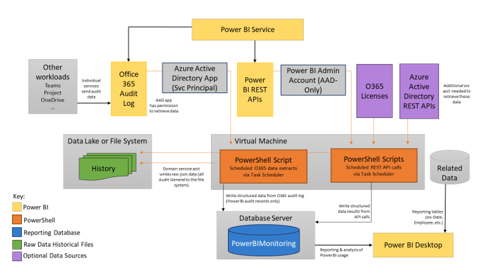
Sample architecture for 3Cloud’s Tenant Inventory and Usage Auditing solution.
In the above architecture diagram, data from the Office 365 Audit logs is retrieved through PowerShell scripts authenticating via an Azure Active Directory (AAD) App and stored in a Data Lake or File System. Additional scripts write only the Power BI-related audit logs to a database on a SQL Server, which can be either in the cloud or on-prem, parsing the original JSON along the way (with a few exceptions that are handled in the reporting layer of the Usage Audit report). Additionally, a series of PowerShell scripts perform calls to the Power BI Admin REST APIs, authenticating via an AAD-only Power BI Administrator account. These data are used to enumerate the existing Power BI tenant inventory, including Workspaces, Datasets, Reports, Dashboards, and Users. Just as with O365 log data, these parsed JSON data are stored in the database on a SQL Server.
Finally, data models and reports are created in Power BI Desktop to give Power BI Administrators insights into their tenant.
Tenant Inventory Report
The Tenant Inventory report can help Power BI Administrators answer essential questions about their Power BI adoption, like:
- How many Test, Production, and Personal Workspaces have been deployed?
- What are the assets associated to each of those Workspaces?
- What permissions do my users have in each Workspace?
The data model for the Tenant Inventory report is as follows:
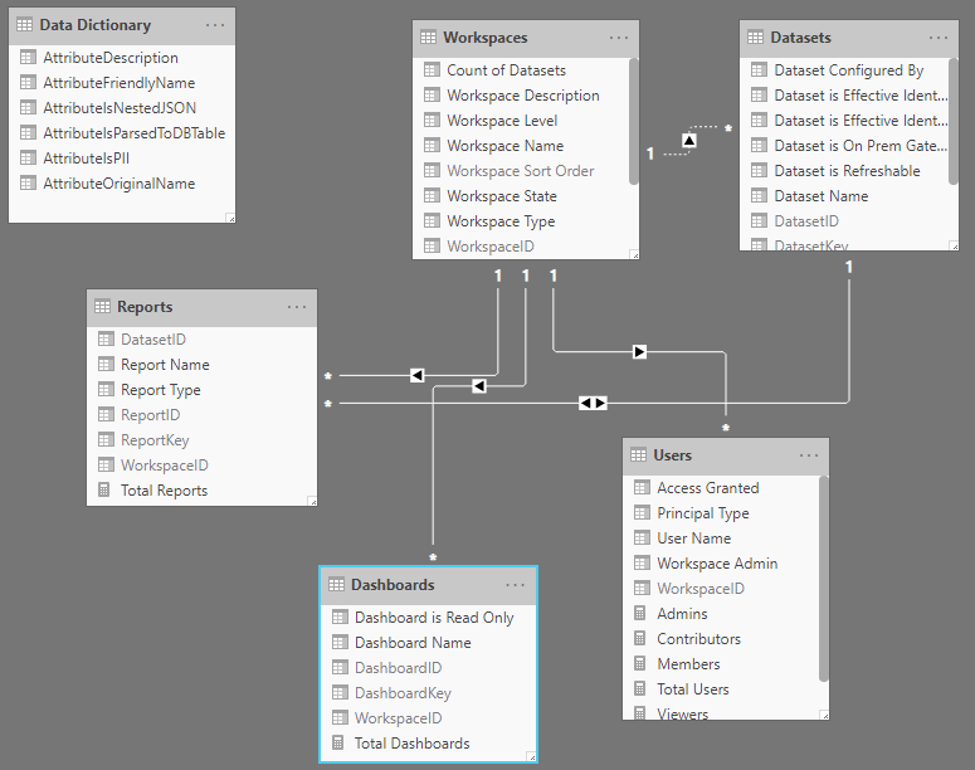
Workspaces are the “parent” data element, with the other inventory components existing as “child” elements. For example, Datasets are identified by the workspace in which they are housed; Users are identified through the Workspaces to which they have access. The exception is for Reports, which have an ID joining them to both a Workspace and a Dataset.
A Data Dictionary table is included to allow report consumers to see the different attributes and their definitions.
The report itself breaks down each element into its own report page, beginning with Workspaces. In this example, additional DAX is used to identify which Workspaces are the Personal “My Workspace,” which are considered Test, and which are considered Production (categorized in this report as “Workspace Level”). This allows Power BI system administrators to see how many of each type of Workspace exist, as well as the additional data elements – Datasets, Reports, Dashboards, and Users – associated to each Workspace. One caveat regarding Users: only users in V2 Workspaces – those decoupled from O365 groups – can be retrieved with their Workspace association through the Power BI Admin APIs. V1 Workspaces are represented by the “Group” Workspace type in these reports. In other words, we know when V1 Workspaces exist, but we can’t see who has what permissions within that Workspace.
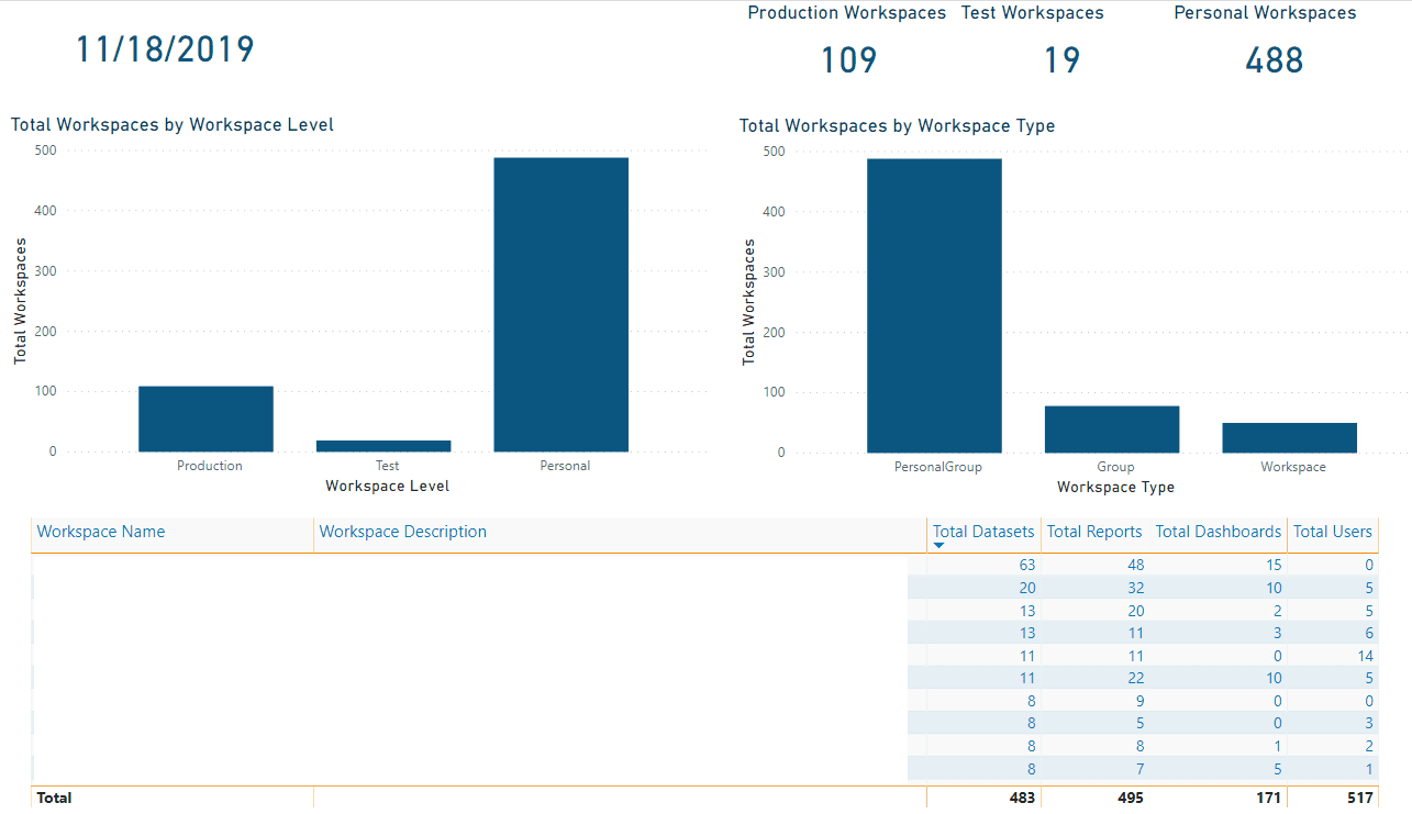
A drillthrough page (not pictured) lists each data element per Workspace by name. Users are also identified as either individuals or AD Groups, and their role within the Workspace is identified: Admin, Member, Contributor, or Viewer.
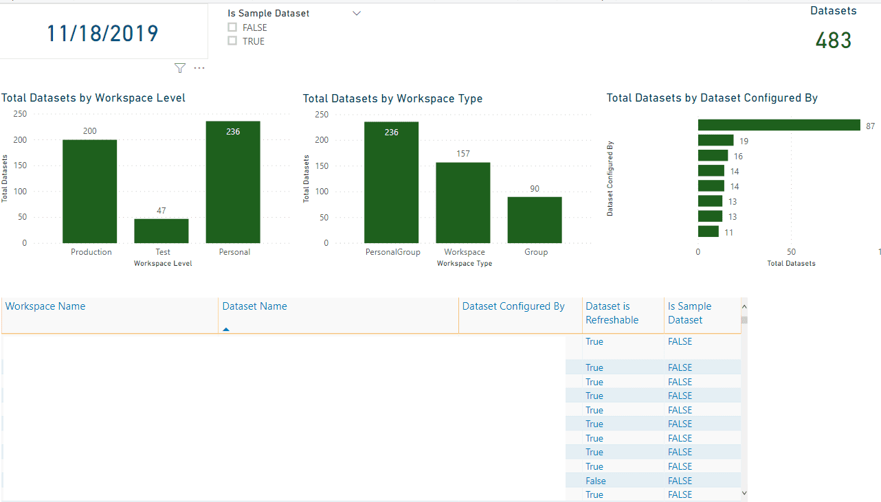
Next, the report identifies Datasets within the tenant. Counts of Datasets by Workspace Level; Workspace Type – where PersonalGroup includes “My Workspace”; Group, those associated with an O365 group (the “old” Workspace experience where Workspaces are tightly coupled with O365 groups); and Workspace (the “new,” decoupled Workspace experience); and which user configured the Dataset. Here, we have also tagged if the Dataset is Refreshable, either through a DirectQuery connection or through a scheduled refresh through a Gateway.
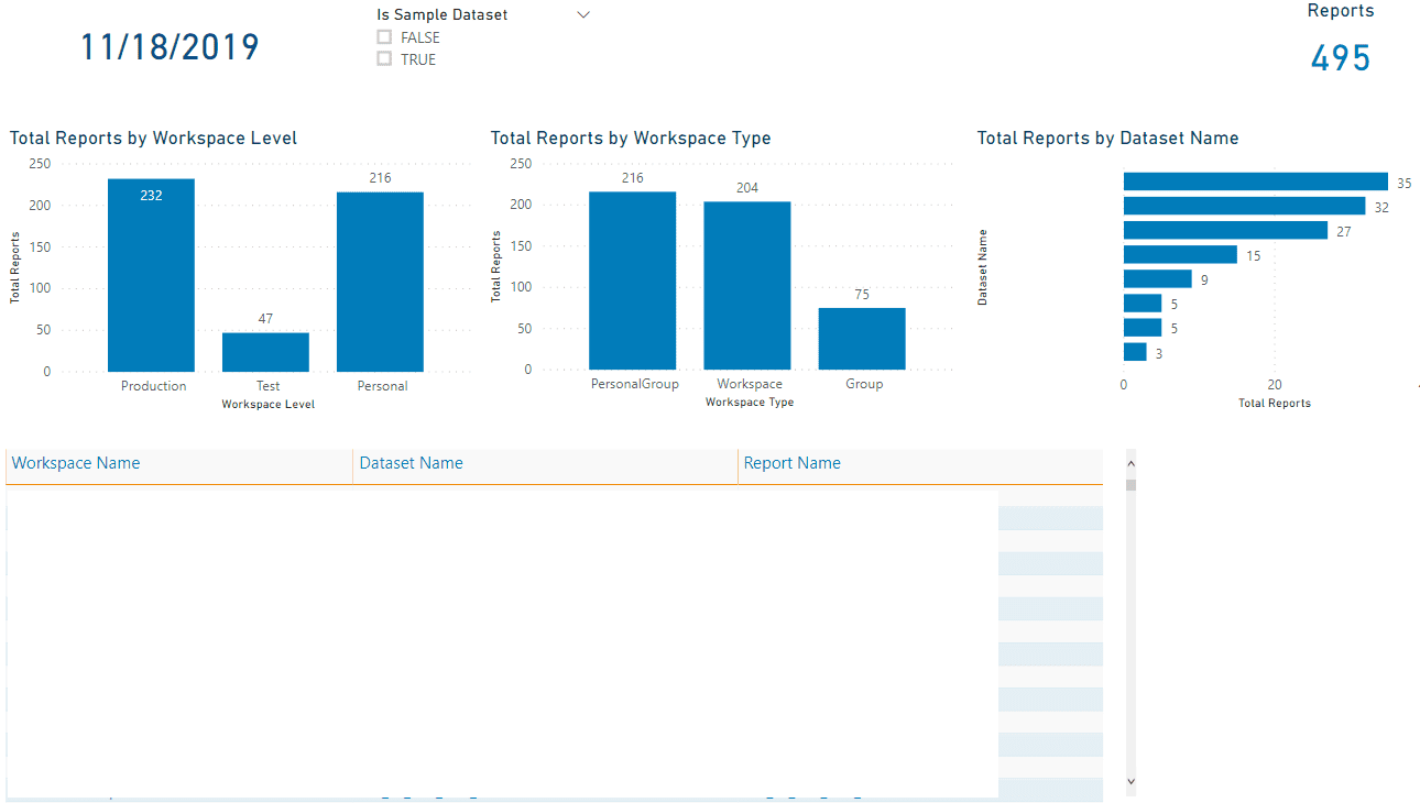
The next element is Reports. Similar to the Datasets page, counts of Reports by Workspace Level and Workspace Type are provided, as well as the number of reports associated to each Dataset. They are also listed in their respective Workspaces in a table visual.
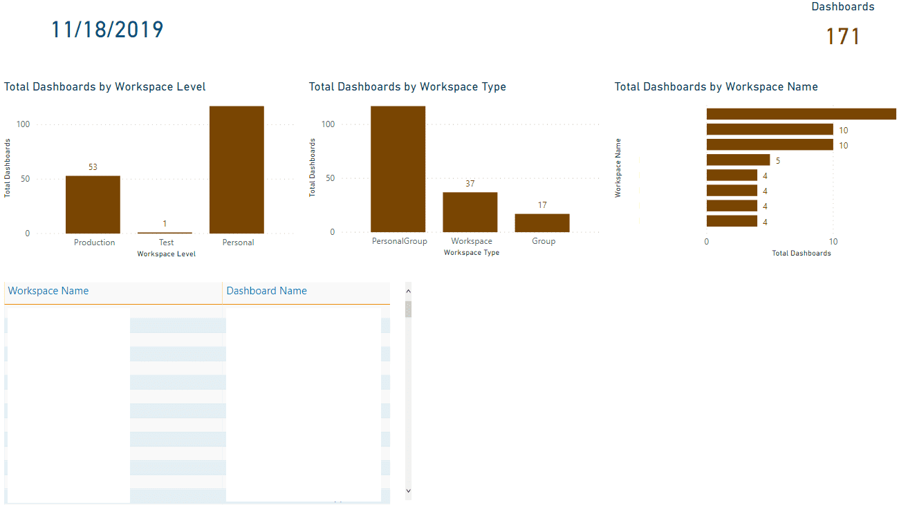
Dashboards are the final asset detailed in the Tenant Inventory report. Similar to previous elements, Dashboards are counted by Workspace Level and Type, and listed within their parent Workspace.
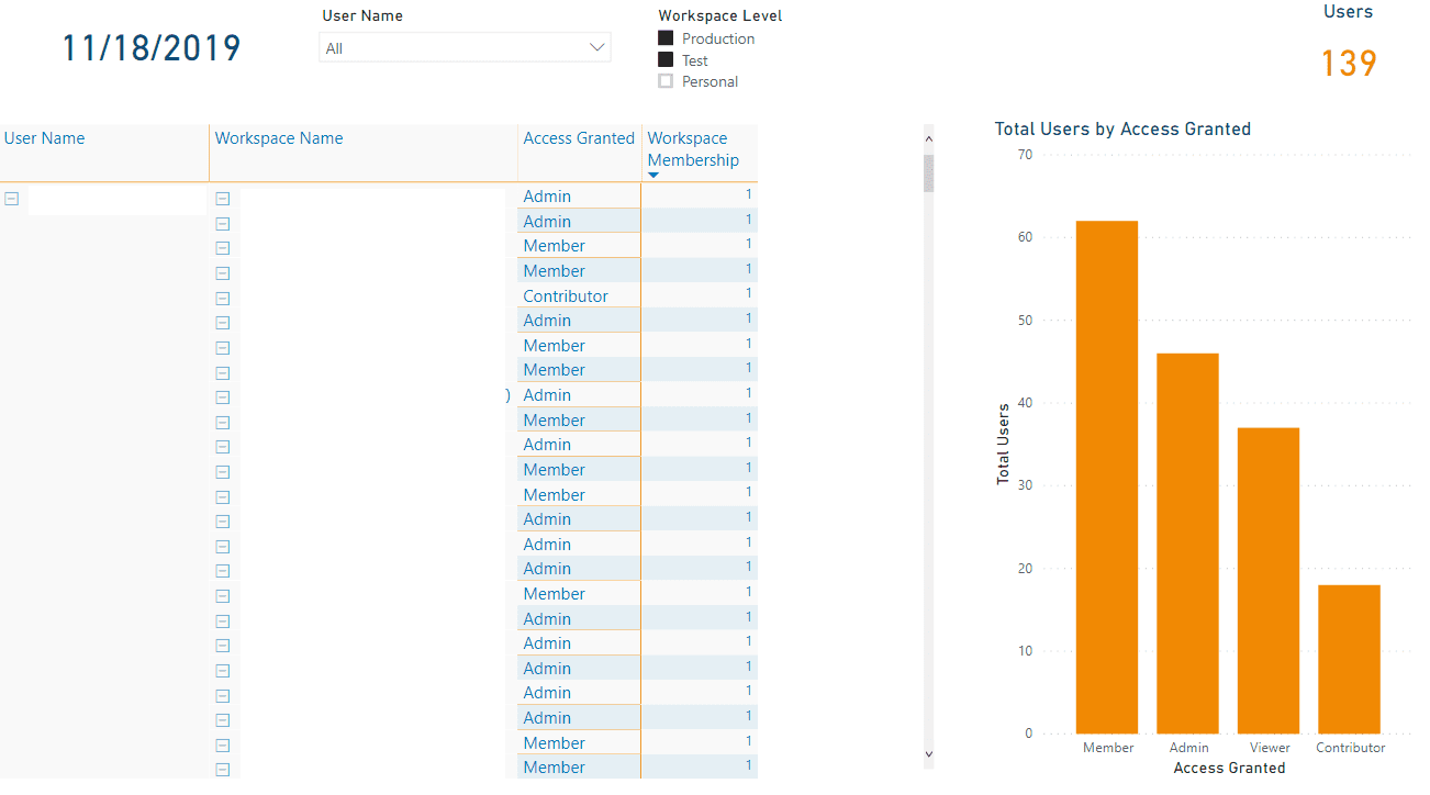
Finally, we come to Users. In the screenshot below, we see that there are slicers to examine Workspace membership for a specific user, or through the different Workspace Levels. A duplicated count of users is given in the column chart to illustrate the distribution of roles access across the tenant. The Matrix visual on the bottom left of the report page lists the Workspace and Access for each user.
Usage Audit Report
The Usage Audit report can help Power BI Administrators monitor Power BI Adoption in their organization by answering the who/what/when/how of their Power BI tenant:
- What content are users interacting with? What are they doing?
- When are users accessing the Power BI Service?
- How are they sharing or distributing content to colleagues?
- What is the most critical content based on frequency of access?
- Who has access to each Workspace?
The data model for the Usage Audit report is as follows:
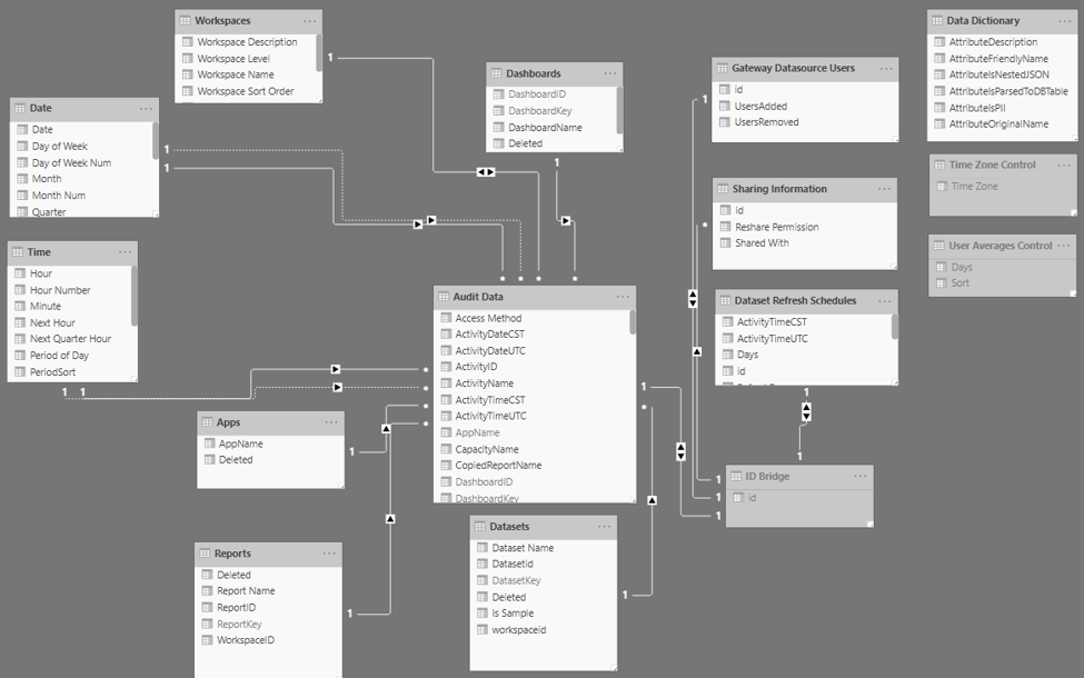
As you can see, the model is a little more complicated than the Tenant Inventory solution. Here, Audit Data is our primary fact table. Supporting dimensions include a boilerplate Date and Time, Apps (referring to Power BI Workspace Apps), and the data elements from the Tenant Inventory solution – Workspaces, Datasets, Reports, and Dashboards.
The Gateway Datasource Users, Sharing Information, and Dataset Refresh Schedules are all born of unparsed JSON fields originally contained in the Audit Data table. The ID Bridge is exactly that – the link between Audit Data and those unparsed elements.
Finally, to the right, you’ll see the Data Dictionary for Audit Data, as well as hidden tables which act as disconnected dimensions allowing report users to toggle time zone and rolling average attributes (Time Zone Control and User Averages Control, respectively).
Data from the O365 Admin logs and Power BI Admin APIs are stored in UTC. Columns representing local date and time were added to the PowerBIMonitoring SQL database. The Time Zone Control table acts as a toggle to display measures in either UTC or Local Time. Additional time zone information could be added to support local time reporting for various global regions.
The first page of the Usage Audit report details the activities being performed in the Power BI Service. In the example below, more than 37,000 unique events distributed among 295 distinct users have occurred in the tenant since monitoring was enabled in July 2019. We can see the peaks and valleys of use (activity tends to dip on the weekends!), the top five activities being performed in the Power BI Service, and additional visuals showing change over time. Right off the bat, we can see that both the use of the Power BI Service is increasing in this tenant, as are the number of users.
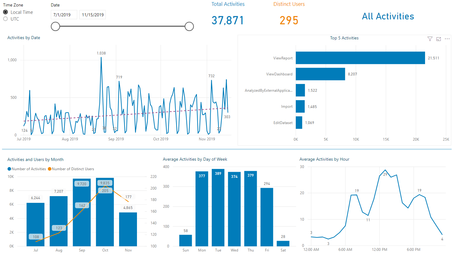
Activity Name filters on all pages allow users to see all or specific activity types throughout the report. Their seledtions are displayed in the card on the upper right corner of the report page. All the screenshots here display “All Activities” as no distinct selection has been made.
The next page has a similar concept, but focuses on users rather than activities:
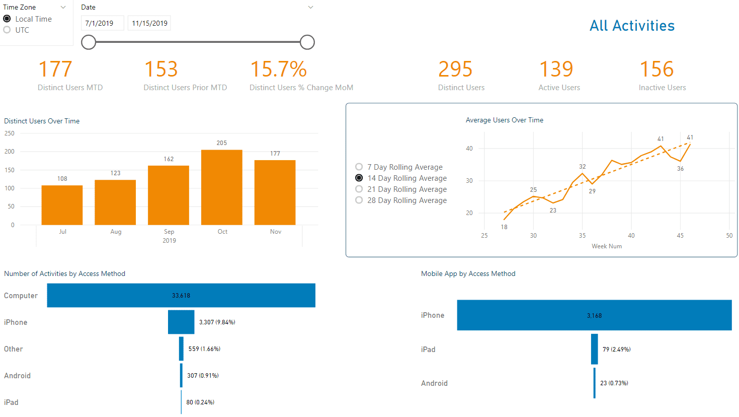
Here again we can quickly see how the number of users has increased over the past five months. We also have funnel charts detailing how users are accessing the Power BI Service, whether through their desktop or phone, and which provider they use when accessing through the Mobile App. Having information about the avenue through which users are interacting with the Power BI Service can help administrators understand if additional support or development may be needed. For example, if a high volume of activity is through the mobile app, report developers may need to ensure that their solutions are designed optimally for mobile.
A User Details page breaks this information down further, showing specific activity counts for individual users, allowing Power BI Administrators to understand exactly what is happening in their tenant and who is performing those operations. Additionally, measures were written to show the number of days that have passed since a user’s last activity in the Power BI Service. This is particularly powerful information, as perhaps users who do not frequently interact with the Service do not need a Power BI Pro license (if you have Pro licenses in your organization).
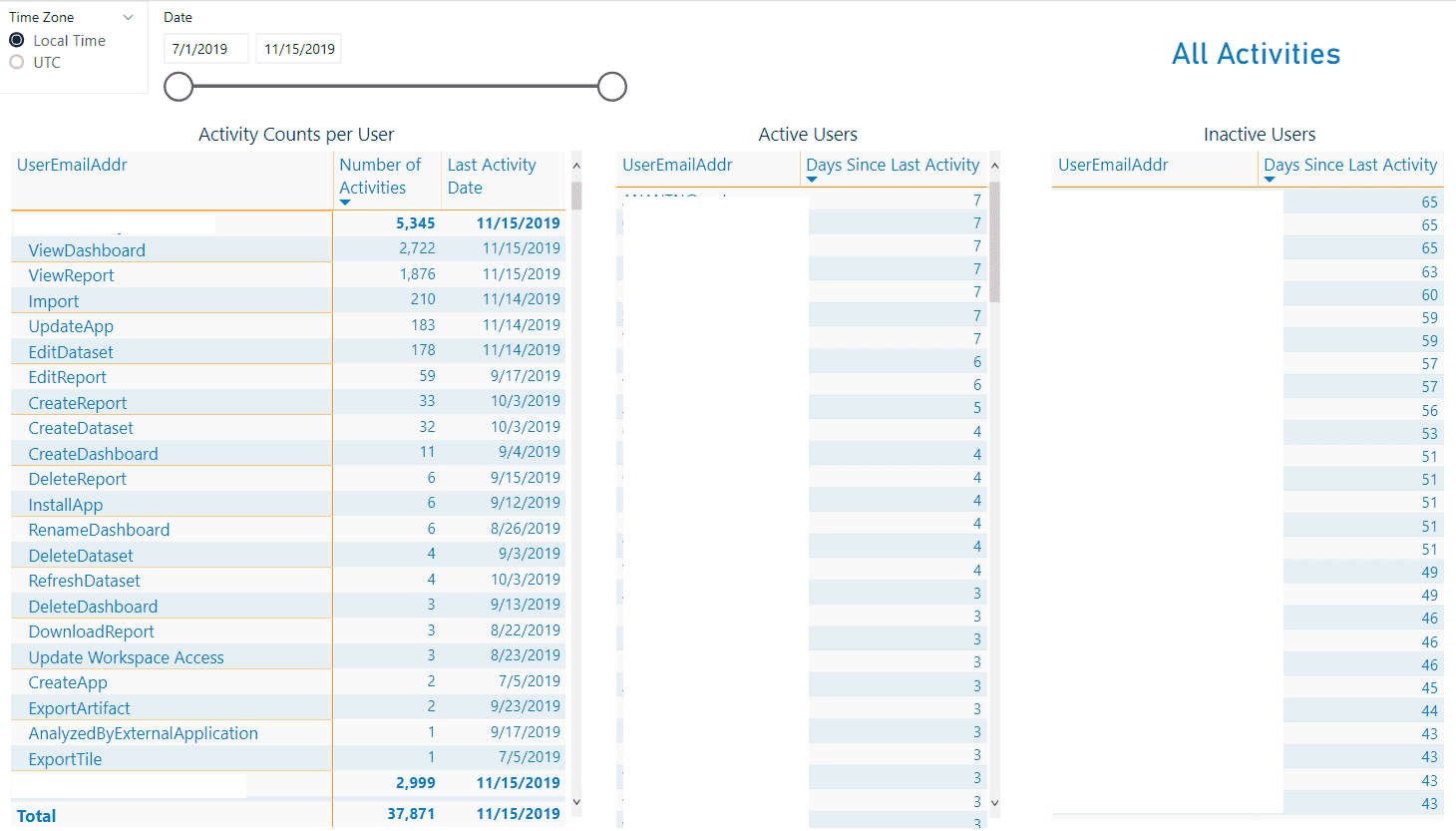
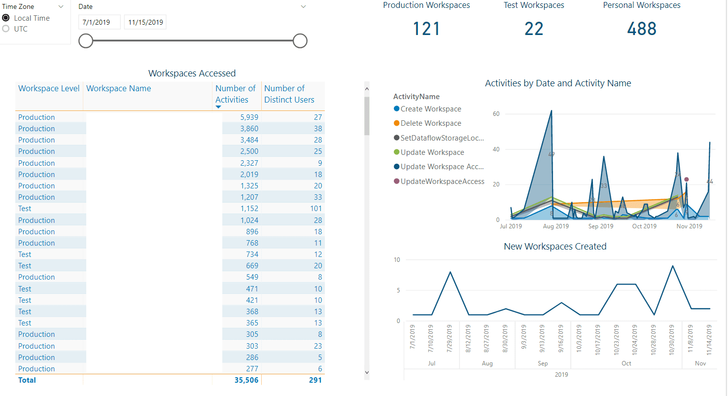
The next set of pages in the Usage Audit report enumerate the number of activities and distinct users for the different assets in the Power BI Service – Workspaces, Datasets, Reports, Dashboards, and Workspace Apps. Drillthrough pages provide additional details for specific assets and users. The example below is the primary page for Workspaces:
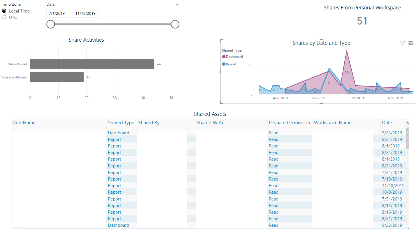
Many organizations choose to discourage the use of the Sharing feature in the Power BI Service in favor of content distribution through Workspaces and Workspace Apps. Sharing is an activity type that is recorded in the O365 Logs and detailed in the Usage Audit report. Administrators can follow up with any users who may appear to be “oversharing” content.
As you can see, there are many avenues to explore and many questions to answer once you have access to the complete data needed to monitor your deployment to the Power BI Service. Whether you are just beginning your journey into using Power BI or have a long-standing implementation, 3Cloud can help you understand how the tool is being used in your organization.
3Cloud can optimize your investment in Power BI with our Catalyst for Modern BI. To learn more about how our Catalyst Framework speeds deployment and adoption of Power BI contact us today.
Additional links:
- Additional Power BI blog articles from our team at 3Cloud.
- A complete list of activities audited by the Power BI Service is available here.
- Power BI Admin APIs are listed here.

