Editor’s Note: The post was originally published in [November, 2017] and has been updated for freshness, accuracy and comprehensiveness.
For better or worse, the game of baseball has changed drastically in just the last few years.“Small ball” (an approach to baseball that involves base hits, sac fly’s, bunts) is dying. Players are swinging for the fences every chance they get and thus, are striking out at a higher rate than ever before. Balls are being put in play less and less.
Why is this happening? The use of real-time data in sports is challenging players to push the boundaries of athletic performance. In 2007, MLB introduced StatCast which gives teams access to data never imagined before. Over the last 10 years, we’ve seen baseball transform from a competitive team sport to a more individualized performance sport driven by the desire to improve one’s own statistics. A great show of sportsmanship is now more about the performance of the individual than the W or L of the team.
This “analytics revolution” in baseball is just beginning.
- Analysts are working to predict injuries to pitchers just by looking at minute differences in pitch velocity and spin rate.
- Batters finish their “at bat” and go back to the dugout and check what their “launch angle” and “exit velocity” were.
- Outfielders check the piece of paper in their back pocket to see exactly where they need to stand for the current batter based on that batter’s spray chart.
- “The shift” is a new concept that baseball traditionalists scoff at. Infielders move from their normal position and move the other side of the infield because the data says that that is where the ball is most likely to go.
- Pitchers are being trained to throw the ball harder and harder than ever before.
Don’t believe me? Let’s let the data speak for itself. Does the data support this new trend of pitchers throwing harder than ever before? We will use simple linear regression and compare the ERA of pitchers in 2016 to their average fastball speed.
For those who do not know, ERA is a commonly used statistic for pitchers that stands for Earned Run Average. It is the number of runs scored against that pitcher per nine innings pitched. The lower the ERA the better.
What is Linear Regression?
| X | Y |
| 1 | 5 |
| 2 | 7.5 |
| 2.7 | 10.3 |
| 3.5 | 12.9 |
| 3.7 | 13.9 |
| 4.9 | 16.6 |
| 5.8 | 19.5 |
| 6.2 | 20.6 |
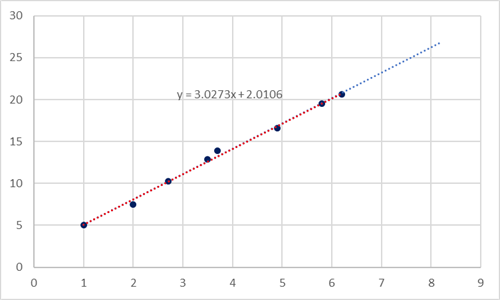
A linear regression involves plotting a line that best represents a scatter-plot of points, like the one above. The line of best fit is the line that minimizes the total squared distance from each point to the line. You can use the equation of the line to predict future point values. For example, if X were 7.3 we can use the equation to predict the value of Y.Y = 3.0273*(7.3) + 2.0106 = 24.10989.
Another important value to note in a linear regression model is correlation. Correlation is a value between -1 and 1 that describes how well the scatter-plot fits to a line. Positive correlation means as X increases, so does Y. Negative means as X increases, Y decreases.The closer correlation is to 1 or -1 then the better the data fits to a line. A correlation of 0 means there is no correlation.The correlation for this example is 0.997688.
Gathering the data
We will use two different data sources for this pitch speed analysis. The first is called the Lahman Database. Run by a man named Sean Lahman, the Lahman database has complete end of season stats going all the way back to 1871. At http://www.seanlahman.com/baseball-archive/statistics/ you will find a Microsoft Access version, a CSV version, and a SQL version.For this demo we will be using the CSV “Pitching” table from the database.You’ll find a description of all the columns here: http://seanlahman.com/files/database/readme2016.txt.
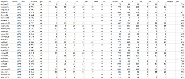
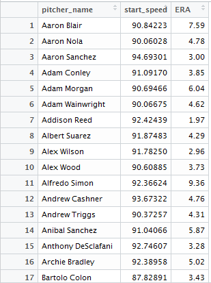
Small portion of the “Pitching” table from the Lahman Database
The Lahman database covers a lot of different stats but it gives you no way to explain “why” players are or are not having success. This is where MLB.com’s PitchF/x data comes into play.As of the 2008 season, we have data for every pitch thrown including the type of pitch, where it crossed the plate, the speed, how much break it had and in what direction, and much more. https://fastballs.wordpress.com/category/pitchfx-glossary/ is a great resource describing what all the columns from the pitchF/x data mean.
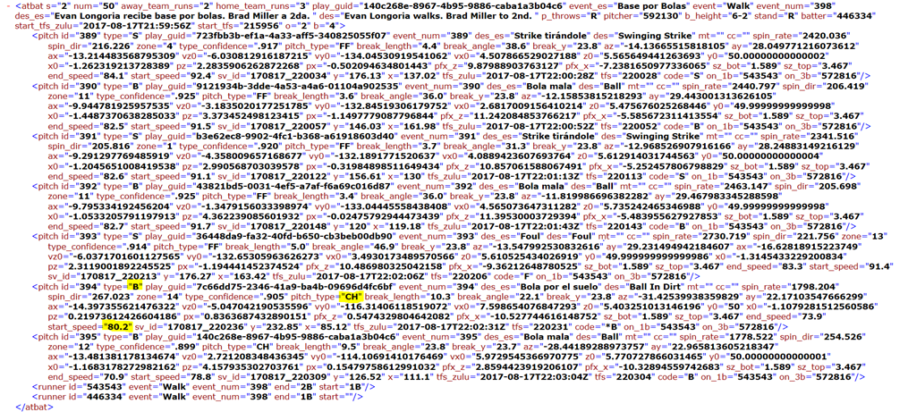
Example of what the raw data looks like from MLB’s website.
HTTP://GD2.MLB.COM/COMPONENTS/GAME/MLB/
This data powers the MLB At Bat application.The picture above is all the data from an at bat by Evan Longoria of the Rays with Danny Barnes of the Blue Jays pitching. At the top, you’ll see the result of the at bat (“des”) which was “Evan Longoria walks. Brad Miller to 2nd.” I’ve highlighted a few key stats from the penultimate pitch thrown to Longoria.You can see there that type = “B”(ball), pitch_type = “CH” (changeup), and start_speed = 80.2 (80 mph when released).
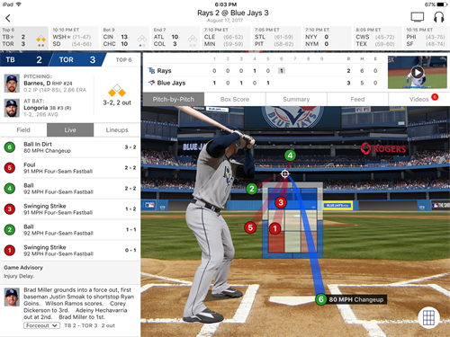
Barnes throws an 80 MPH Changeup for a ball to Evan Longoria. Screenshot taken from MLB’s At Bat application.
The next step will be getting the PitchF/x data, which is an XML file, into a form that we can digest in R. Then we will join these databases together so we can look at pitcher’s fastball speed and compare this to their ERA, both for the 2016 season. As a reminder, the lower the ERA, the better.
Massaging the data
Finally, time to start using some R code.
Using the “pitchRx” package and the “scrape” command we can pull pitch data from the MLB website for specific games or for a date range into a nice data frame that is easy to use.You’ll find all documentation for the “pitchRx” package here: https://cran.r-project.org/web/packages/pitchRx/pitchRx.pdf.
INSTALL.PACKAGES(“PITCHRX”)
LIBRARY(PITCHRX)
GAME <- SCRAPE(GAME.IDS = “GID_2017_07_19_TBAMLB_OAKMLB_1”)
GAMES_APRIL <- SCRAPE(“2016-04-03″,”2016-04-15”)
This gives you 5 tables. The best way to utilize the results are to combine the pitch table with the atbat table. This way you have every pitch that was thrown as well as the results of the at-bat.
PITCHES_APRIL <- PLYR::JOIN(GAMES_APRIL$ATBAT, GAMES_APRIL$PITCH, BY=C(“NUM”, “URL”), TYPE=”INNER”)
Unfortunately, the scrape command has a limit of 200 games per use. To get around this we’ll simply use the “scrape” command multiple times and combined the results into one table.
GAMES_APRIL_2 <- SCRAPE(“2016-04-16″,”2016-04-28”)
PITCHES_APRIL_2 <- PLYR::JOIN(GAMES_APRIL_2$ATBAT, GAMES_APRIL_2$PITCH, BY=C(“NUM”, “URL”), TYPE=”INNER”)
PITCHES_ALL <- PLYR::JOIN(PITCHES_APRIL, PITCHES_APRIL_2, TYPE = “FULL”)
Rinse and repeat.
Now we need to join this table with the pitching table from the Lahman database.Unfortunately, there is no direct way to join these tables together.MLB uses unique numbers to identify pitchers and Lahman uses a playerID column. The Lahman database has a “master” table for this purpose but the master table does not have the MLBcode.Baseballprospectus.com has a table with both playerID and MLBcode but this table is incomplete.
To join the tables, we used Lahman’s “Master” table and made a new “pitcher_name” column and joined the tables using the pitcher’s full names.
SETWD(“#MY FOLDER#”)
PITCHING_STATS <- READ.CSV(“PITCHING.CSV”
PITCHING_STATS <- SUBSET(PITCHING_STATS, PITCHING_STATS$YEARID == 2016)
MASTER <-READ.CSV(“MASTER.CSV”)
MASTER <- SUBSET(MASTER, SELECT = C(“PLAYERID”,”NAMEFIRST”,”NAMELAST”))
MASTER$PITCHER_NAME <- PASTE(MASTER$NAMEFIRST, MASTER$NAMELAST, SEP=” “)
PITCHING_STATS_WITH_NAMES <- PLYR::JOIN(PITCHING_STATS, MASTER, BY= “PLAYERID”, TYPE=”INNER”)
PITCHES_ALL_AND_STATS <- PLYR::JOIN(PITCHING_STATS_WITH_NAMES, PITCHES_ALL, BY= “PITCHER_NAME”, TYPE=”INNER”)
This is a very large table, with which a lot of analysis can be done. If you choose to go a different direction from here please let me know what insights you find!
We, however, are going to start trimming the fat to look at only the columns we need for this analysis.
PITCHES_ALL_AND_STATS <- SUBSET(PITCHES_ALL_AND_STATS , STINT == 1)
PITCHES_ALL_AND_STATS <- SUBSET(PITCHES_ALL_AND_STATS, IPOUTS >= 150)
PITCHES_FASTBALLS_AND_STATS <- SUBSET(PITCHES_ALL_AND_STATS, PITCH_TYPE %IN% C(“FA”, “FF”, “FT”))
PITCHES_FASTBALLS_AND_STATS <- SUBSET(PITCHES_FASTBALLS_AND_STATS, SELECT = C(“PITCHER_NAME”,”START_SPEED”,”ERA”))
The “stint == 1” is to ensure there is only one row for each pitcher. Pitchers who pitched for multiple teams in one year will have more than one row for each team. “IPouts >= 150” is to filter the results to only include pitchers who have thrown at least 50 innings (50 innings = 150 Outs) to avoid pitchers with a small sample size.
Now we have every fastball thrown for pitchers who threw at least 50 innings in 2016 along with the name of the pitcher and that pitcher’s 2016 ERA.Now the only thing left to do is to average the fastball speed so we have one row for each pitcher and then rename the column back to “pitcher_name.”
PITCHERS_FASTBALLS_ERA <- AGGREGATE(PITCHES_FASTBALLS_AND_STATS[,2:3], LIST(PITCHES_FASTBALLS_AND_STATS$PITCHER_NAME), MEAN)
COLNAMES(PITCHERS_FASTBALLS_ERA)[COLNAMES(PITCHERS_FASTBALLS_ERA)==”GROUP.1″] <- “PITCHER_NAME”
Creating the Linear Model
We’ll start by looking at the correlation between start_speed and ERA.
COR(PITCHERS_FASTBALLS_ERA$ERA,PITCHERS_FASTBALLS_ERA$START_SPEED)
The correlation we get is -0.234668 which is not a particularly strong correlation but it shows that there is some sort of relationship between speed and ERA. As speed increases, ERA tends to decrease.
Now, let’s create a linear model.
LM_ERA <- LM(FORMULA = ERA ~ START_SPEED, DATA = PITCHERS_FASTBALLS_ERA)
SUMMARY(LM_ERA)
Residuals:
Min 1Q Median 3Q Max
-2.2760 -0.8130 -0.0811 0.6954 5.3207
Coefficients:
(Intercept) 14.90057 2.78855 5.343 1.99e-07 ***
start_speed -0.11759 0.03021 -3.893 0.000126 ***
—
Signif. codes: 0 ‘***’ 0.001 ‘**’ 0.01 ‘*’ 0.05 ‘.’ 0.1 ‘ ’ 1
Residual standard error: 1.147 on 260 degrees of freedom
Multiple R-squared: 0.05507, Adjusted R-squared: 0.05143
F-statistic: 15.15 on 1 and 260 DF, p-value: 0.0001261
Our line of best fit has the equation:
ERA = 14.90057 – 0.11759*(start_speed)
Using this equation we can predict ERA using start_speed but how accurate would this prediction be?
Also, worth noting are the p-value for start_speed and the adjusted R-squared value. The p-value for start speed (represented by Pr(>|t|) is 0.000126. What this means is that there is a 0.0126% chance that our results just happen by coincidence. This tells me that fastball speed does have a statistically significant impact on ERA.
The adjusted R-squared value is 0.05143. What this means is 5.143% of the variance in ERA is explained by our model. Not a large amount unfortunately. This tells me that, while fastball speed does influence performance, it is only just one part of it.
Using the ggplot2 package we can create a scatterplot of our data with the line of best fit. http://ggplot2.org/
INSTALL.PACKAGES(“GGPLOT2”)
LIBRARY(GGPLOT2)
GGPLOT(PITCHERS_FASTBALLS_ERA,
AES(X = `START_SPEED`, Y = `ERA`)) + GEOM_POINT() +
THEME(PANEL.BORDER = ELEMENT_RECT(COLOR = “BLACK”, FILL = NA, SIZE = 1),
PANEL.BACKGROUND = ELEMENT_RECT(FILL = “WHITE”),
PANEL.GRID.MAJOR = ELEMENT_LINE(COLOR = “GREY”, LINETYPE = “DASHED”)) +
STAT_SMOOTH(METHOD = “LM”, COLOR = “ORANGE”, SIZE = 1, LEVEL = 0.95)
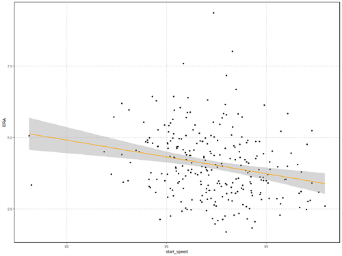
The shaded gray area represents the confidence interval. You’ll see in the code that we set the confidence level for the “stat_smooth” argument to 95%.
Testing Assumptions and Improving the Model
The first thing you should always check when making a linear regression model is that the residuals are normally distributed (bell curve). Residuals are the distance of each point to the line of best fit. If the residuals fit a normal distribution then this tells us that a linear model makes sense and not a polynomial one.
LM_ERA_RESID <- AS.DATA.FRAME(LM_ERA$RESIDUALS)
PLOT(DENSITY(LM_ERA$RESIDUALS),XLAB = “RESIDUALS”, MAIN = “DISTRIBUTION OF RESIDUALS”)
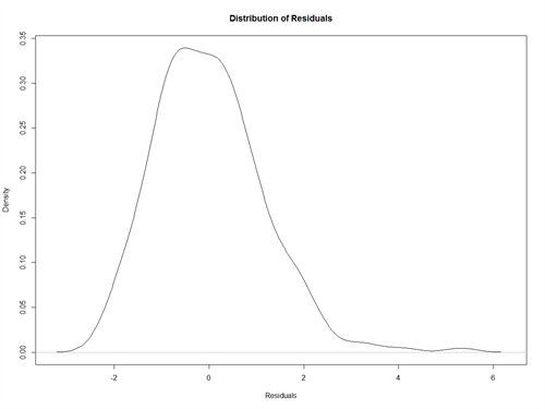
This does look normally distributed with a little skew to the right. To confirm that it’s normally distributed, let’s create a Q-Q Plot. A Q-Q plot compares our data to that of a theoretical normal distribution. If the graph forms a straight line then our residuals are normally distributed.
QQNORM(LM_ERA$RESIDUALS, MAIN = “Q-Q PLOT TO TEST NORMALITY OF THE RESIDUALS”)
QQLINE(LM_ERA$RESIDUALS, LWD = 3, COL = “RED”)
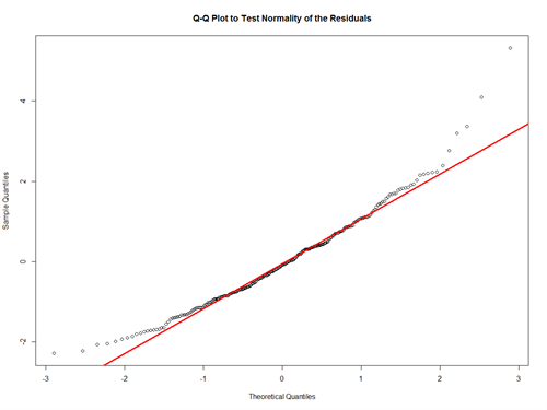
Our data fits the line well, but it appears there may be some outliers. We can use a box plot to check for outliers and then remove them.
BOXPLOT <- BOXPLOT(PITCHERS_FASTBALLS_ERA$START_SPEED, PITCHERS_FASTBALLS_ERA$ERA, MAIN = “FASTBALLS AND ERA BOXPLOT”)
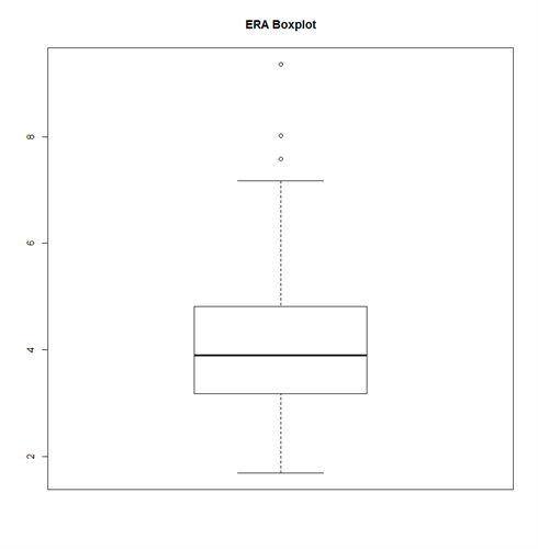
ERA_BOXPLOT <- BOXPLOT(PITCHERS_FASTBALLS_ERA$ERA, MAIN = “ERA BOXPLOT”)
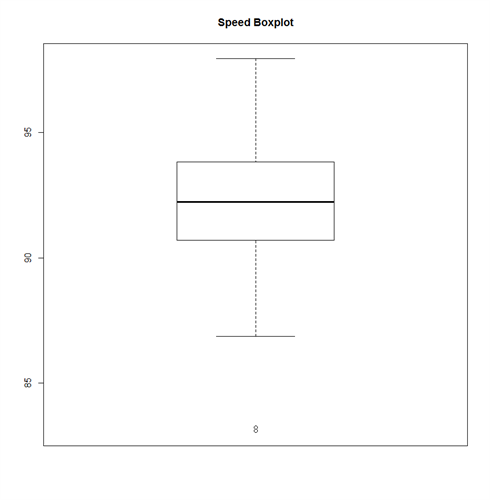
SPEED_BOXPLOT <- BOXPLOT(PITCHERS_FASTBALLS_ERA$START_SPEED, MAIN = “SPEED BOXPLOT”)
You can read more about how a boxplot is calculated here http://stattrek.com/statistics/charts/boxplot.aspx.
boxplot_outliers <- data.frame(boxplot$out, boxplot$group)
| boxplot.out | boxplot.group | |
| 1 | 83.10969 | 1 |
| 2 | 83.23261 | 1 |
| 3 | 7.59000 | 2 |
| 4 | 9.36000 | 2 |
| 5 | 8.02000 | 2 |
Now let’s mark which points in our data are outliers and graph it again
BOXPLOT_OUTLIERS_ERA <- PITCHERS_FASTBALLS_ERA[PITCHERS_FASTBALLS_ERA$ERA %IN% BOXPLOT_OUTLIERS[3:5, 1], ]
BOXPLOT_OUTLIERS_SPEED <- PITCHERS_FASTBALLS_ERA[PITCHERS_FASTBALLS_ERA$START_SPEED %IN% BOXPLOT_OUTLIERS[1:2, 1], ]
BOXPLOT_OUTLIERS_ERA_NAMES <- ROWNAMES(BOXPLOT_OUTLIERS_ERA)
BOXPLOT_OUTLIERS_SPEED_NAMES <- ROWNAMES(BOXPLOT_OUTLIERS_SPEED
BOXPLOT_OUTLIERS_NAMES <- C(BOXPLOT_OUTLIERS_ERA_NAMES, BOXPLOT_OUTLIERS_SPEED_NAMES)
GGPLOT(PITCHERS_FASTBALLS_ERA, AES(X = `START_SPEED`, Y = `ERA`)) + GEOM_POINT() + THEME(PANEL.BORDER = ELEMENT_RECT(COLOR = “BLACK”, FILL = NA, SIZE = 1),
PANEL.BACKGROUND = ELEMENT_RECT(FILL = “WHITE”), PANEL.GRID.MAJOR = ELEMENT_LINE(COLOR = “GREY”, LINETYPE “DASHED”)) +STAT_SMOOTH(METHOD = “LM”, COLOR = “ORANGE”, SIZE = 1, LEVEL = 0.95) +
GEOM_POINT(DATA = PITCHERS_FASTBALLS_ERA[BOXPLOT_OUTLIERS_NAMES,],
AES(X = PITCHERS_FASTBALLS_ERA[BOXPLOT_OUTLIERS_NAMES, ]$START_SPEED,
Y = PITCHERS_FASTBALLS_ERA[BOXPLOT_OUTLIERS_NAMES, ]$ERA), COLOR = “RED”,
SIZE = 3)
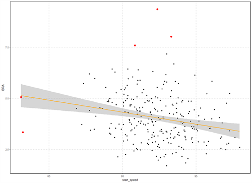
The red points represent the outliers.; Now let’s take these points out and recreate the model.
PITCHERS_FASTBALLS_ERA_NO_OUTLIERS <- SUBSET(PITCHERS_FASTBALLS_ERA, !ROWNAMES(PITCHERS_FASTBALLS_ERA) %IN% BOXPLOT_OUTLIERS_NAMES)
GGPLOT(PITCHERS_FASTBALLS_ERA_NO_OUTLIERS, AES(X = `START_SPEED`, Y = `ERA`)) +
GEOM_POINT() + THEME(PANEL.BORDER = ELEMENT_RECT(COLOR = “BLACK”, FILL = NA, SIZE = 1), PANEL.BACKGROUND = ELEMENT_RECT(FILL = “WHITE”), PANEL.GRID.MAJOR = ELEMENT_LINE(COLOR = “GREY”, LINETYPE = “DASHED”)) + STAT_SMOOTH(METHOD = “LM”, COLOR = “ORANGE”, SIZE = 1, LEVEL = 0.95)
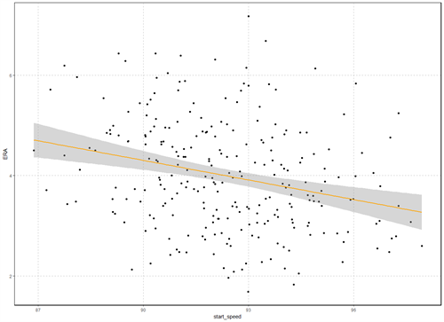
COR(PITCHERS_FASTBALLS_ERA_NO_OUTLIERS$ERA,PITCHERS_FASTBALLS_ERA_NO_OUTLIERS$START_SPEED)
Correlation has improved from -0.235 to -0.265
LM_ERA_NO_OUTLIERS <- LM(FORMULA = ERA ~ START_SPEED, DATA = PITCHERS_FASTBALLS_ERA_NO_OUTLIERS)
SUMMARY(LM_ERA_NO_OUTLIERS)
Residuals:
Min 1Q Median 3Q; Max
-2.2256 -0.7723 -0.0313 0.6986 3.2559
Coefficients:
Estimate Std. Error t value Pr(>|t|)
(Intercept) 16.00280 2.72378 5.875 1.31e-08 ***
start_speed -0.12998 0.02948 -4.409 1.53e-05 ***
—
Signif. codes: 0 ‘***’ 0.001 ‘**’ 0.01 ‘*’ 0.05 ‘.’ 0.1 ‘ ’ 1
Residual standard error: 1.052 on 255 degrees of freedom
Multiple R-squared: 0.07082, Adjusted R-squared: 0.06718
F-statistic: 19.44 on 1 and 255 DF, p-value: 1.535e-05
Our new formula is
ERA = 16.00280 – 0.12998*(start_Speed)
What we see here is that, with such a low p-value, fastball speed definitely influences ERA.However, even though it has improved, the adjusted R-squared is still only 0.06718 which means that our model still only explains less than 7% of the variation in ERA.
Multivariate Linear Model
To help improve the model, we can add more factors.Let’s use my new favorite visualization to look at correlation between multiple objects: ERA, fastball speed, spin rate on fastballs, spin rate on curveballs and sliders, and salary.
The ggpairs command in the “GGally” package displays a correlation matrix with a scatterplot comparing all the columns to each other, a histogram showing the distribution of each column, and each correlation value.
INSTALL.PACKAGES(“GGALLY”)
LIBRARY(GGALLY)
GGPAIRS(PITCHERS_NO_OUTLIERS[,C(“ERA”,”START_SPEED”,”SPIN_RATE”,”SPIN_RATE_CU”,”SALARY”)],
LOWER = LIST(CONTINUOUS = “SMOOTH”), DIAG = LIST(CONTINUOUS = “BARDIAG”))
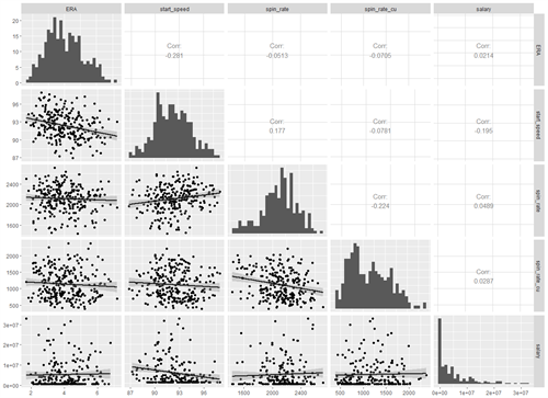
Looking at this, it appears spin rate does influence ERA, although the correlation is not as strong as it is for fastball speed.Salary does not have an impact and actually decreases the adjusted R- squared value of the model.Salary is often a representation of how long a player has been in the league, less so how well they perform.
MULTIVARIATE_LM_ERA <- LM(FORMULA = ERA ~ START_SPEED + SPIN_RATE + SPIN_RATE_CU, DATA = PITCHERS_NO_OUTLIERS)
SUMMARY(MULTIVARIATE_LM_ERA)
Residuals:
Min1QMedian3Q Max
-2.23046 -0.77149 -0.07979 0.70964 3.08181
Coefficients:
Estimate Std. Error t value Pr(>|t|)
(Intercept)17.8763102 2.7985197 6.388 7.93e-10 ***
start_speed -0.1431117 0.0304353 -4.702 4.22e-06 ***
spin_rate -0.0001266 0.0002769 -0.4570.6480
spin_rate_cu -0.00033090.0001638-2.021 0.0444 *
—
Signif. codes: 0 ‘***’ 0.001 ‘**’ 0.01 ‘*’ 0.05 ‘.’ 0.1 ‘ ’ 1
Residual standard error: 1.07 on 255 degrees of freedom
(6 observations deleted due to missingness)
Multiple R-squared: 0.09316, Adjusted R-squared: 0.08249
F-statistic: 8.732 on 3 and 255 DF,p-value: 1.556e-05
Conclusion
The new equation to predict ERA is:
ERA = 17.876 – 0.143*(START_SPEED) – 0.000126*(SPIN_RATE) – 0.0003309*(SPIN_RATE_CU)
The very small p-value associated with start speed shows that fastball speed does have a statistically significant impact on performance.However, the adjusted R-squared value is still only 0.0825 so there is still a lot that this model is unable to explain. So, while fastball speed is an important factor, it is certainly not the only one that is necessary to be a good pitcher.
One could continue to improve the model from here. Some factors that we did not include but intuitively would influence performance are: location of pitches, variance of speed and/or spin between pitches, pitch selection, and many others that may have yet to be discovered. Connect with us to start the conversation and discover how 3Cloud expertise can transform your business’s future.