In the first part of this series, we discussed the joint statement from AIR, EDUCAUSE, and NACUBO and its impact for supporting students:
Analytics can save higher education.
In part two, we will elaborate on how and why to drive cultural change in higher education with analytics.

An Engaged Culture
An engaged culture is core to institutional identity.
- How does it feel to be on campus as a professor, advising students about which classes to take next semester?
- What does it feel like to be on a virtual advising session as a student, interacting with a professor remotely?
With the accelerated pace of digital transformation in the last year, we have had the opportunity to build and deploy solutions rapidly. As we continue to develop digital resources, we should work hard to ensure our solutions are inclusive.
When people feel included, it can lead to better decision making, greater collaboration, and an increasingly engaged culture.
In this article, I will discuss three ways to promote an inclusive culture through analytics:
1. Access
Access to information is essential to make informed decisions.
During the last year, many schools have created a new campus—off-campus. To continue teaching and learning activities, teams shifted quickly to support faculty, students, and institutional success. Some schools deployed a cloud-based, self-service business intelligence solution to become better at inclusive decision-making and collaboration.
Power BI has several options to communicate data and insights when users need it most. The following diagram illustrates one example of a Power BI enterprise deployment. Here, dashboards and reports are available to users via online and mobile workspaces as well as through email subscriptions:
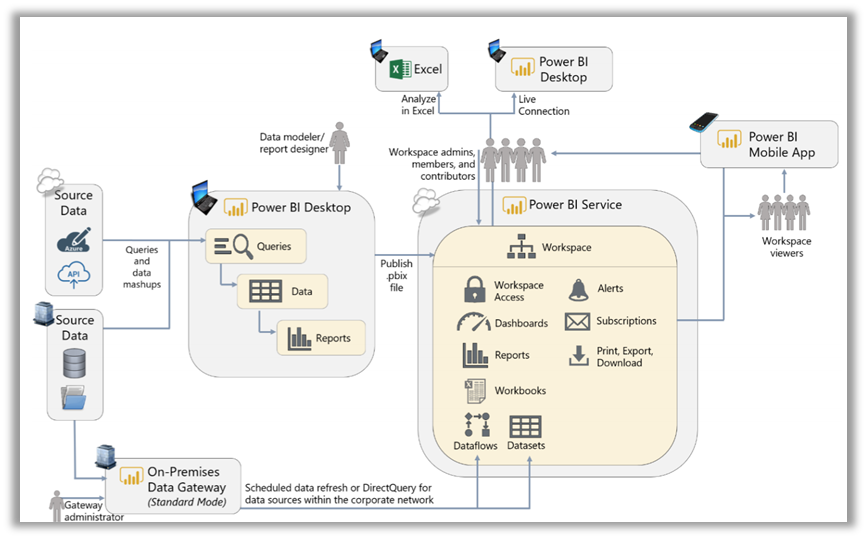
Along with this example, this white paper covers many other scenarios in detail. Ensuring equitable access to decision support tools in higher ed is overdue. The value of equitable access helps to remove communication obstacles and helps to invite contribution from everyone.
2. Inclusive Design
Inclusive design creates better experiences for everyone.
It is a methodology that enables and pulls from the full range of human diversity. It welcomes diverse people to engage with the institution and considers needs past those of the perceived average user. Although inclusive design takes usability into account, it also helps us understand complex intersectional needs and learn from people with a broad range of perspectives.
Creating trusted solutions means encouraging feedback, enabling a more sustainable and equitable future for the institution. One of Power BI’s newest features provides a way to extend visuals and reports through smart narrative summaries. Smart narratives accompany visuals to address key trends, takeaways, and insights.
By presenting a dynamic narrative, users can understand the information faster as the text automatically regenerates as they interact with the visuals:
This visualization above includes an example of a smart narrative. Here, we can see the number of Bachelor’s Degrees awarded in Tennessee in a given year. The smart narrative automatically summarizes some of the key insights in the visual, including the percentage of Bachelor’s degrees accounted for by the top school.
Listening and providing opportunities for feedback are essential in the inclusive design process. Our responsibility is to be iterative and design for impact—to all faculty and staff and the students we serve.
3. Accessibility
Accessibility is another critical part of digital inclusion.
We must consider diversity among users in all forms, including ways to effectively interact with solutions and resources. This section will discuss some examples of the accessibility features included in Power BI.
Visual accessibility: features that accommodate blindness, color vision deficiency, and low visual acuity.
Objects in Power BI that have keyboard navigation are compatible with screen readers. When a report consumer navigates to a visual, the screen reader will read out the title, visual type, and any alternative text descriptions (alt-text) that have been set. Alt text should include descriptive information that is meaningful to understand an object in the report:
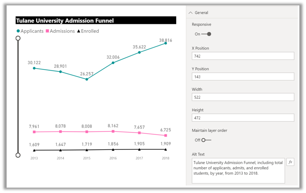
Although Power BI has colorblind-friendly themes built-in, it is best practice to identify metrics with additional indicators. In the example visual above, we have used Alt Text, the Colorblind Safe theme, and custom marker shapes. Test drive your reports with screen readers to better understand visually impaired users’ experiences and ask for feedback during development.
Cognitive accessibility: features that accommodate challenges in areas such as attention, memory, and sensory sensitivity.
When designing reports and visuals, maintain consistent and straightforward interfaces to reduce the cognitive load on users. It is also important to understand the urgency and medium of notifications and insights:
- Do you have a range of alerts that convey varying levels of importance, or is everything ‘top priority’?
Some tips to optimize content include:
- Reducing visual stress:
- Clear, minimal navigation
- Icons to reinforce meaning
- Bold key terms
- Reducing unnecessary notification and subscription frequency
In addition to the accessibility functions mentioned here, Power BI adheres to the following accessibility standards.
- WCAG 2.1
- US Section 508
- EN 301 549
Microsoft also provides a more thorough checklist for designing Power BI reports for accessibility. For additional accessibility resources, visit The Web Accessibility Initiative: a project dedicated to pursuing web accessibility support through strategies, standards, and resources.
Summary
As we increasingly shift to digital environments in higher ed, let’s make sure we are building an inclusive, accessible culture where everyone can contribute.
To do that, we should:
- Ensure everyone has access to information to make informed decisions.
- Create inclusive solutions so everyone has a better experience.
- Prioritize accessibility as an essential part of digital inclusion.
If you’d like to learn more about Power BI and how it can help drive organizational change at your institution, read our collection of resources for education or reach out with any questions, we’re here to help!