This is the second part in my running series on the importance of data structure in analytics, where I seek to demystify – and perhaps justify – some of the commonly accepted “best practices” around how we, as data engineers and business intelligence developers, seek to arrange data for analytical purposes. For this entry, I’ve decided to focus on a narrow (and thus defensible) slice of a broad and sometimes contentious topic: the dimensional model, or star schema, and its role in the Microsoft analytics world. Specifically, I want to take a look at why adherence to what can often seem like something of an esoteric concept really and truly can pay dividends when working with Microsoft analytics tools, and especially Power BI – one of the most capable and popular analytics tools out there today.
Let’s first take a quick look at the star schema and talk a little bit about its history, and then from there look at how it has come to remain a best practice gold standard in Microsoft analytics, and how it can help guide your efforts when working in Power BI.

The Dimensional Model – A (Very) Brief History
I realize there are some of you who are thinking, “Ugh, did he say ‘schema’?” or who might otherwise have no idea what I’m talking about when I refer to a dimensional model. For those of you who do – please, bear with me for a moment.
In this case, both “star schema” and “dimensional model” can be used interchangeably, and refer to a set of related data tables, both in terms of how those tables are built and what data they contain, as well as how – quite specifically – they are related to one another. We can think of it as being representative of a particular type of data model, or a way of structuring and storing our data, and one which is designed specifically with analytical use-cases in mind. This is different than data models designed to favor speed of writing data rather than reading it, such as highly normalized table structures. Dimensional models, conversely, tend to be de-normalized – or built with as few tables as possible, and in such a way that makes analysis more natural and intuitive – more on that in just a minute.
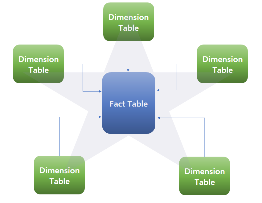 Figure 1 – The Star Schema
The dimensional model has been around for quite some time, at least relative to the fast-paced advance of information technology as a whole, and continues to confer benefits to its adherents today. Made popular by Ralph Kimball years ago, the dimensional model was central to Kimball’s prescribed approach to data warehouse architecture. Just as a simple level-set for the sake of this post, we can think of a data warehouse as a common repository where data is combined (originating from many different source systems) and conformed (made to adhere to common definitions and concepts) for the sake of helping facilitate analytics and reporting, usually at a large scale. While plenty of data warehouses are still built today using this design, some of the core benefits to its implementation were embraced by other analytics tools along the way, and those legacies live on in the here and now – particularly within the Microsoft Business Intelligence and analytics tool set.
The Dimensional Model and Power BI
Modern tools like Power BI might allow you to get away with building reports out of, and generating analytical value from, data in an unstructured, or improperly structured, data model. However, the fact that a traditional architecture was embraced early on in the evolution of analytics tools – especially by Microsoft – is key to its importance today, right alongside the features that transcend any particular technology altogether.
For Microsoft in particular, the first incarnation of their dedicated data analytics engine, named SQL Server Analysis Services (part of their data technology stack), was absolutely dependent on the data source being structured as a dimensional model. These models were referred to as “cubes”, and generated aggregate values as “intersections” of data. The current version of Analysis Services, known as Tabular, while being somewhat less dependent on this type of data structure, still benefits immensely from it. Power BI’s analytics engine is based upon this same technology; so the same techniques that would benefit you in an enterprise setting – with something like Analysis Services or Azure Analysis Services – apply just as much to analytics and self-service reporting using Power BI.
In addition to being able to consume data from existing structured data sources, Power BI allows users to build their own data model right there within the tool itself, offering a number of useful features, such as being able to draw from and analyze many different sources of data at the same time, adding custom repeatable logic using DAX (Microsoft’s Data Analytics Expression language) for translating business and analytical requirements into results, and to have control over the end-user experience. Reports and analyses should be performant and intuitive – and this all begins in the data model itself.
What It Is And Why It Matters
I’ll be perfectly honest with you: there’s a lot that can go into building a proper dimensional model, and sometimes familiarity – or knowing what to do – is contingent solely on good old exposure and time. But understanding how to get the most out of your Power BI data model, even if it’s just knowing that a particular type of model works best, can often be all the difference in the world between building something that “just works” and something that “maybe works OK some of the time”. There’s unfortunately, and perhaps obviously, more to it than I can fit into a blog post – or even a series of posts – but covering some of the basics is still warranted.
In very general terms, a dimensional model seeks to divide your data into two big groups, and thus two different types of tables in your model: facts and dimensions. It’s helpful to think of a “fact” in this case as being some event we’re interested in analyzing. This can be a line item in a sales transaction, an encounter between a physician and a patient, or an entry in a general ledger. This event, and its frequency, forms what we would call the base “granularity” of a fact table – or that which would spark the creation of a new row in such a table. As for what data a fact table contains – we strive to keep it as close to being strictly numeric values as possible. Thus, it would contain the quantifiable data points that describe an event: How much was an item sold for? How many items were sold? What was the amount posted to the general ledger? Sometimes our event doesn’t have much, or even any, implicit numeric information – such as a patient making an appointment to see their doctor – and in these cases the fact table acts as a “bridge” between our related dimensions.
If fact tables contain the quantifiable data we’re interested in, dimension tables contain the contextual information that we wish to analyze: Who was the client? Where did the event take place? What day did the event take place on? In a dimensional model, we would generally seek to take all of this contextual data and create a dimension table for each logical grouping – and then make each value there distinct. In other words, we would have a Date dimension with each date, month, and year on the calendar to supply the temporal context. We might also have a Client dimension with each unique client we do business with and each aspect, or attribute, of a client that is analytically useful. The dimensional values represent the context of our analyses.
The end result for users is a logical and intuitive grouping of values: numeric values are stored in one place, while each set of related contextual values is grouped in as few thematic sets as needed. This is especially helpful for analytics tools which feature a “drag-and-drop” approach to data exploration and report building – a feature central in Power BI and Microsoft’s Excel. Humans inherently break down events this way logically. We take some metric and then ask, “Where was this metric impacted?” “Who or what impacted it?” And so on. This factor alone is no small part as to why tools, particularly those aimed at business users, were built around this approach – and that’s something that can’t be said enough when it comes to some of the less obvious benefits to embracing a dimensional model as the source for analytical initiatives.
Power BI data models get loaded into memory which, for those not particularly interested in knowing the intricacies of modern computing hardware, generally means they can crunch numbers very quickly – no matter how your data is structured. However – and this may especially resonate with those of you who came here because you saw “Power BI” in the title – it’s still easy to end up with a data model that isn’t fast at all. Even a Ferrari can only go as fast as the cars in front of it when there’s a traffic jam – and having the right data model design can often be thought of as the best defense against traffic jams – in short, because the tool was designed with just such a model in mind. Ninety-nine times out of 100, Power BI is simply most performant when the data it’s using comes from a dimensional design.
Lastly, there are analytical languages like the earlier-mentioned DAX. Just as the actual engine a tool uses to process data is designed with certain prerequisites in mind, analytical languages work best with certain formats. DAX, used in Power BI, is often described as “elegant” because it can do in a single line of code what would maybe require hundreds of lines of SQL (or a lot of head scratching and convoluted statement building with earlier languages like MDX, multidimensional expressions.) But this is not at all guaranteed, no matter what the sales pitch is! Trying to create a Power BI data model consisting of one immense table with nearly a hundred columns could require you to write incredibly complicated (and slow-performing) DAX queries, whereas the exact same results could be produced simply and elegantly were that data transformed into a dimensional model.
What To Do Next
There are lots of great resources out there on this subject – and certainly enough to help just about any level of experience when working on designing or modifying data models to better suit analytics and reporting needs. At 3Cloud can lend our expertise, as well as offer training, to give you that extra leg up when working with Power BI, Dimensional Models, modern analytics and more!