(This topic was the Use Case example shown during our August 2019 session of Power BI Office Hours.)
As this is a long blog article there are the relevant sections:
Creating the Disconnected Date table
Creating the Calculated Measures
Refining the KPI Card Measures
Overview/Requirements
I was out on the interwebs the other day and there was a request on the PowerBI User Group:
“So I’m working on a report and I need to be able to see the MTD and YTD of sales for a selected date. I also need a graph showing the sales of each day in the month of the selected day up to that day. These will be on separate pages so I do have the date slicer already synced but I threw the visual one page for simplicity’s sake. Any advice? Right now I can only get visuals to show for the selected day.”
For this blog post we’ll set the requirements as such:
- One (1) slicer that has a list of dates
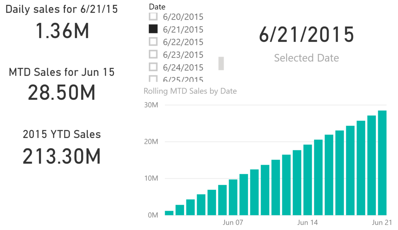
- Three (3) KPI cards that reflect the daily, MTD, and YTD sales for the value selected in the slicer.
- One (1) clustered column chart that lists the MTD values by date from the beginning of the month of the date selected up-to-and-including the date selected.
Something that looks like this:
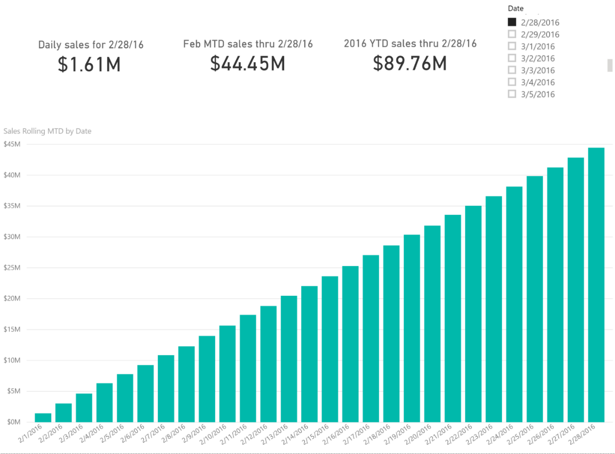
And for extra credit we’ll make the titles above the cards dynamic as well.
How did I accomplish that? The answer – disconnected tables.
Why?
Well, think about what’s happening behind the scenes if I have the following dataset:
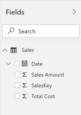
Time Intelligence Measures
Imagine that I throw a slicer on the page with Date and then create the calculated measures for Daily Sales, MTD Sales, and YTD Sales. These will all function just fine.
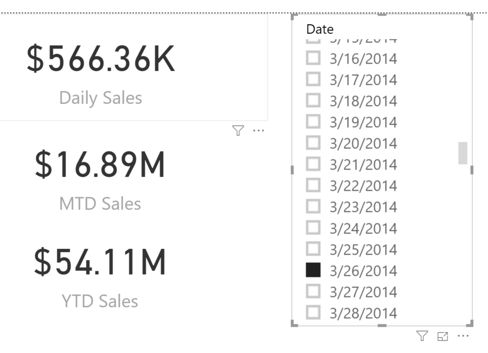
Here’s the code for the 3 calculated measures:
Daily Sales = SUM(Sales[Sales Amount])
MTD Sales = TOTALMTD([Daily Sales], Sales[Date])
YTD Sales = TOTALYTD([Daily Sales], Sales[Date])
However, the moment I try to add the clustered column chart and use Daily Sales as my measure what happens? It only displays the data for the one date selected in the slicer. How can I get it to display all the dates up thru the date I’ve selected in the slicer? Sadly, as long as they both come from the same Date field they will always both have the same Filter Context. Enter the disconnected table.
I use disconnected tables when I want to drive a slicer by one set of values and use the value(s) selected to then control what is displayed.
Here’s the technique I’m going to use:
- Create a date table to drive the slicer – I’ll leave it disconnected from the fact table.
- Create a calculated measure that looks at the date selected in the slicer and determines if a value should be calculated.
- Use that calculated measure in my chart.
Creating the Disconnected Date table
There are a few different ways I could create my date table – I could reimport the source file, select just the Date column, and remove duplicate rows. But that’s too much work. Enter one of my favorite DAX function: CALENDARAUTO().
The CALENDARAUTO() function scans all Date/DateTime/Time columns in your entire model, goes to Jan 1 of the earliest date it finds and Dec 31 of the latest date it finds and returns a table of dates with all dates in-between. All with very little typing.
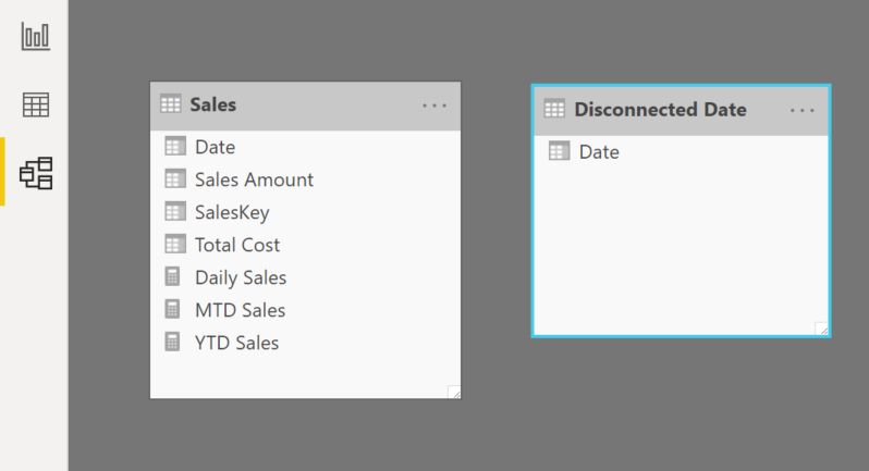
So, I’ll click the “New Table” button in the Modeling menu in the toolbar and replace the “Table = “ with “Disconnected Date = CALENDARAUTO()”. Presto – magic date table.
**Note: I want to reiterate what the CALENDARAUTO() function returns – it looks at all dates/datetimes in your model. So if you have fields like date-of-birth or defaults that set null dates to, say, 1/1/1900 you may want to use a different technique so you don’t have a Date table that goes from 1/1/1900 – 12/31/2031. But for this example it will suffice.**
**Important: do not create a relationship between the date table and the fact table – in fact double-check and make sure the engine didn’t try to create one for you.**
Creating the Calculated Measures
Ok – next step – the calculated measures.
There are a number of functions that determine if something has been selected in a table: HASONEVALUE(), ISFILTERED(), SELECTEDVALUE(), etc. I chose to use SELECTEDVALUE() in this scenario.
We’ll start easy and then refine it.
First we’ll start with the code that says “sum up Sales Amount for any day prior to the date I’ve selected in the slicer”.
How do I know what date I’ve selected in the slicer? SELECTEDVALUE(). Let’s see it in action.
I’ll create a calculated measure in my Disconnected Date table called “Selected Date”. Here’s the DAX:
Selected Date = SELECTEDVALUE(‘Disconnected Date'[Date])
I’ll add that calculated measure to a card on my report canvas and create a new slicer with the Date column from the Disconnected Date table (leave the other one on the page if you’re working along with me).
As I select different values in the new slicer note that the “Selected Date” measure changes to reflect the date selected. Perfect.
**Note: The SELECTEDVALUE() function has an optional second argument – we will use MAX(‘Disconnected Date’[Date]) as the second argument in the event the user multi-selects two or more dates in the slicer.**
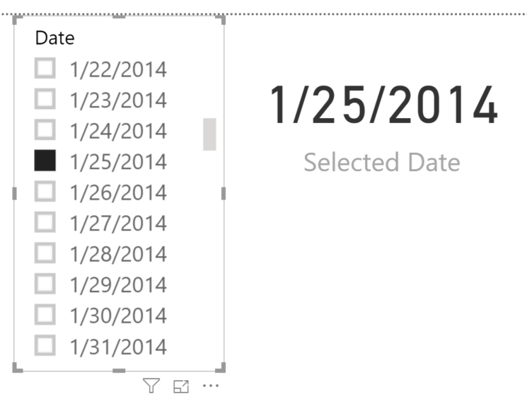
Ok – now the hard part. Creating the calculated measure that looks at that “Selected Date” value and figures out if the engine should calculate a value.
Here’s the logic: “if the user selects a date in the slicer then calculate the MTD sales for any date on-or-before the date selected and in the same month as the date selected”.
Here’s the DAX that does that work:
(formatting provided by DaxFormatter.com – thanks SQLBI.com guys!)
Rolling MTD Sales =
CALCULATE (
[Daily Sales],
FILTER (
ALL ( Sales[Date] ),
Sales[Date] <= [Selected Date]
&& MONTH ( Sales[Date] ) = MONTH ( [Selected Date] )
&& YEAR ( Sales[Date] ) = YEAR ( [Selected Date] )
&& Sales[Date] <= MAX ( Sales[Date] )
)
)
So, what does that do? Well, we know [Daily Sales] is simply SUM(Sales[Sales Amount]). The FILTER() function then filters the Sales table, clearing any context on the Date column using the ALL() function, and then applies a new filter saying “where the Sales[Date] column is less-than-or-equal-to the Date selected in the Disconnected Date slicer and has the same Month and Year as the Date selected”. Why do we need that last “&& Sales[Date] <= MAX(Sales[Date])”? Because the left-hand side of that argument is the value of the Date column in the filtered table (essentially “inside” the FILTER function) and the MAX(Sales[Date]) references the outer context in my visualization (essentially “outside” the FILTER function).
(Note: if you want to learn more about evaluation context I encourage you to check out this great video on SQLBI.com: https://www.sqlbi.com/tv/deep-dive-into-dax-evaluation-context/?nu=19529)
If I add my new [Rolling MTD Sales] measure to a clustered column chart let’s see what happens. The magic here: I’m using the Date column from my Sales table.
So what’s going on there?
Can you see that slight “lean” at the front of that chart? We’re accurately calculating the MTD (if I hover over one of the points in the far left of the chart the tooltip returns the correct MTD value) but I’m then showing that value for the rest of time. Let’s clean that up:
Rolling MTD Sales =
IF (
OR (
ISFILTERED ( ‘Disconnected Date'[Date] ) = FALSE (),
MAX ( Sales[Date] ) > [Selected Date]
),
BLANK (),
CALCULATE (
[Daily Sales],
FILTER (
ALL ( Sales[Date] ),
Sales[Date] <= [Selected Date]
&& MONTH ( Sales[Date] ) = MONTH ( [Selected Date] )
&& YEAR ( Sales[Date] ) = YEAR ( [Selected Date] )
&& Sales[Date] <= MAX ( Sales[Date] )
)
)
)
I’ve added a new IF() function at the beginning saying “if the user hasn’t selected a value in the Disconnected Date table OR the Date that we’re looking at in the visualization is greater than the date selected in the Disconnected Date table return a BLANK() otherwise do the math”.
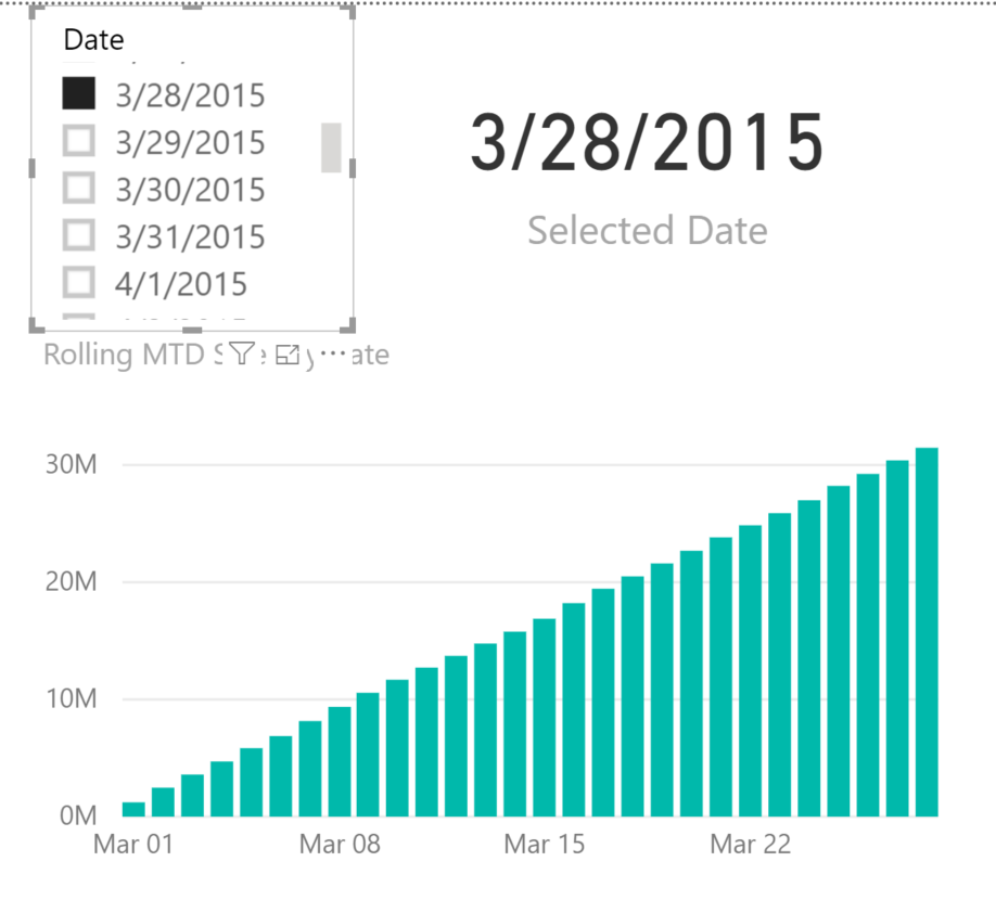
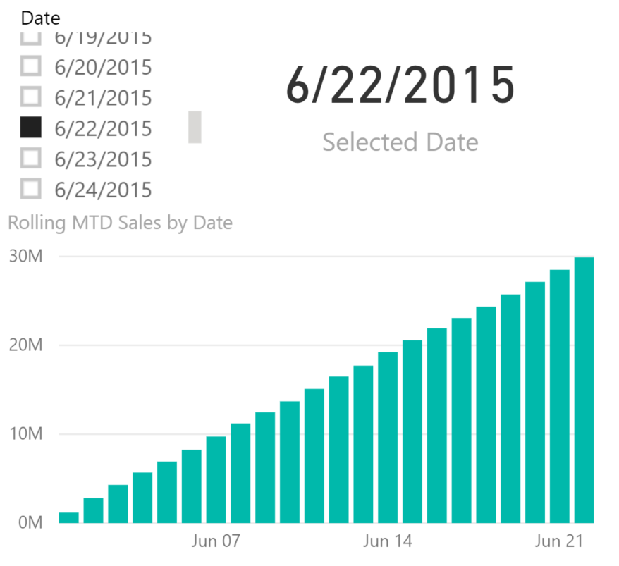
That looks a LOT better. If I select another date it does exactly what I want.
Refining the KPI Card Measures
Lastly I need to get those KPI cards working. They’re currently not “hooked up” to the Disconnected Date slicer.
The Daily Sales one is pretty easy to solve.
Rolling Daily Sales = CALCULATE([Daily Sales], FILTER(Sales, Sales[Date] = [Selected Date]))
The MTD values is a little trickier. If I try to use [Rolling MTD Sales] in a KPI card it’ll return a Blank. Why? Because in the KPI Card the Sales[Date] column has no context so the MTD DAX doesn’t know what date to use.
We can use the same technique as above with one little tweak:
Rolling MTD Sales Card = CALCULATE([Rolling MTD Sales], FILTER(Sales, Sales[Date] <= [Selected Date]))
I have to use “<=” so that I don’t focus the context on the Sales[Date] to just one date (try it – watch what happens if you use just “=”).
And then for the YTD card I’ll create a [YTD Rolling Sales] calculated measure and then another [YTD Rolling Sales Card] measure to use in the KPI card.
Rolling YTD Sales =
IF (
OR (
ISFILTERED ( ‘Disconnected Date'[Date] ) = FALSE (),
MAX ( Sales[Date] ) > [Selected Date]
),
BLANK (),
CALCULATE (
[Daily Sales],
FILTER (
ALL ( Sales[Date] ),
Sales[Date] <= [Selected Date]
&& YEAR ( Sales[Date] ) = YEAR ( [Selected Date] )
&& Sales[Date] <= MAX ( Sales[Date] )
)
)
)
Voila!
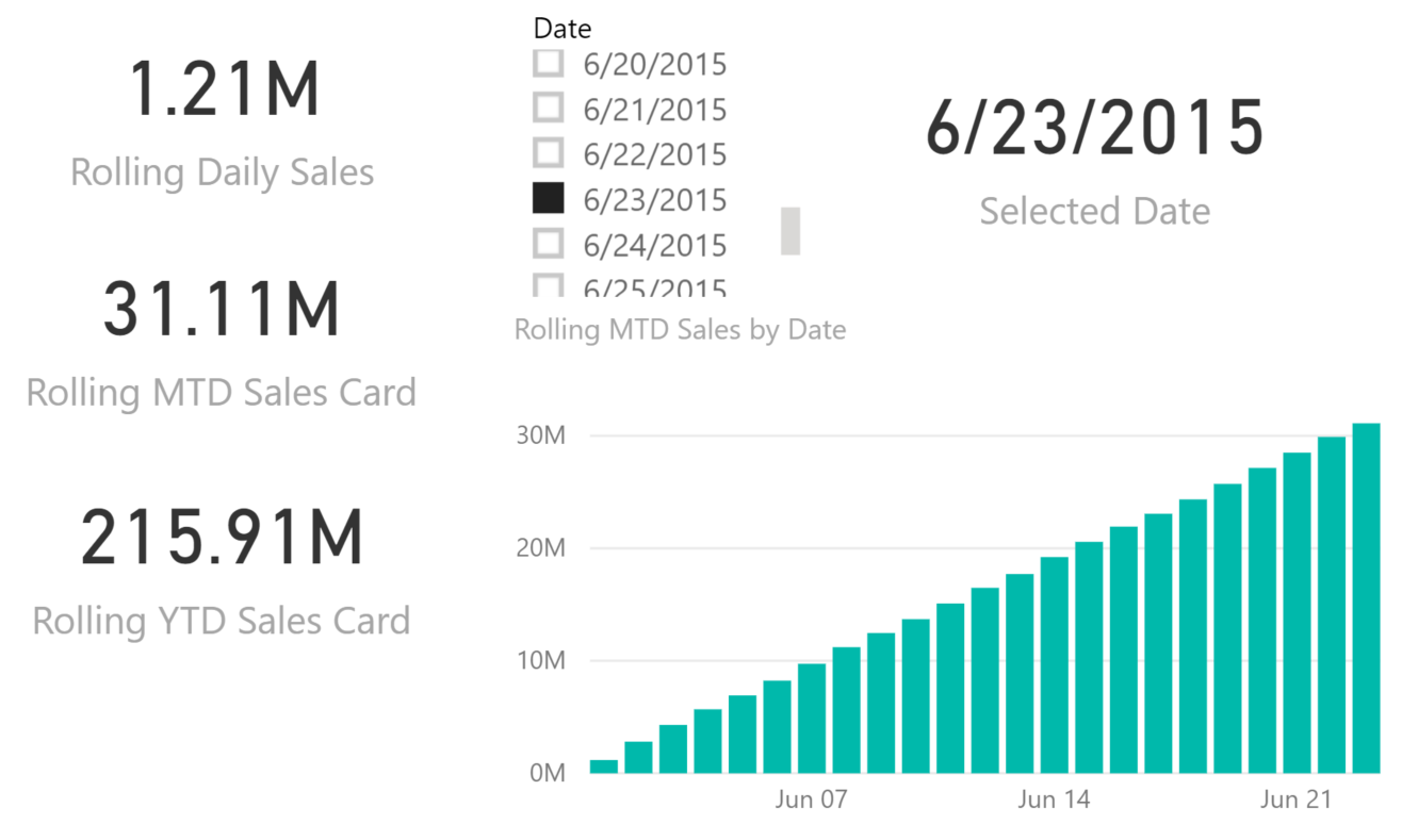
If you’re interested, here’s the code to generate a few Dynamic Titles.
(You can find a great blog article on dynamic titles by Lindsay Pinchot here).
Rolling Daily Sales Title = “Daily sales for ” & FORMAT([Selected Date], “M/d/yy”)
Rolling MTD Sales Title = “MTD Sales for ” & FORMAT([Selected Date], “MMM yy”)
Rolling YTD Sales Title = FORMAT([Selected Date], “yyyy”) & ” YTD Sales”
If you have further questions please don’t hesitate to Contact Us and we’ll be happy to help!


