With the ubiquity of online survey services like SurveyMonkey, Qualtrics, and many others, it’s very simple today to get a survey out to a large group of people and collect responses in a timely manner. The question is, what can you do with all that data that comes back to get the most value out of it? Recently, I did some volunteer work for a local government agency to produce visualizations for print, using Power BI, and I want to share some techniques that worked well. If you are an advanced Excel user, and perhaps are wondering what benefit there is in newer tools like Power BI and Power Query, this post is for you.

Problem
Traditional survey results from services can be a bit lackluster because the services are general-purpose, and they don’t “know” your data intimately. The appearance of charts and graphs or typeface and color selections may be limited and, most important, getting deeper insights into your results may require extra steps and extra time. This is especially true of doing analysis of the data across different questions.
Suggestions
Get the Data
The first step is to pull the results out of the service in a basic, raw data format such as an Excel spreadsheet or CSV file. Examine what you’re getting back in terms of format – what are the columns? How are different types of questions represented? Are they text, numerical values? For a given question, are the responses spread across different columns?
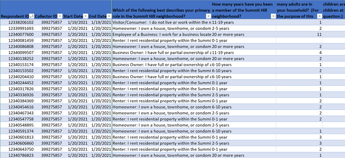
We aren’t going to look at survey design issues in this post, focusing on how to consume the data. But one basic technique is to ask some demographics questions in addition to questions about the topic at hand. For each survey question, make a note of which category it belongs in – is it about the respondent? Or about the topic? The demographics answers are data we want to transform into dimensions – that is, data that describe all the other questions.
Another way to think about this is the “by” phrase – what are the questions in your survey that you want to see “by” other responses? For example, is it favorite color by age group? Whatever is after the “by” is the dimension you will want to apply across all the topic-related questions.
Next, examine the questions by question type. Setting aside the topic content altogether, note which questions are numeric or text responses, which are multiple choice, which are ranking and so on. It’s likely that you’ll end up processing the data in the same way for questions of the same type.
Structure the Data
To make a professional-quality analysis often requires reshaping the data. The specific task we had with this survey was a one-time effort with the goal of producing a document, so for ease of use we used Power Query and Tables in Excel to shape the data, and Power BI to create print visuals. If you face something larger, repeated, or more complex, it may be worth considering a more robust database solution than Excel.
Power Query’s great advantage is that it makes a repeatable data transformation that can be refined and re-run, as opposed to a manual manipulation of the data that is difficult to repeat.
These are some types of transformations to consider for surveys in particular:
- Take those questions that are in your “dimensions” category – the “by” questions – and make a small, numbered table of the possible responses. This can be done quickly by copying all the responses from a column, pasting into a new sheet, and using Data > Remove Duplicates.
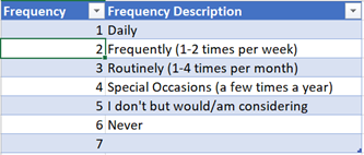
- Use Power Query’s Merge to bring the numbered column back into your data, by joining on the text. In our case, I used the raw data in one table as a source and output a second table of results containing the Power Query transformation(s).
Listing these values separately gives you these major advantages: The values will be represented as a named table; you can very easily create alternate/shorter labels to the literal responses from the survey; it’s very simple to provide a custom sort order for your results that is not the alphabetical order of the text, which is a very common requirement for graphs; and you can very easily create groupings or rollups just by adding a column of categories.
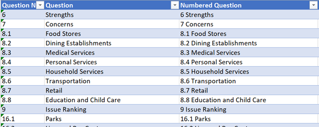
- Do the same thing to explicitly number and label your questions. This might seem odd, but in some survey service results, while the answers are all present in columns of data, the specific question numbers and text are not.
Produce Print Visuals
Once we had the cleaned and transformed data set in tables, we used that as the source for Power BI Desktop, making a small data model:
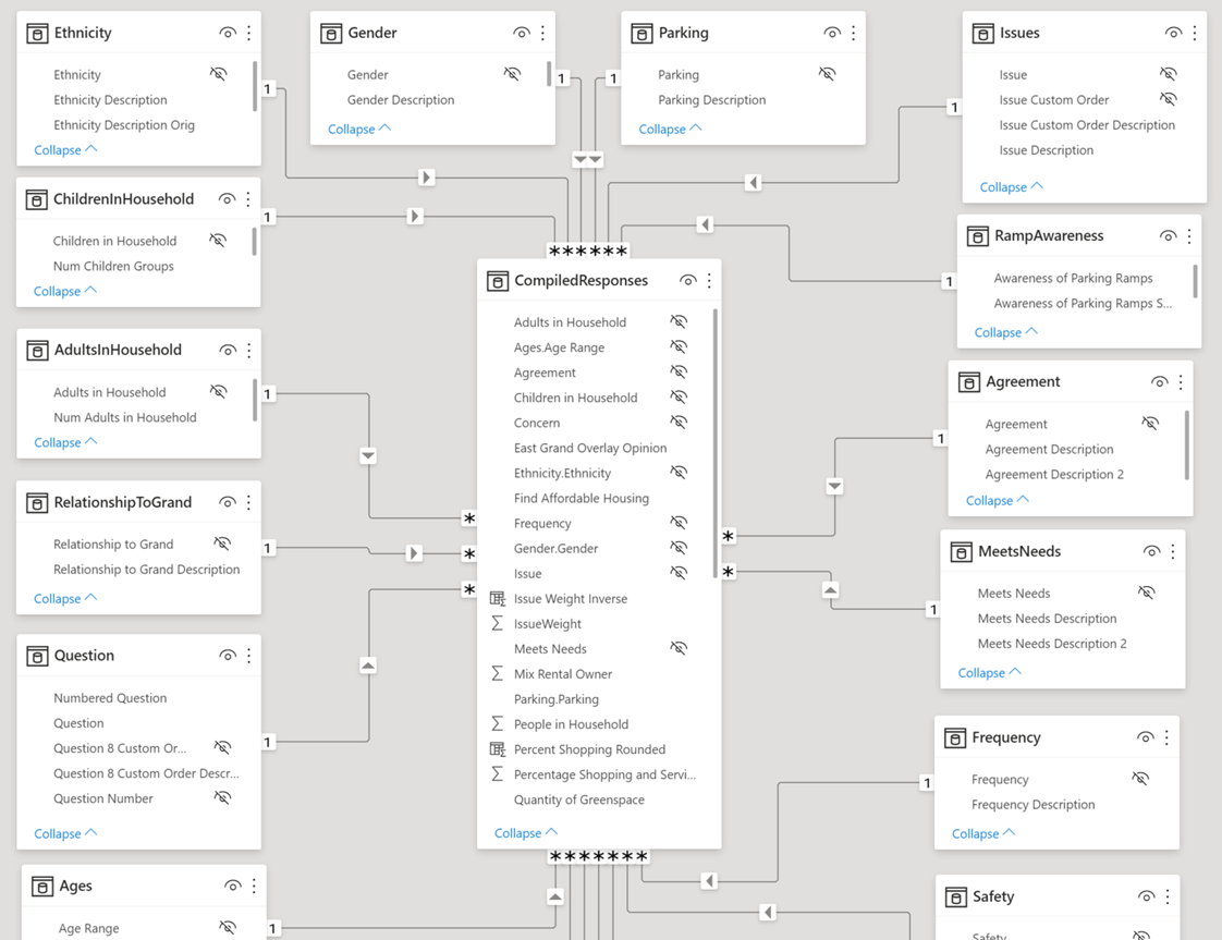
This creates a Star Schema, where each box represents a table from Excel. At the center you can see the responses to all the questions, and around the outside are all those “dimension” categories. Each of the smaller tables like Gender or Frequency contains a numbered list of the possible response values for one question. Where we needed a set of custom labels, a custom sort order, or groupings of values, we just quickly added them to that table in Excel, and they would appear here after clicking Refresh.
This underlying structure makes it very simple to make the visuals, including handing that problem of breaking out responses to questions “by” other categories.
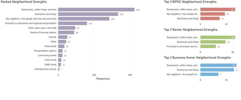
Through some iteration refining the Power Query scripts and refreshing this Power BI report, we were able to produce 30+ pages of truly in-depth presentation over the data.
Producing the final graphics is as simple as Export > PDF, and the resulting pages can be incorporated into whichever publishing tool you prefer.
Post-processing the Visuals
Many automated chart and graph tools are wonderful as a baseline for creating visualizations, but they also have some limitations you might run into, where you can’t format a graph just the way you’d like to see it. Perhaps the labels land in the wrong place, or you need some alternate data labels that the tool is not capable of rendering. For these cases, don’t be afraid to post-process the graphics in another tool. The PDF files that come out of Power BI, for example, can be edited as artwork in Adobe Illustrator or another vector drawing tool.
Conclusion
By exploring our results using clear visuals on this project, the group involved was able to see if hunches they had about opinions were supported by data. They could explore relationships, such as the opinions of under-represented groups, that might otherwise have been lost in a wall of numbers. Finally, they presented the data to a public / non-expert audience in a way that is clear and intuitive.
Please visit our website to learn more, or contact us directly to see how we can help you explore your about modern data analytics options and accelerate your business value.

