
What if there were a tool available that empowered you to conduct your own analysis of stocks such as trends over time and high-level forecasting (the magic word)? Would you consider investing? Or perhaps you’re already an investor and would like to add another tool to your trading arsenal? Microsoft’s latest Business Intelligence tool, Power BI, does all the above and more without over complicating the process.
Power BI is a lightweight, easy to use, free/inexpensive self-service business intelligence tool provided by Microsoft. For more details on pricing, check out the Power BI official page here. For the purposes of this blog, all you will need is Power BI Desktop, which can be downloaded for free from the above link.
Connecting to Data Sources
Now that you’ve got your magicians hat on, let’s dig into it! Before you get started in PBI, take a few minutes to establish which companies you would like to analyze and some details about them in an excel document. See the example below:

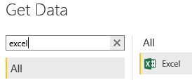
After launching PBI Desktop, you’ll want to Select Get Data. Power BI makes it extremely easy to connect to a variety of data sources, but for this blog, we’re going to focus on connecting to Web and Excel sources.
Let’s go ahead and import our company data from the excel doc we created. After selecting the file from its location, you’ll have the option to either load it straight away or do some editing. You shouldn’t need to do any editing here, but if you want to confirm correct data types you can do so by selecting Edit, otherwise, Load the data.
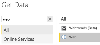
Next, head over to your finance website of choice. The Web source will work with any website that has a table. I have confirmed that this works with both Google Finance and Yahoo Finance. For simplicity, and because I know that it works, I’ll be analyzing Amazon Historical data using Google Finance located here. Copy the web address of the page containing the table and paste it into the web source in PBI. You’ll be able to preview all the tables that have been found on the page. Select the table of interest but this time select Edit as we will need to do some data cleansing.
Cleansing the Data
Now that we have the historical data for the desired stock let’s clean it up a bit using the Query Editor. Query Editor allows you to really dig in and manipulate the data. Here you can transpose columns, promote the first row to headers, create new columns, change data types, and filter data.
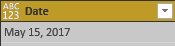
When the table is imported, the data types will likely all be set to ABC or text types. You’ll want to assign correct data types by clicking on the data type icon next to the column header. This part should be relatively intuitive, so I won’t go into much detail.
Initial Data Type Configuration:
Correct Data Configuration:
You will also want to link your Company and Historical Data tables together by creating a new column on the Historical table. Power BI makes this pretty easy as well. Navigate to the Add Column tab, select Custom Column from the ribbon, name the column appropriately, and in the Custom Column Formula simply set it equal to 1 then select Ok. When finished, rename your table to something more meaningful than “Table 1” by double-clicking on the table name from the left-hand side. The finished product should look something like this:

To save changes and exit the Query Editor, navigate back to the Home tab and select Close & Apply.
Managing Table Relationships
Power BI enables you to manage relationships between tables directly inside of PBI Desktop. There are a couple of ways to do this, but for simplicity sake, we will be looking at the Relationships tab on the left side of PBI Desktop:
![]()
You will notice that because we added the Company ID column to the Historical Data table, the two tables are linked together. Without that column, the two tables would be independent of one another, prohibiting data analysis. This will become especially important when you start adding Historical Tables for multiple companies.
Viewing Table Data
The Data tab of PBI Desktop enables you to do several things. Here, you can create a new table, columns, and measures to use in your analysis. You can also change data types as well as see a list of tables and their columns (Fields) on the right side. Selecting any table will bring a preview into the main presentation area of the window. One of my favorite features here is being able to hide objects, such as columns or measures, from the report view. This will come in handy if you decide you want to share your work with others and would like to limit what they are able to use in their reporting. To hide objects, right-click them from the Fields pane and select “Hide in Report View.”
Creating Your First Report
So, you should now have enough cleansed data to build out your first report. All of your hard work is about to pay off, perhaps quite literally! Navigate to the Report tab and let’s get started.
![]()
One of the best things about Power BI is that it’s incredibly user-friendly. The drag-drop interface makes it simple for even the most entry-level users to quickly create useful insights. There are two key visualizations that I’m going to touch on and the rest; I’ll leave up to you to explore and discover on your own.
Let’s create a line chart that plots the closing price of our Amazon historical data. Select the line chart visualization from the Visualizations pane on the right. Next, check the box next to Close from the Fields pane. We are going to want to look at the Average Close Price. To accomplish this, select the down arrow next to Close in the Values box and choose Average. Finally, drag Date from the Fields pane into the Axis box in the Visualizations pane. By default, the date will be displayed in a Hierarchy. To disable this, right-click Date from the Axis box and select “Date.”
Date Hierarchy:
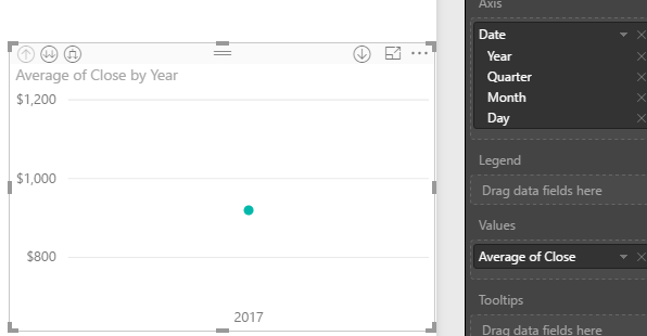
Standard Date:
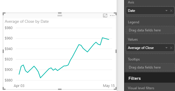
Now let’s add a trend line to the line chart. To do this, navigate to the Analytics menu, select Trend Line, then select Add. Power BI will automatically plot a trend line for you on the line chart. Here, we can also add Forecasting to our chart by selecting Forecast and Add. In this example, there is not enough historical data to successfully Forecast. I will show an example of Forecasting from another demo in the summary.

Power BI also allows you to quickly customize your visualizations with titles, data labels, colors, backgrounds, and borders from the Format menu of the visualization pane. I won’t go into detail here but go crazy!

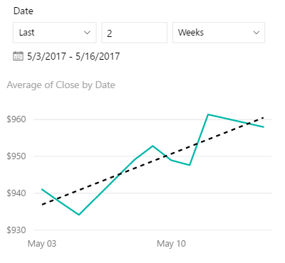
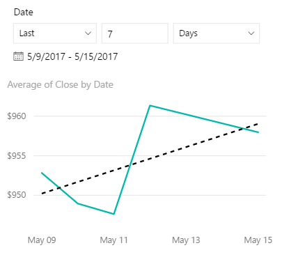
The second visualization that I want to highlight is a newly added feature called the Relative Date Slicer. This visualization allows you to analyze data over periods of time such as rolling averages and is currently still in preview, but I doubt it will be for long. To enable features that are in preview, navigate to File, Options and Settings, Options, and Preview Features. Select all that you would like and click Ok. You’ll need to save and restart your instance of Power BI Desktop for the changes to become active.
Once you have activated the Relative Date Slicer, select the Slicer visualization and add it to your canvas. Check the box next to Date from the Fields pane. Hover your cursor in the top right of the visualization and click on the down arrow indicator followed by Relative from the drop-down menu. With the Relative Slicer now in place you can manipulate the line chart using the Slicer. This is extremely useful for analyzing market trends over time and will enable you to make better-informed decisions on your road to financial success.
Relative Slice Example:
Summary and Review
While the content presented has been extremely high level, and continuous updates being pushed out every month, we’ve only began to scratch the surface of what Power BI can do. For more advanced users, PBI presents itself as a powerhouse of functionality. DAX, the language-specific to PBI enables power users to create complicated, comprehensive expressions for reporting. For those that are familiar with color palette optimization and themes, PBI also offers the ability to create custom themes to be used in reporting. If the out-of-the-box visualizations aren’t enough, you can get ahold of custom visualizations from the community here. You can also create your own custom visualizations if you can’t seem to find what you’re looking for.
I guess what I’m trying to say is that Power BI meets the needs for any and every type of user, regardless of skill level or business needs. On that note, I’ll leave you with a more detailed look into the potential of Power BI and Market Analysis. Cheers!
Click here to see an Interactive Market Trend Analysis Report via Power BI.