What is data science? At its heart, it’s the ability to extract insight from data. Successful practitioners know that understanding basic statistics is the first step toward mastering this skill. In this post I’ll cover some beginning statistics concepts, then explain how to calculate statistics in Data Analysis Expressions (DAX), and how to create histograms to communicate your statistical findings in Microsoft’s Power BI.

Definitions and Statistical Notation
Before we begin, let’s cover a few mathematical terms and how to easily communicate those terms via notation.
- x – A variable we’re trying to find an answer for.
[Amount]is our variable in these examples. - ∑ – This equates to
SUMorSUMXin DAX. - N – The Population Size of your data set. If there are 100 records in your data set your Population Size is 100. N = 100 in this case.
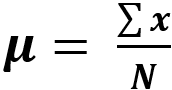
- µ – The Mean or Average of the measure in our data set.
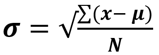
AVERAGEin DAX. - σ – Standard Deviation. A measure of how far away from the Mean a particular data value is. The larger the Std Dev the more spread out our data set is.
Pin DAX.
Making a Histogram in Power BI
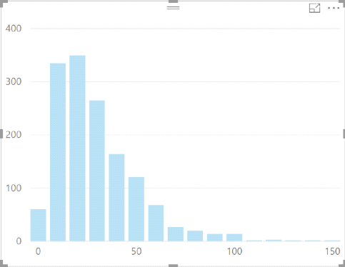
Histograms or Bell Curves are the most common ways to display statistics about data sets. In Power BI terms, the only real difference between these is the chart type; the Histogram uses a Bar Chart while the Bell Curve uses an Area Chart.
 |
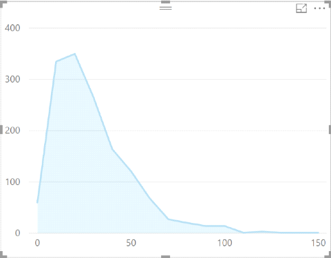 |
| Bar Chart | Area Chart |
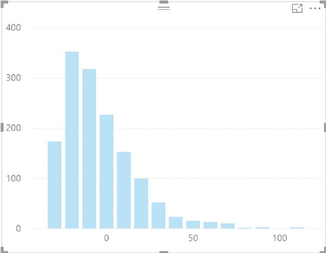
A Histogram differs slightly from a standard Bar Chart. A typical Bar Chart relates two variables; in BI speak, a Measure and a Dimension. A Histogram, however, only visualizes a single variable. The variable on the x-axis (in this case [Amount]), and the frequency of that variable on the y-axis. To get the frequency, we just need to count the rows in the data set.
Row Count = COUNTROWS('MyTable')
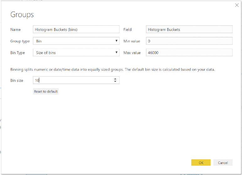
We can then create our Amount groupings. I do this in two steps.
1. Create a New Column.
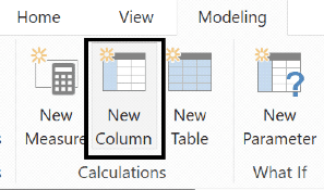
Histogram Buckets = [Amount]
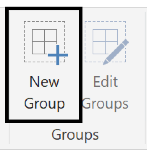
2. Select your new Column and add a New Group.
 |
 |
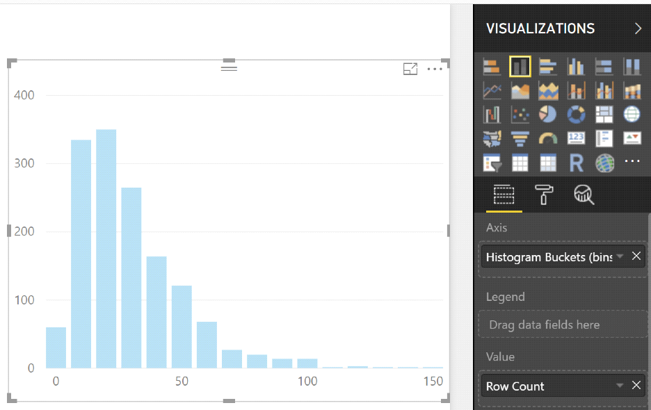
You can then create a new Histogram with the [bins] on the Axis and [Row Count] on the Value.
Applying Statistics to Data
Now that we’ve got our Histogram, we can apply our Statistics. For our example, assume we’re looking for Outliers in our data set. An Outlier is typically defined as a data value that falls outside of 3 Standard Deviations of the Mean.
First, we find the Mean of our data set.
Mean:
DAX:
Mean =

CALCULATE (

AVERAGE(MyTable[Amount])

,ALL(MyTable)

)
We can then apply the Mean to the Histogram. Using the formula (x – µ) moves the center point of the curve to 0.
Histogram Buckets = ([Amount]-[Mean])
Next, we need to find our Standard Deviation for the Population.
Standard Deviation:
DAX:
Std Dev =

CALCULATE (

     STDEV.P(MyTable[Amount])

     ,ALL(MyTable)

)
We can then apply the Standard Deviation to the Histogram. Using the formula ((x – µ)/ σ) moves the center point of the data set to 0 and divides the values in [Amount] by the Standard Deviation converting our chart into a Normal Distribution. Apply the formula to [Histogram Buckets] and change the Bin Size to 0.5 (feel free to change the Bin Size to whatever makes sense in your data set).
Histogram Buckets = DIVIDE(([Amount]-[Mean]),[Std Dev],0)
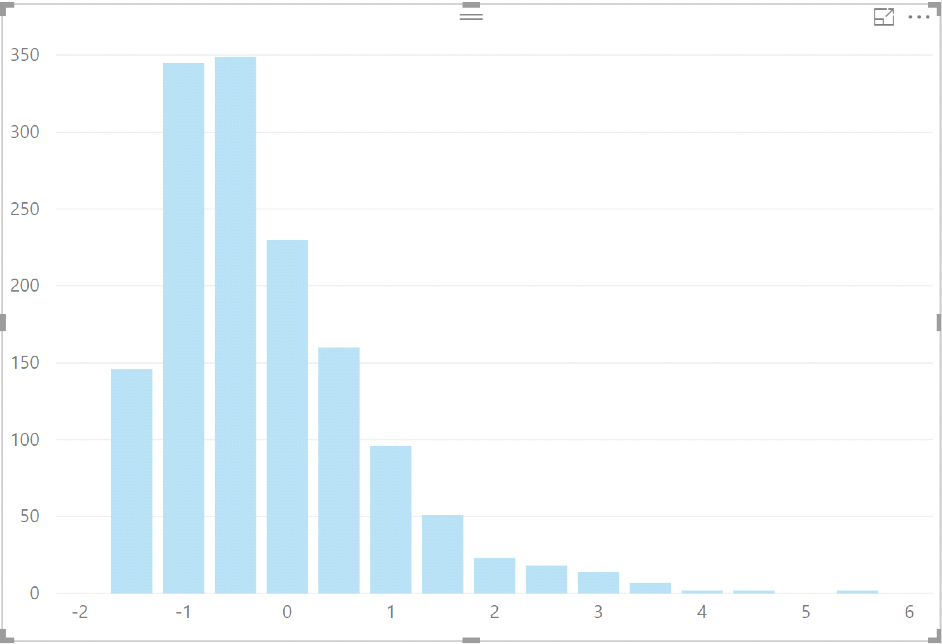
Now that our data has been normalized we can easily see our Outliers (bars over 3 or under -3).
For more DAX tips and tricks, be sure to check out this tutorial from BlueGranite’s blog: 5 Useful DAX Functions for Beginners; and Microsoft’s handy DAX reference.
Looking to master and truly own your organization’s data? BlueGranite can help! Contact us today to learn more about our on-site Power BI training. Whatever your data requirements, we customize our analytics solution to meet your company’s needs.