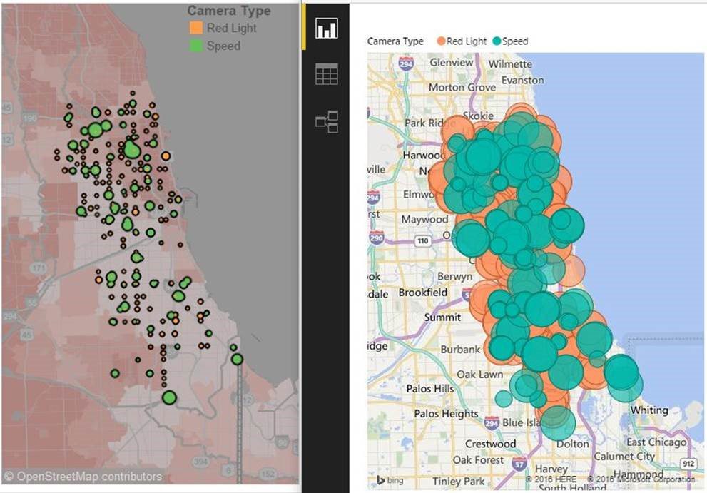
With the recent announcement of ArcGIS Maps for Power BI and the collaboration between Esri and Microsoft, more advanced mapping capabilities are coming to Power BI. Microsoft has partnered with a leader in the GIS industry and will bring state-of-the-art geospatial analysis to its users this Fall. For any Power BI user or developer, these new capabilities are something to be excited about. They also shore up a key area where Power BI had some noteworthy feature gaps with competitors.
Crucial Mapping Needs
While there are many existing strengths in Power BI, the ability to build appealing maps has been elusive until now. My first encounter with maps in Power BI occurred in early 2015 before the product became generally available. I wanted to take a map of Chicago that I had built in Tableau and rebuild it in Power BI. At the time, Power BI maps did not offer demographic underlays, different background layers, and a host of other functionality that Tableau had.
Over time, some workarounds or alternatives appeared using custom visuals or R visuals that were simply not as functional or convenient to use. Compared to a competitor like Tableau, the gap in mapping capabilities when using or demoing Power BI was often awkward. The diagram below shows a Tableau map (version 8.3 at the time) on the left with a current Power BI map on the right.

The NEW Power BI + ArcGIS Maps Solution
With the coming ArcGIS Maps for Power BI, that gap is now closed. There are some features that the Power BI maps will have that Tableau does not and vice versa, but incorporating ArcGIS Maps is a colossal step forward for Power BI. Take a look at how a map of Chicago will now appear in Power BI with ArcGIS Maps.

With functionality like clustering* and heat maps native to Power BI as well as conveniences like selecting data based on shapes in your reference layer, it would not be bold to say that Tableau will have some catching up to do. The main point, however, is that you can now make comparable and visually appealing maps in both products that help satisfy numerous customer requests.
Here is a short list of what ArcGIS Maps for Power BI will offer when it becomes available this fall:
- Four basemaps including a dark and light canvas
- Compared to the current multi-colored map background, minimizing streets and having an appealing base layer allows you to place more focus on your data rather than worry about visual distractions.
- Map themes including size, size and color, heat map and clustering
- Traditional map styles are enhanced by the ability to add heat maps as well as the option to aggregate individual points into larger circular “clusters” as you zoom out.
- Optional reference layers that can appear under your data that offer a large variety of current 2016 demographic estimates
- It appears that there are only United States demographic layers such as income, population, and a few more native ones. You will have the ability to search ArcGIS for additional layers though.
- Increased formatting options for size, color, transparency, and more
- As one example, the current map offers no control over minimum bubble size, which often leads to overlap when there are dense clusters of points.
For more detail, read about ArcGIS Maps for Power BI from Esri and Microsoft.
Finally, thank you to both the Microsoft and Esri teams that helped put this collaboration together. A significant gap between Power BI and competing software has been addressed, and there is a bright future for plotting location data in Power BI.
*Tableau recently released a great feature called “clustering” in version 10. This feature allows users to use its algorithm to automatically group—or cluster—data. This is distinct from geospatial clustering, which aggregates points into a more visible group as you zoom out on a map.


