For organizations developing Power BI reports, there is typically a strong desire to design them in a way that provides the best user experience. This includes not only providing excellent data visualization to meet reporting needs, but also designing reports for optimal performance. Too often the burden of performance optimization is placed solely on IT or Power BI administrators when it should be a function of anyone using the tool.
Performance optimization may seem daunting, especially to a self-service user or someone new to report development, but there are plenty of actions to improve report performance without needing to be a seasoned professional.
In this blog post I’m going to walk through some practices that your organization can implement now, right in Power BI Desktop, to optimize report performance no matter what level of development experience your team has. Specifically, this post will discuss tactics in two areas where performance can easily be improved: report and visual design, and data transformation in the Power Query Editor.
Report and Visual Design
First, let’s focus on report design and visualizations. What many Power BI users don’t realize is that every visualization displaying data issues a query to populate that data before rendering. Visuals like text boxes and images don’t issue a query, but they do take time to render on the page. All of this can add up quickly as more gets added to a page.
The best approach to design is to only include smart, thoughtful visuals on a report page, striking a balance between giving users satisfactory insight and overcrowding the page. If a page is performing slowly and is loaded with visuals, find places where you can eliminate or combine visuals, or move them to a different page or report.
Below, I’m going to show how I reduced visuals in a report without sacrificing insight, thus improving performance. As always, I love wordplay, so my “Hospital Performance and Patient Satisfaction” report is the one I chose to demonstrate Power BI performance optimization. The original pages have “Original” in the title, and the optimized pages have “Optimized” in the title.
The difference between the first two pages is subtle. The metrics displayed in “Overview Original” along the top are all separate cards sitting inside a rectangle shape. As a result, I have three visuals issuing a query and four that take time to render.

On my optimized page, I’ve taken these separate cards and combined them into a multi-row card. I formatted that card to closely match the visual effect of the single cards, and I turned on the border to eliminate the need for using a shape as a container. Thus, I have taken four visuals and made them one. Combining single cards into a multi-row card and eliminating shapes by making use of borders or custom page backgrounds are quick ways to reduce rendering time. This trick may not always produce the exact same visual effect, but in an instance where performance is concerned, it’s close enough.

The Patient Satisfaction Analysis page has more going on. As you can see in the original, this page contains a lot of slicers, because users need to be able to analyze patient satisfaction in a variety of ways.
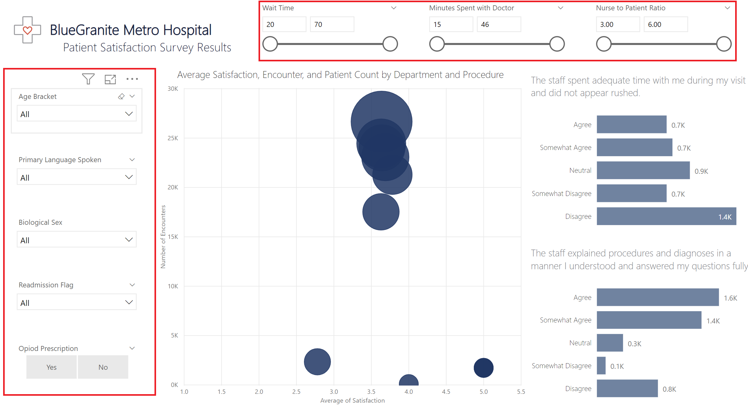
Slicers are the biggest offenders for negatively affecting report page performance. With the new filter experience available in preview, consider using filters instead of slicers to give users the same functionality. Filters do not issue a query until the users interact with them, whereas slicers issue a query before rendering. In my optimized page, I moved some of the slicers to the filter pane and I formatted the filter pane to be a very light blue, so it stands out just enough to make users aware of it.
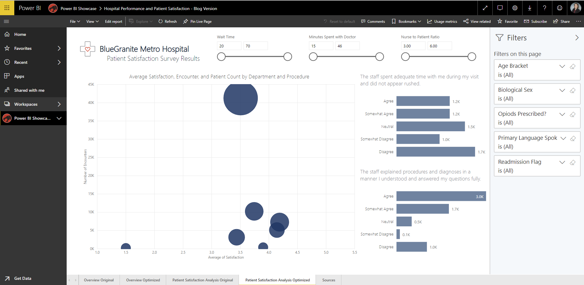
The filter pane is not available in a report published publicly to the web, so you cannot interact with the filter pane in the embedded version in this post. However, as you can see in the screenshot, users accessing the report from my organization in Power BI Service can use it.
Using filters not only reduces load time, but also frees up precious canvas space on the report page. You’ll notice, too, that I kept three of my slicers. I chose this design because my users like the experience of using the slider bar for these metrics and these are the slicers that users always interact with when viewing the page. The report is performing optimally, so unless it becomes an issue, I will keep these slicers as they are. This is how I struck a balance between performance and visual design, giving my users the best experience possible.
Test Performance in Power BI Desktop
I used the Performance Analyzer within Desktop to test how the simple visual changes I made on my optimized pages reduced load time. The Performance Analyzer records and displays how long it takes each visual to render on the page and breaks that time out into categories. You can learn more about how to use the Performance Analyzer and interpret its results from Microsoft’s documentation.
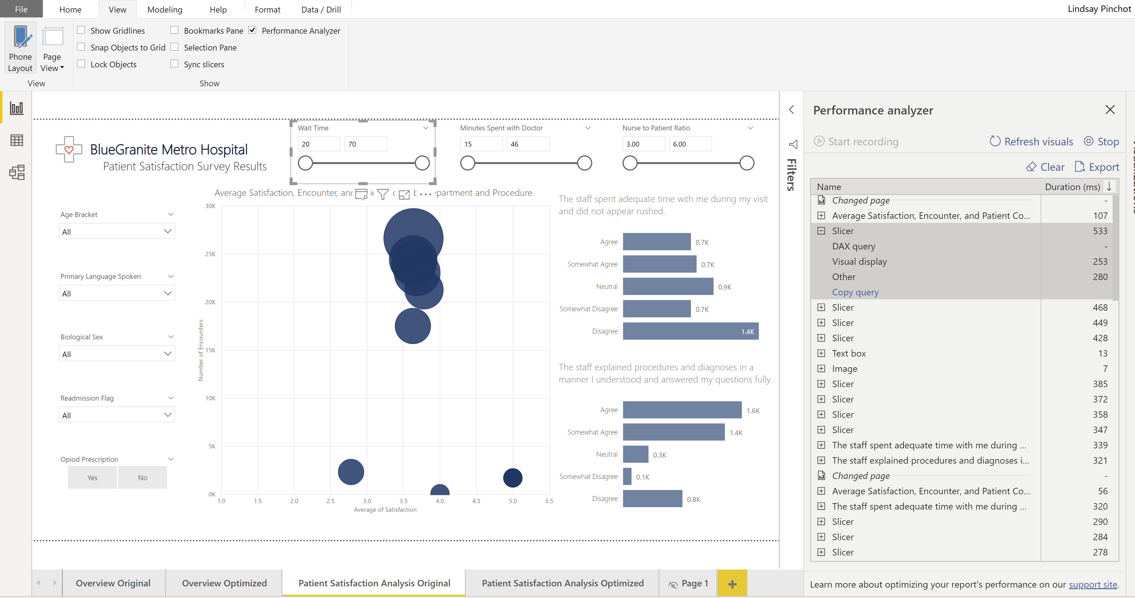
In the instance of the “Overview” pages, the difference in performance was only about 100 milliseconds. On the ‘Patient Satisfaction Analysis’ pages, where I moved most of my slicers to the filter pane, the difference was anywhere from 300-500 milliseconds throughout multiple test scenarios. Keep in mind that in my example, none of the pages take terribly long to render because I’m not working with a large amount of data and my model behind the scenes is optimized for Power BI. The changes I made did save time, and in a report that is suffering, potentially with a larger amount of data, this makes a world of difference.
Power Query Editor and Data Transformation
Next, let’s talk about Power Query Editor and data transformation.
Power Query Editor is one of the most valuable aspects of Power BI. It lets users perform complex data transformation and preparation in a simple interface, without needing to know a query language or use an additional tool. While Power Query makes data transformation easy, it makes tanking performance easy, too. It’s easy to begin clicking around, transforming data, and end up with an Applied Steps trail a mile long accompanied by a report that renders at a glacial pace. Fear not — I’m going to explain a few aspects of Power Query Editor and present two simple practices that will help you avoid getting into a situation like that.
First and foremost, do transformation steps in the right order. Yes, there is a right order, even if any order may produce the desired data transformation. It’s best to go in with a clear plan of what you need to do to the data before you start transforming it.
For example, if you know you only need a portion of the data from your source, filter it down at the first step. Working with only the necessary set of data during the rest of your transformations will not only speed things up, but there are also certain scenarios where Power Query Editor can push data back to the source, using the power of a relational source like SQL Server database to do transforms. This is a process called Query Folding, and while it may sound complex, all you really need to understand is that sometimes certain data transforms can be done more quickly in an environment like SQL Server, and when it can, Power Query will send those transforms to be performed at the data source. If you do steps like filtering data up front, Power Query will recognize when this can be pushed back to the source, improving report performance.

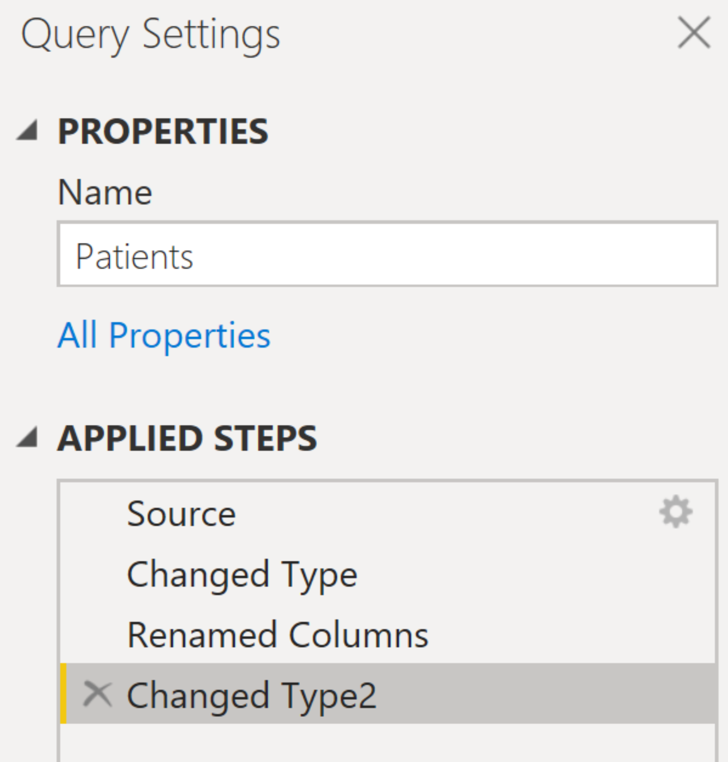
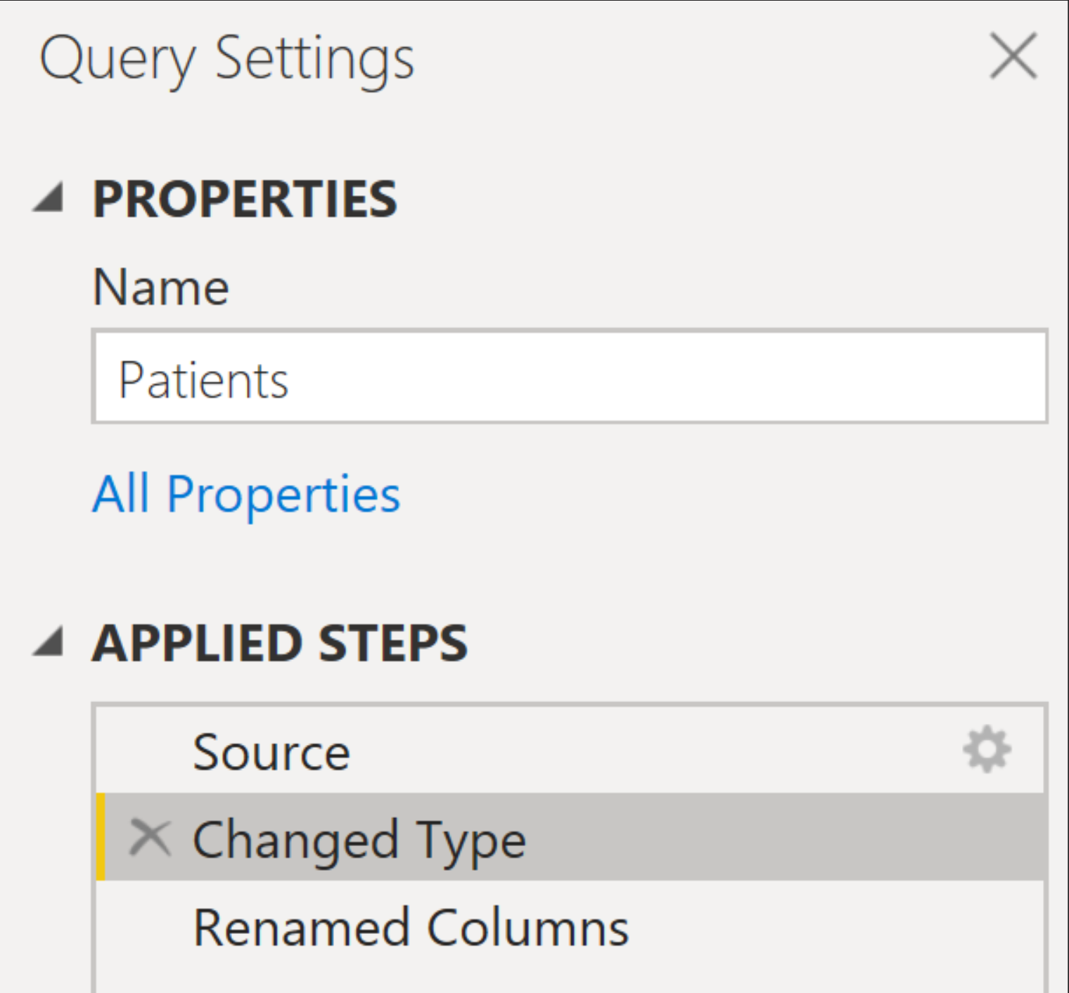
To find out if a step has been included in Query Folding, you can right-click on it. If the option to ‘View Native Query’ is available (not grayed out) that step has been folded. You can see that the ‘Filtered Rows’ step was selected for Query Folding to improve performance.
Some examples of transforms that can sometimes be included in Query Folding are filtering rows, changing data types, and concatenating fields. It’s best to get in the habit of doing these transforms first. Regardless of whether Query Folding is available, it is always best to filter data your data up front, thus working with a smaller set of data for the remainder of transformations.
In keeping with doing transformations in the correct order, do similar steps together when you can. For example, if you need to change data types and rename columns, do these transforms all together. Change all the data types you need to, then move on to renaming. If you change a data type, perform some other transform function, then go back to changing data types, there will be two steps for data type change, rather than one.
The more steps present in Power Query Editor, the longer data will take to return on the report page, so pay attention to (and avoid) scenarios like the above. If you simply forgot to change a data type while you were doing it initially, remember that within the “Applied Steps” pane you can select a previous step to edit or add to it.
Be cognizant that adding or editing a step this will affect the steps below it, and proceed with caution.
To sum up how to begin optimizing performance in Power Query Editor: do similar data transformation steps together and always filter your data first.
Performance in Power BI can be complex – there are a multitude of factors that go into it and a multitude of areas to investigate when a report is performing slowly. This post is not meant to be a comprehensive outline of how to navigate these challenges. Its purpose is to present simple design techniques that any Power BI report developer can employ to prevent some performance issues. Even with these design tips, you may find yourself with a report that is slow to render. If that’s the case, it’s time to investigate other areas and it may be time to pull in additional help to do so, such as this helpful post from our BlueGranite team on data modeling and the importance of structure in analytics.
Adopting the basic design principles outlined in this post as habits will go a long way in not only optimizing performance, but also helping your organization build reliable reports that users enjoy. The ultimate goal is broad user adoption of Power BI across your enterprise, which can help you reap the rewards of fast and productive access to your organization’s critical asset – data!
If you have additional concerns about Power BI performance or managing your Power BI deployment in general, or need additional training for your team, we can help.