Databricks unwrapped an early holiday gift for the modern data platform community this past November with the announcement of SQL Analytics. SQL Analytics is a service that provides users with a familiar interface to perform BI and SQL workloads directly on a data lake. Leveraging this lakehouse architecture in workloads results in up to 9x better pricing and performance than traditional cloud data warehouses. In addition to executing performance optimized queries in a SQL-native workspace, users also have the ability to create advanced visualizations, dashboards, and even alerts. Furthermore, SQL Analytics provides built-in connectors to existing BI tools, including Power BI and Tableau, allowing for even greater collaboration while still maximizing performance. This blog will provide a high-level demo of some of the capabilities within SQL Analytics.

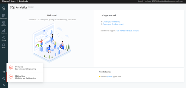
To start, SQL Analytics can be accessed by directly logging into the portal or, if already in a Databricks Workspace, by switching to the SQL Analytics tab in the bottom left pane as shown in the image below:
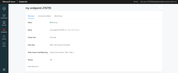
Similar to Databricks Workspace clusters, SQL Analytics uses an endpoint as a computation resource. One of the advantages of endpoint creation, as opposed to workspace cluster creation, is a new and simplified cluster size naming convention. Cluster sizes range from 2X-Small to 4X-Large with all the conventional shirt type sizes one would expect in between.
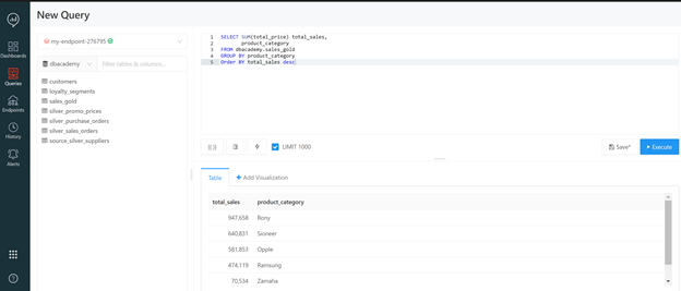
Databases and tables can be created using native SQL code with associated path files. Multiple external data sources including SQL Server, Google Analytics, and Redshift can also be retrieved by clicking on the New Data Source tab and following the configuration instructions. For this instructional demo, a database and tables are created from Databricks toy datasets using the “databricks-datasets” path file. This code is executed in the editor section of the Queries tab. Once completed, a database tab will appear on the left-hand side of the editor displaying the tables. In the example below, a dbacademy database with seven retail related tables is created:

Now that data exists, SQL queries can be executed against the tables within the editor window. In the example below, the sales_gold table is queried to obtain the total sales broken down by product category. The result of the query is displayed as a table within the Table tab.
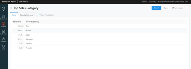
By clicking on the New Query heading in the top left corner, the current query can be named and saved for future reference. All saved queries can be accessed and viewed through the Queries tab in the left side panel. For this example, the query is saved as Top Sales Category.
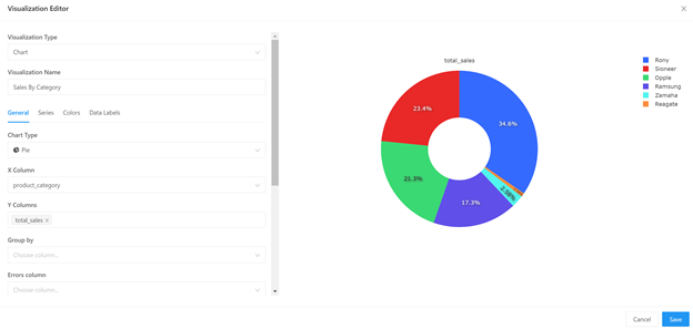
One of the more advanced features of SQL Analytics, as compared to a normal Databricks Workspace, is the out of the box visualization capabilities. SQL Analytics supports a wide variety of visualizations and customizations that would normally require extensive code within a workspace. In SQL Analytics, once a query is executed, simply clicking on the +Add Visualization tab, located to the right of the Table tab provides multiple options within a user-friendly Visualization Editor interface. In this example, the Top Sales Category query is displayed as a pie chart by selecting the chart type, X-Column equal to product_category, and the Y-Column equal to total_sales:
Once the chart is saved, it now also appears under the Top Sales Category query in addition to the raw table data:
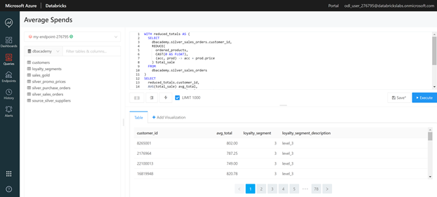
While the Top Sales Category query and chart were relatively simple, SQL Analytics can process complex queries in a short amount of time as well. For instance, in the Average Spends query below, a join is preformed on the loyalty_segments and silver_sales_orders tables then aggregated to the customer level on average total spend with the associated loyalty segment:
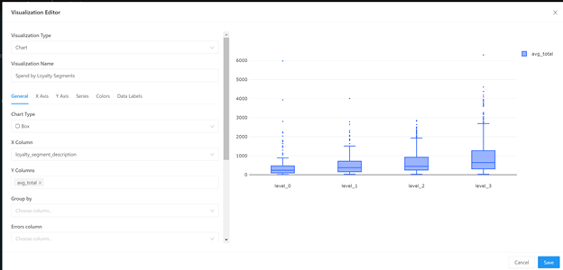
More advanced charts can be created via the Visualization Editor such as a Box Plot by loyalty segment:
Returning to the Queries tab, now both the Average Spends and Top Sales Category queries appear:

Now that the analysis contains multiple queries comprising both the raw data and visualizations, a way to present the information is needed. As in a Databricks Workspace notebook, an SQL Analytics dashboard feature exists for this purpose. Dashboards are created by clicking on the Dashboards tab in the left side panel and then selecting the Add Widget button in the bottom left corner. A widget is simply an individual query visualization that is displayed within the dashboard. To add a widget, first select the query followed by the desired visual within that query. In the example below, the Top Sales Category query is first selected, followed by the raw table data to create a new widget within the Spend Analysis dashboard:
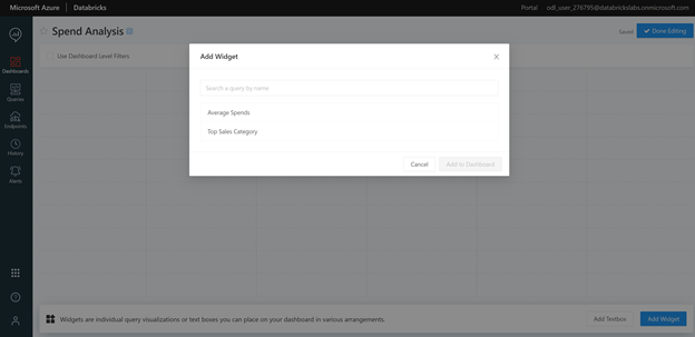
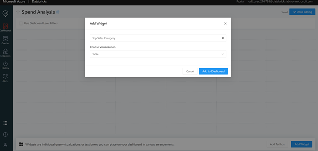
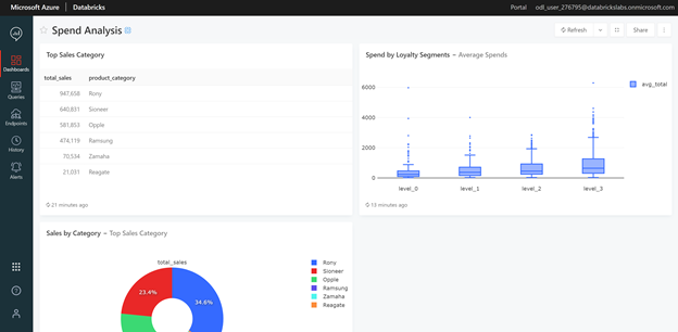
Several widgets from the same query, as well as different queries can be added to a dashboard. In the Spend Analysis Dashboard, widgets from the Top Sales Category query include both the raw table data (as demonstrated in the steps aforementioned) and the Sales by Category pie chart. The box plot associated with the Average Spends query is also included in the dashboard. Once completed, this dashboard can be saved and shared via a link to the relevant audience.
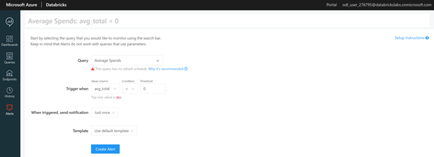
SQL Analytics also provides an alert feature which is useful for both monitoring and ensuring good data quality. Navigating to the Alerts tab on the left side panel will open a window for query selection. A Trigger When drop down option allows users to select the value column, comparison type, and threshold value. When an alert is triggered, the related data (which can be customized or defaulted to the SQL Analytics template) can be sent to emails, Slack messages, or even webhooks by adding an alert destination.
In this example, the Average Spends query is selected. The trigger is set when the average total column is less than zero, since a negative spend value would indicate faulty data. For this alert, an email is sent just once using the default template:
Overall, SQL Analytics delivers not only improved query performance but a greater level of collaboration among all data team members. SQL users will find ease in the familiarity of the interface, while current Databricks users will be able to adapt to the intuitive workspace layout. SQL Analytics completes the final step in Databricks’ lakehouse architecture resulting in a unified approach focused on maximizing performance while mitigating costs. Although, SQL Analytics may be new, it is sure to be a revolutionary game changer in modernizing data warehouses.


