If you think about it, many organizations are collecting and storing data in hopes of deriving valuable information from it. In other words, they want their data to tell them a story. While that story should be non-fiction, it doesn’t have to be as dry and un-captivating as an encyclopedia. Because dashboards are the ‘storybooks’ of the data analytics world, then it would require the same steps to construct a captivating and informative narrative.
- Adequate planning
- A good first draft
- Communicative imagery
1. Adequate Planning
Every great narrative starts with a great idea. But most ideas, no matter how great, need planning and refinement—and the same can be said when building your dashboard. A good starting point is to determine how your dashboard will respond to the following questions:
- What business needs will it fulfill? Are there information gaps you need to fill? Are there any problems that need to be solved? Or is this a strategy to target minor issues before they become major problems?
- For example: The marketing team needs more visibility into the effectiveness of their latest marketing campaign. They are spending millions of company dollars on this campaign, but they aren’t clear on how much revenue this campaign is bringing to the business.
- Who is your target audience? Who will need the information in this dashboard? Is this a niche report for a specific department, or would multiple departments benefit from this?
- For example: Continuing the marketing example—while this hypothetical report would primarily benefit the marketing team, it may also help the finance team determine how much budget to allocate to the marketing team for the next fiscal quarter.
- Does your organization have the data you need to convey this message on your dashboard? All too often, an organization isn’t far enough along on the BI maturity scale to obtain the right data to create meaningful reports. If you don’t yet have the data you need, you may first need to work with a data scientist and/or data governance team to ensure you’re gathering the right data for the business need(s).
2. A Good First Draft
By ‘good first draft’—I’m not talking about a first draft that perfectly paints your narrative and is ready to be productionized for your report’s consumers. Instead, I’m talking about a draft that will help you determine the most effective design for your dashboard.; In the BI industry, this is known as wireframing.
There is no single right way to wireframe. Some mock up their report designs on a cocktail napkin; some prefer using Visio.
Whatever your preference, a successful wireframe considers the following:
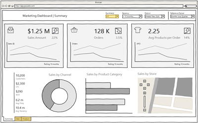
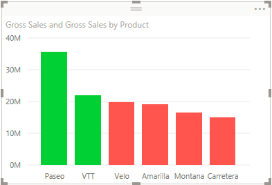
- Alignment – it might not seem mission critical, but poorly-aligned visuals not only look unappealing and messy (like the Power BI example below), but also can distract the reader from the report’s story.
- Order of metrics/visuals – studies have shown that humans of typically interpret a visual from the top left to the top right and then downwards (sometimes referred to as F-pattern scanning); thus, it would help your readers obtain quicker insight by placing the most important visuals at the top of your report(s).
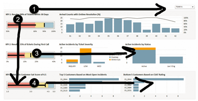
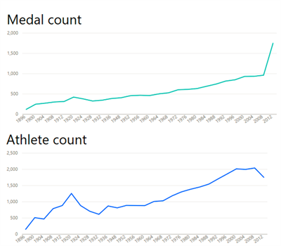
- Proximity of metrics/visuals – do your visuals contain interrelated metrics or data points? It might be more strategic to place these visuals closer together on your dashboard for ease in analysis—or better yet, incorporate both metrics onto the same visual. In the visual example below, the two graphs show a relationship to the number of medals for a given team vs. the number of athletes on that team.
Right after the planning phase, you might have an idea of metrics you’ll want to include as well as what visuals you’ll use to best convey those metrics. However, getting all those metrics into one report screen may be challenging. Thus, a good first draft will help you best understand which ‘characters’ are critical to your plot, which ones can be omitted, and which ones may be introduced later in the story—or perhaps in another story altogether.
3. Communicative Imagery
If a reader cannot visualize the story you’re trying to tell, they aren’t going to get a rich experience from your story—and possibly, they may not fully understand the story’s message—which is why communicative imagery is so important to storytelling. Communicative imagery helps readers stay engaged with the story by helping them build their own mental images.
When creating a dashboard, however, a lot of the visuals are already there for the report consumer.; What is more, too many words are strongly discouraged on any dashboard—the whole point of such reports is to use visuals to communicate key point(s).
So, then, how do you use communicative imagery on an already-visible-dashboard? By using color. Using color strategically not only mitigates the need for verbose captions, but it can also aid in better articulating important information. Because we as humans tend to associate specific feelings and emotions with certain colors, you can use that to your advantage when selecting colors for your dashboard’s visuals. In other words, you can use colors and their associations to articulate your most important points. Here are a few colors and their respective psychological associations:
- Red: This color attracts attention more than any other color, so try to use it sparingly. Red can be used to convey some of your most critical points—especially points where immediate action needs to be taken. This color can be used to indicate specific performance areas that are putting a heavy strain on the business.
- Orange: This color isn’t as much of an attention grabber as red, but still an intense color that draws attention quickly. Orange can be used to convey areas of high risk, warning, and enthusiasm. Using this color would work for metrics that aren’t performing well, but haven’t yet reached a point where they are a strain on the business.
- Yellow: This color can signify joy and happiness, as it produces a warming effect that arouses cheerfulness. The other side of yellow, however, can simply entering an area of caution. Using this color would be great for KPIs that are falling short of business expectations, but are still performing adequately.
- Green: This color, most closely associated with nature, symbolizes harmony, growth, and healing—in the business world, it can also be associated with money and profit.Using this color would be great for KPIs that are performing well and meeting business expectations (i.e., profitable).
For more colors and more information on color association, here is a great source.
Conclusion
By this point, you’ve come up with a plan for your dashboard—you know the business requirements, you know who will be consuming your report, and you have access to the data you need to incorporate the key points of your report.
You have also drafted or sketched out a wireframe—determining not only the general layout and aesthetic of your report but also the order in which you want to display your visuals and their respective proximity to each other.
Lastly, with the aid of basic color psychology, you have selected a color palette that not only looks great but also helps to better articulate important information.
By following these three simple tips, you’ll have all you need to tell a captivating, yet informative narrative. Happy dashboarding!