It’s been argued that the term business intelligence (BI) dates all the way back to 1865, when author Richard Millar Devens used it to describe how an astute banker tapped into business information to gain an edge on his competitors. Nowadays, the label encompasses everything from reporting, analytics and decision support to key performance indicators, dashboards and executive information systems. While solutions and technology have evolved significantly since Devens’ day, companies still face the same age-old problem – what resources offer the most value from their data?
For a growing number of organizations the answer is Microsoft’s business analytics workhorse, Power BI.

While modern data organization procedures are fairly standardized, methods of exploring that data can range from beautifully simple to painfully complex.
The organization process typically begins by:
- identifying data to access;
- choosing what the data outputs look like (e.g. reports, dashboards, etc.);
- and finally, deciding what questions will be asked up front.
Once an organization has taken those steps, it can begin to interact with its data and get answers.
Let’s take a closer look at the final step, and its importance to business. For example, what if I’m looking at sales information and I see a problem, or a high-level opportunity, that I want to access in greater detail? My output is configured so I can investigate geography, personnel, product, time, weather, customers, and more. I could spend hours, or even days, manually exploring different combinations to try to understand something like the reason behind an increase or decrease in sales. The answer is crucial. I can only communicate my findings and take action once it’s in hand.
What if I only had to identify the data set I am interested in? What if the click of a button could reveal outliers, correlations and trends? What if I was looking at my reports or dashboards and had the same high-level sales question, but did not have to manually cycle through myriad combinations to be able to zero-in on what drove changes?
Power BI makes that not just possible, but easy. As Microsoft integrates machine learning and data mining into this self-service BI tool, its substantial analytics value continues to grow.
One of my favorite Power BI tools is the Quick Insights feature. It applies a set of data mining algorithms to a data set, auto-generating a series of charts and graphs that reveal trends, correlations, and outliers – no set-up required. Just feed in the data to discover patterns that can broaden understanding and help formulate questions. It’s as easy as 1-2-3:
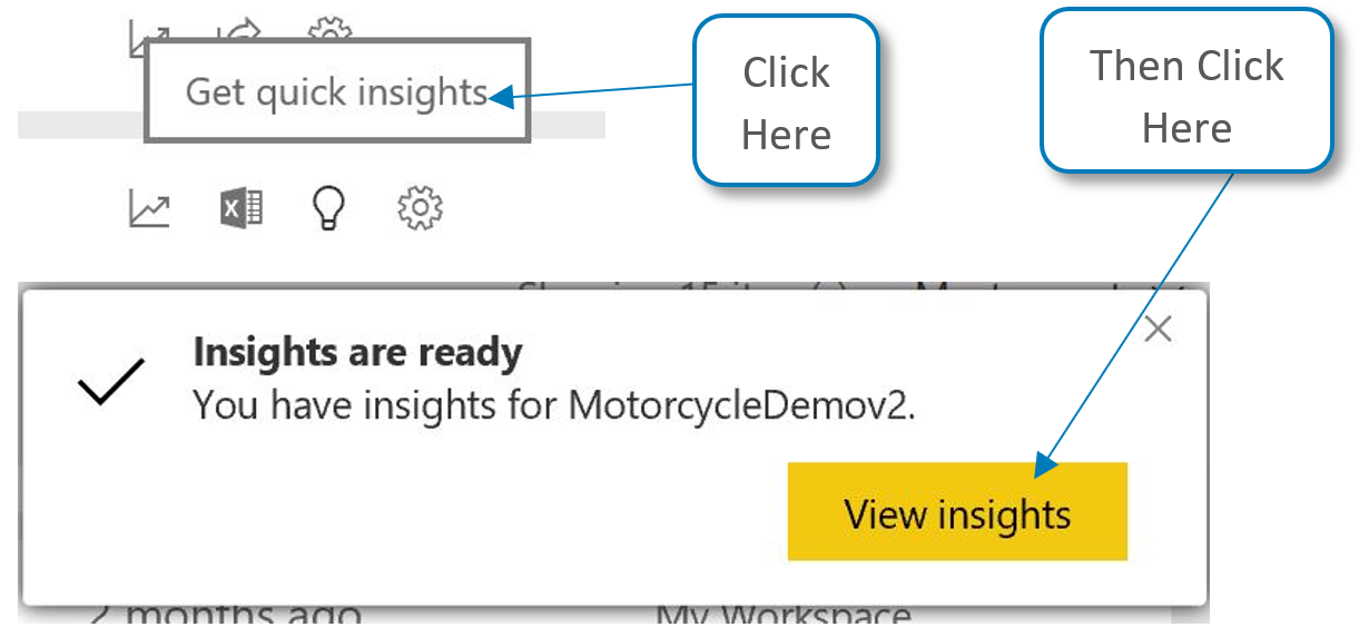
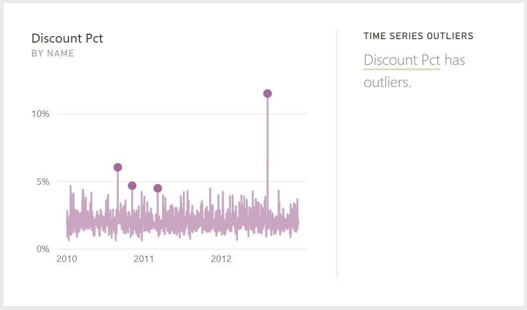
The chart those simple steps created shows me that there are outliers in Discounting:
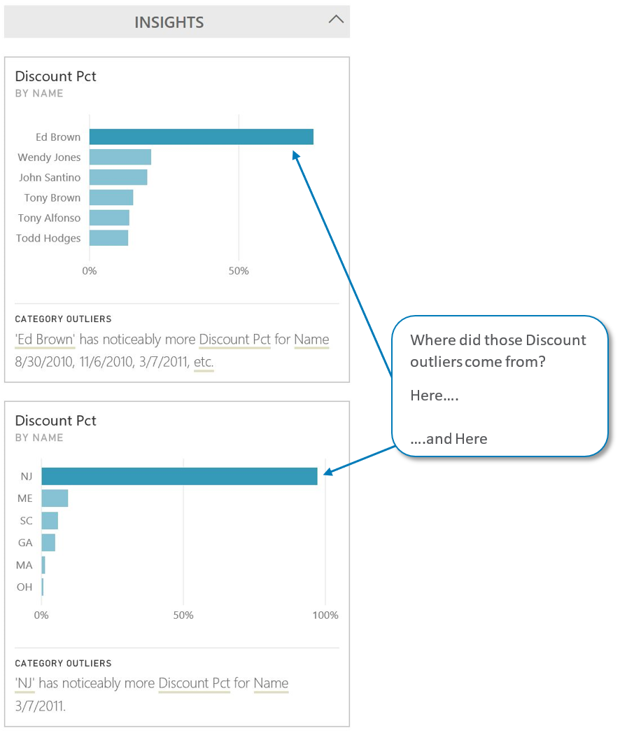
I can then focus Quick Insights on those outliers, to uncover their origins. This action autogenerates the next series of charts, shown below:
Though it seems to be a lesser-known feature, this Power BI capability has been around for a while. If you’ve never tested it out, I suggest giving it a try.
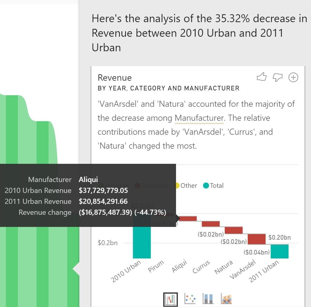
Another exciting feature in Power BI is the latest data mining infusion. Now, when looking at a chart I’ve created with a timeline attached to it, I only a click away from understanding why a value has increased or decreased from the prior period. A series of waterfall charts (users can cycle through a few different chart types) are auto-generated across data combinations to show the origins of an increase or decrease. Even better, the narrative that is written holds insight into relative contributions, not just raw change. For example, Product A historically drives 50 percent of all Product Sales. From period 1 to period 2 there is a $2 million increase in Total Sales. An analysis of the increase might show that during that time Product A sales increased $1 million. The narrative that Power BI writes and the waterfall chart it creates reflect that $1 million of the increase is attributable to Product A, AND that the relative contributions remained the same (as historically expected). On the other hand, if Product B and C were major contributors to the $2 million increase and Product A had none, the narrative would reflect that the relative contributions of Product A, B and C have changed the most. Here is an example:
Given this Ribbon Chart of Revenue across years:
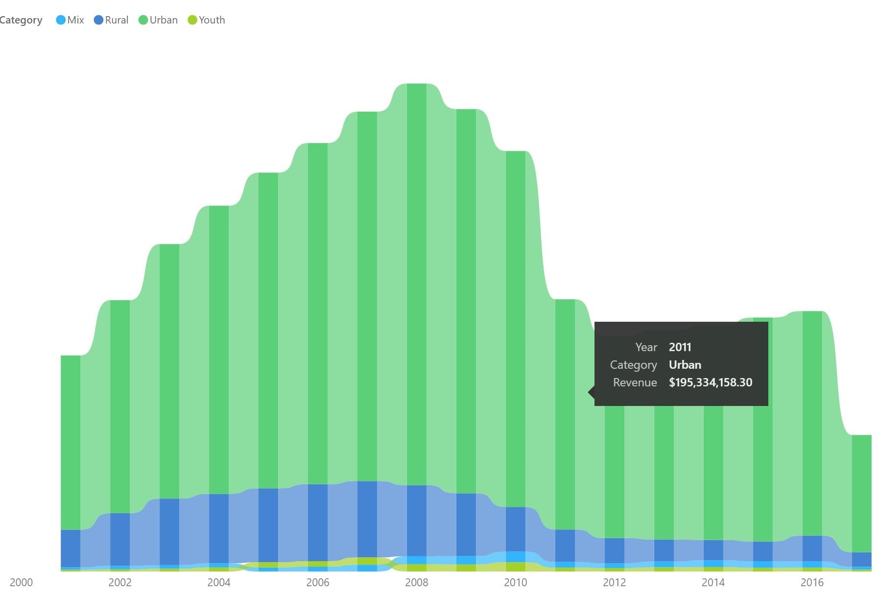
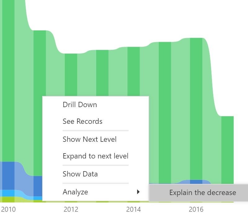
I simply click “Analyze, Explain the decrease” in the bar for 2011:
Power BI delivers a series of charts (by Product, by Geography, by Channel, etc.) that explain the details around the decrease. By clicking on the chart, I can add it into my report to monitor going forward.
Microsoft’s addition of “intelligent’ features to its latest product versions is reducing the once labor-intensive, manual nature of these types of tools. While there are other technologies on the market that offer similar capabilities, they are generally expensive, take a lot of up-front work and require continued care and feeding to maintain. They also lack Power BI’s breadth of capabilities. With tools spanning BI, data manipulation, data acquisition, data mining, and self-service access, to name just a few, Power BI supports users facing an explosion of data volume and granularity, and helps them not just navigate information, but make the most of it.
If you are looking to make the most your data, contact 3Cloud today. Let us help you get the answers you need to deliver value across your organization.

