For many companies, the initial attraction to Azure Databricks is the platform’s ability to process big data in a fast, secure, and collaborative environment. However, another highly advantageous feature is the Databricks dashboard. Dashboards are created directly through an existing Databricks notebook via a single click. They are essentially a presentation-friendly view of a Databricks notebook.

One of the more challenging tasks for data scientists and engineers is explaining the function and results of their code in both an interesting and intelligible manner to key stakeholders. While clients with programming experience may enjoy delving into lines of code, clients who focus more on marketing may place greater emphasis on result presentations. A commonly attempted solution is to piece together a combination of text, code, and results in a PowerPoint presentation, a time-consuming process that still may fail to capture an accurate overview of the entire analysis. This post highlights some of the dashboard’s useful features that aid in resolving these issues through a use case of classifying salary brackets. For this example, the data derives from census information of individuals, along with their annual income. The goal is to predict if an individual earns less than or equal to $50,000 or more than $50,000.
Data Exploration
The first step in any type of analysis is to understand the dataset itself. A Databricks dashboard can provide a concise format in which to present relevant information about the data to clients, as well as a quick reference for analysts when returning to a project.
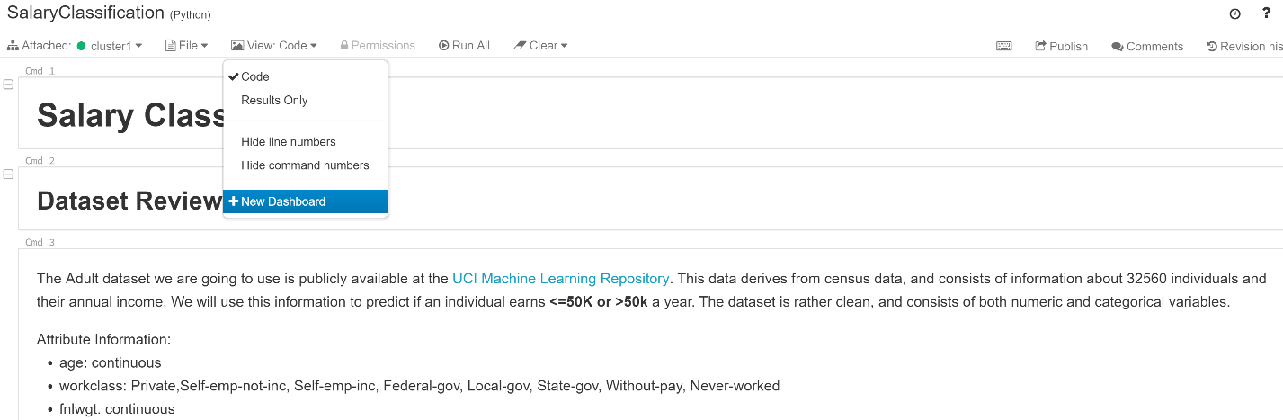
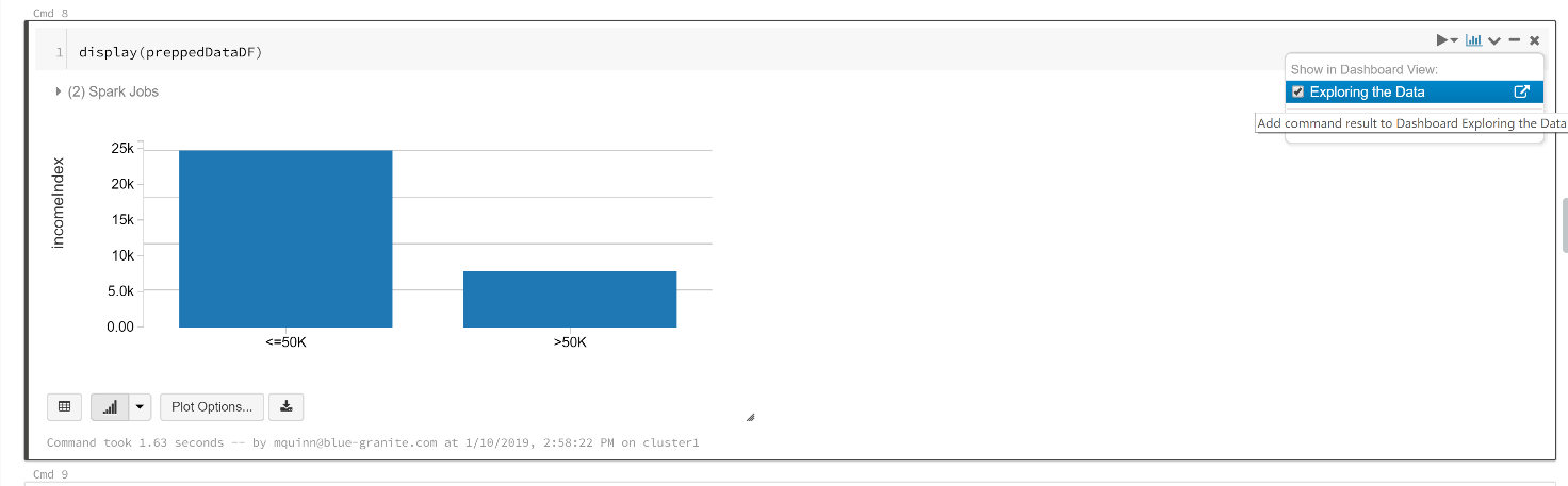
To create this dashboard, a user can simply switch to Dashboard view instead of Code view under the View tab. The user can either click on an existing dashboard or create a new one. Creating a new dashboard will automatically display any of the visualizations present in the notebook. Customization of the dashboard is easily achieved by clicking on the chart icon in the top right corner of the desired command cells to add new elements.
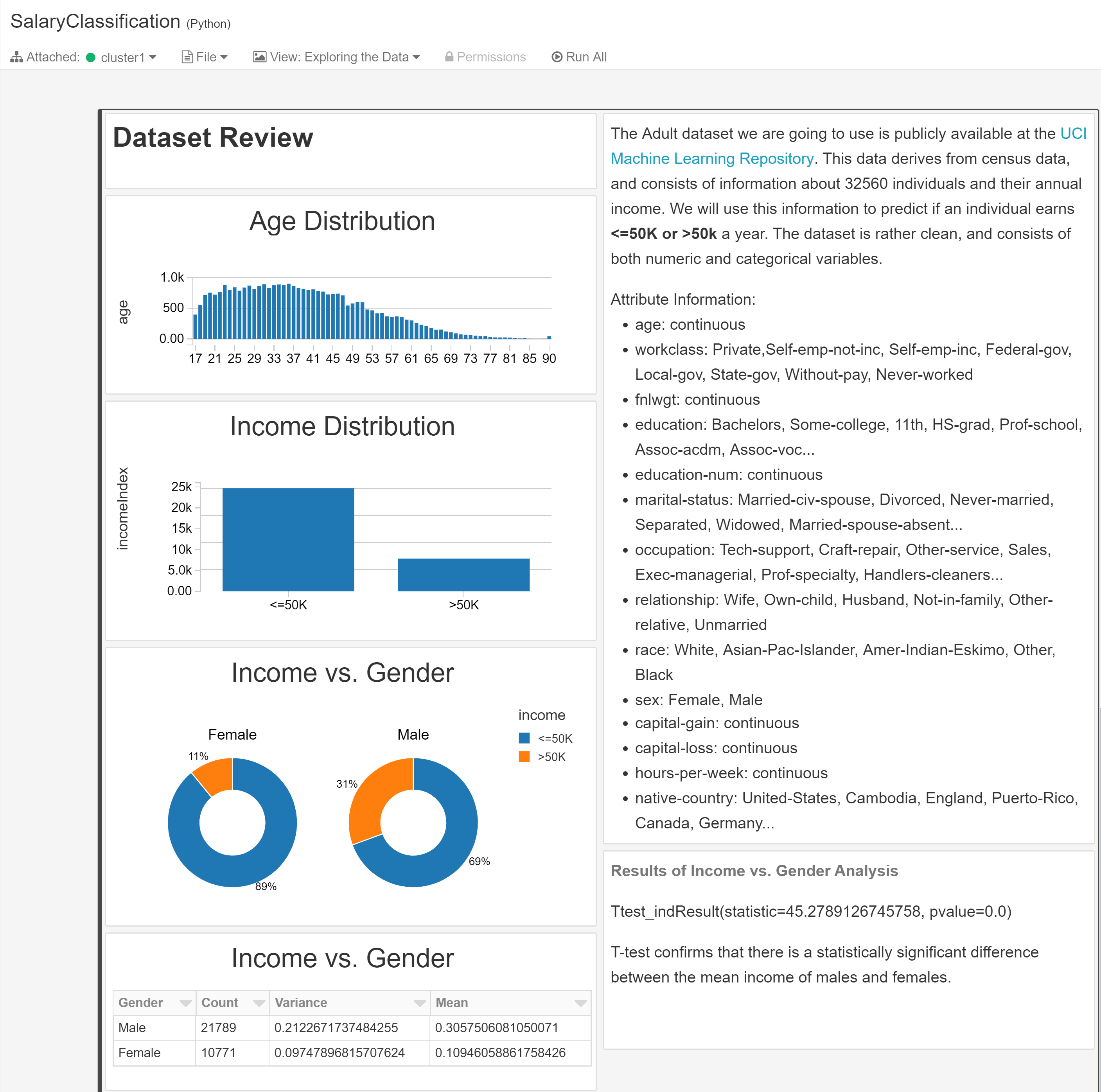
In this example, the Exploring the Data Dashboard shown below provides a general description of the dataset, as well as highlighting interesting trends. From this dashboard we can observe that the age is right-skewed and that there are more individuals in the less than $50,000 bracket than the greater than $50,000 bracket. We can also see that a possible key relationship exists between income and gender. From the pie charts, males seem more likely to fall in the over $50,000 bracket than females. To prove this is a statistically significant difference, the dashboard displays a breakdown of the descriptive statistics associated with each gender, as well as the results of a 2 sample T-test.
Creating this type of initial data exploration dashboard can serve as an excellent way for data scientists to organize their thoughts about potential influential factors to consider during analysis, as well as highlight to clients possibly undiscovered trends in their data.
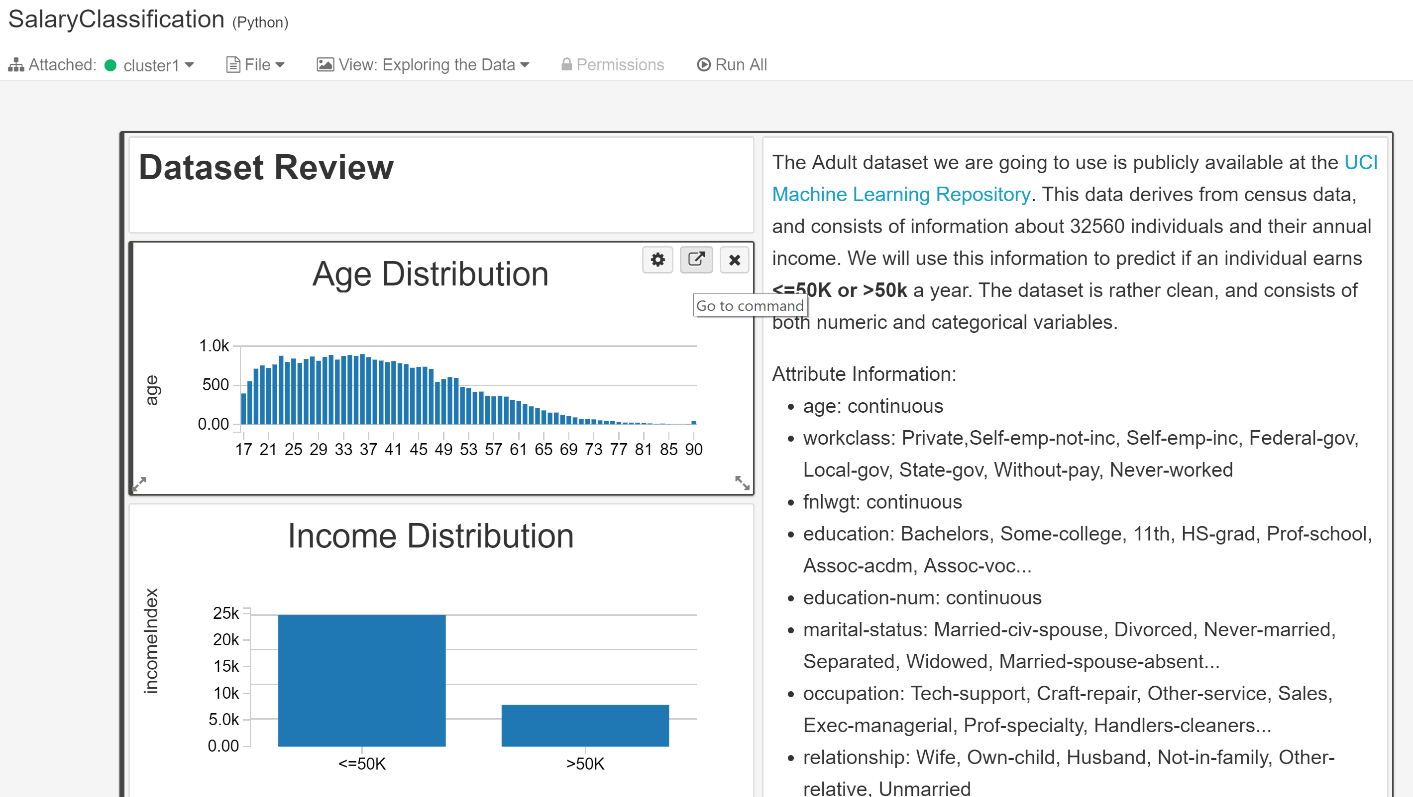
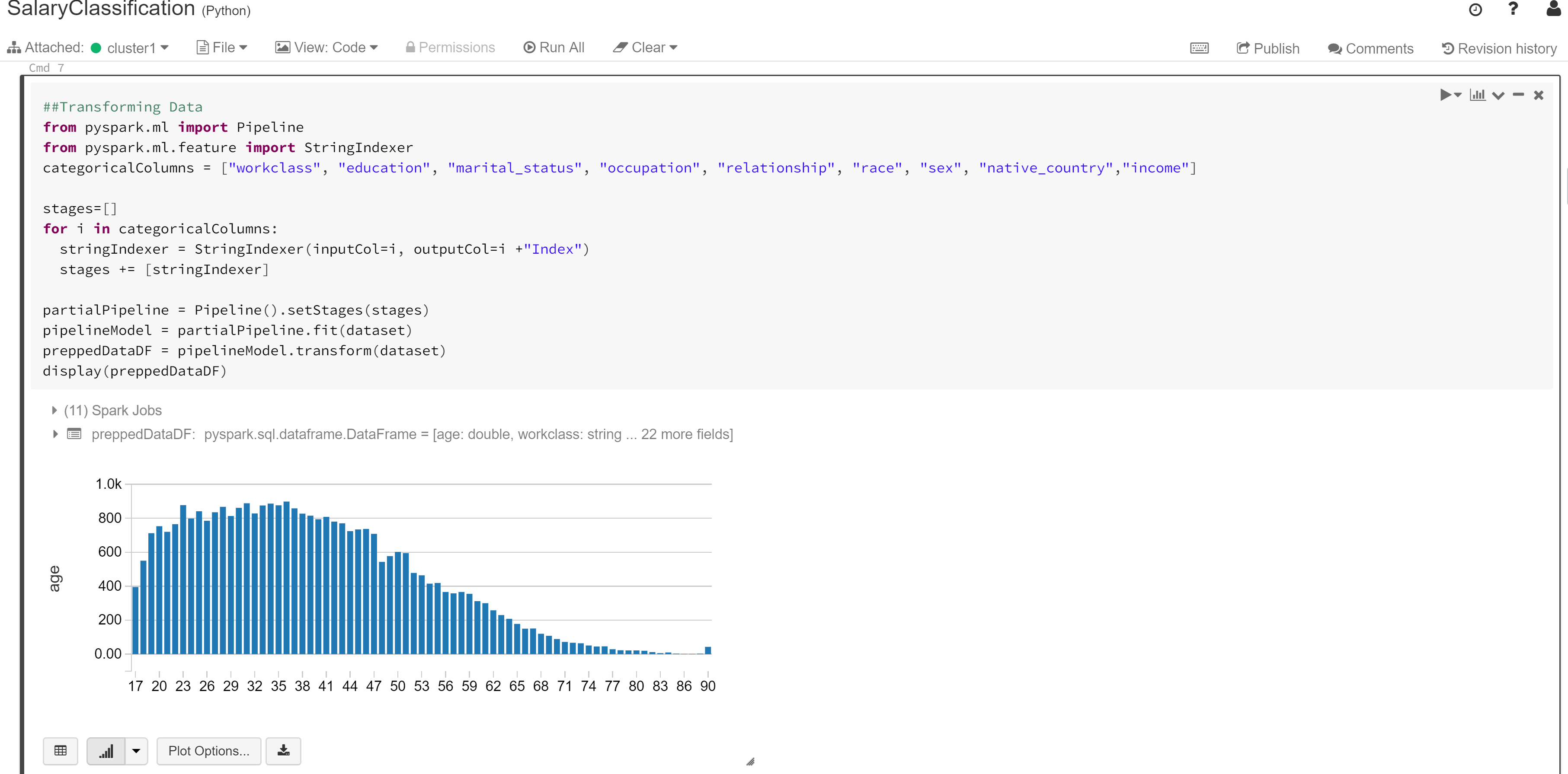
Another valuable feature of the Databricks dashboard is the ability to easily show the code associated with a certain visualization. For instance, if a client is interested in the generation of the Age Distribution graph, clicking on the Go to command icon appearing in the top right corner will automatically switch to the notebook view in the exact location of the command. This tool provides a convenient method to demonstrate both results and code without aimlessly scrolling through several lines or copying and pasting only small, dispersed snippets. It also provides data scientists the convenience of easily locating specific code for editing purposes.
Data Modeling
Dashboards can also be created to present the method and results of the data model. For clients, this aids in making complex analyses more tangible. Data scientists gain benefit from having all the key results organized in one place, an extremely useful feature especially if additional analysis will be performed at a later date.
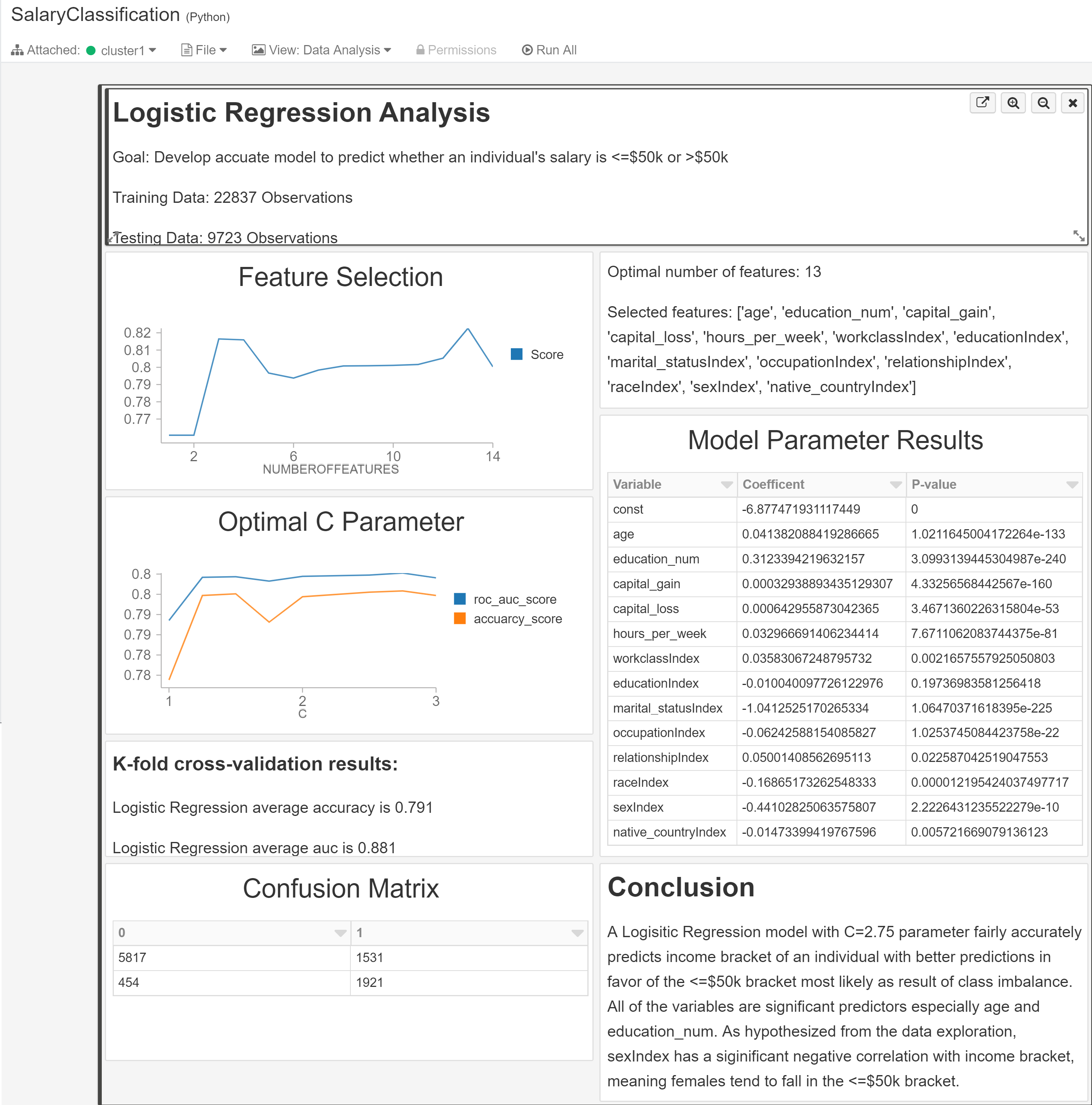
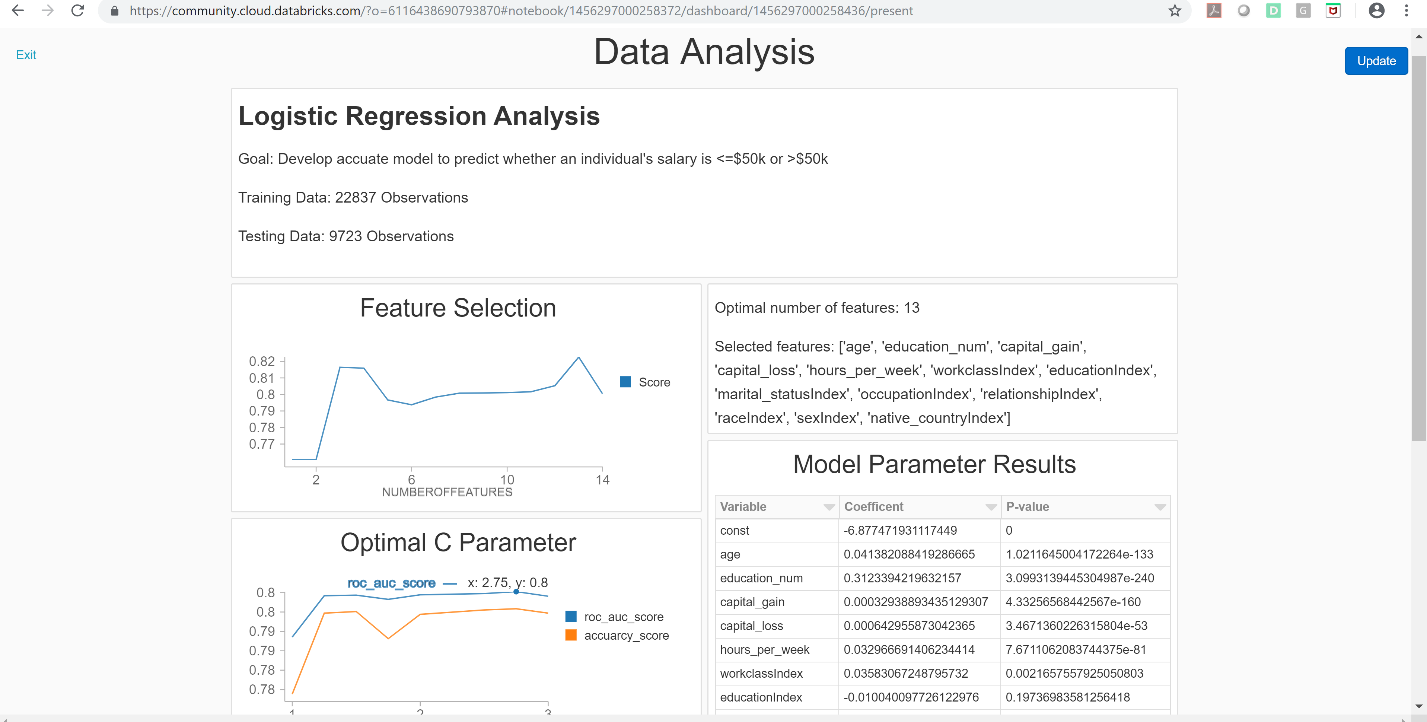
In the Data Analysis dashboard below, we can see that logistic regression was applied to the salary classification problem, as well as the breakdown of the training and testing datasets. The Feature Selection graph illustrates that only 13 of the original 14 features are considered in the model. These features are then listed on the right side for easy reference.
The next step in creating a model is finding the optimal parameter values. For logistic regression, this is the C value, or a penalty parameter, that reduces overfitting. The Optimal C Parameter chart compares both the area under the curve and accuracy scores for various C values between 1 and 3. For both score types, C = 2.75 provided the highest value. Using this parameter, the model is then evaluated using 10-fold cross-validation. From the K-fold box in the dashboard, we can see the model has both a high accuracy and area under the curve score. The Confusion Matrix table also illustrates the model’s hits and misses.
Finally, the resulting model is also easily shared on the dashboard through listing the variables’ coefficients and their associated p-values. Markup command cells can also be added to the dashboard to create an overall summary of the findings as in the Conclusion box below.
Once a dashboard is completed it can be shared via a URL by clicking on the Present Dashboard tab in the left side pane. From this URL, users can examine specific data points by hovering over the charts, reorder data in tables, and even update the dashboard to reflect the most recent code in the notebook. This capability of user interaction and live data connection creates sophisticated presentations that are both interesting and beneficial for clients, more so than static PowerPoints or Word documents.
Overall, Azure Databricks offers data scientists the potential to both easily analyze and present big data. The dashboard’s ability to interactively display results, text, and code in an easily tangible and succinct manner not only saves data scientists time and resources but also provides clients with an interesting view of the data and process. Viewing an analysis in this manner fosters greater client understanding and reception of all the steps required in machine learning, including data exploration, modeling, tuning, and model evaluation. Even the most accurate and thorough model can be declined by stakeholders, if its presentation fails to accurately reflect its value, which is why the dashboard is such a crucial, complementary feature to the overall processing ability of Databricks.
Contact 3Cloud today to learn more about how your organization can capitalize upon the data-driven insights of the dashboards available with Azure Databricks.