There are data visualizations all around us. It’s easy to place value when judging a graphic display on appearance alone – pretty colors, fancy charts, cool pictures – but if the visualization doesn’t give quick insights that aid decision making, it’s really not effective.
Identifying and removing chart clutter reduces visual “noise”, allowing the audience to focus on the information. In “The Visual Display of Quantitative Information” Edward Tufte describes such noise as “elements in charts that are not necessary to comprehend the information represented in the graph.”
Common chart clutter items include:
- 3-dimensional effects
- Dark gridlines (use soft gray gridlines or eliminate gridlines when possible)
- Overuse of bright, bold colors
- Unnecessary use of all uppercase text (uppercase text is only necessary when calling attention to an element)


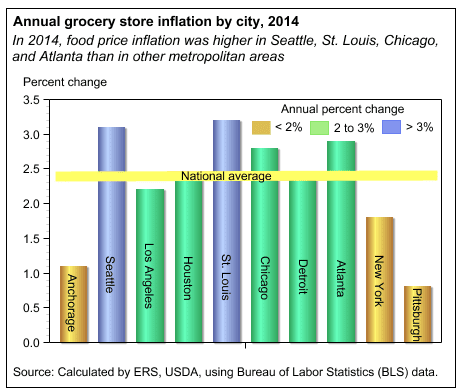
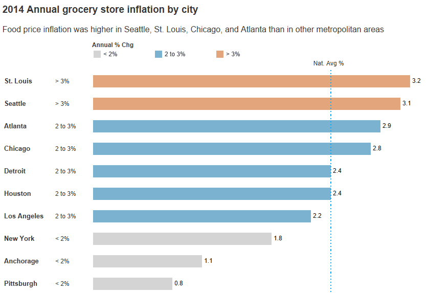
In the images above, the top chart comes from the USDA Economic Research Service. The bottom chart contains the same data but has less chart clutter, making it easier to read. Here are the things that were changed:
- Remove 3-D effect: A 3-D chart showing 2-D data doesn’t add value to your charts but does add noise and makes the chart harder to read.
- Use softer color tones except where you want to draw attention. Bright colors can be tiring to look at. Be mindful of your color-blind audience and use tools like the Coblis Color Blindness Simulator to determine whether your visual is color-blind friendly.
- Pivot the chart: Use the horizontal bar chart when you have category labels that are many characters long so that users don’t have to tilt their heads to read the chart.
- Choose an appropriate bar width: Make bars skinnier to use just enough white space so that the bars are slightly thicker than the white space between them. When the bars are too close together, your brain will naturally try to evaluate the area vs. length.
- Remove the x-axis header and add data labels. By adding data labels, you can easily see that the national average is 2.4%. Since we added data labels, the x-axis would be redundant and thus may be removed.
A final change made to the bottom chart improves readability; sort the bars in descending order. By sorting, readers of the bottom chart can easily see that food price inflation is highest in St. Louis, Seattle and Atlanta and lowest in New York, Anchorage and Pittsburgh. Try for yourself to see which chart is easier to read.
A good practice after creating a chart is to take a step back, identify unnecessary elements (chart clutter), and remove them. Repeat this process until nothing else can be removed because every element of the visualization has a purpose and supports the objective of the visualization.


