In the Business Intelligence community, it’s easy to get caught up in data. Numbers form the basis of everything we do. We want to count, add, estimate. We pull data from different sources and coalesce that into one version of the truth. We want to acquire and generate data. Really, that’s only the first step of BI. The acquiring, modeling, and calculation of data cannot stand on its own. The heart of BI is turning data into information. It’s not information if we can’t use it. The core of that transformation is turning that heap of data into something that humans can process. And humans can learn a lot by looking at a picture.

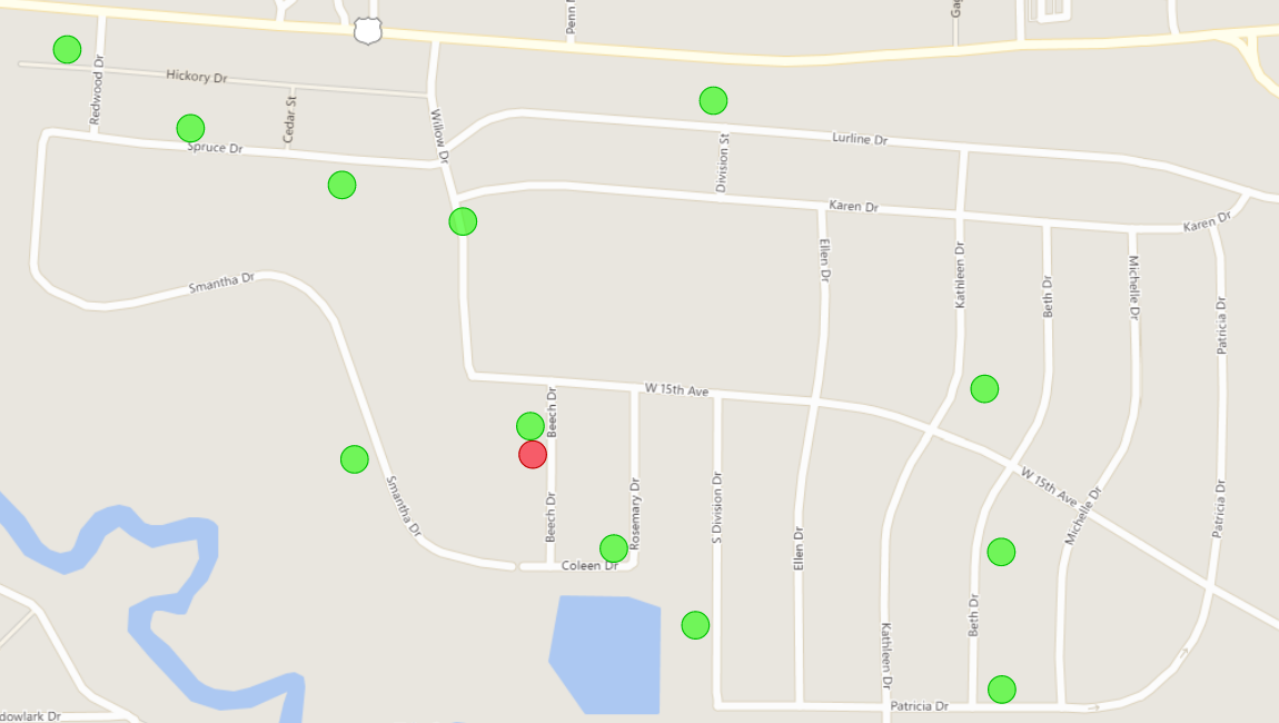
Take, for example, addresses. I had a problem recently where I needed to compare a handful of addresses to a much larger population of addresses. The test addresses had to be ranked based on their proximity to the control addresses. I extracted both the test addresses and the control addresses and mapped the results. Being ad hoc, it didn’t have any measures. It didn’t calculate any distances. It was just mapping a series of addresses and color coding them. Just looking at the map was all I needed. Compare test address A:
To test address B:
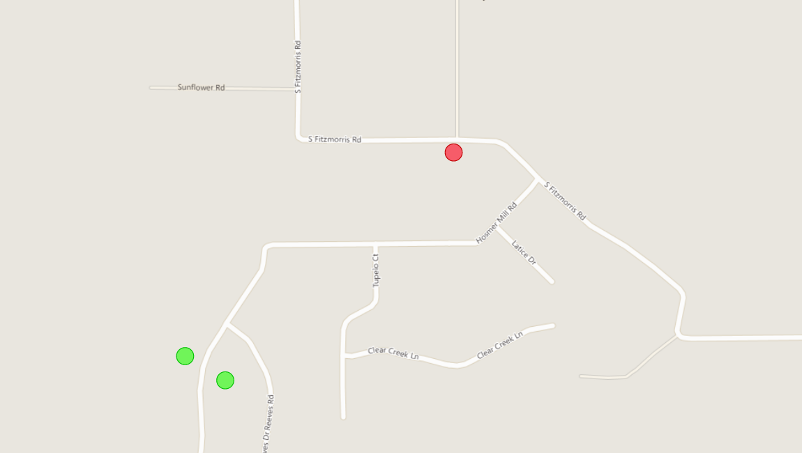 Just by looking at test A, the former, you can tell that it had much greater proximity to a cluster of control addresses than the latter. Those pictures are far more insightful than the list of addresses I started off with. Just from plotting the addresses on the map, I can see that address A is in a subdivision near a highway, and the subdivision has lots of control addresses. In comparison, address B looks more rural and only has a few control addresses. It’s something you can pick up intuitively in a few moments. Compare that to looking at a table:
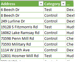
It would be more difficult to gain the same insight without visualizing it on a map. In fact, it would be quite a bit more difficult. Internally, the tool I used looked up geospatial coordinates and filled in bubbles against a map at the proper locations. So, in attempting to arrive at a similar conclusion, I’d have to grab those geospatial coordinates. Then, I’d have to calculate the number of control addresses that fall within a given distance from the test addresses. You could then calculate that test address A is a higher rank than test address B. That calculation only addresses the primary insight. To calculate other conclusions that you can make from the map, you need quite a bit more data. In fact, you might run out of resources before you could accurately calculate the other conclusions.
Let’s look at another example. This time, I won’t give any context, just the picture.
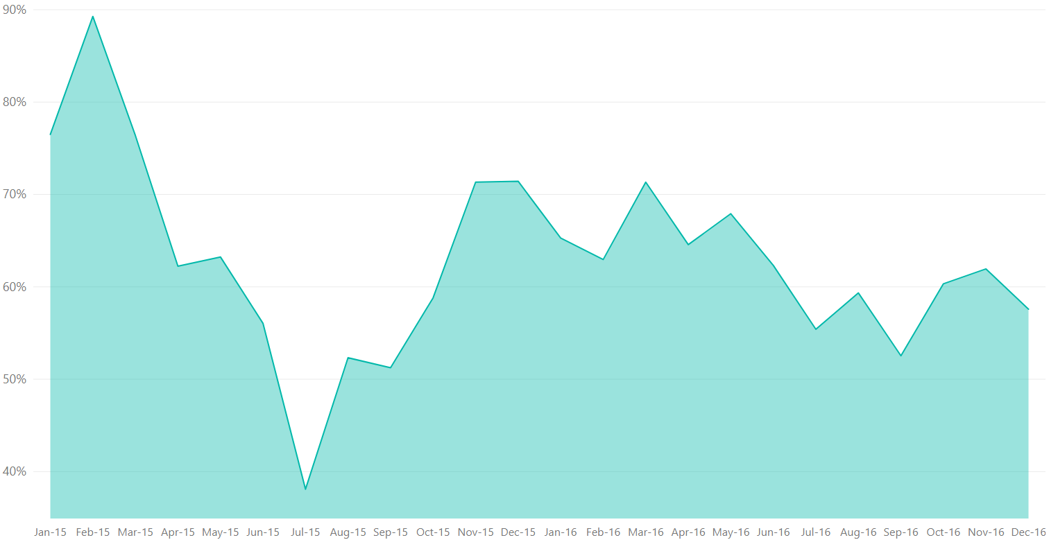 What can you tell just by looking at the picture? Let’s break it down. First, we’re looking at how a percentage measure changes over a two-year timespan. The first 3 months of 2015 had a much higher percentage than any other quarter, but it was followed by numbers dropping like a rock with a giant dip in the summer months. It seems to have evened out a bit for a much more stable 2016. Again, this analysis becomes much more visceral when looking at a graph rather than a bunch of numbers.
However, the graph also shows a little bit of the flip side of visualization. Look at the scale on the left. The scale is showing percentages, but it starts at 35% and only goes to 90%. Depending on what I’m intending to show, that could be misleading. By truncating the scale, it emphasizes the relative differences between month-to-month values, rather than their absolute values. A 0% to 100% scale would instead emphasize their absolute values. Which approach is “right” depends on what you’re intending to communicate to the audience about the data.
In short, a chart like this isn’t useful in the real world without any context. Realistically, this graph in isolation is useless. It could be a failure rate (lower is better) or it could be an office occupancy rate (higher is better). Let’s look at a revised chart, then.
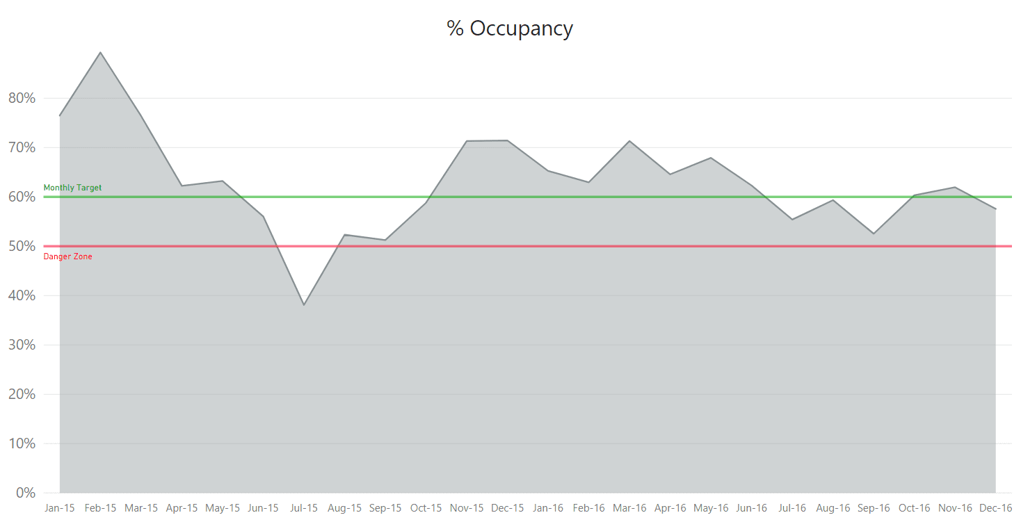 Here, the chart itself gives the context. It calls out the measure in the title and clearly distinguishes our key performance indicators for Occupancy. We see that one month had an exceptionally low occupancy rate and that several months were in the acceptable but below target rates. We also revised the scale on the left to begin at 0%. July 2015 was clearly a low point, but it wasn’t quite as low as you might be led to believe based on the first chart. Depending on what we want to communicate, we might add callouts to draw our attention to certain points. It depends on the story we want to tell with the data.
Okay, so we’ve looked at a couple of examples. What can we take away from this? Most importantly, good visuals can help us intuitively understand data they represent. However, we also learned that it takes effort to design a good visual. It is not enough to display “the data” – the context of the data can be just as important. And, unfortunately, we learned that you can display the data in ways that manipulate perception of the data. A picture can be worth a thousand numbers. Why is that? A well-designed visual will tell a story of the data in a single picture.
If you need some help with visualizing your data, be sure to contact BlueGranite for help.

