Among the many exciting developments surrounding Power BI this summer, one that may have been easy to overlook was the release of interactive R visuals. For anyone looking to extend Power BI beyond its built-in or custom visual options, R is a good choice due to its variety of packages. For data visualization, R can be approachable whether you want an advanced statistical plot or a basic map.

What’s Interactive?
The first generation of R visuals in Power BI only created and displayed a static image. With interactive R visuals, the output is HTML rather than a static image. This means that you can create and use visuals that largely work like standard Power BI visuals. In-visual interactivity such as zooming or hovering is now possible.
Even with interactive R, there are some caveats. First, many standard custom visuals and all native Power BI visuals permit user selections to filter or highlight content in other visuals on the report. In contrast, an interactive R custom visual is interactive unto itself. It is a step up from static R visuals that only render an image, but there is no way to click on content in an interactive R visual and filter other report visuals. Second, interactive R is only available as a custom visual and not using the R visual in Power BI itself. Rather than scripting your R code directly in Power BI Desktop like you can with a static visual, you need to develop interactive R visuals using the Power BI Custom Visual API.
What Does It Take to Build?
After the announcement of interactive R visuals, I created a preview version of a basic table visual that I called rDataTable. It was an interactive R custom visual that uses R’s DT package, which itself binds to JavaScript’s DataTables library. It offered built-in search across all columns, column-specific filter in the visual itself, dynamic paging, and more. You may wonder about the level of effort involved to create this table.
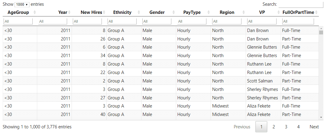
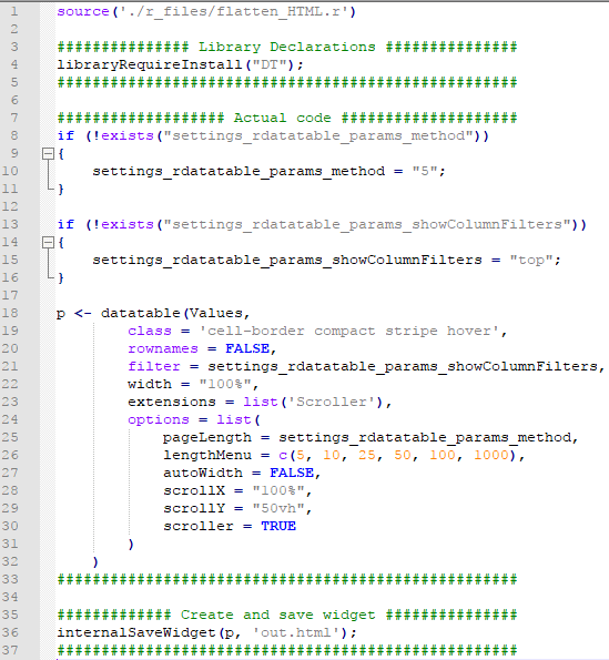
Rapid development is one of the strongest advantages of R visuals in Power BI. This is true whether you create static or interactive R visuals. To obtain what you see in the screenshot as well as the functionality outlined above, it only took a few lines of R code. This is due to the impressive level of innovation surrounding the htmlwidgets package and the many other packages that combine R with JavaScript to produce interactive content in today’s R ecosystem.
Four Considerations
Here are four broad considerations when creating interactive R custom visuals for Power BI:
 Audience: Will you be keeping your visual for personal or team use, or do you plan to deploy it to a wider audience? The level of initial effort — not to mention potential maintenance and support — varies substantially depending on whether you build a visual for a small team, a large organization, or open-source and release it for everyone in the Power BI community.
Deployment: Does your organization use Power BI Service or Power BI Report Server on-premises? Are you building it for yourself and can get away with having it only in Power BI Desktop? As with static R visuals, interactive visuals have a dependency on the R packages available in your environment.
- Power BI Desktop: You are limited by your local R workspace. If you don’t have a package you need, install it locally to get your visual to work.
- Power BI Service: Interactive and static R visuals should work as long as packages are supported by Microsoft. Mobile reports should render interactive and static R visuals. While there are hundreds of packages available to Service users, only a few cater to interactive HTML output. If you plan to create a visual for wide distribution in Power BI Service, consider supported packages that create render HTML such as Plotly, timevis, networkD3, Highcharter, or DT.
- Power BI Report Server: No R visuals are currently supported. There is no mobile support by extension.
Data: How many records do you need to represent in your R visual? As with static R visuals, interactive R visuals allow for up to 150,000 records. Note that this is still a heavy advantage over standard custom visuals, which plateau at 30,000 records.
Format options: How much customization do you want to allow users, if any? Most custom visuals give report builders the courtesy of changing options like data colors, font size, and more. It may be quick work to write a few lines of R code with formatting hardcoded. Once you add custom formatting, however, the effort grows significantly. You will be no longer be exclusively working in R. Instead, you will venture into TypeScript and JSON. Decisions like allowing users to customize colors will therefore substantially increase the effort to build a visual not simply by expanding time but also by broadening the required skillset.
Once you have an idea of who will use your visual, how and where it will be used in reports, what type of data it will display, and how much user customization you may want to consider; you’re in a suitable position to plan your interactive R visual development in more detail.
How Can I Get Started?
To get started with custom visuals in Power BI, see the Microsoft documentation on GitHub. In addition to the basics of setting up your development environment, the docs lay out basic steps to work with interactive R in the “Creating R Powered Custom Visual with HTML Output” section.
3Cloud also has the expertise to help guide you through Power BI development and training. Please contact us today!

