We have all seen how pretty Tableau dashboards can be and we want to jump right in and start making beautiful dashboards to get those ooohhs and aaahhs. The truth is, getting the data in the correct format usually takes longer than building the entire dashboard itself! Before you start, you need to understand a few things about your data so that the visualization part will be much more fun.
Here are three tips to get your data ready for Tableau:
#1 Understand Your Data
Think about the message you are trying to communicate and what types of visualizations you will need to accomplish this task. Do you need raw (row-level) data to produce scatter plots to find outliers? Say I wanted to find the correlation between sales and profit. I wouldn’t want sum of sales and sum of profit, I would want every sale and every profit (all rows). Or maybe you need sales data by territory and month? Then you will need to take the data to the grain of territory and month. Most commonly we need to know if your data is at a yearly, monthly, or daily grain.
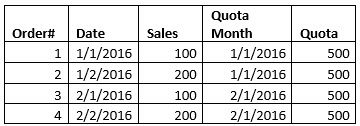
Source Data:
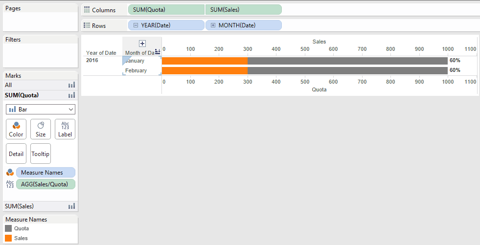
Tableau Result:
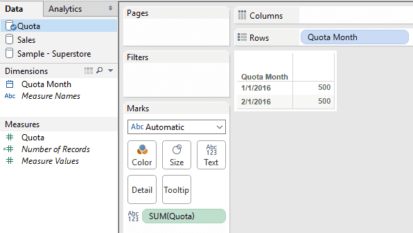
In the table above, I want to see how my sales is performing against my quota. Sales is at the level of day while quota is at the level of month. Since they are at different levels, you would have to get monthly sales in order to compare it to the monthly quota. So you need to get your data to the level of month to compare sales against quota.
Source Data:
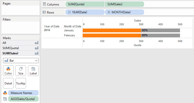
Tableau Result:
#2 Flatten Your Data
The best data structure for Tableau data sources is flat. Tableau likes to have everything in one flat table. Denormalize your data into a flat structure and take it to the lowest grain that you will need for your dashboards. In my experience, it’s better to flatten the data outside of Tableau (SQL Server or Excel) and then bring it in as a data source.
#3 Blend Your Data
When you can’t flatten your data, you need to blend. Using the same example from the Level of Detail description, you can also get the data to the right level if you blend.
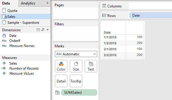
You take the Sales data:
And blend it with Quota data:
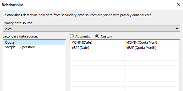
But here you must specify the relationships so they join correctly.
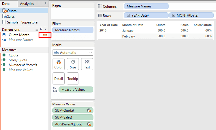
Then you simply drop a pill from Sales and another pill from Quota and turn on the relationship by clicking on the join symbol next to Quota Month. Now see how the numbers calculate correctly because they are at the same level of detail.
I once worked on a project where we had budget information that was at the grain of Year, forecast information that was at the grain of Month, and sales data that was Daily. Naturally, I thought I could have everything in one table and Tableau would just know not to sum up my budget information for each month since I had Year as a field, but that was not the case. In the end, I had to roll my sales data up to Month, then separate my budget and forecast information into two tables and blend them back together. With this approach, I was able to see how my daily sales performed by month and how my monthly totals were performing against my annual budget.
Closing Thoughts
Do not be afraid to create data sources with similar data at a different grain. This is a good thing to do in Tableau in a case like this. When you build it like this, name your fields carefully so that you know which fields belong to which tables. You will often need to bring in duplicate fields to create relationships so it’s best to keep track of which fields you are using in your worksheets.
Take the time to get your data right before you jump into building the dashboards. Once you have all three of these steps completed, you can get to the fun part of visualization!
Looking for a solution specific to your needs? Learn how we can help you move your business forward. Interested in Tableau? Click here for a free trial of Tableau Desktop.

