(The Preview Edition)
I have a confession to make. I love movie previews. LOVE them. Many people complain when they go to the theater to see their long-awaited summer blockbuster, only to be greeted with 20 minutes of movie trailers. I am not one of those people. I get lost in each two-minute mini-movie, and always find myself wanting more. The same can be said about Microsoft’s monthly Power BI Desktop update.
Each month, Microsoft unveils several long-awaited features and enhancements to its Power BI Desktop product. These new features often serve as the solution for customer requests and technical requirements that we encounter on Business Intelligence projects. In this post, we will look at three Power BI Desktop features that are still in preview, and discuss how they can help in your next BI initiative.
Enabling Preview Features
Before you can begin exploring the features that are in preview, you must first enable the desired preview features within Power BI Desktop.
To enable preview features, follow the steps below:
- Open the Power BI Desktop app and navigate to the File drop down on the navigation ribbon.
- Navigate to Options and Settings ⇒ Options.
- In the Options window that appears, under GLOBAL, select Preview features towards the bottom.
- Your screen should now look like the screenshot below. Select any of the preview features you would like to enable and click OK.
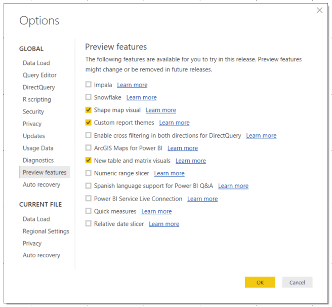
SPOILER ALERT! I have only enabled the preview features we will be discussing throughout the rest of this post.
Shape Map
The Shape Map visual is the oldest preview feature discussed in this post, but it’s still a good one. Unveiled almost a year ago in the June 2016 update, the Shape Map allows you to make regional comparisons on a static map. While the traditional Map and Filled Map visuals leverage Bing Maps for precise geocoding, the Shape Map is used for relative comparisons.
As an example, let’s suppose you work for a company that serves customers across all 50 states. You want the ability to plot your sales territories on a map, while also providing key sales metrics as tooltips. As shown below, the Shape Map provides a no-frills map for your regional comparisons, yet its simplicity perfectly satisfies the requirements that were given. While working with customers, we often find that many prefer these simpler mapping features for deliverables, such as executive-level dashboards and company infographics. In the example below, we used the USA: states map to plot our sales territories, but the Shape Map also natively supports maps for other countries, including Canada, Mexico, Australia, and France. For an in-depth reading on Shape Maps, check out this documentation on the Power BI website.
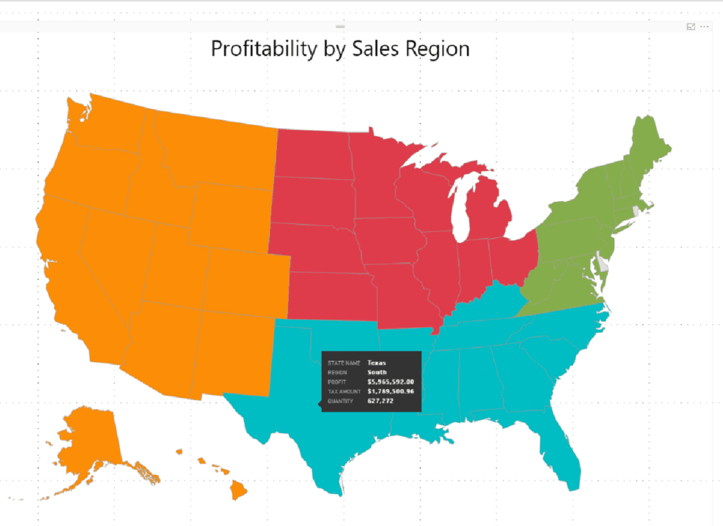
Shape Map example that shows a company’s four sales territories across the US. Tooltips were added to provide key sales metrics about each state when you hover over them.
Report Themes
In the March 2017 Power BI Desktop update, Microsoft released the long-awaited Custom Report Theme feature. Report themes allow you to apply a custom color theme to your entire report. Often, customers want the ability to apply a corporate color theme across their reports. Others want to apply different color themes by department. And some customers just want something different than the default theme Power BI provides. With the new Report Theme feature, we can import a custom color theme into our Power BI report with just a few clicks.
The first step, however, is to identify the colors we want to use and create a simple JSON file that will contain the metadata about the colors in our custom theme. If you’re thinking to yourself, “Great. I don’t know anything about JSON!” do not fret. The Power BI team has provided a sample template you can leverage, so all you have to do is copy and paste the color codes you want. The screenshot below shows a sample JSON report theme.
 Example of what your JSON report theme could look like.
Not feeling creative? No worries, the Power BI community has you covered with pre-built themes you can import into your reports. You can check out the gallery here. If you’re interested in creating your own theme for corporate branding purposes there are some useful sites on the web to help you get started. Color Combos provides an easy-to-use Grab Colors tool that lets you type in the website of your choice. The tool will then read the website’s HTML and CSS files and return all the HEX color codes that it finds. You can then pick and choose which colors you want to use in your custom report theme JSON file. At BlueGranite, we have personally used this tool to help us create a corporate report theme for a customer that was very well received.
Once you have your JSON file with your desired color HEX codes, you can then import the theme into Power BI Desktop. On the Home tab of the Desktop ribbon, you will find the Switch Theme button (again, the custom report theme feature must be enabled to see this button). Once you click on the button you can choose to import your desired JSON file or revert to the default Power BI theme.

The screenshot below shows a sample Sales report I created using colors found on BlueGranite’s website! For an in-depth reading on custom report themes, check out this documentation on Power BI’s website.
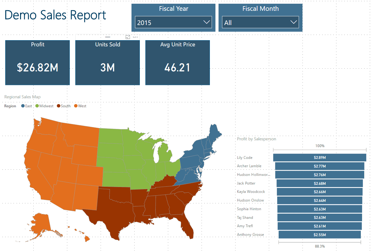
Sample report showing colors from a custom report theme that was imported into Power BI Desktop.
New Table & Matrix Visuals
Additionally, in the March 2017 Power BI Desktop update, the Power BI team gave the Matrix visual a long-awaited facelift. They then carried over this update to the Table visual in the May 2017 update. Rather than updating the existing visuals themselves, new Matrix and Table preview visuals were added to the Visualizations pane for test-driving the new functionality.
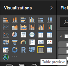 Table preview visual, with the Matrix preview visual beside it. The original Table and Matrix visuals are still available as well.
Some of the new features added to these visuals include the much-needed cross-filtering/highlighting functionality, as well as word wrapping, and a stepped layout for drilling down hierarchies.
Table or Matrix cross-filtering/highlighting works just like it does on other visualizations. You can click on an item within your table or matrix and use the Edit Interactions functionality to dictate how it will filter or highlight other visualizations. Building off of our previous example, I added the new Matrix preview visual to my report. I then selected “Texas” within the matrix to cross-filter and cross-highlight the other visualizations within the report.
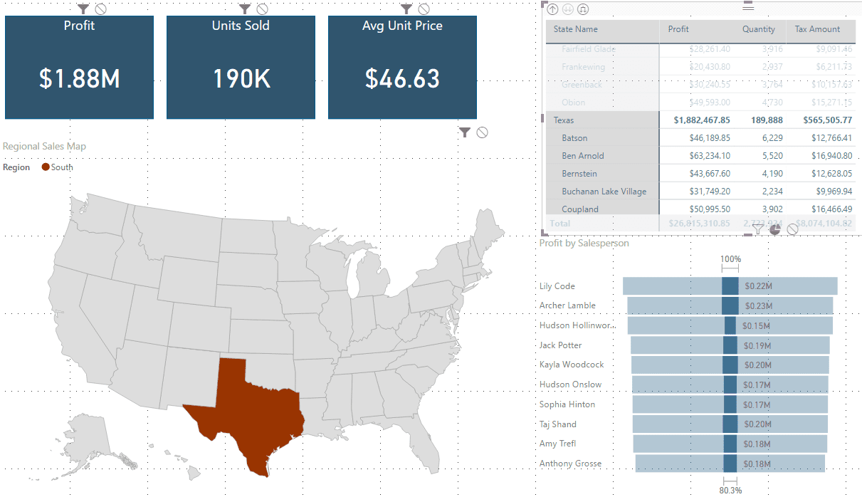
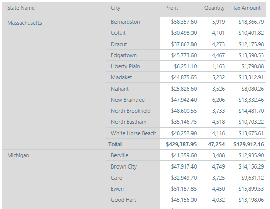
If you look closely at the Matrix visual, you’ll also see the new stepped functionality at work. Notice the city names slightly indented beneath each state. This helps both for readability, and to conserve some real estate on your report.
 |
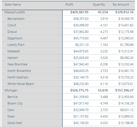 |
| Matrix with stepped layout disabled | Same matrix with stepped layout enabled |
Hopefully you enjoy these preview features as much as I do. Microsoft follows a monthly release cycle for Power BI Desktop, so be sure to keep an eye on their site to learn about the latest features released each month.
Honorable Mentions
Discussing every Power BI Desktop feature currently in preview is outside the scope of this post, but here are additional blog posts that cover several more features we couldn’t cover today:
- 5 New Power BI Features that will Accelerate Self-Service BI Adoption
- 3 Helpful Power BI Features You Might Not be Using
If you have any questions or want to know more about how your organization can utilize Power BI, contact us!


