When Gartner released its Business Intelligence and Analytics Magic Quadrant earlier this year, Microsoft again landed at the top of its class for the Ability to Execute and Completeness of Vision. A big contributing factor for Microsoft’s continued ascension in the BI and analytics space is the evolution of Power BI. In this post, we will review three Power BI features that aren’t highly advertised, but could prove especially useful as you plan and prepare for a Power BI implementation at your organization.

On-Premises Gateway: Map User Names
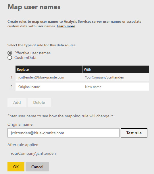
If you’re already acquainted with the Power BI Service, then you probably already know about the On-Premises Gateway, which allows Power BI to issue live queries or scheduled refreshes against a high-performance, on-premises database such as SQL Server Analysis Services. However, did you know that when connecting to your SSAS data models, you can also define user name mappings between the Power BI Service and SSAS? This can be a useful feature if your Power BI Service login name differs from your local Active Directory User Principal Name (UPN).
We have often used this feature with clients when developing Power BI Proof-of-Concepts (POC). Often, clients in the exploratory phase of purchasing Power BI want to determine how the Power BI Service will interact with their existing SSAS data models. To demonstrate this functionality, a client first installs the On-Premises Gateway on their internal server. Next, we use our BlueGranite Power BI Service account to add the newly installed gateway. Finally, we use the Map user names feature to map BlueGranite email addresses to local Active Directory accounts that were created by the customer.
By creating these mappings within the Power BI Service, we are now able to issue live queries from Power BI reports against the client’s local SSAS data models. This allows us to demonstrate all the cool features of Power BI Service using a client’s own data! The screenshot below shows this simple example in action. Additionally, check out this useful Power BI documentation on working with on-premises SSAS models.
Using an Image as a Filter – Chiclet Slicers
A well-known feature of Power BI (and even Excel Pivot Tables) is the concept of slicers. Slicers are visual filters that allow the end user to easily select and change data filters on the fly. For example, a Power BI report page may have a simple year slicer that allows the user to toggle what year’s data they want to view. Traditional slicers are limited to text-based values, but what if the need arises to create a slicer based on an image or logo? This is where Chiclet Slicers come into play! The Chiclet Slicer is a custom visual add-in to Power BI that was developed by Microsoft. The Chiclet Slicer behaves like a traditional slicer, but it allows you to leverage images that serve as filters on the report canvas.
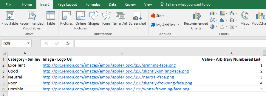
To illustrate an example, let’s say we have recently implemented a customer satisfaction survey for our ecommerce business. Our customer satisfaction survey has a simple scoring scale (1-5) with an appropriate smiley face emoticon that represents how satisfied they were with our service. To view our data, we want the ability to easily toggle between the survey scores by simply clicking the appropriate smiley emoticon for each score. We can easily create this functionality by leveraging the Chiclet Slicer. To use a Chiclet Slicer, we will need three things: A category, a value, and an image.
NOTE: Ordinarily, you would want to maintain this data in the data model in accordance to your enterprise standards, but for the sake of a simple example, below are the steps we took to create a Chiclet Slicer.
We first created a simple Excel worksheet with three columns, one for each component of the Chiclet Slicer. You’ll notice we used actual URLs for the images as Power BI naturally works well with hyperlinks. We already have a customer survey results table whose records reference our scoring scale. We imported the worksheet below into our Power BI Desktop workbook.
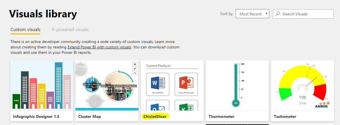
Next, we downloaded the Chiclet Slicer custom visual from the Power BI Visuals Library page.
We then imported the newly downloaded Chiclet Slicer visual in to Power BI Desktop.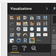
Lastly, we added the Chiclet Slicer visual to the report canvas and configured the components.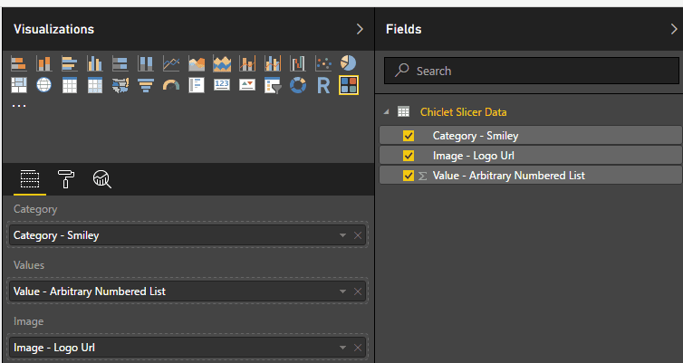
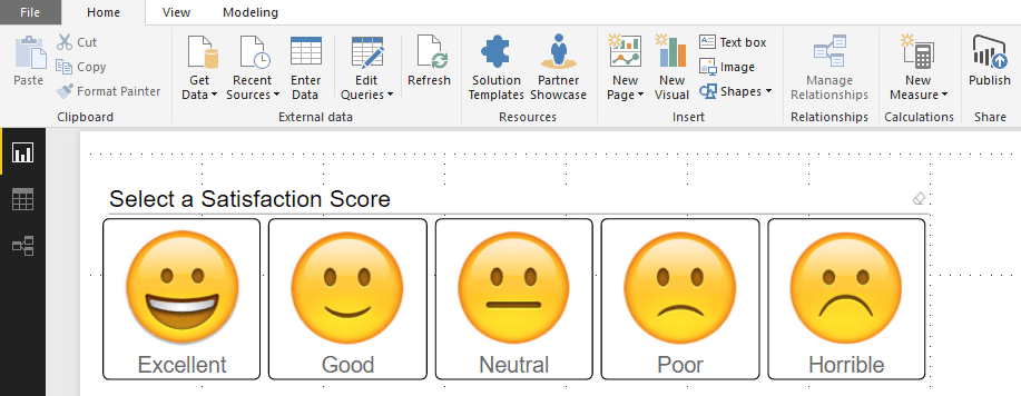
Below is the final output of our customer satisfaction emoticon slicer!
Dashboard Tiles – Custom Links
The last feature of this post will walk through how we can add custom hyperlinks to tiles on a Power BI dashboard. If you are familiar with Power BI Dashboards, then you have probably realized that the default “click” action on a dashboard tile is to drill through back to the original report from which the tile came. However, when designing your dashboards, you can also set your own custom links for individual tiles.
A great use case for this feature is to create a custom link to execute a Reporting Services (SSRS) report that will provide the details behind the value(s) in a tile. This will allow your dashboards to continue to provide an aggregated view of your data, but still provide the flexibility to allow users to drill through to the details for further analysis. Let’s look at an example.
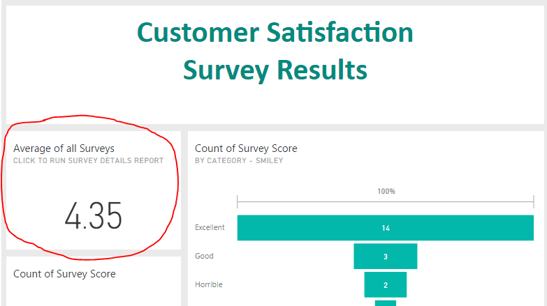
Continuing with the Customer Satisfaction Survey theme, we created a simple Power BI dashboard that uses a card visualization to prominently display the average customer survey score for all customers in the current year.
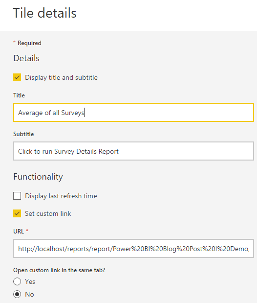
We wanted to create a custom drill-through action by having the tile execute a detailed SSRS report whenever the tile was clicked on.
Simply follow these steps to set the custom link on the tile:
- Hover your mouse over the tile and click on the ellipsis that appears in the upper right-hand corner
- Next, click on the pencil icon that says “Tile Details”
- Once on the Tile Details screen, you can check the check-box that says “Set custom link”
- This can be found under “Functionality” as shown in the screenshot below
- Specify the URL you want the tile to open when a user clicks on it
- Specify whether you want the custom link to open in the current browser tab or to open a new tab
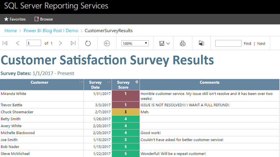
We created a detailed SSRS report that provides a complete listing of all customer survey results for the current year. By adding interactive sorting to the Survey Score column, we can quickly leverage this report to identify poor survey scores and figure out how to best improve the situation for our customers.
If you have questions about Power BI or want to know more about how we might be able to help, please feel free to reach out to us!