Data visualization is a science. Those of us who are enthusiasts can appreciate the power of this science. We know to place charts, titles, labels, etc. in their proper place and we know it’s not just to make things pretty, as there’s a lot more to it! Every element placed on the dashboard should help support the information that needs to be surfaced, but sometimes you might use eye candy to help reel in the audience or connect the them to the data. Eye candy are visual elements that look slick but can be difficult to interpret or just don’t add much insight. When used sparingly, and depending on the context, eye candy can add a nice touch to a dashboard.
 Some visualizations can benefit from eye candy when a little fun is allowed (usually not financial reports). From time to time, we may encounter a business dashboard loaded with eye candy (pie charts, word clouds, unnecessary images) and the person who created it was probably proud of it. These dashboards can be exhausting to use because of all the attention it demands, and the visual elements may distract from the significance of the data. The designer may be trying to showcase their visualization talents at the sacrifice of data insights or audience satisfaction. While eye candy charts can be fun to build, it should not be used as a main chart to showcase data. When used carefully, they can be very effective in drawing attention to a dashboard.
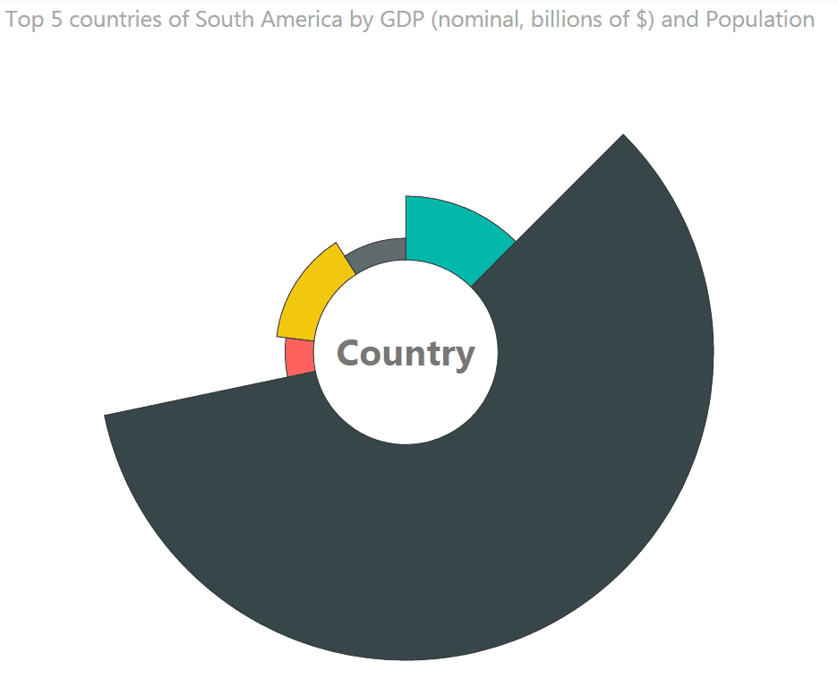
Below, you’ll find an Aster plot from the Power BI Gallery. The visual looks great, but users need to hover over the visual to gain information and it’s difficult to see the top 5 South American countries at a glance.

After downloading the workbook and creating a dashboard (shown below) with the same data, the Aster plot and map now draws attention to the dashboard. The Aster plot and map are both eye candy that serve different purposes. The map gives the audience a connection to the country and can help reinforce what this dashboard is about (South America). According to Joshua Sarinara, a neuroscientist at the Massachusetts Institute of Technology, “vision is the strongest and most influential in memory formation”. While most people probably have an idea on where South America is, having a map as eye candy helps them remember which country had the largest GDP and population even after they are no longer viewing the dashboard. This is the power of recognition and recall, when the brain is able to recognize a familiar topic and recall something about it.
The Aster plot chart is additional eye candy that brings an audience deeper into the dashboard by inviting them to interact with it. Here, text is used to tip the audience on how the chart functions. By adding effective visualizations around the original graphic, it is more clear on how the top 5 South American countries performed and the information is easier to consume. Brazil is clearly the leader without needing to click, and the data source is the same, but the data is now presented with more effective visualizations that give quick insights. Bar and column charts can be very easy to read, compared to Aster plots that may require more work to build and decrease readability.

Eye candy can be helpful in drawing attention to a dashboard, but should be used sparingly. Use eye candy to pull your audience to the location of most importance but be weary of detracting from the importance of the subject or purpose of the dashboard. In the eye candy example, the map and the Aster plot chart both had importance and contributed to the purpose in a different way. When eye candy has a purpose, it won’t be considered chart junk.


