The “World Energy Production Capacity” report explores the energy capacity of various nations and highlights a few components of Power BI along the way.
The Data
The data is regularly compiled by the World Resources Institute and consists of over 28,600 power plants and production facilities from 164 countries. It is important to note that the data relates to production capacity rather than actual production or energy usage within a country. What is capacity? It is the maximum amount of energy that could be produced by a power plant under optimal conditions. Not all facilities operate at 100% capacity, however, and countries trade energy for consumption. As a result, the Power BI report shows the production potential by various countries if all facilities were operating at their maximum capacity. A comparison of estimated generation vs capacity could be a future report, but attempting to delve too deeply into multiple topics from this dataset felt like it was diluting the story. This decision speaks to the difficult choices content authors face. Rather than put everything available from a dataset into the report for the user to explore, this report attempts to guide the audience with a narrower focus.
The Report
The report attempts to drive viewers toward a better understanding of each country’s capacity by energy source. It starts with raw numbers and then considers why raw numbers may not be the most appropriate measure to derive insights by country. It also moves from summary to detail by eventually allowing users to obtain plant-level data across the world.
First Page – Raw Production Capacity
The first page of this report provides a measure of energy capacity in megawatts. It introduces raw measurements of capacity in a series of faceted bar charts, or “small multiples“, by energy source. Small multiples aid in the ability to view each country’s values by source, but there is a key problem with displaying raw megawatts. China and the United States lead the world in capacity, but this is largely a reflection of population and industrialization factors. Color helps highlight China (orange) and the US (blue), while the rest of the world appears grey. This page helps showcase “how much of what”, but many potential insights are overshadowed by China and the United State’s large potential.
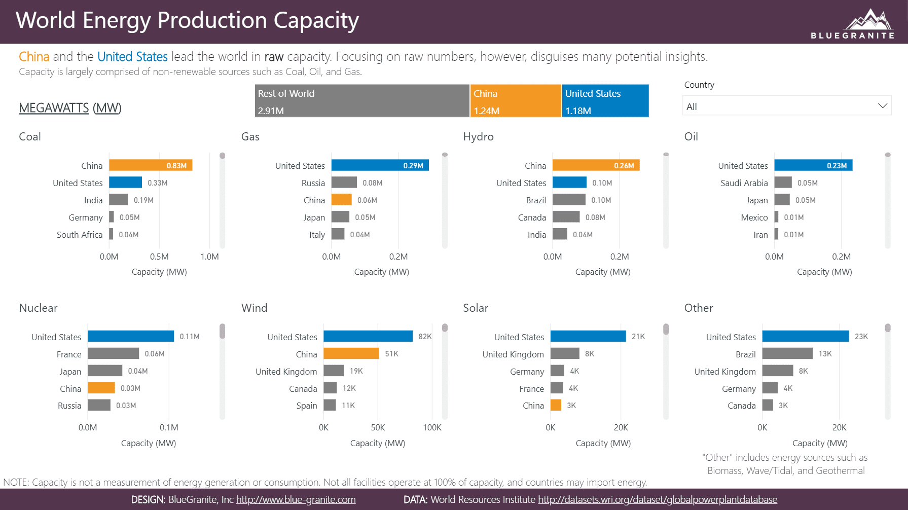
While viewing the page, users can easily identify the diverse mix of energy sources for both the United States and China immediately by looking at color and getting a sense of the magnitude if they consider the data labels. It takes some digging to understand what might be going on with other countries though. To help with that, the Country slicer at the top right allows viewers to easily filter down to an individual country’s capacity. Overall, however, this page does not easily show how certain energy sources may drive a country’s contribution.
Second Page – Percent Contribution
All is not lost! The second page contrasts the prior focus on raw numbers with a measure of each country’s share by energy source. By shifting the measure from raw megawatts to contribution percentage, this page helps showcase the imbalance of many country’s production capacities between sources.
While still retaining the orange and blue colors for China and the US respectively, viewers will immediately notice that neither country appears at the top of any particular multiple. Instead, users see how different countries may rely heavily on one particular source while other countries have a more balanced mix. If viewers want to easily see the production mix for either China or the United States though, they can click on the country in the bar chart at the top, and the small multiples will filter to show a single country. Additionally, users can still select from the Country slicer at the top right to get data for any country.
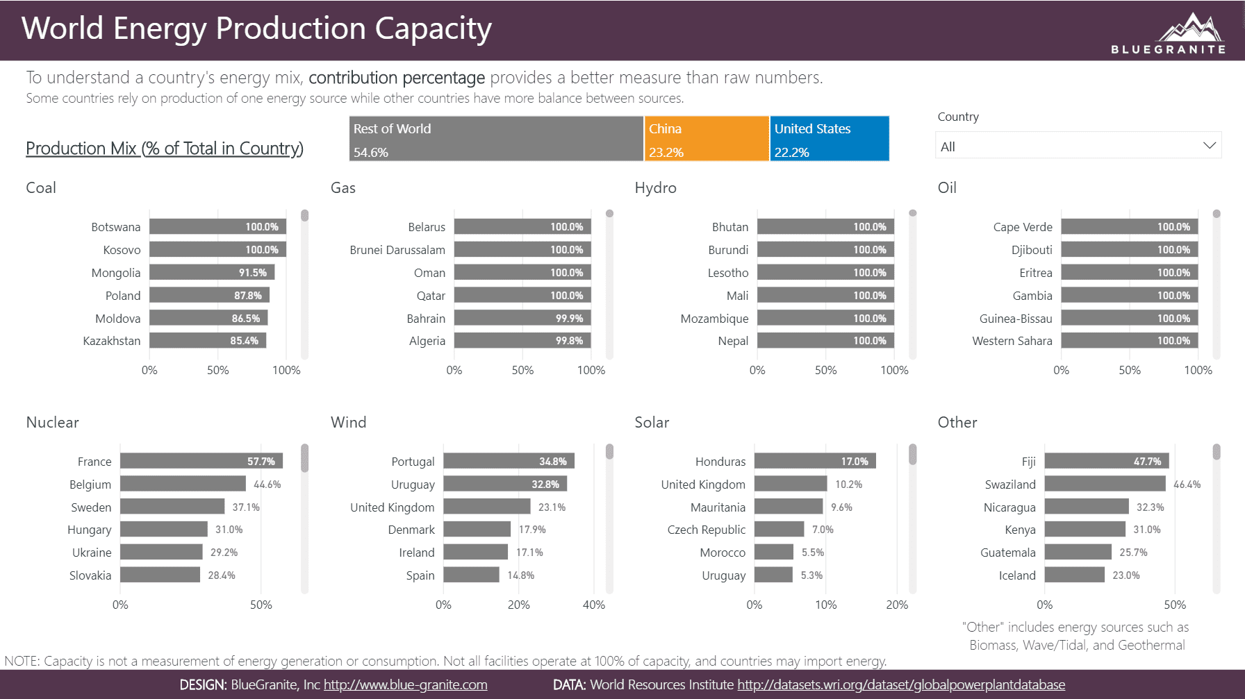
Another possible way to highlight what is going on in the rest of the world would have been to normalize the data by accounting for each country’s population. The production capacity per capita for each energy source would also help offset the heavy focus on China and the US based on the raw numbers, but that also leads to a slightly different story.
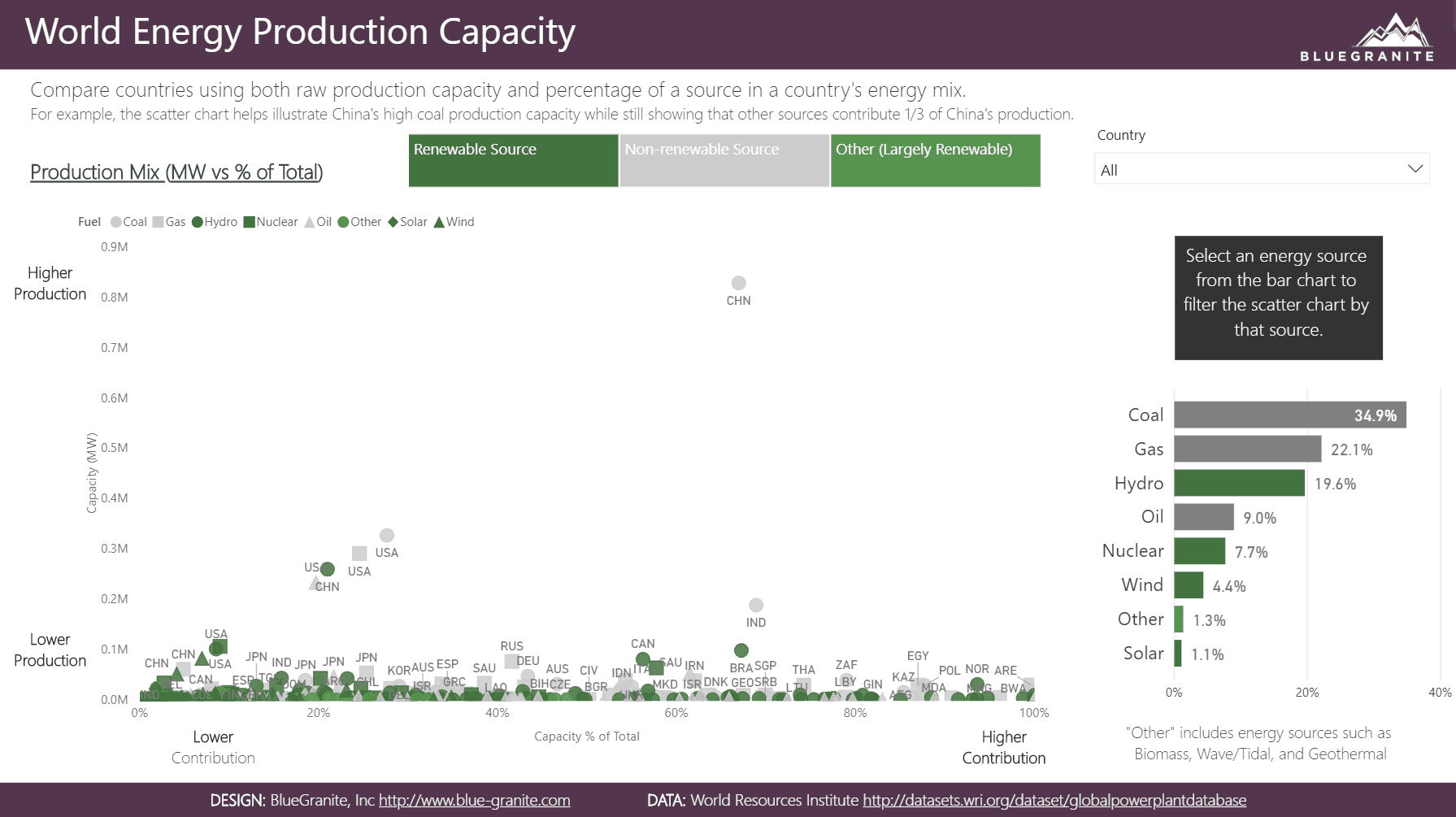
Third Page – Numbers vs Percentages
Building upon the idea of contribution percentage from the prior page, the third page helps balance the views based on raw megawatts with production mix by energy source. The colors change focus so that instead of highlighting countries, it now changes to focus on what sources are renewable (green) versus non-renewable (grey). This distinction is not part of the original dataset, so the categories for Renewable Source and Non-renewable Source were added using Power BI’s “Groups” functionality.
The introduction of the scatterplot helps provide answers for questions surrounding both “how much?” and “what type of mix?”. To quickly filter down to a single energy source, users can click on the bars in the charts at the top and to the right. Raw capacity appears on the Y Axis while contribution percent appears on the X Axis. This chart helps viewers see insights such as:
- While the United States has a high capacity for each non-renewable source, each source accounts for a small percentage of the US production mix.
- The United States leads the world in raw capacity for sources such as nuclear, wind, solar; but each source makes up a small percentage of the share of US energy. In contrast, France has both high capacity and a high share of nuclear energy.
- No country is exclusively reliant on non-renewable sources such as wind and solar, but many countries produce all energy with hydro power.
Many of these sample insights would have required additional thought when seeing the same data presented on separate pages with small multiples. To account for having both measures presented on the same page with one visual instead of eight, different shapes help users more easily distinguish between energy sources when looking at the scatterplot.
The bar chart on the right also helps show the overall production mix for all countries combined, something that was lost when the data was presented in small multiples. It is easy to see that the combination of coal and gas makes up more than half the world’s production capacity, hydro makes up a larger percentage than may have been expected, and wind makes up almost 5% of the world’s capacity at this point.
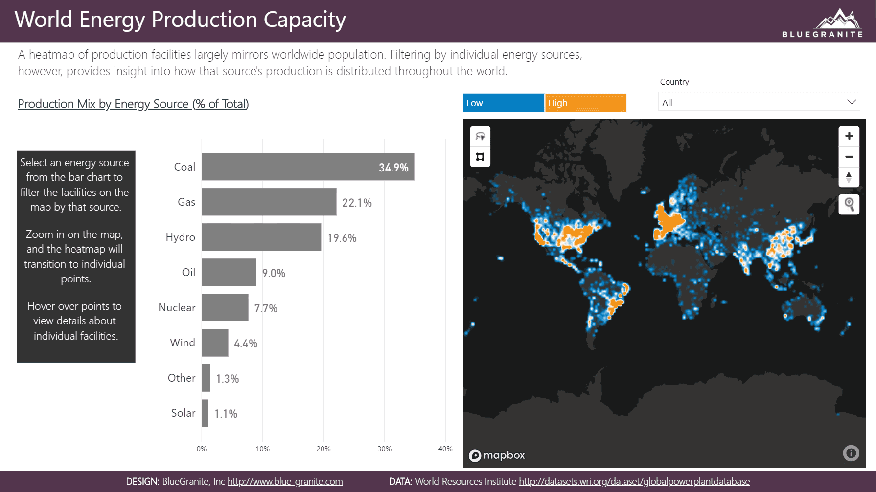
Final Page – Facilities
The final page reintroduces the bar chart by energy source from the third page and allows viewers to explore how each source is distributed throughout the world. To view this distribution, the report uses a heatmap that plots each facility’s latitude and longitude on Power BI’s Mapbox custom visual. What started as an aggregate view by country ends with plant-level detail. Areas of high density appear orange while areas of low density (and eventually individual facilities when zooming in) appear blue. The heatmap also visualizes the issue when overall distribution largely mirrors population. Clicking on individual bars on the bar chart, however, shows how energy is spread by source without as noticeable of a population factor.
To interact with the report in more detail, view the live version here!
Why Power BI?
Power BI is the leader in modern business intelligence with the most balanced capabilities between data preparation, data modelling, and visualization. It also integrates well with a variety of other Microsoft services and technology investments both in the cloud and on-premises. While this showcase report demonstrates the several ways to visualize data, there is a lot more to a successful analytics initiative than what appears on the surface.
If Power BI intrigues you, 3Cloud offers engagements for both deployment and training. In addition, we also have deep expertise in the Microsoft data platform overall. Whether you are interested in launching Power BI within your organization or incorporating it as part of a larger solution, please contact 3Cloud today.