This post will walk through the first report in 3Cloud’s Power BI showcase – a series designed to highlight key capabilities and tools within the Power BI platform using real and reproducible methods – and introduce the data and features used to create it.
The “Employee Retention – Organizational Flight Risk” report displays the results of a real-world, predictive analytics and machine learning scenario within a healthcare organization. Its intended use is for HR to explore flight risk data (high risk being most likely to leave the organization, and low risk being least likely) to uncover patterns at both a high level and a detailed, employee-population level. It tells the user who is leaving, from where, and why. This organization especially wanted to see how its leadership training program for supervisors affected employee retention. Keep in mind that this dataset is solely for demonstration purposes, relating only to this organization, and that all the data within it has been anonymized.
The Data
The model behind the data was built by taking several different internal and external datasets and running them through an Azure Machine Learning model created by one of our data scientists. This model was then used to predict the probability of an employee leaving, using the flight risk score assigned to an employee by the machine learning algorithm. If you’d like to learn more about the process of developing a predictive model for employee flight risk, check out this blog from our data scientist, Jacque Carlson.
The Report
Acquiring and modeling data is only the first step on the path to data discovery and actionable results. For a data model to be a success, end users need a way to examine and draw conclusions from it. This is where Power BI comes in. Power BI reports present data in a manner conducive to exploration and discovery. This report introduces users to the results of the model, leads them through a deeper analysis of it, and at the end of that process delivers actionable insights.
| Note: As you explore the report on your own, I recommend clicking the double arrow in the bottom right corner to view the report in full screen mode: | 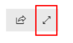 |
First Page – Dataset Overview
The first page of this report gives an overview of the data but doesn’t go too deep. This page is intended to answer the “who” and “where” questions surrounding flight risk.
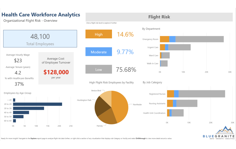
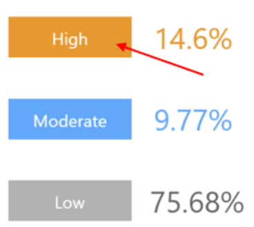
As users click around on the first page, they start to notice which jobs have the highest and lowest flight risk scores and how many employees are at risk of leaving. Data is broken down by flight risk level and employee population, and sliced by attributes such as age group, facility, and job category. Not only do the visualizations on this page interact by highlighting and cross filtering each other, but users can click the “High”, “Moderate”, or “Low” buttons under the flight risk header to reveal a configured view of the page for that risk level.
 |
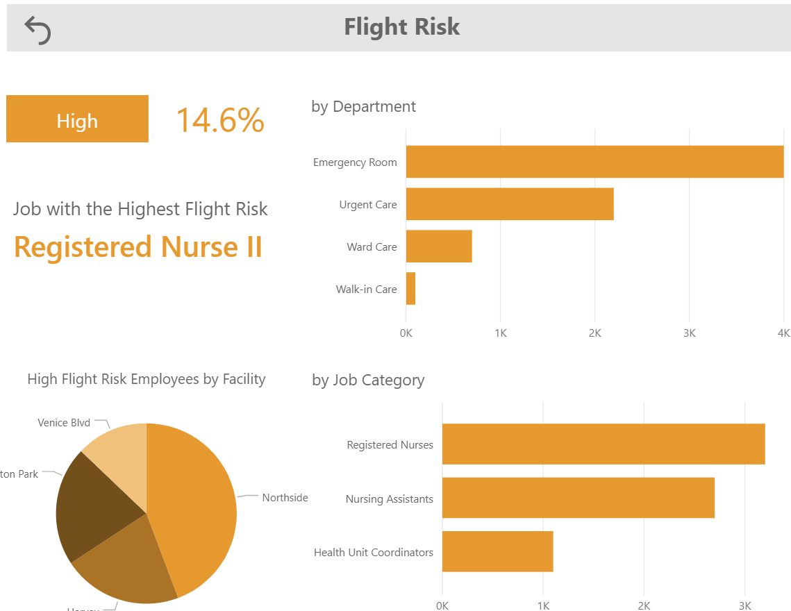 |
| Note: These detailed, risk-level views were created using bookmarks. To return to the original view, simply click the arrow that appears in the Flight Risk header bar. | |
After exploring the first report page, users have some insight as to which employee populations are most at risk of leaving, thus giving them some direction as they delve further into the dataset on the next page.
Second Page – Exploration
The second page of the report takes analysis a step further. Here, the user begins to understand not only the “who” and “where” of flight risk, but the “why”, as well.
Users can explore data either as a scatter chart or a table by utilizing the selections in the bottom right of the page. There are a multitude of slicers for users to pick from as they conduct analysis. At the top, users can make selections to filter down to different parts of the organization. From there, numeric slider bars along the top of the chart can be adjusted to see how factors like wage, patient to staff ratio, paid time off (PTO) used, and commute length affect flight risk.
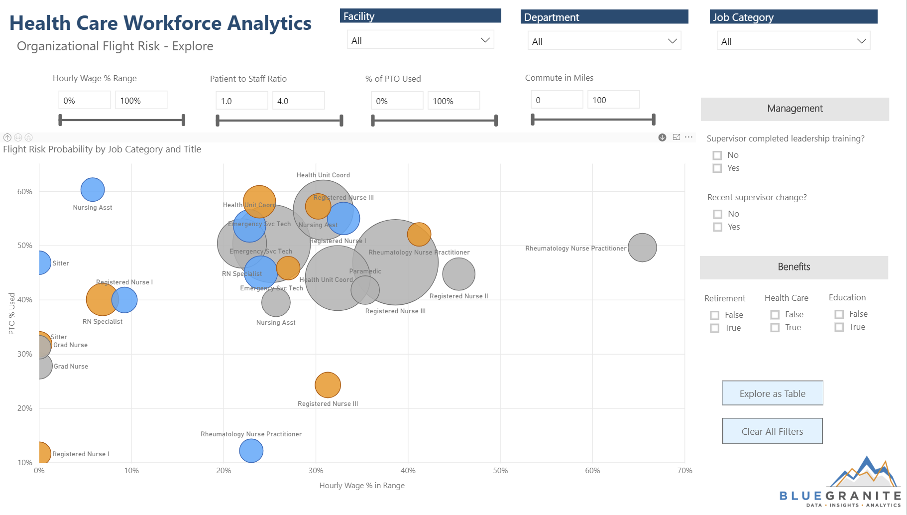
The scatter chart is great at showing relationships and potential correlation between multiple numeric values. Users can also click the arrows in the upper left corner of the chart to drill up and down between job and job category, and they can select the arrow in the upper right to enable drilling in on a job category bubble, down to its jobs.
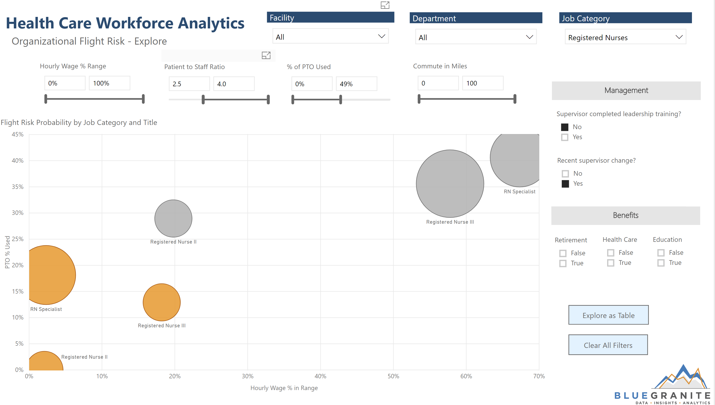
As users make selections with slicers, they begin to see patterns in the data, helping to identify which factors seem to most affect the probability of flight risk. Among nurses, for example, high flight risk numbers increase when “RN Specialist”, “Registered Nurse II”, and “Registered Nurse III” employees have a higher patient to staff ratio, have used less than half of their PTO, and have recently had a change in supervisor where leadership training was NOT completed:
With so many slicers to make selections from, it can be easy to lose track of what has been selected. To start fresh, users can click the “’Clear All Filters” button in the lower right corner of the page to clear all of their selections.
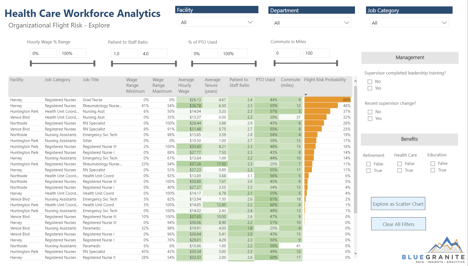
To view the data in a table rather than a scatter chart, users can click the “Explore as Table” button in the bottom right corner. Having a table view is great for users who want to do “show me the numbers”-type analysis. This table has been conditionally formatted to show correlation, too. Values for factors that are assumed to be generally positive, meaning one would expect them to result in a lower flight risk score, are colored in a deep shade of green. For example, cells indicating higher wages, longer tenure, lower patient to staff ratios, more PTO used, and shorter commutes are the deepest green. The table is also sorted so that the highest flight risk populations are at the top, letting users easily identify who is likely to leave, why, and from where.
This type of examination leads users to actionable insight, but analysis doesn’t have to stop here. In many cases, it’s worth delving into data at the employee level. This report is conducive to that kind of analysis, too.
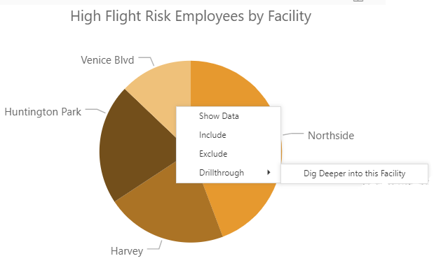
Drillthrough Pages
There are two drillthrough pages built in, where users can explore either a certain job category or facility more closely. To get to either of these pages, users must right-click on a visualization where either the facility or job category fields are used, select “Drillthrough” and then “Dig Deeper into this Facility” or “Dig Deeper into this Job Category”:
 |
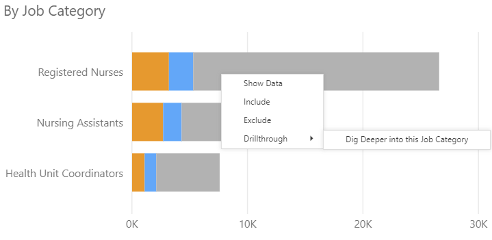 |
Both drillthrough pages are set up similarly, only the data behind them is different (to reflect either a facility or job category):
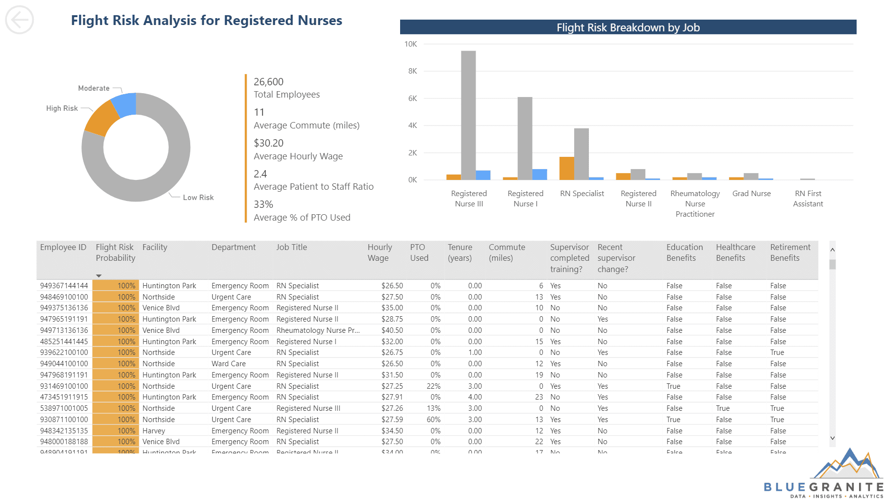
These pages still help to answer “who”, “where”, and “why”, and they also give detail down to the employee level. At this level, users can see which factors are affecting a specific employee. Drillthrough is a great way to give users access to a finer grain of detail, without sacrificing the high-level overview and analytic functionality on previous pages. On this page, DAX – or Data Analysis Expression language – was used to create a dynamic title that reflects the user’s drillthrough selection. This gives context to the page, so users always know what they’re looking at. Additionally, the drillthrough pages are hidden to ensure that users use the back button in its upper left-hand corner when navigating back to the original page (this clears the drillthrough value and resets the page). The donut chart on this page is intended to convey some information – the distribution of flight risk levels within this specific facility or job category – but it also allows the user to filter the rest of the page by risk level.
After exploring this report and all its pages and bookmarks, HR users within this organization will better understand flight risk and its causes. They should also have an idea of what actions they can take to retain employees and reduce high and moderate flight risk numbers at both the population and individual levels.
Why Power BI?
Data is best when shared. Even if a developer creates the most detailed, impressive predictive or analytical data model, if end users cannot view, interact with, and draw insight from that model, it fails to serve its purpose. Power BI facilitates sharing data with end users, with powerful visual representation and interaction, giving a data model the chance to accomplish what it was intended to do – share valuable insights with end users. Power BI has a multitude of features to create reports that lead end users through an immersive, app-like exploration of data, making it easy to delve into data, digest and understand it, and take data-driven action.
Want to check out the report for yourself? You can explore the live version here!
Whether you are interested in deploying Power BI interactive analytics within your organization, or you want to further explore its capabilities, please contact 3Cloud. We would be happy to share our knowledge and experience.