Bringing more AI to Power BI
The February 2019 release of Power BI Desktop unveiled a new, out-of-the-box visual to Power BI called Key Influencers. Key Influencers is Power BI’s first Artificial Intelligence (AI) powered visualization. Microsoft has long incorporated AI capabilities in Power BI through features such as Natural Language (Q&A) and Quick Insights. However, with Key Influencers report developers now have explicit control in leveraging AI to discover insights in their data. Even more, Key Influencers is essentially multiple visuals baked into one! Let’s take a deeper look at this new visualization in action.
Key Influencers Example
When learning new Power BI features, I find it helpful to start the learning process by playing with an example. So, feel free to download the report and play around to test drive the new Key Influencers visual yourself! After experimenting with the report, read on to learn more about specific features.
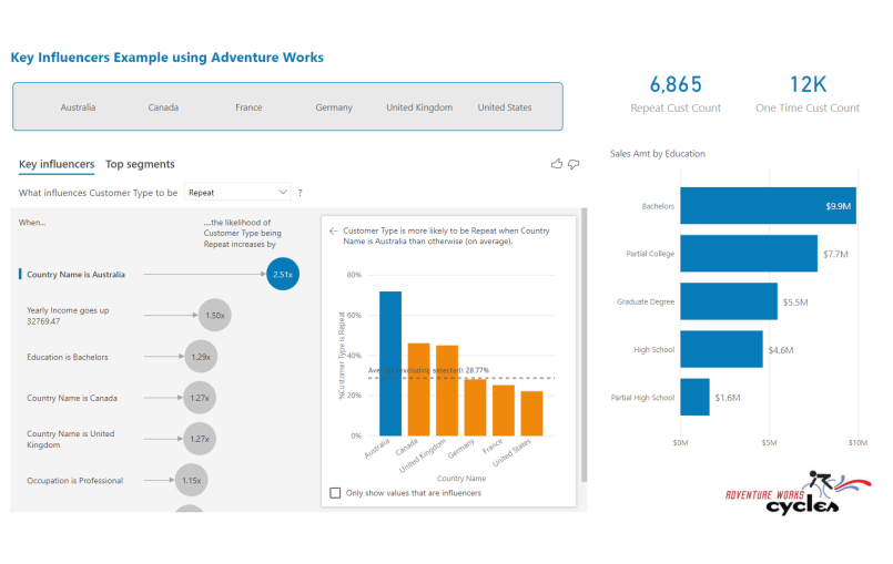
NOTE: The downloadable report and screenshots in this post leverage data from the AdventureWorks demo database. All data is fictitious and is merely used to illustrate the new Key Influencers visual. The sample report uses customer demographical attributes to explain a calculated column called Customer Type. Customer Type counts the number of purchases made by each customer and categorizes the results as either a repeat customer (i.e., multiple purchases found) or a one-time customer.
To follow along with this post, download the Power BI Report pictured above with this link.
Two for the Price of One!
The Key Influencers visual is comprised of two tabs: Key Influencers and Top Segments.

NOTE: The new visual itself is called Key Influencers. Also, within the visual, there is a tab with the same name.
The Key Influencers tab will display a ranked list of the individual contributing factors that drive the selected condition. The Top Segments tab will take this a step further and display groupings of key influencers and their impact on the selected condition.
Key Influencers Tab
The Key Influencers tab runs a logistic regression to analyze your data and identify the main factors that influence a specific metric or condition. For example, in the screenshot below, we are using the Key Influencers visual to identify the drivers behind both repeat customers and customers who have only made a single purchase, thus may have churned. Rather than spending minutes, hours, or even days building various visuals and reports to analyze our customer base, we can use Key Influencers to tell us what factors contribute most to each outcome in a matter of seconds.
 1 – Analyzing the key influencers that drive repeat customers.
Changing the value in the drop-down box will allow us to run a separate analysis against our subset of customers who only made a one-time purchase.
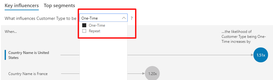 2 – Use the drop-down box to analyze a different condition or outcome.
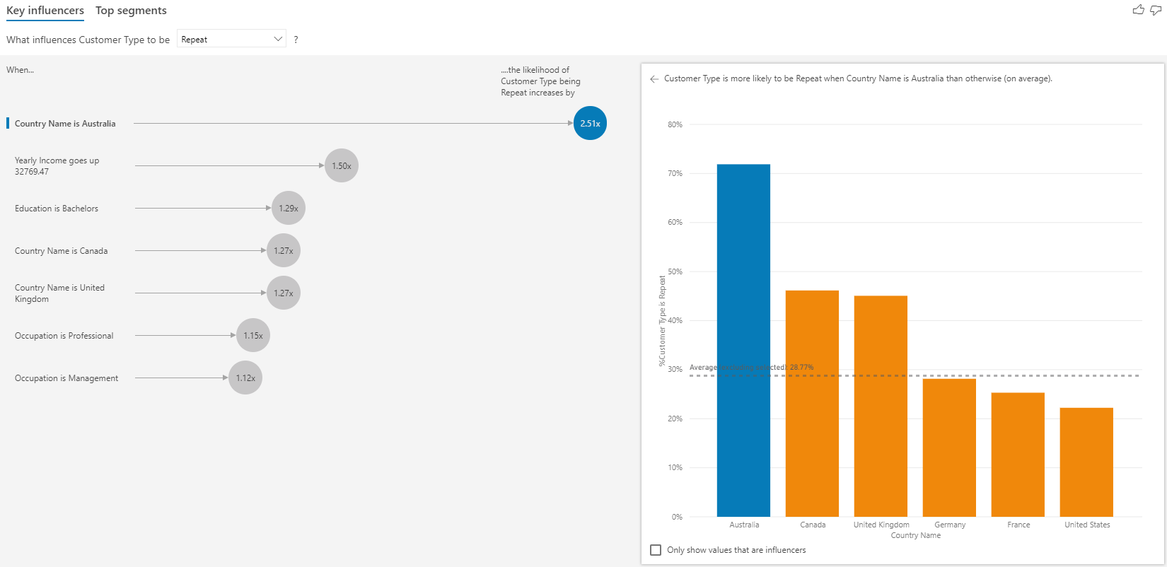
As previously stated, one of the things that makes Key Influencers a fun visualization is that it is essentially multiple visuals baked into one. Even the Key Influencers tab itself gives us two panes of visuals. For example, on the left-hand pane you have an infographic of the key influencers themselves, ranked based on their relative impact on the condition being analyzed (in our case, repeat customers).
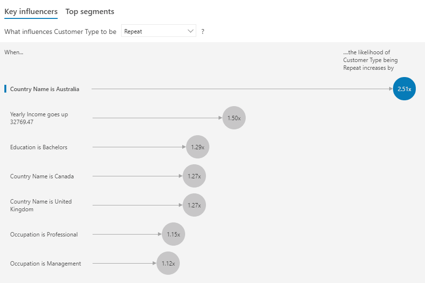 3 – Customer Country of Australia is the most important driver found in the dataset
towards determining repeat customers.
When a key influencer is selected in the left-hand pane, the right-hand pane will display a chart containing the values of that attribute, along with the average percentage that value matches the condition. For example, the screenshot below tells us that, on average, roughly 72% of Australian customers have made a repeat purchase. This can be contrasted against the other individual customer countries, including the average of all other countries, for which only 29% of customers have made a repeat purchase.
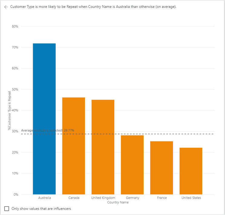 4 – Australian customers are repeat customers 72% of the time.
Clicking on a different Key Influencer will change the chart in the right-hand pane. Additionally, if your key influencer is a continuous attribute, then the chart will be displayed as a scatterplot, as shown below.
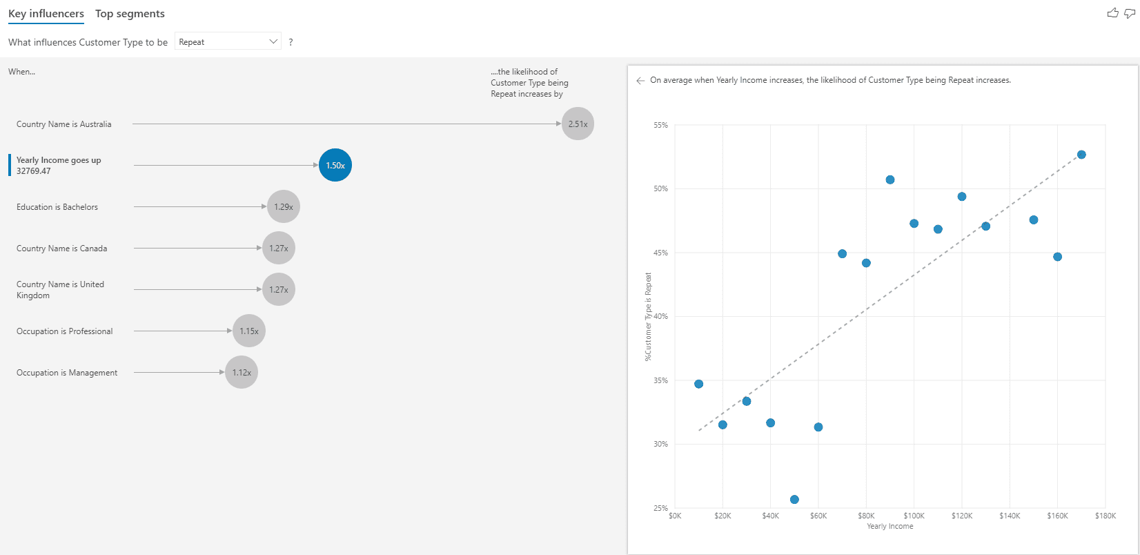 5 – As a customer’s annual income increases by $33k, they are 1.5x more likely to be a repeat customer.
Top Segments Tab
On the Top Segments tab, you will see how groupings of key influencers affect the selected condition. The segments are ranked based on the percentage of records where the condition is met. The size of each segment bubble represents how many records (population count) are in the segment.
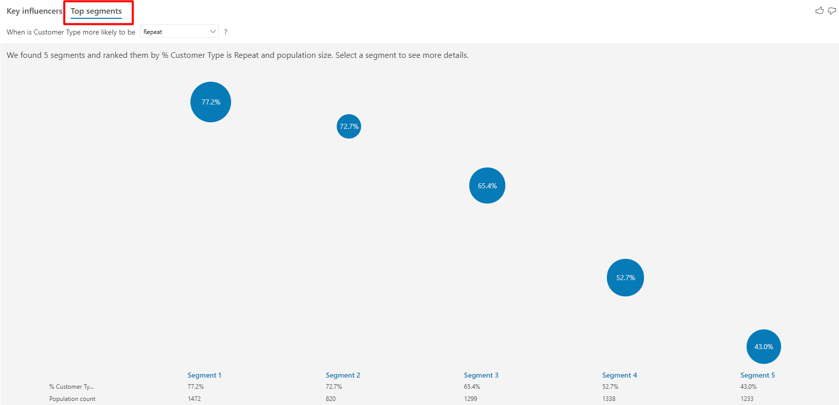 6 – The Top Segments tab found five segments, or groupings, of key influencers that drive
the outcome of repeat customer.
Like the Key Influencers tab, the Top Segments tab also gives us multiple visuals to play with. For example, you can click on a segment bubble to see which individual key influencers combine to make that segment. Looking at the screenshot below, we can see that Segment 1 is comprised of customers from Australia, that have no children at home, and have an income greater than $55k. When a customer meets those conditions, they are a repeat customer 77.2% of the time, compared to the average of 37.1%. The visual also tells us that this segment accounts for 8% of the dataset. In other words, 8% of our customers are Australian, with no children at home, who earn more than $55k annually.
Lastly, the Top Segments tab allows you to dive in even further by clicking on Learn more about this segment. When you click on that button you can play around with different scenarios to split your segment down even further by other key influencer fields.
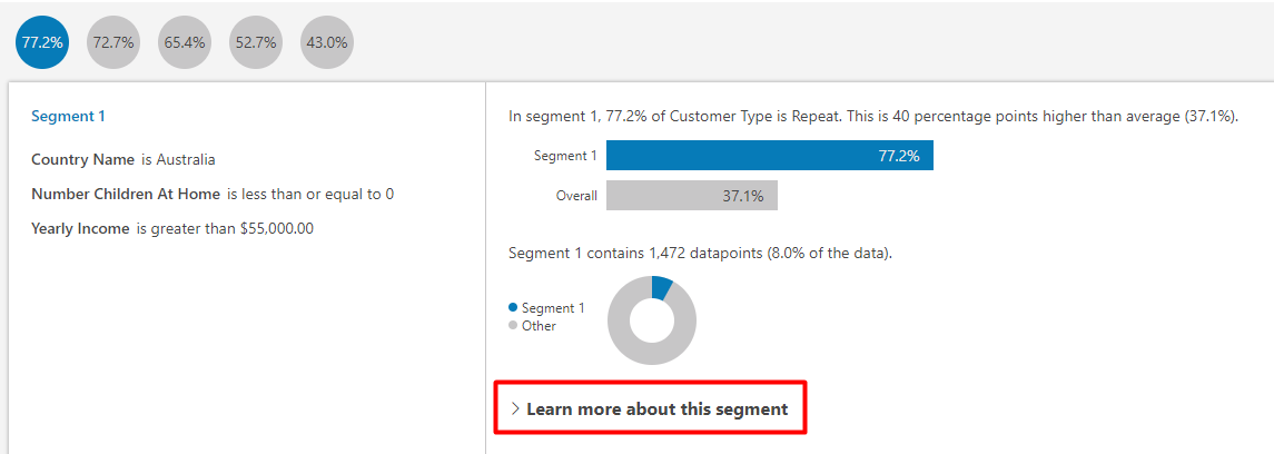 7 – Click on Learn more about this segment to play around with other scenarios
to identify additional patterns.
Interactivity
Key Influencers is fully interactive, meaning you can use filters, slicers, and selections on other visuals to affect the results. For example, we can select the United States in our country slicer to re-run the Key Influencer analysis for only U.S. customers.
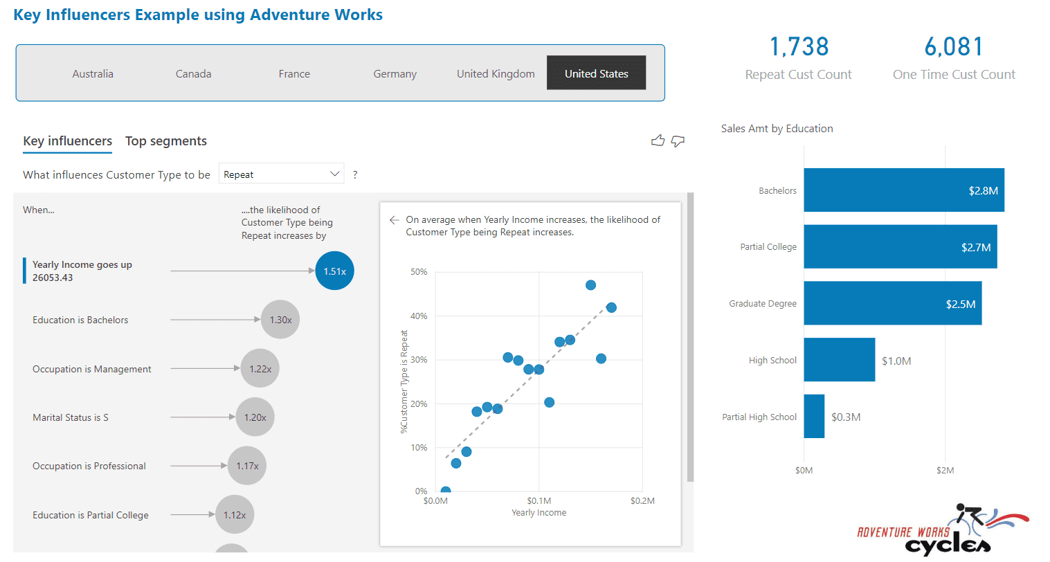 8 – United States is selected and now the Key Influencers results have been recalculated.
Next, we can select the Graduate Degree bar in our Sales Amt by Education bar chart to cross-filter as well. Notice how the key influencers have changed and now having a Professional occupation is the influencer with the largest impact.
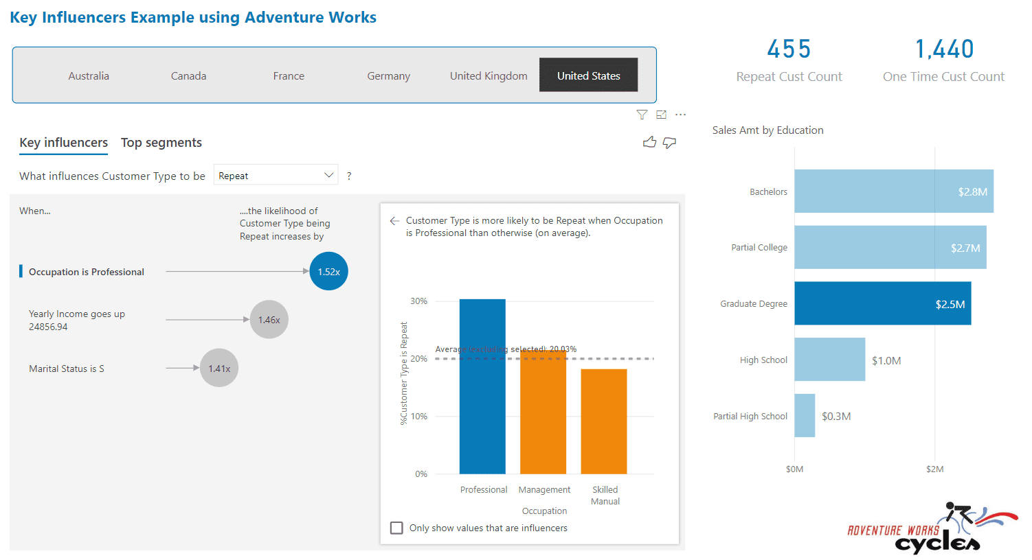 9 – Cross-filtering also affects Key Influencers. The results are now for Repeat Customers
from the United States who have a Graduate Degree.
Configuring the Visual
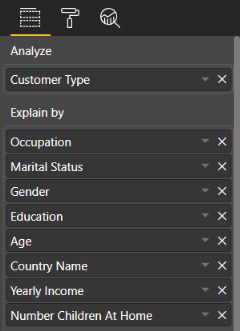
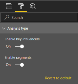
Setting up the Key Influencers visual is straightforward. There are two sections to drop fields in: Analyze and Explain By. Analyze is where you will drop your field that contains a condition or result you would like to explain. In our example, this is where the Customer Type field goes. The Explain By section is where you will drop your fields that you feel could influence the results of Customer Type. For example, I thought Yearly Income and Number of Children at Home both could influence whether a customer made repeat purchases. From a formatting standpoint, there’s not a whole lot to the visual, but you can disable the Key Influencers or Top Segments tabs.
 |
 |
| 10 – Configuring the Key Influencers visual. | 11 – You can enable or disable the Key Influencers or Top Segments tab from the formatting pane. |
Limitations
Since the Key Influencers visual is in public preview, there are several limitations to consider currently. The list below is from Microsoft’s own documentation, which can be found here.
The features below are currently unavailable:
- Analyzing metrics that are aggregates/measures
- Consuming the visual in Power BI Embedded
- Consuming the visual on Power BI mobile apps
- RLS support
- Direct Query support
- Live Connection support
- Publish to Web (thus the download link for the report)
The documentation highlights other issues you may encounter and how to troubleshoot them. Additionally, the documentation also explains the machine learning algorithms behind the visual, so check it out!
Final Thoughts
The limitations listed above will most likely keep the Key Influencers visual on the sidelines for many organizations for now. However, the initial preview of the visual is extremely promising. As evidenced by the 2019 Gartner Magic Quadrant for Analytics and BI platforms, Microsoft is a leader in both BI and AI technologies. Like Natural Language and Quick Insights before it, Key Influencers is the latest example of Power BI converging AI and BI capabilities.