Dashboards can be used to communicate a dense collection of information efficiently on a single canvas. Your audience has a limited amount of time to monitor key metrics to get a quick status and identify anything that needs attention. The attention span of the average human has gone from about 12 seconds in 2000 (when mobile phones became mainstream) to about 8 seconds today – a second less than a goldfish – according to a 2015 study.
Following data visualization design principles is key to making your dashboard easily consumable. A poorly designed dashboard can make your eyes jump all over the screen. While it won’t give you much insight, it may cause a headache. In the Western world, we read from top left to right, then zig-zag down left and scroll right again (in a Z-pattern). Understanding where the audience’s eyes will start and travel next allows you to guide them through your dashboard.

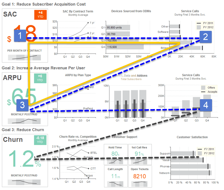
The purpose of the dashboard above is to monitor a wireless communications company’s top operations goals. Another approach to dashboard layouts is to use quadrants of importance. This corresponds well to the Z-pattern.
Quadrant 1 (Q1): This is where to place the most important information – that which requires immediate attention. Reducing Subscriber Acquisition Cost (SAC) is the highest priority for the company, so the critical information related to its current SAC is placed where the eyes automatically look first.
Quadrant 2 (Q2): Q2 is an extension of Q1 but with data from a different level of detail or different category. This is usually something that needs to be compared to or evaluated with Q1 or that supports Q1. In the above dashboard, every chart in the top row gives more detail about the cost of a new customer (lowering in importance as we move right).
Quadrant 3 (Q3): Q3 contains less important information that is still related to Q1 to achieve the overall purpose of the dashboard. This dashboard shows how Average Revenue Per User (ARPU) is performing in Q3, and the charts that follow the Z-pattern to the right support the visual to the left.
Quadrant 4 (Q4): This is the quadrant where you include visuals that have value (otherwise they wouldn’t appear in your dashboard) but are less emphasized. In this case, we have included charts that display the underlying measures that affect ARPU.
There is also a dashboard layout concept called the golden triangle, which indicates where the most important items of the Z-pattern should be placed. The golden triangle is the Q1-Q3 (top-left) corner. It is where the eye focuses the most and where your audience’s attention needs to be.
Positioning a number or a chart in Q1 that should be in Q4 disrupts the flow of the dashboard. It’s like reading the ending of a book first. Place visuals in supporting order so that each visual makes sense and guides the user on a journey to insights.
Please contact us if you’d like to set up a call to talk about design best practices.


