I’ve gotten quite a few questions over the past few months about the new Power BI Key Influencers visualization. While many of my colleagues and clients really love the concept and the visualization, others are struggling to understand what exactly it is and how it works. I’ve done some research over the past few weeks on the underpinnings of the Key Influencers viz and have come up with some interesting results.

The example that follows resulted from my work helping an education client analyze student data. In their case, they wondered what effects certain variables had on their senior cohort’s Admissions Index – a measure used within higher education to help qualify prospective students. After computing a few descriptive statistics for the cohort, we began throwing variables into the Key Influencers visualization to see what kind of answers we could come up with. The client was amazed by the visualization and the fact that they now had AI at their fingertips. And then we got the inevitable question: “What do these numbers mean?”
The visualization itself has two tabs: Key Influencers and Top Segments. These two tabs operate by way of different models. Key Influencers uses regression models, while Top Segments uses Decision Trees. To make things just a little more complex, Key Influencers also uses two types of regression, depending on the situation; Linear Regression for continuous variables, and Logistic Regression for categorical variables.
Models Used in Key Influencers Visual in Power BI
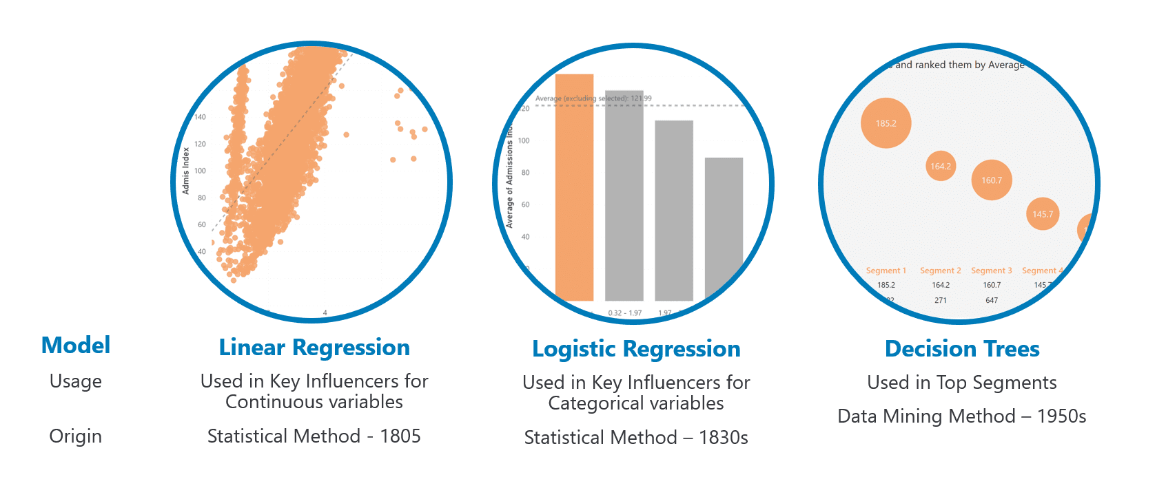
Today we’ll be sticking strictly with the Linear Regression model as our example, as it’s the most straightforward to understand. (For more info on Linear Regression, see my post on Simple Linear Regression in Power BI.)
In a nutshell, Linear Regression works by plotting two variables – x and y, or input and output, or independent and dependent – against each other, then calculating a trend line that is the best fit for the model. Without getting into the math, the typical method is to use Ordinary Least Squares, which attempts to find the trend line with the least amount of total distance, or error, between the line and the actual data points. The output of the model is the linear equation.

The one thing that we need to take away from this equation is b. This number is the coefficient of the input. This number describes the relationship between the input and output: b is equal to the amount that y increases for every 1 increase in x. If you recall from your early math days, this is the Rise over Run.
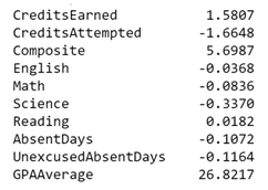
In the example we’re using, plotting GPA Average against the Admissions Index results in a coefficient of 26.8217. So, for every 1 point increase in GPA we’ll see a 27 point increase in the index.
Now that we understand how to get our coefficient, let’s make it a little more complex and add in multiple inputs like we see in our Key Influencers visualization.

Mathematics aside, we now have multiple coefficients for our multiple inputs.
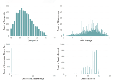
There’s one problem with this. The scale of these inputs can be (and usually are) completely different. Below I’ve plotted four of our dimensions as histograms to demonstrate. (More on histograms and how to make them in Power BI). Notice how each histogram has its own scale on the x axis. It wouldn’t make sense to compare the coefficients from these inputs when one ranges from 0 to 5, while another ranges from 0 to 20, and yet another from 15 to 40.
To get around this issue, the Key Influencers visualization normalizes the dimensions using their Standard Deviations. In our example, the standard deviation of Composite ACT scores is 4.56 and the standard deviation of GPA Average is .91.
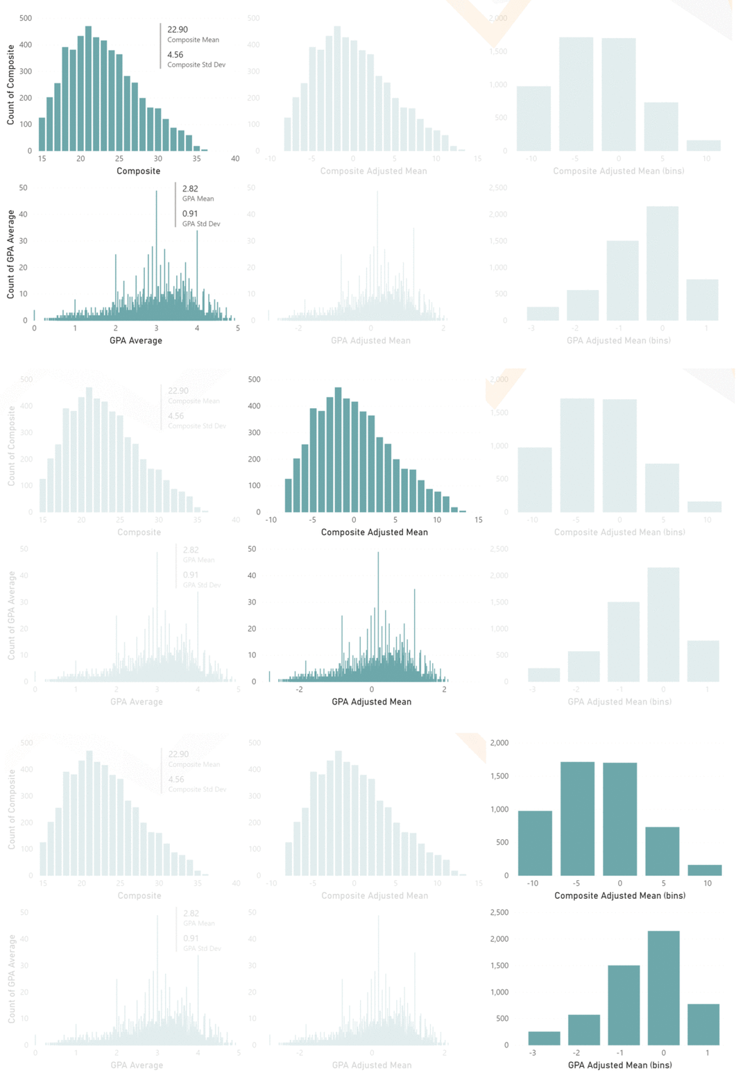
Using these numbers, in combination with their respective coefficients, allows Key Influencers to report the output variable on the same scale, so we are now comparing identical values in our visualization. And we can see from our example below that, according to our model, Unexcused Absences have the greatest impact on a student’s Admissions Index, followed by GPA and Credits Earned, then by Composite ACT scores.
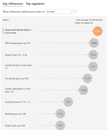
One last thing to note: this visualization uses a proprietary version of the Linear Regression algorithm called Fast Linear. You will not be able to get an exact match between Key Influencers and a standard Linear Regression model using Excel, Python, or R. The coefficients adjusted for standard deviation should follow a similar pattern to the visualization, though.
As we’ve demonstrated, at its core, Key Influencers is a visualization of multiple linear regression. Visualizing this type of model has historically been impossible; statisticians skip the visual and report only the model output. This, in my opinion, is the most impressive attempt at visualizing these types of models that I’ve seen to date. It does take a little work to interpret, but the resulting usefulness is limitless, given proper usage.
In our example today we’ve seen how we can get insight into what drives student success in education by using Multiple Linear Regression via the Key Influencers AI visualization. This simple example can help educators understand the influences behind learning metrics and home in on students that may be having issues and get them on the correct path to a good education.
To reiterate my comments in my previous post, Linear Regression has an endless number of uses. It can offer insights into our budget trends. We can analyze the effect of marketing on sales and profits. Or it can clue a company in to how raising prices may affect a consumer’s buying habits. Insurance companies can also use this technique to assess risk between customer demographics and insurance claims.
Next time we’ll discuss some of the pitfalls of Linear Regression, and by extension Key Influencers, and explore solutions to avoid them. Explore more of 3Cloud’s Machine Learning & AI experience here to learn how we can help your organization maximize Power BI’s expansive capabilities.

