Power BI has long had the ability to apply conditional formatting to values in table columns. However, many felt that the functionality for managing the colors and parameters used in Power BI Desktop was too limited and didn’t provide the level of granular control desired by many users. In a recent update to Power BI Desktop, Microsoft has addressed this limitation and introduced the ability to use DAX measures to control the conditional formatting of table columns. As we’ll see in this blog post, by creating a simple measure using the SWITCH function, users can take granular control of conditional formatting and apply it to values in columns.
Conditional Formatting using Power BI formatting pane
If you have a table of data and would like to apply conditional formatting to a numeric column, you can choose between three different formatting options. First, make sure the visualization is actively selected in Power BI Desktop. When you have a visualization selected that supports conditional formatting the option will be available to you in the formatting pane:
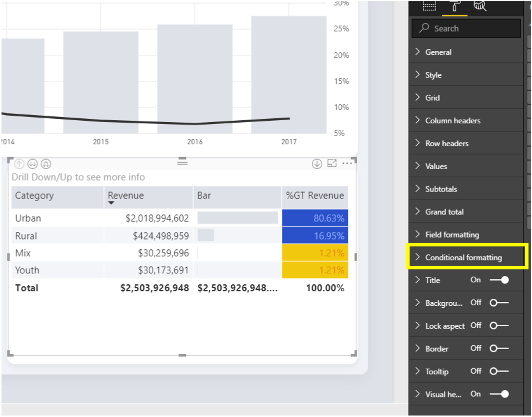
Expanding the Conditional formatting option will show the list of numeric columns that can have conditional formatting applied. After selecting one of the columns, the user can then choose from applying conditional formatting to the Background color, Font color, or adding Data bars:
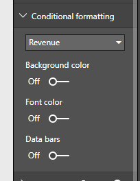
Clicking on the slider for any one or more of the Conditional formatting options will apply it to the visualization. Let’s apply Font color Conditional formatting to the Revenue column.
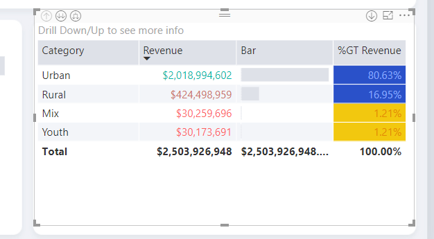
Power BI will automatically apply color formatting to the value, and the range of colors will be automatically calculated based on the range of values in the column. If we click on the Advanced controls link for the Font color option, it shows the default (Color scale) which generates a color for each cell based on the color scale generated from the lowest and highest values in the column.
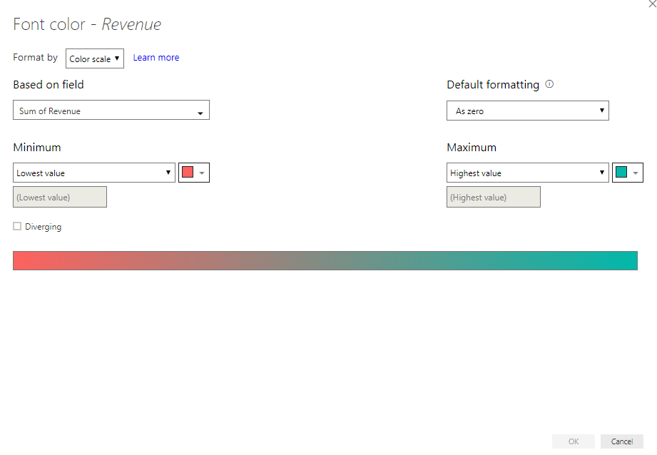
There are a lot of options in the Color scale formatting that can be modified by the report creator. The colors selected for minimum and maximum values can be changed to generate a different color scale, and the values used to generate the scale can be changed to eliminate outliers or to adjust for scale.
The second advanced option for conditional formatting is to use Rules instead of the Color scale to determine the formatting:
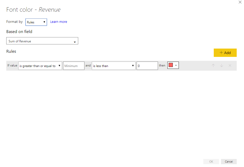
This option uses standard If/Then conditional rules to specify what color should be applied to a cell when the rule applies to the value. Users can add additional rules to create complicated conditional formatting scenarios and assign specific colors for values that meet the criteria for each rule.
One of the drawbacks of using either the Color scale format or Rules format is that any changes made in the advanced editor are specific to that visualization. If the same data is used in a different visualization, none of the conditional formatting rules will apply. This can possibly lead to confusion if different rules are being used on the same data in different parts of the report or if other reports are being built from the same dataset. It can also take a lot of additional effort to ensure that the metrics and conditional colors remain consistent across all visualizations.
The recent update to the advanced options for conditional formatting now allows users to format by field value. This option allows the report developer to use a calculated measure that defines the thresholds for a value and the color that should be displayed when those thresholds are reached. As an example, to define the thresholds and assign a color value for sales revenue, we create a calculated measure with a simple DAX expression:
Revenue KPI Color = SWITCH(
     TRUE()

     ,SUM('Sales'[Revenue]) < 50000000, "#f44242"

     ,SUM('Sales'[Revenue]) < 1000000000, "#f4f142"

     ,SUM('Sales'[Revenue]) > 1000000000, "#5ff442",

     "#f44242"

)
This measure will apply a condition to each value in the column and then apply the appropriate color. To use this in a visualization, change the Format by option to Field value in the advanced controls, then select the new measure as the source for the formatting. Once applied, the visualization changes to show the color values as defined by the measure:
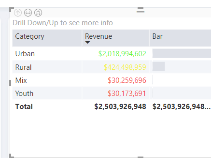
While this example is using summed values as thresholds, we could easily use percentage of total, YoY differential, or any other value as the field to generate the color. And since the colors and thresholds are defined as part of a DAX calculation, the measure can be reused in other areas of the report or in other reports based on the same data model without having to recreate the conditional formatting rules every time, saving effort and ensuring consistency.
For more Power BI tips and tricks, subscribe to BlueGranite’s Business Insights blog. We also offer comprehensive on-site Power BI training. Our 3-day course teaches organizations to create and share spectacular business visuals on the web and across mobile platforms.