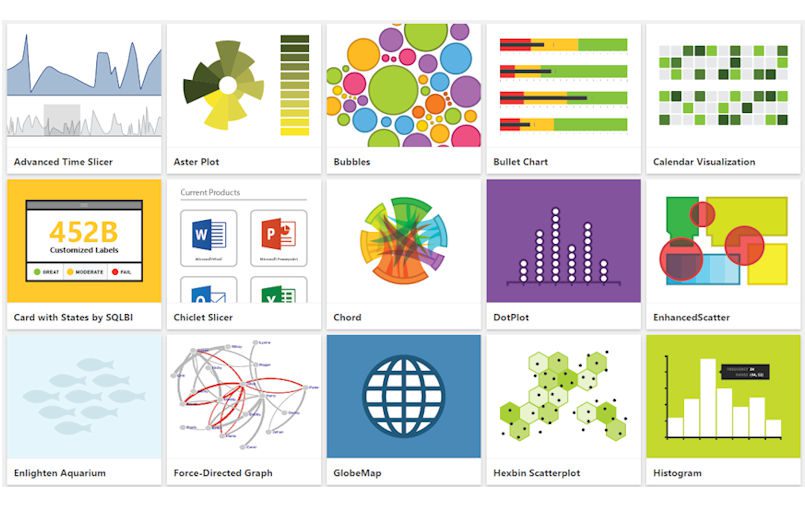
With the announcement of the Custom Visual Gallery and packaged visualizations for Power BI, Microsoft has made a great leap in the evolution of analytics software. As a result, the balance in business intelligence and analytics may shift away from innovating around a common set of vendor-supplied visuals to creating a more flexible user experience. Rather than focus on limitations, customers can now focus on possibilities.

While still an early response to the news, here are four ways custom visuals may have a much broader impact:
Separates Power BI from the Competition
Power BI now allows developers to create visualizations and display data in a way that is not currently available in other BI software. For many web developers, it can be done with their existing skills and with minimal effort. While it is too early to gauge its reception, perhaps built-in custom visuals may start a trend among competitors.
It should be noted that other mainstream BI vendors have attempted to highlight integration with D3.js or other JavaScript libraries, but this typically involves embedding or framing standard BI content in a separate website. Customization is then employed on top of the core visual. In contrast, with Power BI, D3 is at the heart of the visual and not layered on top of it. Whether deployed in Power BI Desktop or in the PowerBI.com Service, it becomes much easier for users and developers to take advantage of the new capabilities.
Empowers Users Through the Gallery
Users are already comfortable with the gallery/store/extension format. It has become a proven way to deliver extended functionality for Windows and other operating systems, browsers, MS Office, and many other platforms. While not an innovative concept in and of itself, the Gallery solves the issue of how to provide additional visualizations in Power BI without having to worry about bloat in the core product. Microsoft provides a set of key visualizations, and users and organizations are empowered to choose complementary ones based on their own unique needs. For some, that may mean trying everything in the Gallery, and for others, nothing. Proprietary visuals can also be packaged as a “pbiviz” file and distributed privately outside of the Gallery. Overall, it puts greater control in the hands of users.
Energizes the Power BI Development Community
Any software derives benefit from its champions and a community of enthusiastic users and supporters behind it. With the release of custom visualizations and their promotion through the Best Visual Contest, the Power BI team extended the audience. While business intelligence products are typically the domain of data analysts, BI developers, and business users; web developers can now be considered part of the fold. Custom visuals allows developers an opportunity to showcase and share their talent in a very visible manner, and everyone benefits as a result. Additionally, it is a big step forward for users who may have highly unique requirements that could not otherwise be met with the standard charts.
Microsoft also minimizes its own risk by shifting visualization effort to independent developers. When it comes to how to best display data, it seems that everyone has an opinion. The recent Best Visual Content saw everything from a spartan and austere bullet chart to colorful fish swimming around (cue the jokes about data lakes). Is Power BI a business-centered product that should only offer core visualizations that align with expert opinions and research? Should Power BI go to the other extreme and offer more capabilities for data art and unlimited creativity? To a large extent, it no longer matters from a product perspective. The Power BI team can focus on continued product improvement in other areas and let the democratic nature of the Gallery sort out winners and losers for visuals. Popular or functional visuals will earn prominence in the Gallery, and unpopular ones will gradually fade into obscurity.
Reflects Favorably on Cortana Analytics
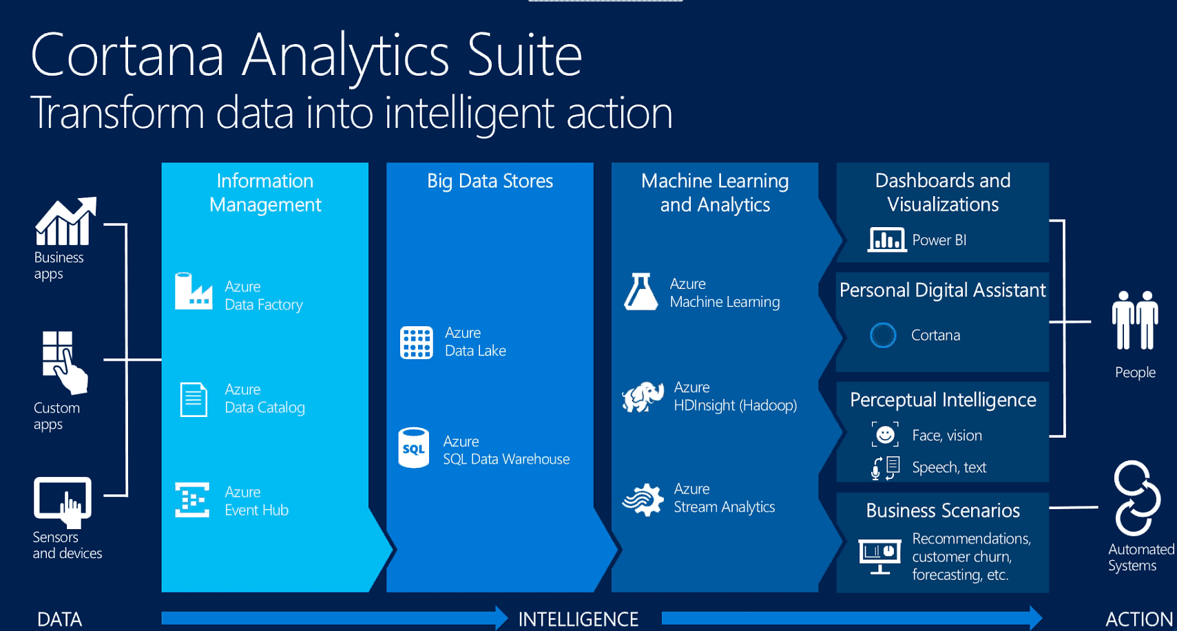
Finally, looking at the larger picture, Power BI is only one piece of a much broader ecosystem. Bringing the ability to easily create and share new visualizations into Power BI is a success for the Cortana Analytics Suite as well. For anyone not familiar with Cortana Analytics, it is Microsoft’s advanced analytics offering that bundles several Azure data and analytics services together—hardly “self-service BI”. Without minimizing all of the great capabilities of the other products in the suite though, Power BI will be the primary way that the majority of business users will interact with Cortana Analytics. For organizations employing Cortana, any strength or weakness in Power BI will reflect on Cortana as a whole. We are witnessing a strength here.

In conclusion, bringing the new visual capabilities and Gallery to Power BI adds critical value. For anyone who has tracked the rapid changes to Power BI throughout 2015, the team has not failed to deliver, but there are still gaps. As the “face of Cortana”, there should be pressure on the Power BI team to deliver enterprise-level software that can meet the needs of any organization. The new custom visuals in Power BI represent a move toward the greater level of control over user experience that many organizations desire. All in all, the ability to create and share independently developed visuals is a welcome innovation not only for Power BI, but hopefully for analytics software in general. It’s great to see Microsoft leading the way here.
Is your organization deploying Microsoft Power BI?
BlueGranite offers hands-on, instructor-led training at your facility to help both business and IT teams adopt Microsoft Power BI for self-service business intelligence and analytics. Up to ten attendees will receive expert-led guidance through a complete set of hands-on labs and training modules. After the training, attendees will be able to acquire data, build data models, and create visualizations quickly and easily with Microsoft Power BI. Click here to learn more.


