| First, a Little Bragging
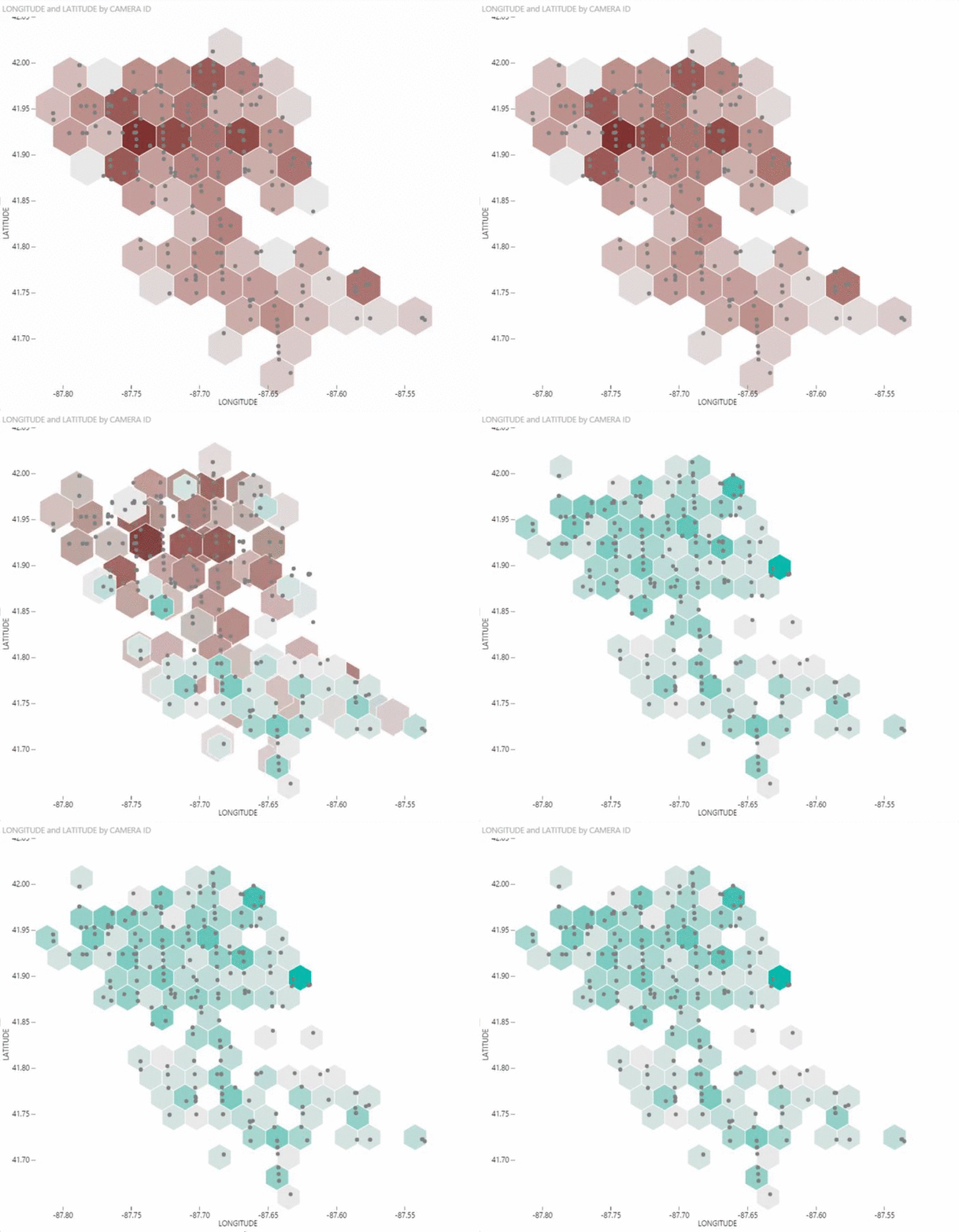
In July, Microsoft announced that Power BI would be open source and developers would have the ability to add custom visuals to the product. To promote this, Microsoft recently held the first Power BI Best Visual Contest. Lots of great entries were submitted but today we are thrilled to announce that 3Cloud’s own David Eldersveld won third prize for his Hexbin Scatter Plot! |
 |
Check out the video of David’s entry below. I love this entry because it takes a commonly used type of chart that can be difficult to interpret and gives it a new layer of meaning by visually grouping related data points. Our heartfelt thanks and congratulations go out to David for his great work!
Why I think this is important
The trend for the past several years has been for customers to want to leverage out-of-the-box capabilities of their BI tool to support reporting and analysis. Tools that allowed for a high-degree of customization were often seen as too complex for the average business user. Unfortunately, the result of this restriction often meant that the results didn’t exactly meet the customer’s expectations. Either we could make it look exactly like they wanted at the expense of interactivity or we could make the result interactive but couldn’t give them the look and feel they wanted. What’s more, ISV’s can’t keep up with the demand for new visuals and capabilities in their products.
Visuals in Power BI are built on the very popular D3.js library. What this means is that you can leverage the power of D3 to embed new and highly customized visualzations directly in to their Power BI solutions without having to code complex web applications. They become drag-n-drop objects just like all the other built in options.
The ability to extend the capabilities of the product with an easily accessible, open source interface opens up tons of possibilities. When faced with a challenging need, advanced users (or their development teams) can now build exactly the right visual for their needs, practitioners can build portfolios of their own work to differentiate them from their peers and a widely accessible, open source community that leverages a well known and powerful platform means that support and examples are only a search and a click away.
I can’t tell you how excited I am by this capability in Power BI. I think it gives Microsoft a differentiator in the visualization market that their competitors are going to need to respond to. I can’t wait to see more and more great work from David and all of the others who are blazing this trail.
How to get started
Read about Power BI Custom visuals on PowerBI.com


