Whether you work in bioinformatics, computational biology, genomics, proteomics, or pharmacology, your data needs often differ vastly from a traditional business user. The file types and volume of data with which you are interacting are typically unique to these industries. The common thread among them is the importance of visualizing the data. With Microsoft Power BI and its ability to integrate with R, you can easily see your data as well as the results of your analyses. Here, we will look at a few examples of visualizing data from bioinformatics-related areas using only R and Power BI.

As you may know, in bioinformatics, we encounter many odd file types. Often, these files can’t be opened in a tabular viewer such as Excel or put into a traditional database table because their structure just doesn’t fit. However, using R, we can use parsers to analyze and display our data. We can even blend this data with traditional data sources to enhance filtering capabilities and more.
Survival Analysis
In our first example, we will implement a survival analysis of tumor DNA profiles. Common industries and uses for survival analyses include:
- Pharmaceutical – Understand the length of time a drug compound stays in a patient’s system.
- Clinical – Track how long individuals live with a certain disease.
- Population Genetics – Gain insight into gene fixation or understand the duration of a trait in a population.
In the image below, you can see a sample Power BI dashboard that shows the tongue sample data from the KMsurv package in R. This data tracks the deaths of individuals with two different tumor DNA profiles over time. To understand the differences in death rates between groups, a survival plot is the obvious choice. Power BI does not have an innate survival plot built in, but using ggplot2 within R can yield nice, custom graphics.
 In this image, you can see the two charts on the left that were generated by the survival and ggplot2 packages. The table and filters on the right are generated by the included functions in Power BI.
The code below is used in the R script editor after adding an R script visual to the Power BI dashboard.
| 1) Survival Analysis Chart | 2) Cumulative Hazard Chart | 3) ggsurv Function for Graphing Survival Analyses |
|
library(survival) #[Insert ggserv function here] surv.fit2 <- survfit( Surv(time, delta) ~ type) |
library(survival) #[Insert ggserv function here] haz <- Surv(time[type==1], delta[type==1]) x <- c(haz.fit$time, 250) ggplot(cum.haz, aes(time, cumulative.hazard)) + geom_step() + theme_bw() + |
ggsurv <- function(s, CI = ‘def’, plot.cens = T, surv.col = ‘gg.def’,
cens.col = ‘red’, lty.est = 1, lty.ci = 2, cens.shape = 3, back.white = F, xlab = ‘Time’, ylab = ‘Survival’, main = ”){ library(ggplot2) ggsurv.s <- function(s, CI = ‘def’, plot.cens = T, surv.col = ‘gg.def’, dat <- data.frame(time = c(0, s$time), col <- ifelse(surv.col == ‘gg.def’, ‘black’, surv.col) pl <- ggplot(dat, aes(x = time, y = surv)) + pl <- if(CI == T | CI == ‘def’) { pl <- if(plot.cens == T & length(dat.cens) > 0){ pl <- if(back.white == T) {pl + theme_bw() ggsurv.m <- function(s, CI = ‘def’, plot.cens = T, surv.col = ‘gg.def’, groups <- factor(unlist(strsplit(names for(i in 1:strata){ dat <- do.call(rbind, gr.df) pl <- ggplot(dat, aes(x = time, y = surv, group = group)) + col <- if(length(surv.col == 1)){ pl <- if(surv.col[1] != ‘gg.def’){ line <- if(length(lty.est) == 1){ pl <- pl + line pl <- if(CI == T) { pl <- if(plot.cens == T & length(dat.cens) > 0){ pl <- if(back.white == T) {pl + theme_bw() |
Power BI connects to the .csv output of the tongue sample dataset. By using this data for the table, multi-row card, and filters, as well as the R visualizations, everything on the dashboard can interact, blending both Power BI graphics as well as R-generated charts.
Protein Structure Analysis
If you’re familiar with protein structure prediction, functional prediction, or proteomics in the slightest, you’ve most likely heard of the Protein Data Bank. When a protein’s structure is determined experimentally, it’s structure is uploaded to the Data Bank as a .pdb file. However, .pdb files are an odd format in that, while they are text-based, they are not tabular and can’t be transformed into a database table.
In this example, we demonstrate how a custom R script can fetch .pdb files from the Protein Data Bank, visualize the B-factors (temperature values) of the residues, and also query BLAST to find possible matches (similar sequences) for your protein of choice.
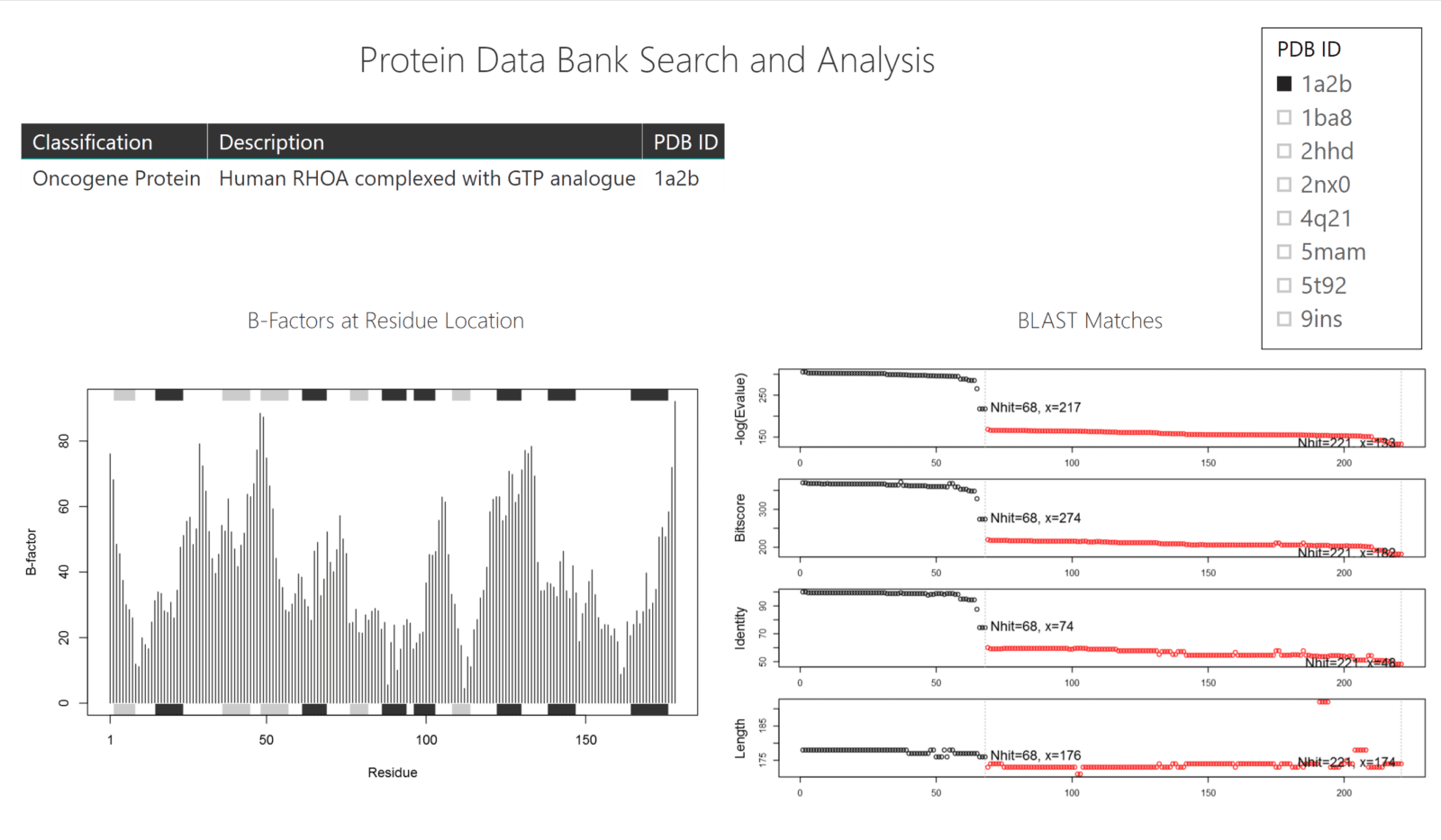 The data that feeds the charts comes from the web (Protein Data Base and BLAST) whereas the table in the dashboard is loaded via a .csv file of PDB IDs, Protein Classifications, and Descriptions.
The code below is used in the R script editor after adding an R script visual to the Power BI dashboard.
| 1) B-factor Chart | 2) BLAST Matches Chart |
|
library(bio3d) # Simple B-factor plot |
library(bio3d)
selection <- paste0(dataset[1,]) pdb <- read.pdb(selection) aa <- pdbseq(pdb) blast <- blast.pdb(aa) top.hits <- plot(blast) top.hits |
Both scripts use the bio3d package to connect to both the Protein Data Bank and NCBI BLAST sites. Both get their query protein ID by the table that has been passed through via the filter in Power BI.
Gene Expression
The UCSC Genome Browser houses sequence/annotation data as well as gene expression data. While these files are often text-based, they are often quite large and hard to interpret at face-value. Visualization of gene expression data as a heatmap is a common way to understand the data. By visualizing the data in this manner, you can understand the expression values as they relate to the individual tissue samples.
Power BI does not have heatmaps as a built-in visualization, but you can generate the graph by using ggplot2.
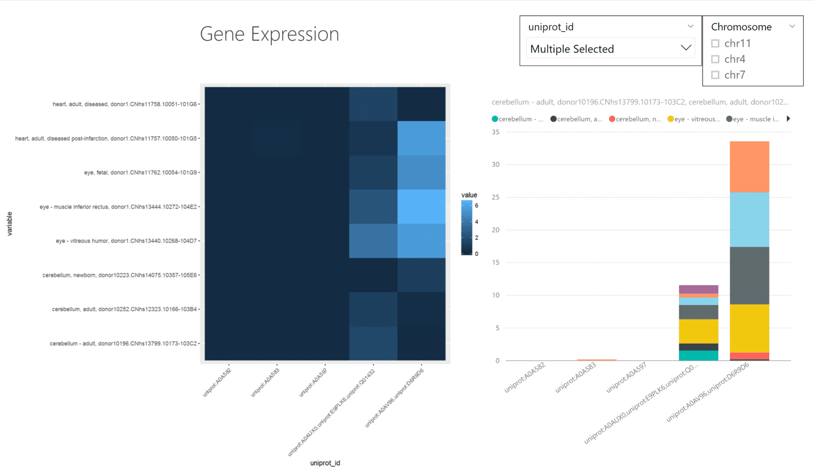
The code below is used in the R script editor after adding an R script visual to the Power BI dashboard.
| 1) Gene Expression Heatmap |
|
library(tidyverse) data_clean <- dataset %>% #Heatmap Plot |
The data is loaded into Power BI from a .tsv file. In Power BI, we prefilter the tissue samples that display to keep the visualizations simple and readable. Plus, adding in the uniprot_id and chromosome variables as a filter will allow users to select the proteins or chromosomes of their choosing. These filters also work with the R-generated heatmap as well.
Conclusion
With the above three examples, I hope to have demonstrated the flexibility and enhanced functionality that becomes available by using R within Power BI. From displaying survival plots to retrieving protein structure files from the web to blending data and filtering functionality with gene expression data, Power BI can display many of the various types of data that you may encounter in bioinformatics.
Custom visualizations are very simple to generate. As long as you have the package installed in R, most static visualization functions work seamlessly in Power BI. So, the next time you need to analyze and visualize your scientific data, look to Power BI to make it easy! If you have any questions or want to know more, contact us!