Your company rolled out self-service Power BI – how exciting! As a new user, you’re set up to start developing reports and sharing them with colleagues. You’ve probably gone through some basic training, so you know how to connect to data and create visualizations, but if you’ve seen or used reports before, you know that some are better than others. What can you do to take reports and visualizations from “just adequate” to “truly great”? How can you better engage your audience and convey the most important information clearly?
In my experience training new users during self-service roll outs and delivering Dashboard in a Day (Microsoft’s one-day introductory course for new users), some of the biggest misses for new report developers involve ignoring visual interactions, not tailoring each visual to best fit its purpose, and not providing adequate context for users. Some of this comes from an initial hesitance to change Power BI’s default format settings, and some of it stems from the fact that these topics are not usually covered in detail during basic trainings. The subtle design considerations discussed here can help you develop a report that’s not only used but relied upon.
This post walks through several examples to illustrate this. The examples refer to a report created for a fictional IT department. The IT department manager needs to see how the IT team is performing, which departments have the most open tickets, and what type of issues users are submitting tickets for. Then she must determine what action, if any, she needs to take.
Edit Interactions
One of the features that makes Power BI such a popular and powerful tool is the interactions between visualizations. In their default state, these interactions work well, but there are steps you can take to make them work best for your report.
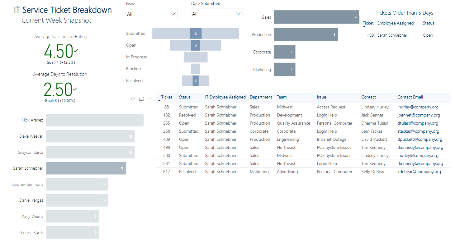
By default, visualizations that interact with bar, clustered column, and other charts do so by “highlighting”. When a chart is highlighted, it can be difficult to discern the selected portions, and the sort order may not reflect the selection. For example, before editing interactions, when Sarah Schriebner is selected in the IT team member bar chart, the breakdown of tickets by department highlights rather than filters.
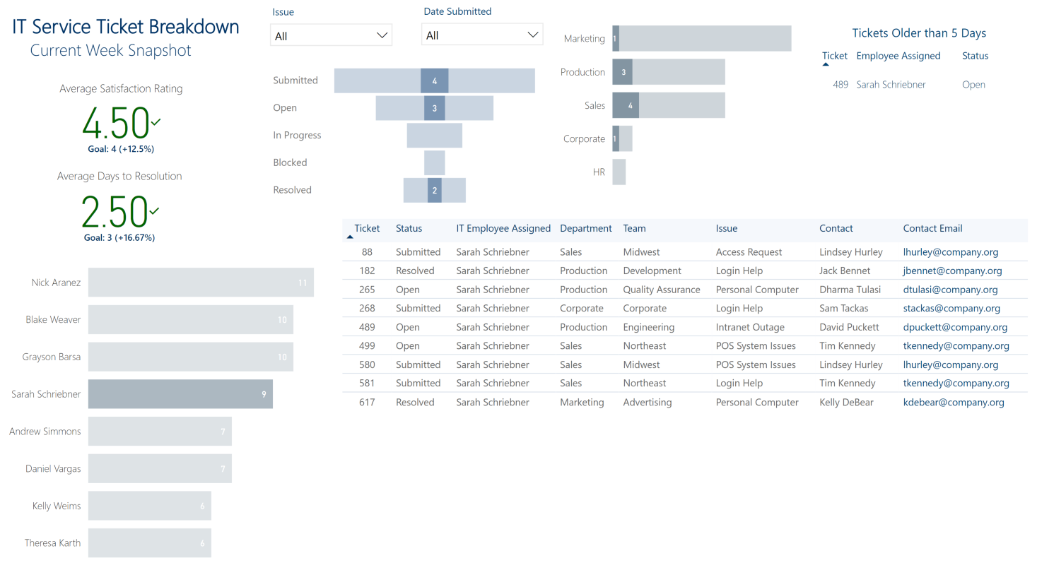
If this interaction is updated to filter instead of highlight, it takes no time to see that Sarah has handled more tickets for Sales than any other department. It is also important to point out that the funnel chart remains set to highlight because it shows amounts in relation to steps in a process. If it were filtered, all the steps would not be displayed, and the chart would be misleading. The interactions are set to best show how many tickets Sarah has in each step of the process and which departments she’s handling the most tickets for. The report works in both instances, but it works just a little better after updating the interactions. Anything you can do to deliver insights quickly and clearly, that saves users time and effort, is a reporting win – no matter how small.
Slicers vs. Interactions
Often, a new developer hears the need for users to filter on a field and immediately thinks, “Slicer.” Yes, slicers work for this purpose, but they work for only this purpose. Beyond filtering data, slicers don’t add analytic value and they take up valuable canvas space. Consider the following scenario. The IT manager needs to able to filter the data on the page by department, IT team member, and ticket status, but it would also be useful to see these fields broken down by ticket number.
The ability to filter by IT team member and department is handled by bar charts and their interactions with the rest of the page, because we have meaningful data that we’d like to attach to those attributes visually. When the manager clicks Nick Aranez in the IT team member bar chart, the other visuals filter and highlight to reflect only his tickets. The manager quickly sees that while Nick has taken on the most tickets this week, he has yet to resolve any, and has one that’s older than 5 days. It’s worth following up with Nick to see what’s going on and if he needs any help resolving his tickets.
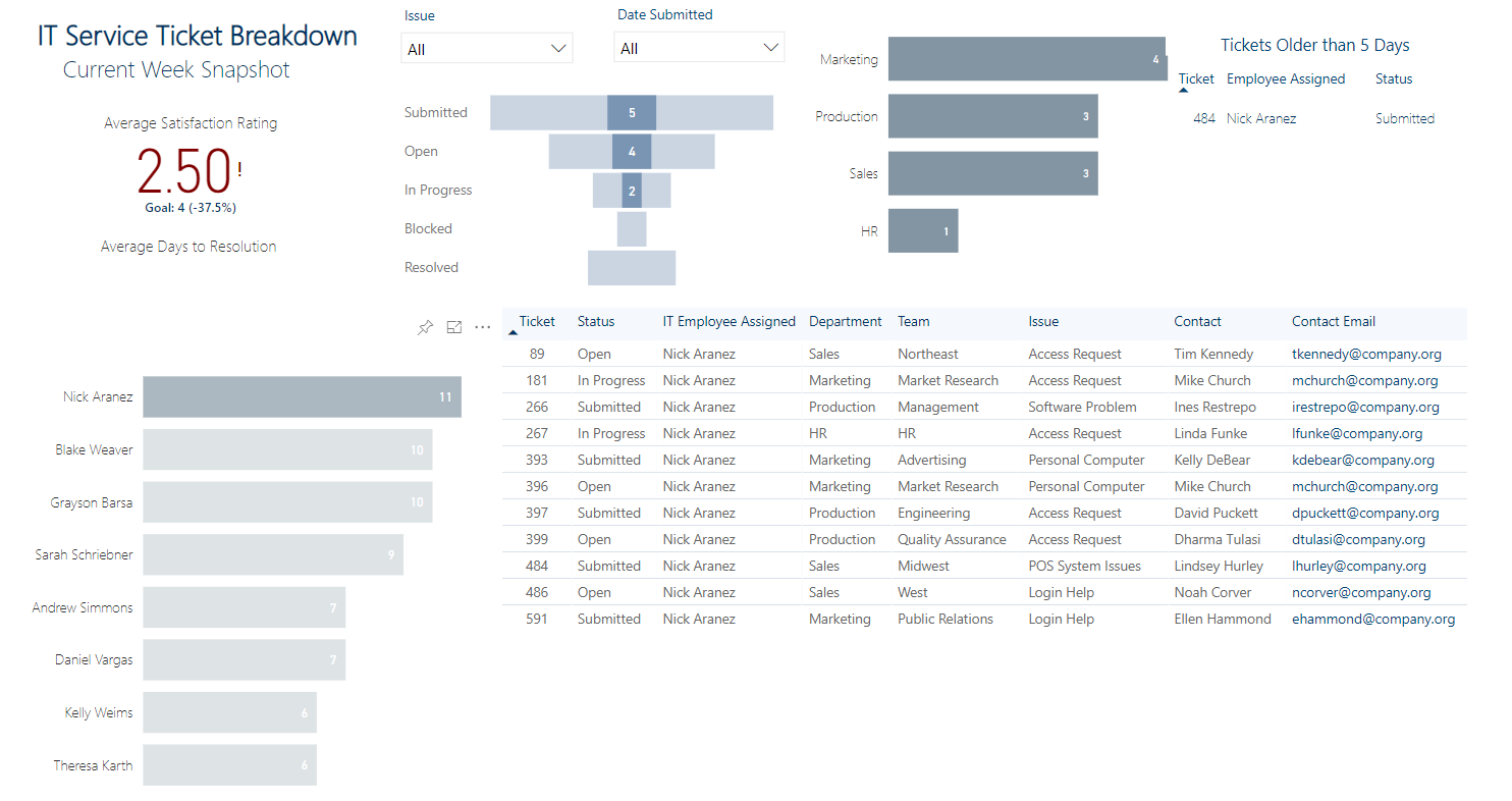
This report page still has two necessary slicers. These slicers contain attributes that we only wish to use for filtering what’s on the page, and they have both been changed from lists to dropdowns. Changing slicers from lists to dropdowns saves space, especially for fields that have more than two values.
Context and Titles
Using titles and text wisely can simultaneously add context and reduce clutter. The first page of the report has two carefully planned titles that provide context. The main title for the page, “IT Service Ticket Breakdown”, indicates to users that they’re looking at ticket numbers in the charts. This eliminates the need for individual titles on each chart, thus reducing clutter. However, there is one visual on the page that needs its own title. The table in the upper right corner is filtered to display tickets older than 5 days. To make this clear to users, it’s explained in the title. The IT manager quickly understands she’s looking at a list of unresolved tickets older than 5 days and she can act accordingly.
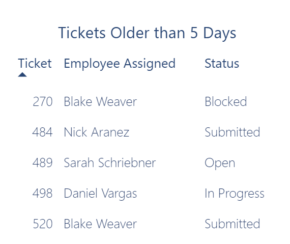
Creating concise and meaningful titles is a great strategy to give users context and direction. If you share your report and are immediately asked “What am I looking at?”, take a minute to revisit it. What can you make more obvious with a title?
Optimal Chart Formatting
With all the features and formatting options available in Power BI, you’ve probably been warned about not overloading and cluttering visualizations. I’m here to warn the opposite – when user needs dictate displaying labels and text, add them! Give users what they need for quick insight.
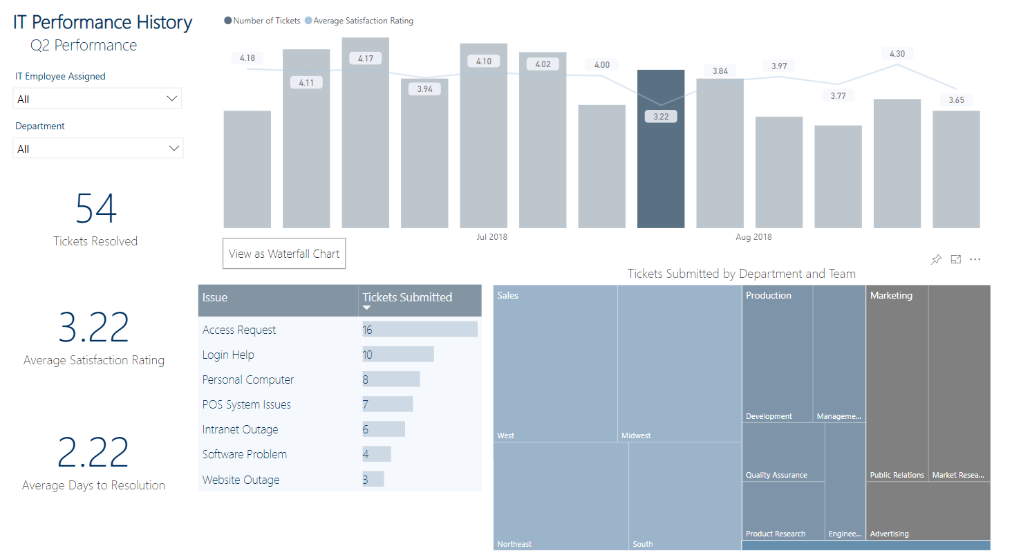
Take the below chart for example. Its purpose on the second report page is to show average satisfaction ratings over time in relation to the amount of tickets submitted. The IT manager cares about the exact average satisfaction rating numbers, but only needs a general sense of how many tickets were submitted each week. This chart is tailored for this exact need. The data labels added to the line show the exact numbers. The y-axis is hidden, and the title eliminated to reduce clutter on the visual. The important information is suitably displayed by the legend, data labels, and bar size. The result is a clean chart that focuses the user’s attention immediately on the most significant data. It’s easy to see that the week with the lowest satisfaction rating had a relatively high amount of tickets submitted, so it is worth the manager’s time to take a closer look at what happened that week.

If she wants to take a closer look at that week, she can click on it. The visual interactions are set up for this type of analysis. From here, she can decide what action to take next.
Development Checklist
The goal in report design is to strike a balance between context, features, and clutter, that fulfills requirements and caters to user needs. This is a skill that takes practice, but here are a few things to ask yourself to help find that balance as you develop reports:
- When I click around on the page, do the visual interactions make sense and add value?
- Do I have any filtering on a visualization, page, or entire report that I need to make users aware of?
- Can users understand what they need to know at a glance, or do they need to do some detective work? In the latter case, is there something simple I can do to lessen this work?
- Have I added any hidden features like bookmarks or drillthrough that I should make obvious to users?
- Are there redundancies between visualization displays, chart legends, and titles that I can eliminate or make more concise?
- Have I used canvas space wisely? Is anything (like a slicer) taking up more room than it deserves?
- Are there slicers that either already are or could be handled by a visualization?
While this gives us a look at a few underused features and overlooked formatting considerations, there is much more to learn about report design, and BlueGranite is here to help. For a more in-depth look at reporting best practices, check out Meagan Longoria’s whitepaper and accompanying webinar. You can also browse our Power BI showcase examples, under Resources, for inspiration.

