In this post, we’ll review an example of SIR modeling on Azure, using the COVID-19 Hospital Impact Model for Epidemics (CHIME) model, developed by this team at Penn Medicine Predictive Analytics. We reworked this model for a BlueGranite healthcare client, customizing it and deploying it to Azure so it could be used by hospital staff across their system. While we didn’t create the CHIME model, we helped our client make enhancements to the model with UI customizations, integrate automated data inputs from their hospital systems, and then deploy the application on Azure. Before we dive into the details of the CHIME model, we’ll get everyone up to speed on how epidemiological models like this work. There’s a little math in this post, but I’ll walk you through it.
The CHIME model as well as some other COVID-19 models that are floating around these days, are variations of what is called an SIR model. SIR models are compartmental models that help us model disease progression over time, and what this means by compartmental model is that there are three kinds of buckets that someone could fall into – you’re Susceptible, you can become Infected, and then hopefully you are soon Recovered.
 |
 |
These models try and see what the movement between these groups are, which are called transitions. The model shows how people flow through this graph, so to speak, over time. For those of you who haven’t seen differential equations in a while, these equations are helping to describe the change in the number of susceptible people over time, how that flows into the number of infected people, and then how does that flow into recovered.
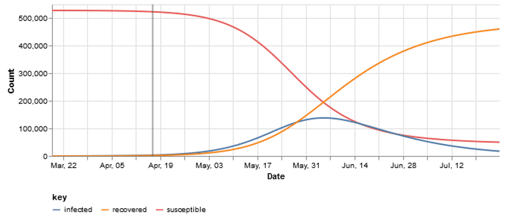
You may have seen some charts that look like this, where you have a certain percentage of the population that is susceptible and then that starts to go down as the number of infected people go up. Then as infected people recover, you can see that the chart flips.
There are built-in assumptions that once someone has recovered, they are no longer susceptible to be infected again, which is true for SARS-CoV-2, for the short-term at least. We know that this virus is an RNA virus and can mutate like the yearly flu. Each year we experience a similar flu, but it has a mutated a bit, which enables it to evade your immune system’s memory of last year’s version. This is the reason why you need a flu shot every year.
*A side note – once you are susceptible, you may get infected, and then once you get through the infection phase, then you may recover. Some epidemiologists treat the “R” in SIR as “removed” instead of “recovered”, and “removed” means they’re just removed from the system – they are removed from the equation, so to speak. This could either be that they are recovered and no longer susceptible, but it could be that they are moved out of the population or they died. While this is a little macabre, it is the way some models capture the change over time.
These types of models can give us a couple different curves that measure slightly different things such as:
- the number of daily admissions into a hospital
- the total number of people in the hospital with COVID-19 (which we call the census view)
- or the proportion of the population that fits into one of these SIR states over time
Flattening the Curve
In the news, we have been hearing for several weeks now that we have to “flatten the curve”. You might be wondering what actually goes into the curve itself! In epidemiology, we have a ratio called R0 or “R naught”, which is the basic reproductive number of a pathogen.
R0 defines how many people we would expect that one person might infect. A pathogen that isn’t so bad has an R0 of less than one, meaning every person that’s infected may infect one person or fewer. Then there are some pathogens that travel through the air (like measles), and the R0 could be 10 or higher. That means that for every one person that’s infected they might infect 10 people, which is really, really bad, and that’s how exponential growth gets out of hand really fast.
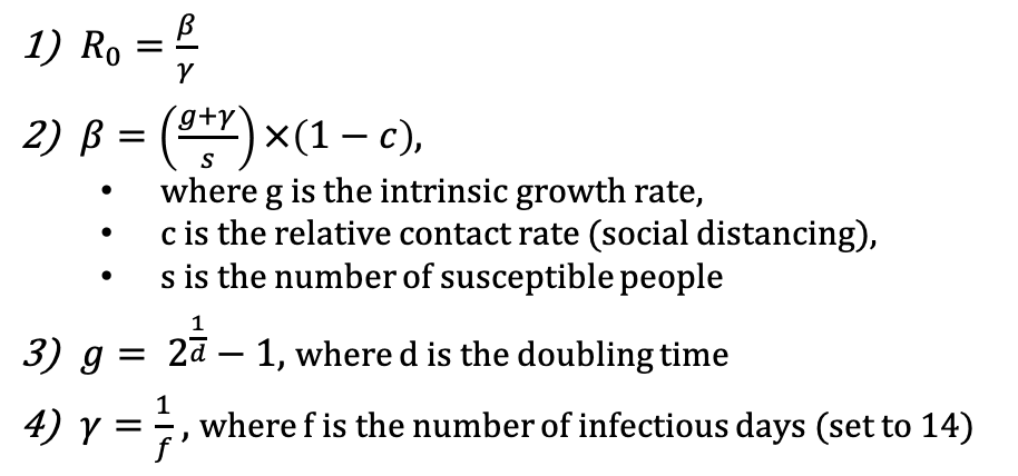 When we talk about R0, it is calculated by looking at the time for the population of infected people to double – what is the exponential growth rate of the population. With mitigation measures like social distancing or better hygiene, we can reduce this growth rate. “Flattening the curve” is just a simple way of saying reduce this R0. In epidemiological terms, we’re talking about reducing R0 into Rt. Rt denotes the reproductive number after you do some sort of mitigation.
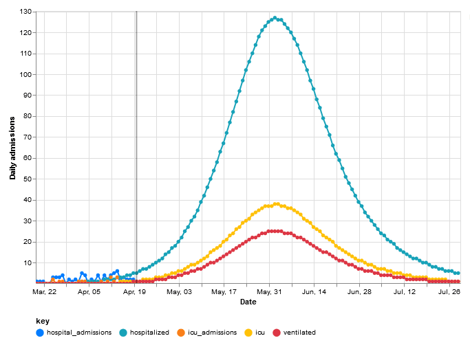
In this example above, 30% social distancing mitigation cuts the R0 of 3.59 down to the Rt which is 2.51. That means that we go from infecting over three people each, to just between two and three each. For this particular population, it also puts the peak of the infected curve to the end of May.
Next, let us see what happens if we bump up the amount of people that are social distancing; that is to say, the percentage of the population that follows the rules and stays home (hopefully all of us!).
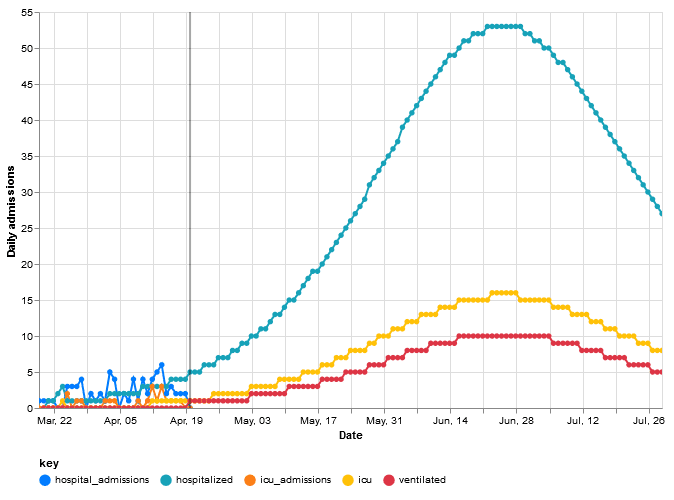
If we move social distancing adherence to 80% (ramping it from 30%) and keep everything else the same – other rates, severity measures, population, etc., – we actually cut the R0 from 3.59 down to an Rt of 1.81.
This is much more manageable. It does not change the fact that it still exponential growth, but what ends up happening is that the exponential growth is not nearly as severe. In this CHIME model, at 80% social distancing, we are seeing that a given infected person might infect one or two people. This also pushes the peak of the curve out to late June instead of late May and reduces the severity of the peak when it gets here (from 120 people down to 53 people at the peaks, respectively). The critical importance of flattening the curve is that it helps to not stress out our health care system.
Side note: flattening the curve does not solve the problem by itself. While flattening the curve helps to not stress out our health care system, it extends the duration of the problem. However, it also gives us more time to develop better treatments, tests, and vaccines. This is what we see happening across the U.S. and the world today.
Enhancing the CHIME Model
The original version of the CHIME was built by researchers at the Predictive Healthcare Team at Penn Medicine. Their original model is completely parameter-driven, meaning that you plug in all of these numbers in a Python script in the app’s files and then it builds the curve based off of these numbers.
Our client wanted the models to be a bit more dynamic and driven off of actual data. So, we modified the CHIME functionality to pull in a stream of data with their actuals – total beds, ICU beds, and ventilator capacity, along with actual daily admissions and counts for each. In the video for this post, you can see the blue line is the actual number of hospital admissions that the client is seeing.
Now the parameters in the CHIME model are taking into account the hospital system’s actual data, so that the physicians (who are not epidemiologists, nor are they mathematicians) can easily go in and see the model and results tailored to their own scenario. The customized web application has most of the numbers the doctors need, so they do not have to change as many factors and turns as many knobs to perform analysis. They can see the hospital system’s up to date admission numbers compared to the predictions in the model. They can dial up or down social distancing and other assumptions to see the impact on bed, ICU bed, and ventilator demands versus capacity. Plus, they can now manually change the doubling rate to see how it affects the curve and the R0.
Deployment on Azure
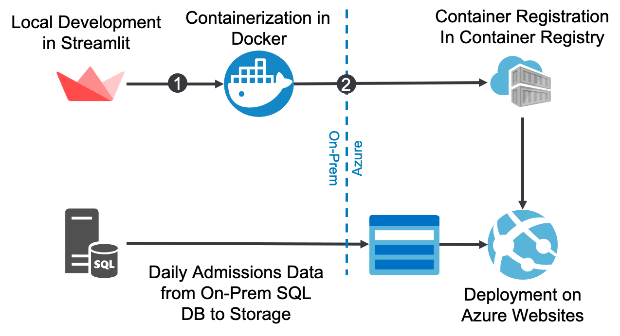
The application itself is written in a web framework called Streamlit. Streamlit is a Python framework that’s kind of like Django or Flask, but built simple modeling tasks with visual outputs, and it’s what the original CHIME model was written in from the U Penn researchers. Our client needed the model customized quickly, so that is what we used for the project.
 |
 |
Shown above is the overall deployment pathway. The application is written in Streamlit locally, and includes different functions to create the charts, the actual SIR model itself, and the logic to make the UI elements for users to play with. There is a lot of functionality that’s built in there, and then it’s all wrapped up as the Streamlit application. For this project, we then containerized the application in a Docker Container, which captures all the dependencies and everything that is needed to run that web application. We then deployed this to the Azure Container Registry, which further deploys to Azure websites. Now this application is hosted in Azure in our client’s Azure tenant.
On the data side, the client wanted to start pulling in actual data on a daily basis to drive more accurate modeling. We started by pulling the data from a local flat file that I had to manually update. To “productionalize” the data ingestion, the client set up a flat file extraction package using SQL Server Integration Services (SSIS) that queries a local database and writes out a CSV file daily. The package then uploads it to an Azure Storage container. Finally, the CHIME app pulls in the data directly from Azure Storage. With this approach, the client doesn’t have to manually update the data – the SSIS job will automatically do this daily extract for them.
What is interesting about this is how easy it was to build the container and deploy it to Azure. We had built containers before, but had never deployed to an Azure Website, especially not a Streamlit application. Oddly enough, it was very straightforward. In fact, it was so easy that I reached out to my co-worker at BlueGranite, Josh Fennessy, to confirm that I was not going crazy.
The back end of the solution was very simple. There are just a few resources that get deployed. There is the storage account that holds the data. The app registry that holds the container registry that holds the container images. The app service plan, which manages the virtual machine that the app is hosted on, and then the web app itself.
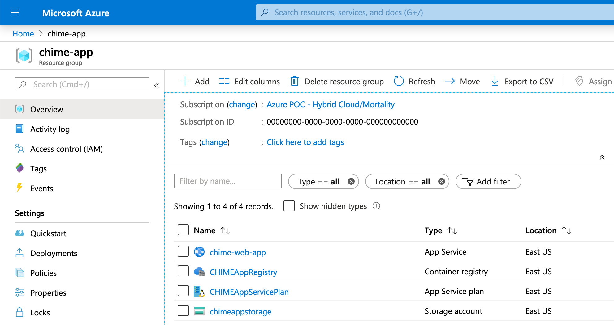
The web app is where the physicians and administrators at the hospital can log in and see the results of the model, or tweak the parameters.
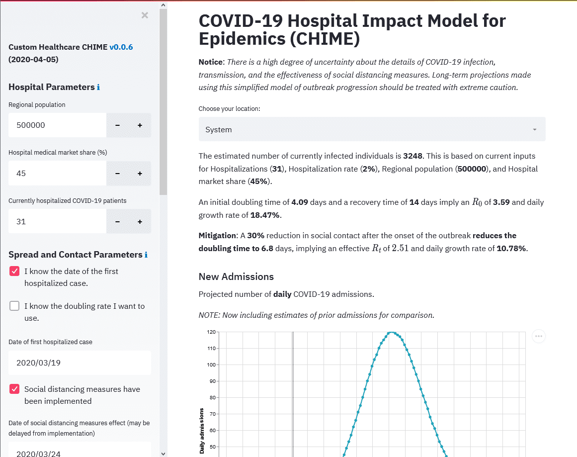
Within the model in the web app, it shows admissions along with lines we added that show bed capacity, ICU capacity, and ventilator capacity. It helps inform hospital staff and administrators when they may exceed capacity, based on current social distancing guidelines, at least based on the CHIME model.
Key Takeaways
A key takeaway from this is that there are all sorts of models! As we like to say in the business, “all models are wrong, but some are useful“. There are news stories, politicians, and business leaders across the country saying that “we’re going to reopen the state” at a certain point. In my professional opinion as a data scientist, biologist, and through my work with infectious diseases and other coronaviruses, they will probably reopen much too early to try and get things moving again with the economy.
As this happens, we may see another bump up in these models, and I expect these models will continue to be adjusted as we collect new data. What we may see is an apex in current curves across states and regions, and then we’ll see another hump later this year (though this isn’t modeled in CHIME or any other popular SIR-based model that I’ve seen so far).
While the future hump will likely be smaller, this is still a problem for those at heightened risk as we have not made as much progress with vaccines and treatments as could be hoped, though we are making advancements with better and more widespread testing.
Stay tuned for adjustments to CHIME, and probably brand new models, that will have to take into account up-and-down adjustments to social distancing as policy changes and new cases increase.
Other Resources
- University of Pennsylvania Medicine Chime Model: https://penn-chime.phl.io/
- University of Washington IHME Model: https://covid19.healthdata.org/united-states-of-america
- WBTV News Interview on COVID-19 Modeling: https://www.wbtv.com/2020/04/13/limited-data-makes-it-tough-model-coronaviruss-spread-experts-say/

