
Combining Power BI with statistics yields some very powerful results. In this post we’ll show how easy it is to do Linear Regression with the Power BI tool.
Linear Regression is a very useful statistical tool that helps us understand the relationship between variables and the effects they have on each other. It can be used across many industries in a variety of ways – from spurring value to gaining customer insight – to benefit business.
The Simple Linear Regression model allows us to summarize and examine relationships between two variables. It uses a single independent variable and a single dependent variable and finds a linear function that predicts the dependent variable values as a function of the independent variables.
We look at two statistical values to determine if there is a relationship between the two variables and how closely related they are.

The Coefficient of Correlation is a statistic we use to determine if there is a relationship between two variables. The output of this statistic equals somewhere between 1 and -1. The closer to 1 the number is, the more positively related the variables are. As in, if X increases, Y increases. The closer to -1 the number is, the more negatively related the variables are. If X increases, Y decreases.
The Coefficient of Determination is a related statistic that then tells us how well our model fits the data. This statistic is always between 0 and 1, and the closer to 1 the value is, the better our model fits the data set.
So how do we perform Linear Regression in Power BI? First, we make a scatter plot and visually examine the data to see if we think there is a relationship.
Scatter Plot in Power BI
In this example, I used my own financial data to see if I could understand the best ways to save money each month. This analysis shows the relationship between the number of times I went to restaurants and the money spent in this category of my monthly budget.
Food is my second highest budget category each month. I don’t think the bank will cut my mortgage down to save me a bit each month, so my restaurant spending seems like the next best place to start. Here’s how to follow along using your own data:
Create a Scatter Plot
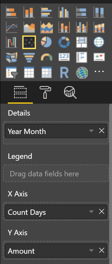
1. Click the Scatter Plot visualization and add your columns. In my case, I used Year Month, Count Days, and Amount to determine how often I’m dining out and the associated cost.
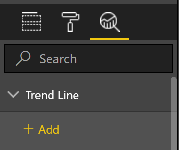
2. From the Analytics pane add a Trend Line.
The results should look something like this:
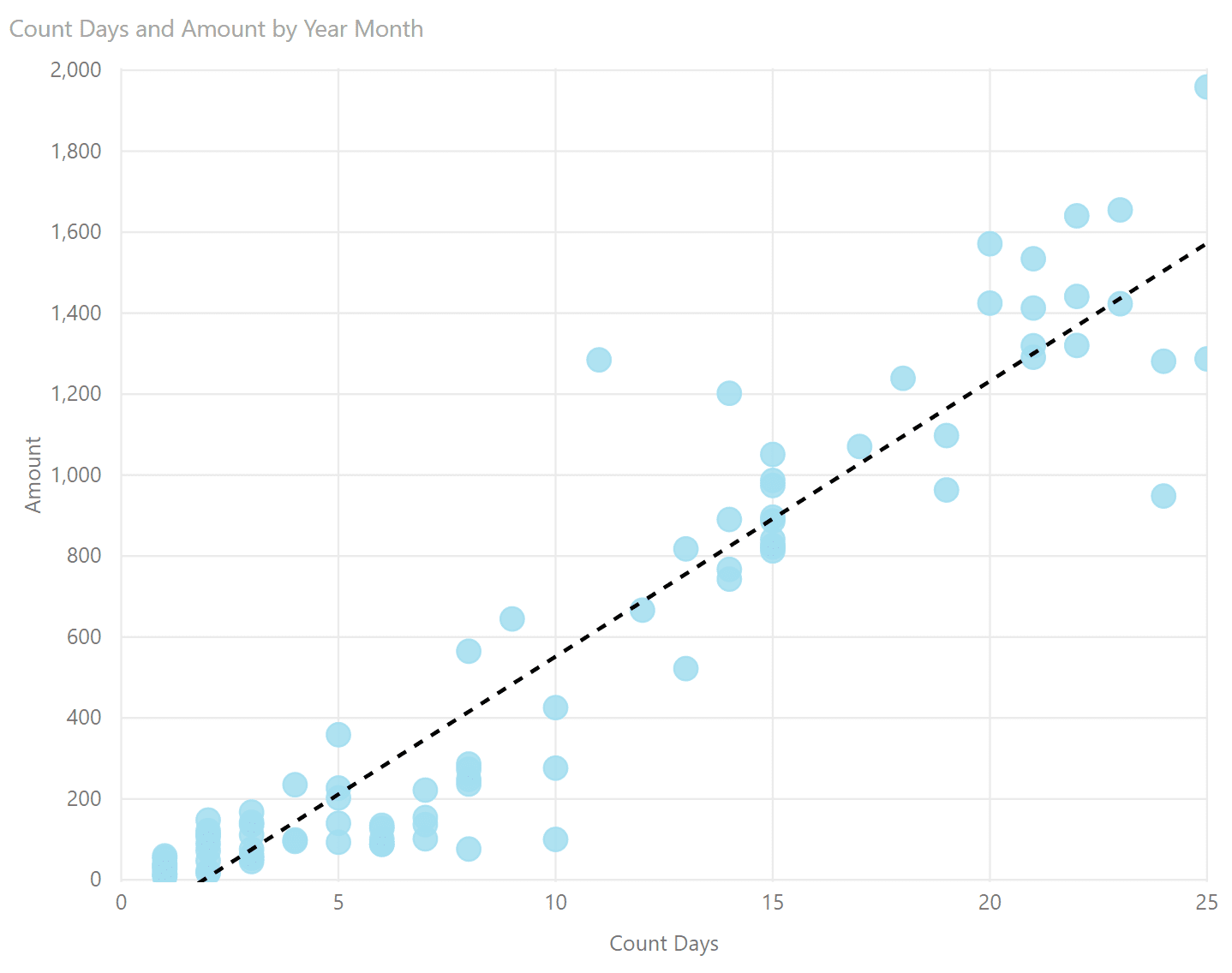
There definitely seems to be a correlation between my dining out and my increased expenses, so I’ll make the calculations to see if I’m right.
Creating the Coefficient of Correlation
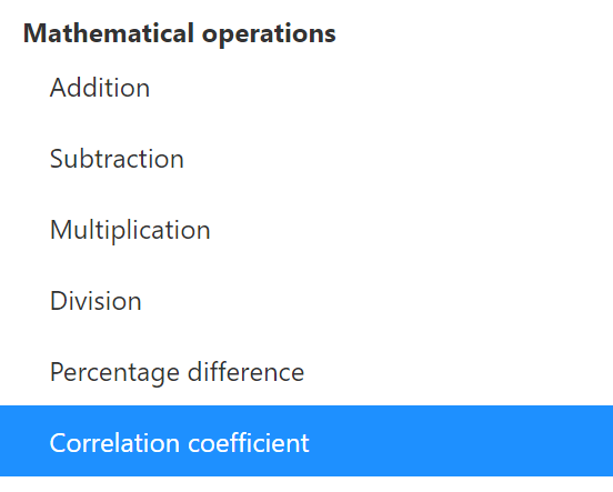
- Right click on the table and click New quick measure.
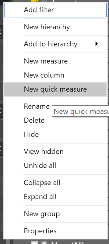
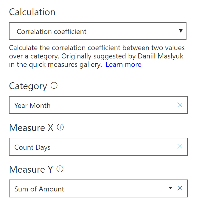
- Select Correlation coefficient from the Calculations under “Mathematical operations”.
- Select the Category, Measure X, and Measure Y. These columns will match the dot plot we created earlier.
The Coefficient of Correlation will now be available in your table, and it’s ready for use.
![]()
Creating the Coefficient of Determination
In this case, a quick measure would be overkill. The Coefficient of Correlation is notated as the letter R. The Coefficient of Determination is R2.
Coefficient of Determination = [Coefficient of Correlation]2
I now have two statistics based on my data set that tell me how and to what degree my X (Count Days) and Y (Amount) variables are related.
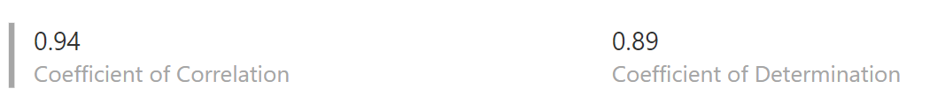
As we can see, per our definitions above, both the Coefficient of Correlation and Determination are very close to 1. This means Count Days is certainly related to Sum of Amount and does a very good job of predicting how much I’ll spend given the number of days I eat out every month.
Model’s Many Benefits
Besides offering basic budget insight, Simple Linear Regression analysis is useful for a wide variety of verticals and business cases. Combining it with Power BI can create powerful analytical capabilities.
We can use Linear Regression to analyze the effect of marketing on sales and profits. Or it can clue a company in to how raising prices may affect a consumer’s buying habits. Insurance companies can also use this technique to assess risk between customer demographics and insurance claims.
Looking to Learn More?
If you are interested harnessing statistics with Power BI to boost your business, contact us today.