Report development is iterative. Every good report goes through multiple phases of the development cycle. Developers try different ways to display data, uncovering new insights and incorporating user feedback until they have a production-ready report. As Power BI evolves and adds new features, even reports in production might benefit from another phase of development. This was the case for BlueGranite’s “Employee Retention – Organizational Flight Risk” report.
The original report, detailed here, showcased how Power BI features like drillthrough, buttons, and bookmarks can be used to investigate predicted levels of employee flight risk. With the advent of Power BI’s built-in AI visuals, it was time for us to take another look at this report and give it some updates.
The predictions used in these reports – the original and updated version detailed in this post – come from a machine learning model built outside of Power BI by one of our data scientists. The model predicts the probability of an employee leaving as “Low”, “Moderate”, or “High” using historic turnover data. If you’d like to learn more about the process of developing a predictive model for employee flight risk, check out this post.
The original report does a fine job of showcasing data, allowing users to explore the model through visuals and slicers to gain insight into the factors affecting flight risk. So why bother updating it? You might be questioning, too, if the data driving the report has already been run through an AI model, what additional insight could these Power BI visuals add to the report?
The answer is simple: Power BI’s AI visuals, specifically the Key Influencers visual and the built-in Insights capability, deliver faster, deeper insight into the root causes of important outcomes. In the original report, users could explore different fields and data points and their effects on flight risk using slicers and visual interactions. This method of exploration often relies on hunches and instincts, utilizing trial and error to eventually identify key flight risk drivers. Power BI’s AI features take guesswork out of the equation to offer a better method for exploring data like this. In both the Key Influencers visual and Insights feature, Power BI analyzes data for you, exploring many variables and categories at once, then displaying the categories and data points that have the biggest impact on the outcome being predicted; in our case, flight risk. This not only delivers faster insight but also helps to ensure that all the important flight risk drivers are discovered.
Here’s a link to the live Power BI Showcase featuring this employee retention report that you can explore on your own. For an overview of the makeover, check out the page-by-page walk through below.
Page 1: Workforce Overview
Like many Power BI reports, the first page, “Workforce Overview”, gives a summary of the dataset. It introduces users to the data in our model and displays high-level metrics.
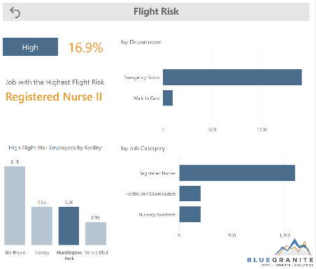
Looking at the first page, users can see that Northside is the location with the most employees categorized as high flight risk. Through visual interactions, users discover that although Northside has the highest number of high flight risk employees, Huntington Park has the highest percentage of high flight risk employees, and a much smaller number of total employees.
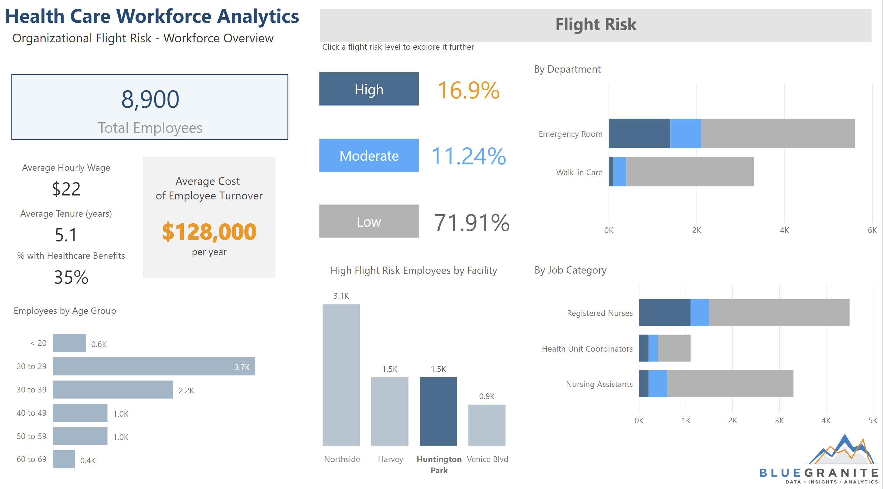
To explore this further, users can click the “High” button to view a bookmarked version of the first page, configured to display only high flight risk employees. If they select Huntington Park in the bar chart, they will see that at Huntington Park, the job with the highest flight risk is Registered Nurse II and the department with the highest flight risk is Emergency Room.
At this point in exploration, the user has a better picture of the overall employee population, an awareness of flight risk at specific locations, and is starting to get an idea of who is at risk of leaving. However, to effectively act upon this insight, users need a deeper, more specific understanding of who is at risk of leaving the hospital and most importantly, why. Enter the Key Influencers visuals.
Pages 2-3: Key Influencers Pages
On the next two pages, developers separated fields across two Key Influencers visuals. For this dataset, we found that separating fields between visuals in this way made insights easier to digest and more targeted for specific actions. Each of the visuals analyzes and ranks fields and data points for their effect on flight risk and displays the most influential ones. The first page, “Key Influencers – Personnel Data”, shows fields and data points relating to HR-type data, like Hourly Wage, Age Group, and Tenure. The second page, “Key Influencers – Work Environment Data”, explores data relating to an employee’s day-to-day work environment, like Patient-to-Staff Ratio and Recent Performance results. Both visuals include Job Title as a field that is analyzed for flight risk alongside the other fields, as it is key to understanding which patient populations fall into the various risk categories.
Looking at “Key Influencers – Personnel Data”, users start to get a better understanding of factors affecting flight risk. Each bubble represents a value or range of values from one of the fields analyzed and uses machine learning to quantify how much it increases the likelihood of being categorized as either high, moderate, or low risk. As the users click each bubble, results of the analysis are displayed graphically on the right comparing other values in the field.
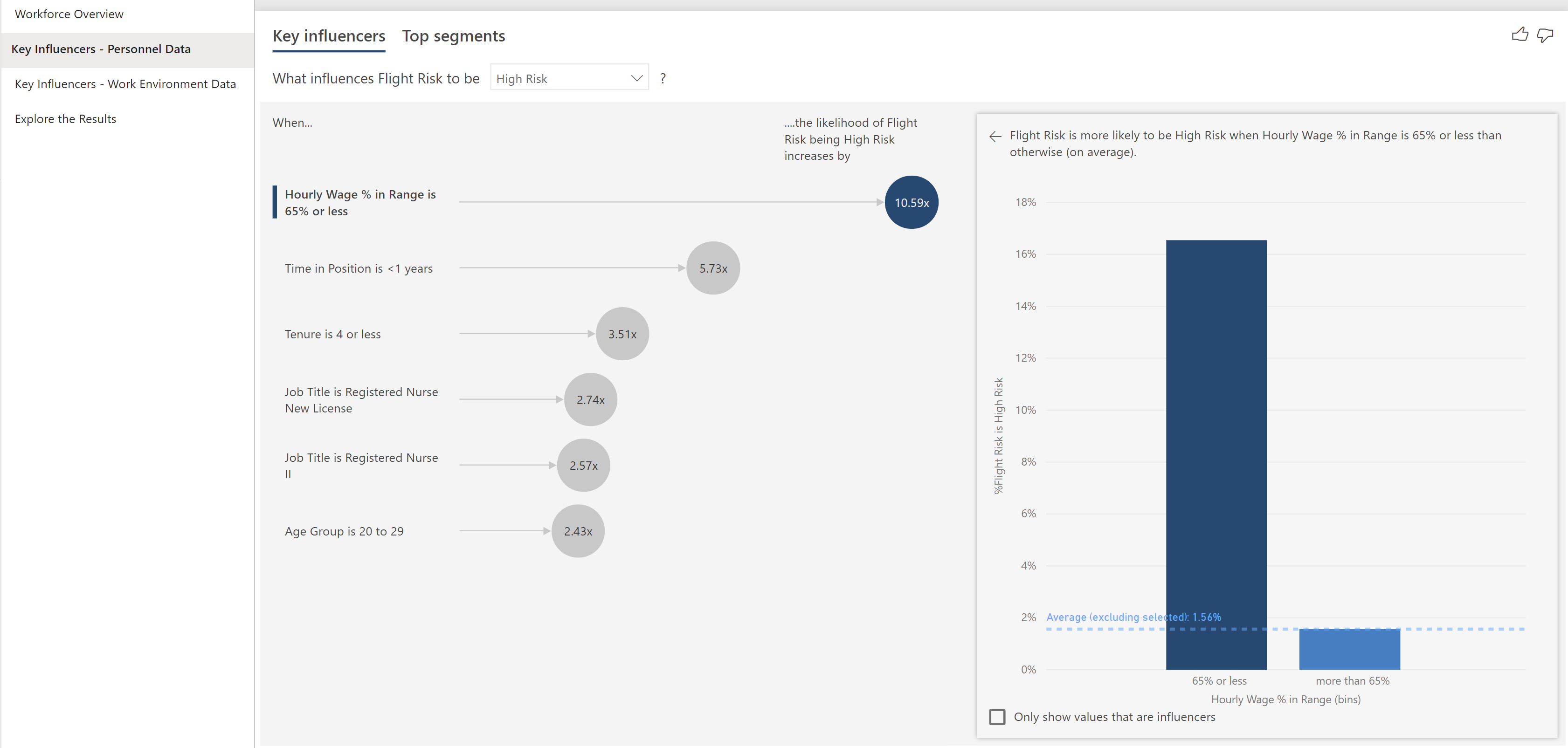
Users can also change the drop-down to view what influences employees to be categorized as moderate or low risk. From the results, users can see that using PTO (paid time off) and scoring high on a recent performance review can decrease an employee’s flight risk.
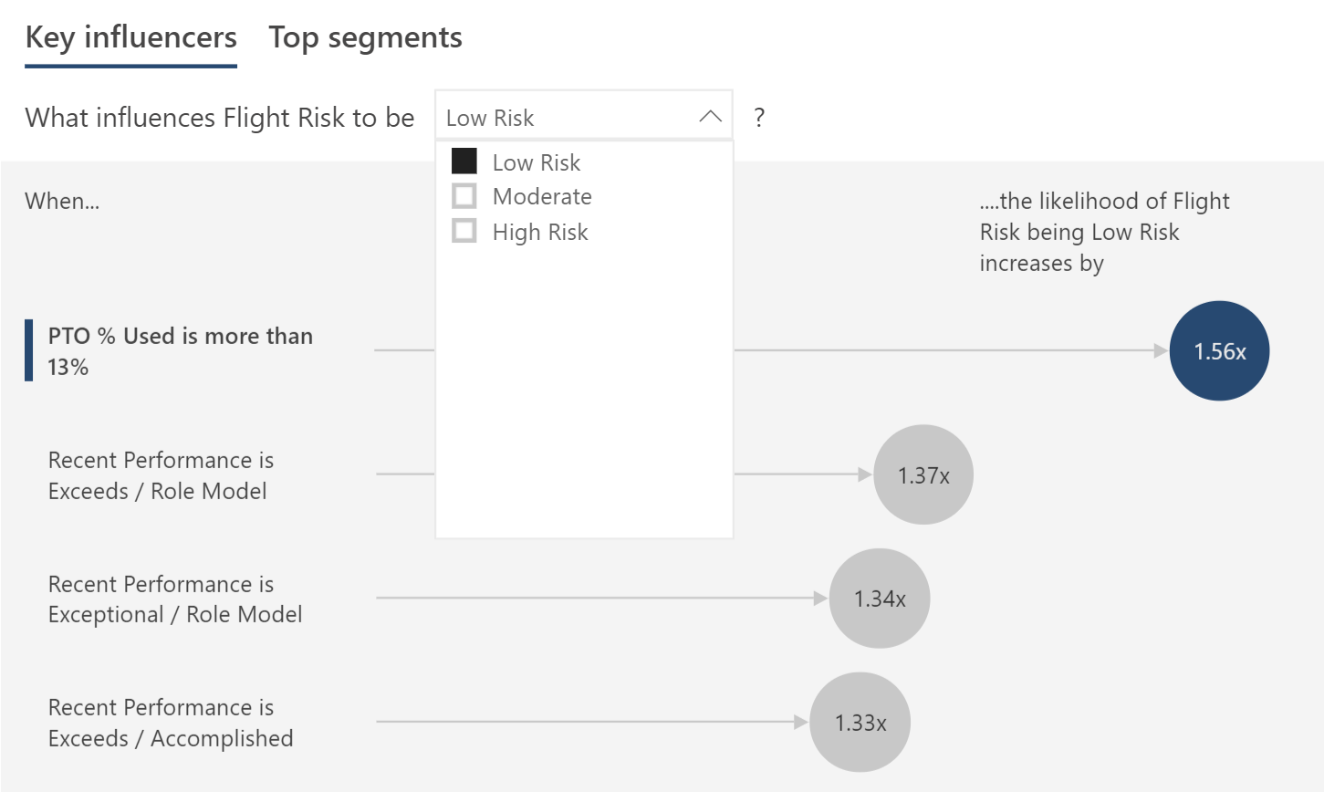
Within this visual, users can also click “Top Segments” to see which segments, or combinations of fields, have the most impact on flight risk. The “Key Influencers” tab of the visualization shows the impact of individual fields, while Top Segments illustrates effects of multiple variables.
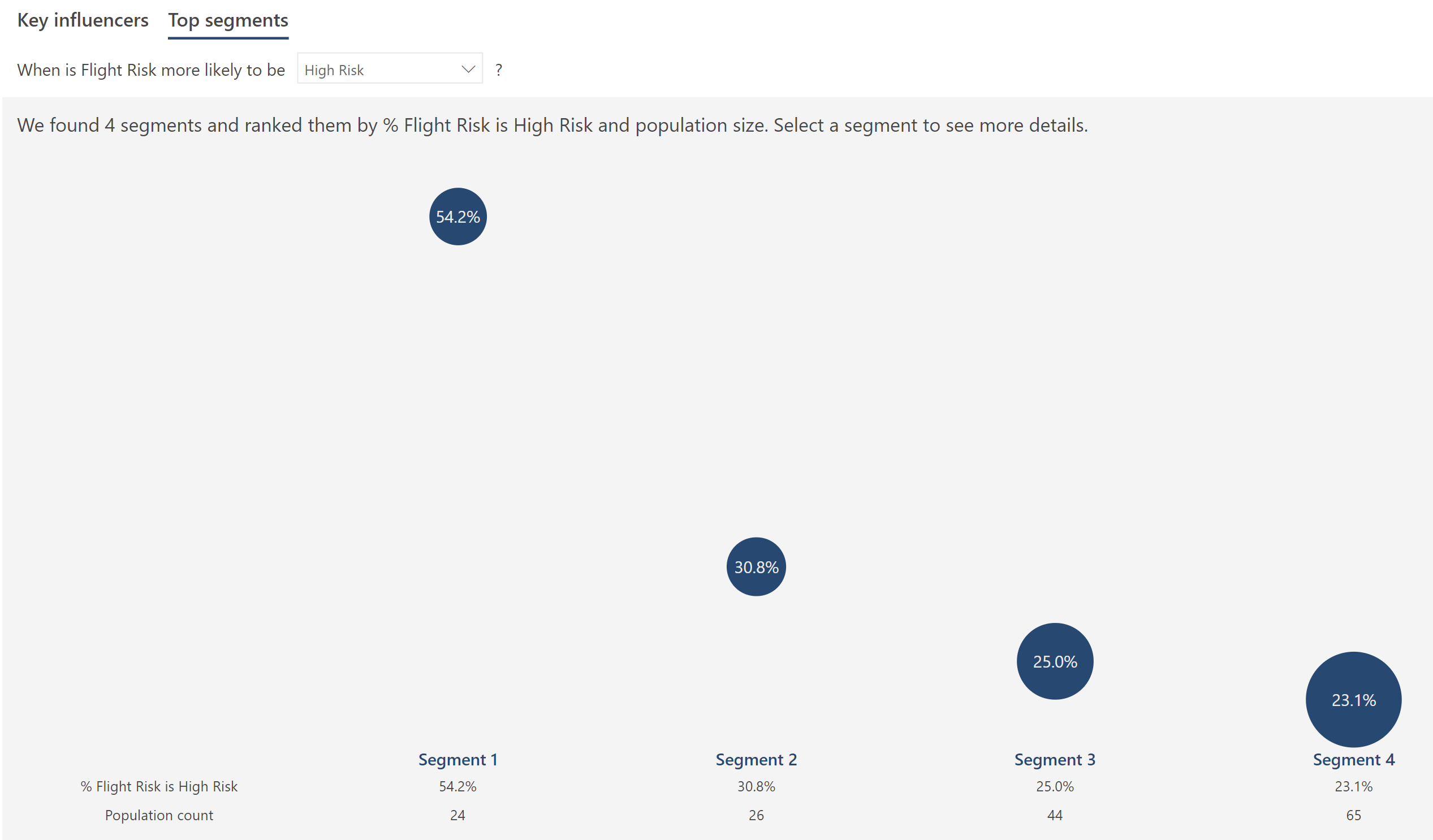
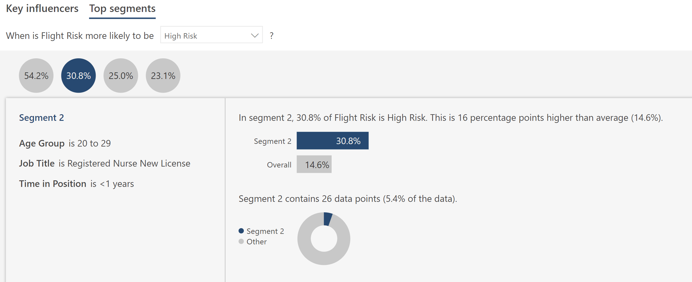
From this view, when users click a bubble, they can see more information about it, as shown below. For example, on the “Key Influencers – Personnel Data” page, the 30.8% bubble in Top Segments represents employees who are between the ages of 20-29, and are newly licensed RNs, and have been in their position for under a year. All these factors combine to greatly increase flight risk. Approximately 31% of employees who have all three of these attributes fall into the high flight risk category, whereas only about 15% of the overall employee population is classified as high risk.
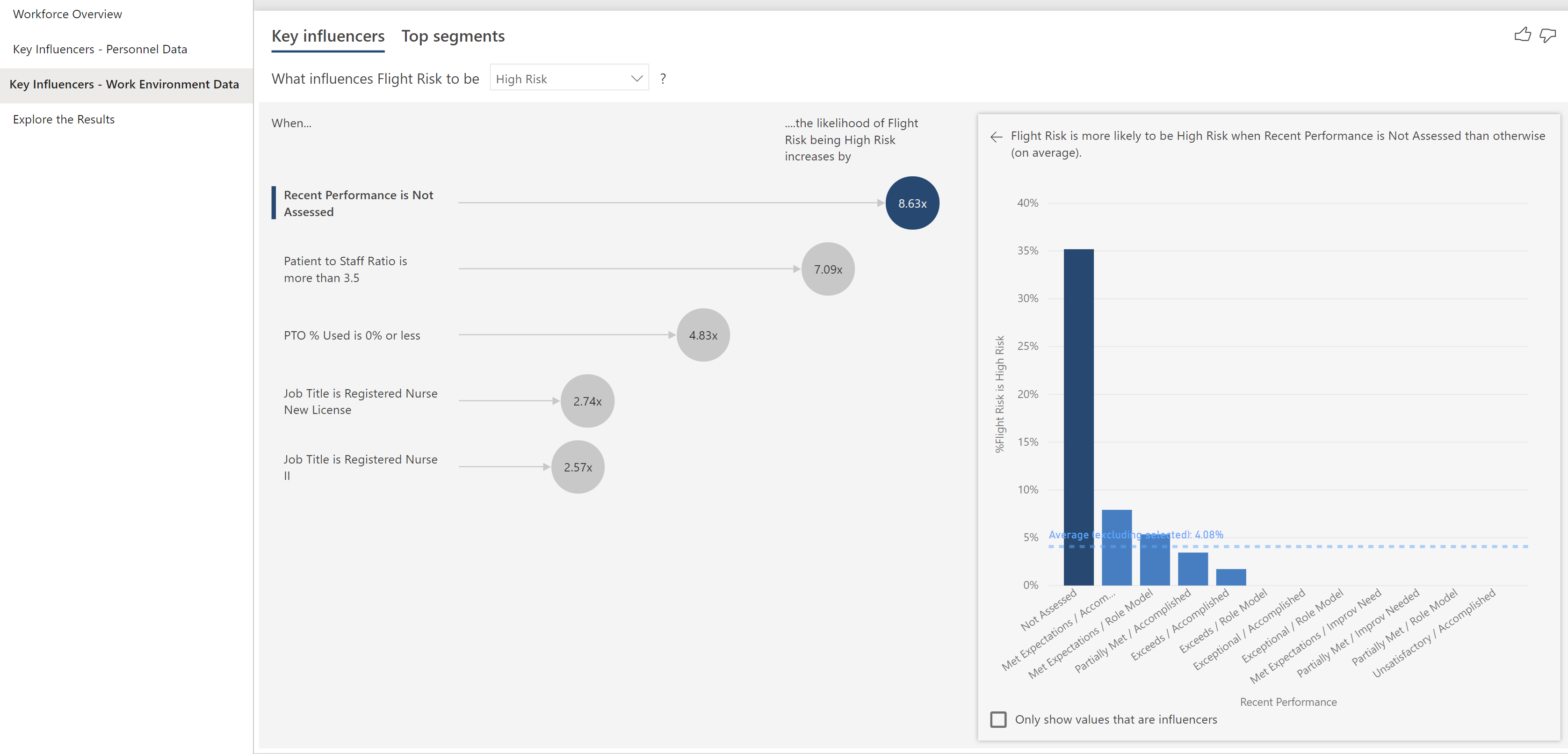
On the “Key Influencers – Work Environment Data” page, users can see additional data points that affect flight risk. For example, for the factor selected above, users can see (below) that employees who have not been assessed for Recent Performance are 8.63 times more likely to fall into the high flight risk category, on average, compared to other values of Recent Performance. It gives users the same ability to interact with the visual and explore different segments, flight risk categories, and data points that the first Key Influencers page does. Fully exploring both the major influencers and top segments identified gives users a complete picture of the major contributors to flight risk.
Final Page: Explore the Results
Armed with the insights and knowledge gained from previous pages, on the final report page, “Explore the Results”, users can explore independently using the Filter Pane or the “View High Risk Employees Only” button to select and view specific employee populations.
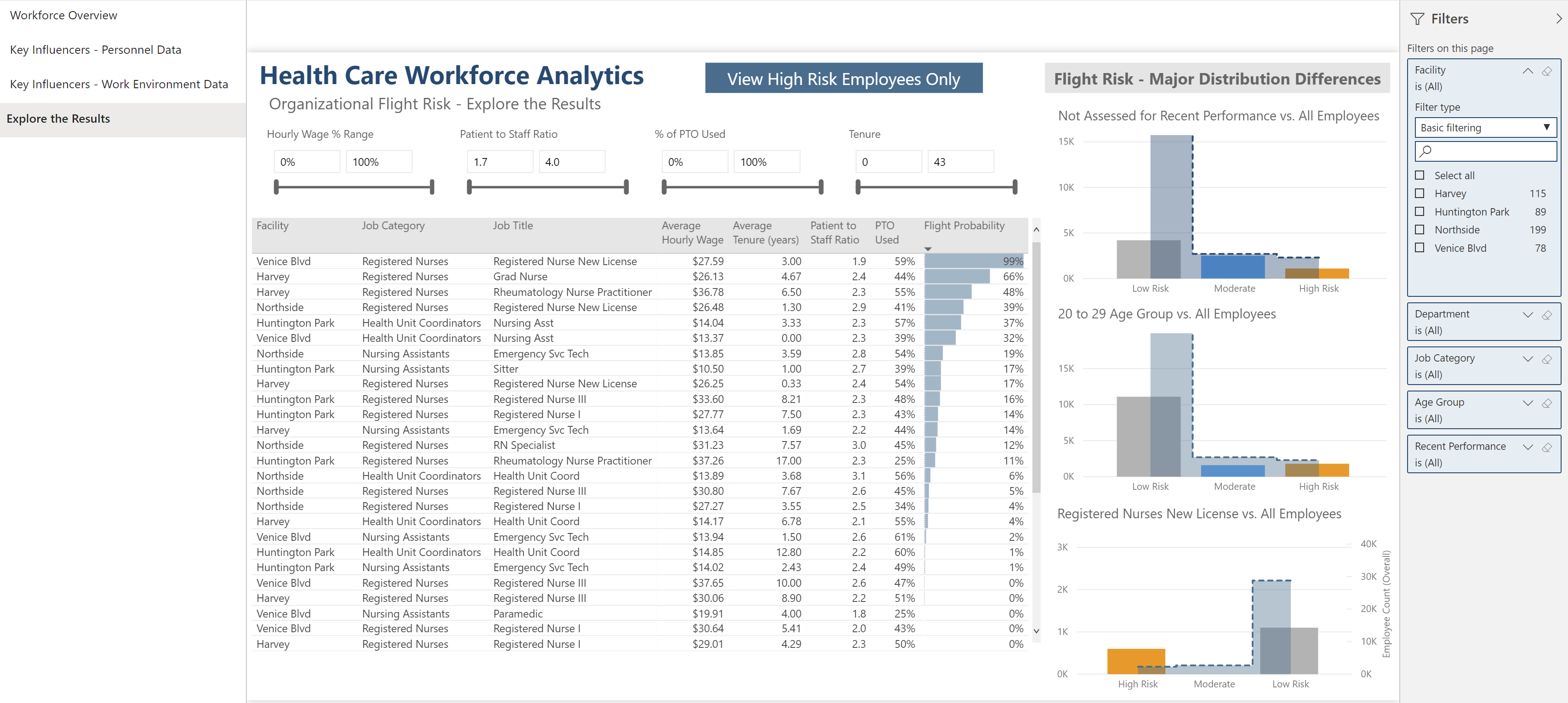
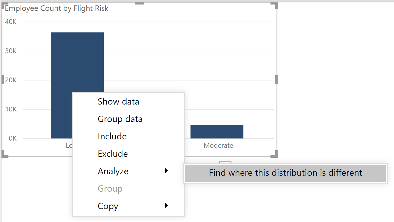
This page has a table that breaks down flight risk and some of its factors by both Facility and job. It also has bar charts that the developer decided were the most relevant and show the biggest and most actionable differences in distribution between flight risk categories. Driving from an initial bar chart that did not end up in the final report, the developer right-clicked on the visual, selected “Analyze” and “Find where this distribution is different”.
Power BI runs analysis and displays its findings in a window. From here, the developer can see which factors affected the difference in distribution between flight risk categories within the employee population the most and choose which visuals, if any, to add to the report. This feature is also useful for initially identifying fields to include for analysis in the Key Influencer visuals.
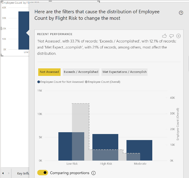
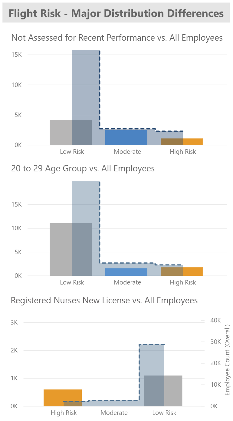
The developer decided to add and format three visuals from Power BI’s Insights to the final report page that show the difference in distribution for employees who have not had a Recent Performance assessment, are in the 20 to 29 Age Group, or who are Newly Licensed RNs compared to the entire employee population. These insights are actionable and have appeared continually throughout investigation of the data model.
At this point in exploration, end users have an idea of specific employee populations that tend to be high flight risk and the factors contributing to that risk that may need attention.
With the dawn of new AI capabilities and visualizations in Power BI, getting fast and complete insight into what’s driving certain metrics is easier than ever before. It might be time for your organization to take a look at existing reports in need of enhancement, like we did here, or to start thinking about exciting new reports that can leverage these features. In a data-driven, fast-paced world, time is of the essence, and getting a comprehensive picture of your data more quickly with Power BI is a major win. If you need help with AI, Power BI, or data in general, reach out to us at BlueGranite. We’d love to help.