The popularity of Data Visualization – translating complex data into graphics to ease understanding – has exploded over the past few years. The tools now at our disposal offer more advanced visualization capabilities than traditional reporting tools ever did; pie charts, bar charts, line charts, etc., are often quite static. With organizations discovering the powerful benefits of using advanced analytics to harness the recent boom in data, today’s business intelligence (BI) practitioners are expected to have a thorough grasp of data visualization theoretical foundations and best practices.
Data scientists, the pioneers of advanced analytics, brought clear Data Visualization theories and methodologies to business. They opened the doors of discovery to Data Visualization trailblazers Edward Tufte, Stephen Few, and “The Grammar of Graphics” – the essential primer on the fundamentals of statistics and visuals – to the business intelligence crowd. Today data scientists and business intelligence practitioners are speaking the same language, but their roles are often quite different.
Both advanced analytics and business intelligence are part of the larger field of visual communication. Understanding the subtle differences between the two can make good dashboards and reports great.
The Communication Model
Let’s use a simplified version of the influential 1949 Shannon – Weaver communication model to try to understand the nuances between advanced analytics and business intelligence:
A sender communicates a message to a group of people or an individual (the receiver) through a specific channel. The message might be altered by filters, either on the sender’s or the receiver’s side.
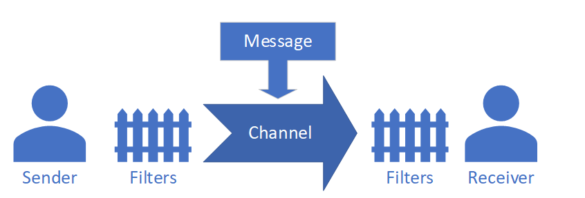
Figure 1 – Simplified version of the Shannon – Weaver model[1]
Before we proceed any further, I would like to address the main critique of this model; it lacks a feedback mechanism from the receiver to the sender (a conversational mode). While true, this is not critical in our case; the amount of feedback is limited for business intelligence projects. However, it is worth mentioning that gathering usage statistics and feedback is usually part of the maintenance of a project.
Why Create Data Visualization?
“Which story do you want to tell?” It’s a common question when building Data Visualizations. Advanced analytics projects and business intelligence dashboards tell stories at different points in time.
In an advanced analytics project, the data scientist analyzes the past to try to predict the future, or to highlight complex relationships not obvious to an untrained eye. These discoveries hopefully lead to business strategy or process improvements. The data scientist guides the audience though the reasoning – the “story” being told – using graphs and tables in a logical manner. This type of analysis is fixed in time. It is valid when the results are presented.
On the other hand, a business intelligence dashboard is designed to be used in the future; the data that will be presented doesn’t exist at the moment the visualizations are created. The dashboard can tell different stories depending on when it is used. Time plays a much different role in this process.
If you have any doubt, just imagine a major bank’s January 2007 financial reports and those exact same reports in January 2009. If, in 2007, you already knew the story that would rock the financial markets in the fall of 2009, you would be a billionaire by now.
Corporate Strategy Key to Great Dashboards
Because a dashboard tells many stories, and we cannot know those stories when we create the dashboard, we should understand a company’s strategy before getting started; then we must figure out how the dashboard can help execute that strategy.
This company strategy – the first crucial piece of information – should be known before creating any visualization. Think of a dashboard like the CEO or CFO directing the organization: “This is what you should focus on. These are your objectives.”
The choice of key performance indicators (KPIs) and metrics displayed should be inferred from the company’s strategy, indirectly or directly. For example, if the strategy is to increase margins, then one KPI should highlight cost reduction, or price increase, to improve upselling. If the strategy is market penetration, the KPI should feature quantity sold, customer loyalty, or marketing budgets.
The choice of KPIs or metrics, their layout, and the time window is as important, maybe more important, than the actual numbers. You don’t even need data to pass this message; it will be identical regardless of the underlying data, and for the whole life of your visualization. A dashboard is a management tool used to communicate strategic or tactical decisions to the appropriate people in the organization. It should be adjusted as the strategy evolves.
The correct visualization will highlight whether corporate strategy is being applied and if it is working. And the right mix of information – lag versus lead indicators, a proper time horizon, and relevant contextual information – will make the difference between a dashboard that is attractive but useless, or one that provides a strategic advantage over the competition.
The table below shows the different goals usually associated with communication; why people choose to communicate in an advanced analytics context versus a business intelligence context.
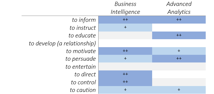
Table 2 – Goals of communication for Advanced Analytics and Business Intelligence
These goals are quite different, and this will have a direct influence on how the message is crafted. On one hand, we have to motivate, direct, and control, on the other hand, to persuade, educate and inform.
This is the first crucial difference; the message will always be fundamentally different as its goals are different.
The Sender
Data scientists usually present their own work; they have a thorough knowledge of their data and of the insights they want to communicate. Their main challenge is to communicate these insights thoughtfully and clearly. In the case of a business intelligence dashboard or scorecard, the sender of the message and Data Visualization creator are often two different people:
- The creator: a report developer who creates the dashboard.
- The sender: the business owner of the report who provides the message.
A report developer (usually a BI professional or a data analyst) doesn’t have anything to communicate. To an extent, they are part of the channel (as defined in our communication model). They are the business owner’s spokesperson, a translator of verbal communication to visual communication. Identifying the real sender while working on a dashboarding/reporting project is not always straightforward, but it is pre-requisite; his or her position in the organization will give precious information about the intended message. When you know who the real sender of the message is, you are more likely to understand their intentions. In large corporations, this can be a real challenge; however this is integral to the success of the dashboard.
As a side note, this is one key advantage of self-service BI. The real sender of a message creates their own visualization (message) and doesn’t have to rely on an intermediary. Even if the Data Visualization is imperfect, it provides a BI professional or data analyst important insights regarding the message the sender is trying to communicate.
On the other hand, the data scientist and the sender of the message are the same person. This makes crafting the message much easier, there is no translation involved. Also, as the data scientist already spent some time analyzing the data and tuning their models, they have already have a good idea of the best visuals to communicate their message.
This is another point where there are some important disparities. While the data scientist has the latitude to decide the message, tone, and overall feel of his Data Visualization, the BI professional is merely interpreting the dashboard owner’s wishes.
The Receiver
In an advanced analytics project, the receiver is usually a group of managers, executives or engineers. Some, if not all, will be project stakeholders. You can expect them to have a decent level of understanding of visual communication. Also, they are often aware of the goal of the project. On the other hand, the target audience for a BI visualization can be anyone in the organization, very often managers and executives, but also salespeople, factory supervisors, and others. You can expect a wider range of personalities and backgrounds. Finally, the receivers are not always included in the project, and they might even disagree with it.
When creating a sales dashboard, there are often disagreements on the best way to count sales. Based on quantity? Based on revenue? When is the sale really counted? Does it count for the Q1 objectives? For the Q2 objectives? Sales are often paired with objectives, and, consequently, factor into salespeople’s’ salaries. The design can impact the receivers’ attitude, not only toward the project but toward their daily job.
Also, as most employees are not part of the project, project designers can’t rely on providing context or explanations, as a data scientist would, when presenting results.
The message should be crafted to maximize its impact on the audience, and as such we should use the proper vocabulary (think about the type of graph you will use; e.g., line chart versus Sankey) with the proper phrasing (level of granularity, use of corporate lingo, density and complexity of the information displayed). For example, in building production dashboards for both engineers and mechanics, regarding the same business process, we must adjust our message so it is easily understood by everyone.
Filters
Whether on the sender side or on the receiver side, filters can be numerous. At a minimum, consider the following points:
- Corporate culture, openness to innovation
- Maturity of their BI and advanced analytics initiatives
- Education level of the target audience, ability to understand complex visualization, statistical concepts
- Knowledge of visual communication
Think of a maintenance dashboard for a manufacturing company versus a finance dashboard for the pharmaceutical industry. Their Data Visualization literacy might be very different. As a dashboard creator, you should incorporate these considerations when creating the visualization. A good dashboard is one that conveys its message quickly and efficiently, and communicates in the language of its audience.
It is worth noting that BI professionals come to each project with their own set of preconceived notions, expertise, and knowledge gaps. Those are also filters; it is worthwhile to take some time to contemplate our understanding, or lack thereof, when approaching communication with a client or department.

Business intelligence and advanced analytics both make intensive use of Data Visualization. However, the use of visual communication is different in key aspects. Though the vocabulary (e.g., type of graphs: histogram, pie chart, violin plot, line chart, etc.) is identical and follows the same rules, and the grammar is identical (e.g., which graph to use and when, proper layout, colors, data-to-ink ratio), the similarity stops there. We should not forget that we need a message to convey, and we need to convey it well; otherwise it’s only pretty graphics. Good communication, in this context, means that we should not forget fundamental requirements gathering: why, from who, to whom and when.
Data Visualization is the proper language of visual communication; it is expected that both the BI and advanced analytics professional be fluent in it. While the two professions share words and a common language; the best visuals acknowledge the subtle differences.
[1] https://en.wikipedia.org/wiki/Shannon–Weaver_model