Many data visualization practitioners have been enjoying the weekly Makeover Monday series on the VizWiz blog where Andy Kriebel (a Tableau Zen Master and certified trainer) posts a link to a publicly available data visualization, gives it a makeover to improve the design, and invites the community to do the same. This is a great way to understand and practice good data visualization habits. It’s also a great way to see how other data viz designers think. In explanatory data visualization, the designer is trying to catch the audience’s attention and communicate a message. Organizations of all types often struggle to do this because the people providing the data or analysis have yet to develop the data visualization skills necessary to achieve these goals.
A colleague pointed out some data visualizations in an article from a regional paper in our area that offered a great opportunity for improvement. They accompanied an article that discussed enrollment metrics and demographics in Kansas public universities and colleges in the 2014-2015 academic year. The article made interesting points about the proportion of the population represented by each ethnicity compared to the proportion of enrollees in Kansas public higher education institutions. It also examined trends for each ethnic group over the last 5 years. The end of the article focused on enrollment by ethnic group at the University of Kansas (the largest university in the state). The charts were created by the Kansas Board of Regents and republished in the article.
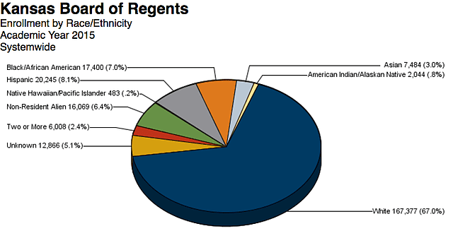
While the article contained great statistics, the graphs didn’t seem to support the story effectively. The first graph in the article used a 3-D pie chart with 9 different slices to show the ethnic makeup of enrollees at all Kansas Board of Regents institutions.
There are some opportunities for improvement with this chart:
- The pie chart doesn’t support the message of how enrollment by ethnicity is trending over time.
- The bold, dark blue color assigned to the white category stands out most even though that is not the focus of the story.
- 3-D pie charts obscure the area and angles of data, making them difficult to read.
- A pie chart with 9 slices is difficult to read, especially when the slices are not ordered in descending size.
- The labels cause the reader to move her eyes back and forth between the pie slice and the label in order to take everything in, and the label text is a bit small and difficult to read.
- There is a general lack of visual appeal with this graph.
This data visualization violates some data visualization principles that come from cognitive psychology. Most people can retain only about 4 chunks of information at a time and preattentively distinguish about 8 colors at a time. The pie chart is problematic as readers attempt to interpret and retain the data from 9 slices.
Seeing an opportunity, I used the publicly available source data to perform a chart makeover. In keeping with the spirit of Makeover Mondays, I time-boxed myself to an hour. A lot can be done in an hour with a good data visualization tool and an understanding of data visualization principles.
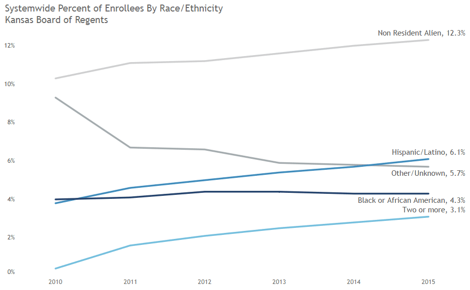
An initial attempt resulted in a line chart.
Since the headline and much of the article focused on change over time, a line chart was a good approach. Nine lines would have been too many to be easily interpreted, so the white category was removed and ethnicities with less than 3% of the total in 2015 were grouped with the unknowns into the “Other/Unknown” category. This is a common practice used to clarify the visual and support the intended message. In this case the message is that enrollment of minority ethnicities has increased over the last 5 years.
The blue and gray color scheme makes it easier to focus on the important information. The least important lines are gray, while the most important lines are blue. The axis labels and graph title are gray so the reader’s eyes are drawn towards the important lines.
The lines on the chart are directly labeled, so there is no need to go back and forth between the lines and a legend. The labels are a larger font size than in the original visual so they are easier to read.
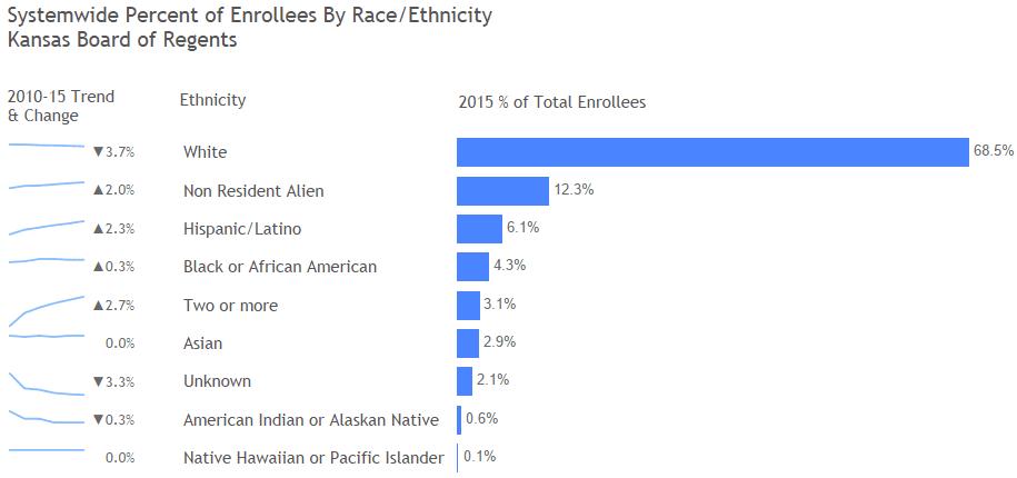
A second makeover attempt resulted in a combination chart.
This visual focuses on the current year by showing the proportions in a line chart, but it also provides the trend over time through sparklines with the change from 2010 to 2016 as a number beside it. All text is in gray to draw attention to the data in the charts. A simple blue color scheme is used to reduce clutter and focus attention. Bars are directly labeled for a clean look.
Since the article mentions specific numbers from the current year, this visual still supports the story while showing a different focus.
Bars don’t have the same limitations as pies and lines, so all 9 ethnic groups can be shown without creating a cognitive burden for the reader.
Both charts look more modern and have more visual appeal than the original. They also do a better job of reducing clutter and focusing attention to the important points in the visual. The biggest difference between the makeovers and the original is the intentional design choices made to better communicate the intended message. The best tip for those new to data visualization comes from Storytelling with Data: “Don’t let your design choices be happenstance; rather, they should be the result of explicit decisions.”


