
Creating a custom app is a breeze thanks to Microsoft’s PowerApps. Users of any skill level can design sleek applications to service numerous business needs as designing an app now requires little to no coding experience. The simple drag and drop interface in Canvas apps boosts efficiency by speeding up development time, while empowering user allow users ultimate control over the layout and navigation experience of the app. Canvas apps can connect to data in hundreds of cloud-based or on-premises sources. Further, your potential audience can access your apps via mobile devices, web browsers, or embedded in external sources or model-driven apps. The flexible nature of canvas apps expands app designers’ horizons and unlocks new potentials for streamlining business processes.

When Should You Make a Canvas App?
Canvas apps are one of three types of Power Apps. You should utilize a canvas app approach when you want to be able to customize each aspect of the app layout and design, such as the color, hover actions, or multiple screen navigation. In contrast, model-driven apps are restricted to a pre-configured basic layout. Further, choose canvas apps when you want to create Excel-like formulas to configure the user experience. For example, you can create formulas to dynamically show or hide content based on conditions.
Business Use Cases
Since the potential design and layout of canvas apps is so broad, canvas apps can service a plethora of common business functions. Canvas apps are known for their flexibility in design and functionality, can cater to a wide range of business needs across various industries. Some common use cases include:
- Directory of contact Information
- Submitting IT Support requests
- Gathering customer feedback
- Creating an interface to display and edit database information
- Suggestion boxes
- Sales management
- Event management and planning
Building the App
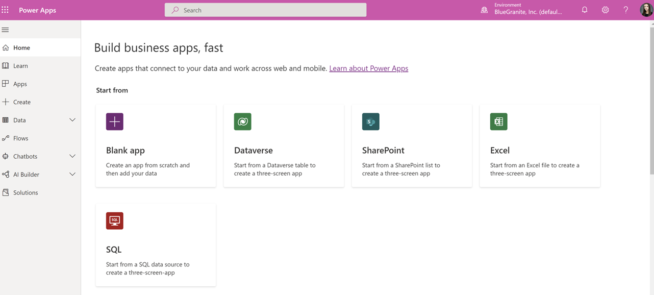
There are numerous ways to begin building your canvas app. When you first navigate to the PowerApps Maker Portal, you can automatically generate a blank canvas app or select one of four common data sources: Microsoft Dataverse, SharePoint, Excel, or SQL Server. If you do not see your data source listed here, don’t worry – there are hundreds of available connectors. Either create a blank canvas app and connect to your source within the blank app, or navigate to the Create tab and select “More Data Sources” to configure the connection to your data source.
If your data source is on-premises, you need to configure a connection via a gateway. The connection can be the same as your Power BI gateway if you already have one.
How To Create From Blank
Creating a blank canvas app provides the highest level of flexibility in app design. When you create a blank canvas app, you receive just that – a blank canvas. You can add visual components to the app and design page navigation and configure your data source connection once you are satisfied with the layout. Alternatively, you can connect to the data source up front and watch how the visuals interact with your data while designing the app.
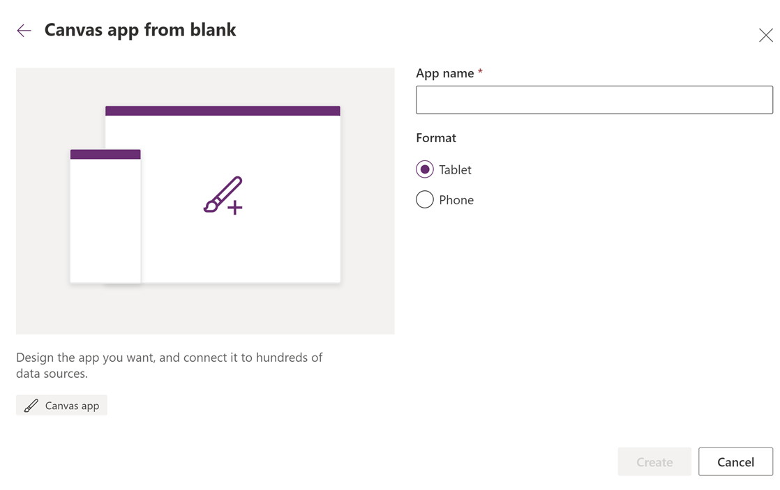
In canvas apps, when you click “Create,” you can specify the orientation format and name the app. The tablet format is horizontal, which is suitable for tablet and web browser users. The phone format is a narrow vertical layout and is intended for mobile users. If you select the phone format, web users can still view the app, just in a smaller vertical view on their screen. Similarly, phone users can still view apps in the tablet format, but the layout can be difficult to read on the narrow phone screen.
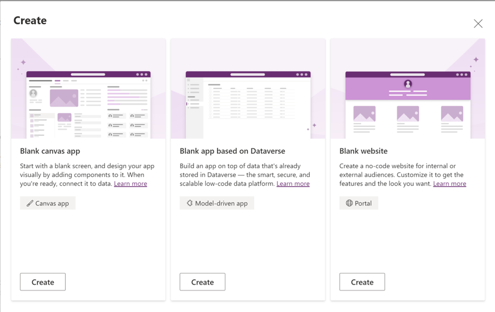
Note: when you click “From Blank,” (pictured above) you also have the option to create a blank app based on Dataverse, which is a model-driven app, or a blank website, which is an external-facing portal. Both options are different from the canvas apps discussed in the rest of this article.
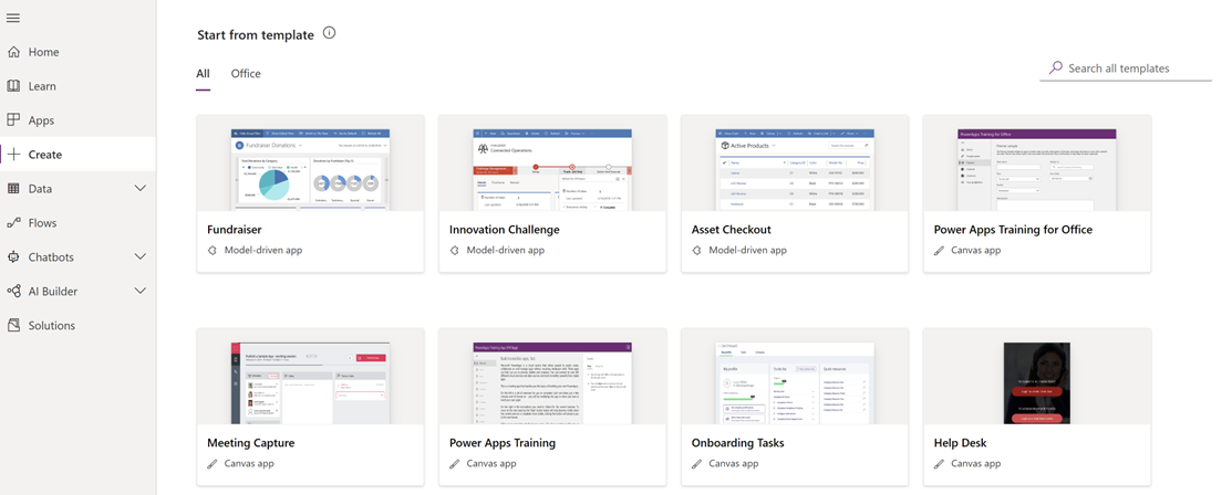
How to Create from Template
If you want to quickly build a canvas app, there are hundreds of templates in the Create tab. Examples include Fundraisers, Service Desk requests, Expense trackers, and Employee Engagement surveys. These templates are a great way to kick-start the development process for many standard business processes. Further, templates are an invaluable option for developers who do not want to spend time on visual design, as each template houses rich visual layouts and screen navigation possibilities. Depending on the template, you set the relevant connections once you select the template. You can then customize the layout just like any other canvas app.
How to Create From Data
From either the Home or Create tab, when you select the option to create from Dataverse, SharePoint, Excel, or SQL Server, PowerApps automatically generates a simple canvas app connected to that data source. Data can come in a variety of data types, such as tables, emails, or lists. When you connect to a data source, PowerApps brings the data locally into the app, and consumers do not have to connect directly to the source when using the app.
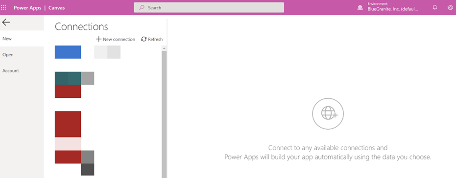
After clicking one of these four data source options, you can either initialize a new connection or use an existing one within your environment. When you click “Add a New Connection,” you can select from one of hundreds of available cloud connectors and enter the required connections.
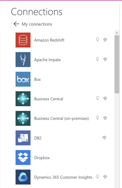
Note: certain connectors have a diamond icon next to their name. These connectors require a per app or per user license to play back the app.
If you select an existing connection within your environment, you can select which table you want to include in your app from the database. If you need to incorporate additional tables in your app, you can do so later by going to the Data section of the canvas app designer.
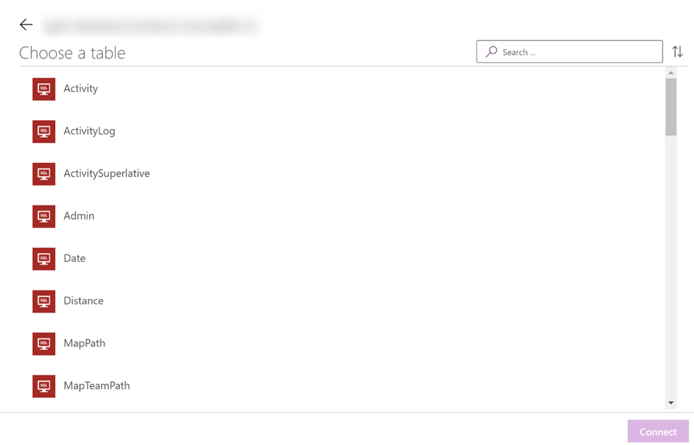
For the rest of this article, I have selected the SQL Server option and connected to a sample activity log database. The process is the same for the other methods of initializing your app.
Canvas App Designer Walk-through
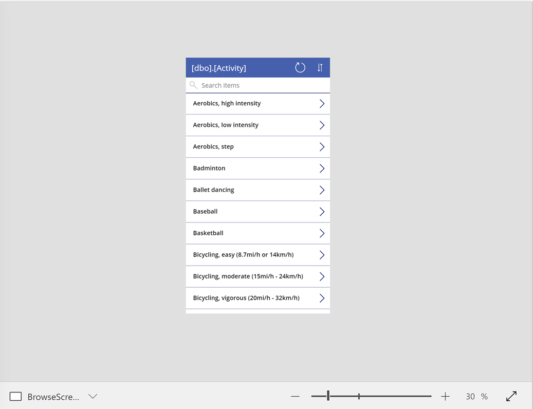
Since I’ve selected the option to connect from data, PowerApps automatically created a basic two-screen navigation app connected to my SQL database. The two screens are a Browse Screen (Shown as BrowseScreen1 in the Tree View) and a Detail Screen (named DetailScreen1 in the Tree View). The overview of this app is that the first screen contains a list (which is known as a Gallery visualization) of the names of all the records in the table I selected from my database. When you click the right chevron icon next to one of the records, the app navigates to a Detail Screen containing all the relevant fields for that selected record. The Detail Screen is configured the same for every record, and when you run the app, the Detail Screen is filtered to the record selected in the gallery visual on the Browse Screen.
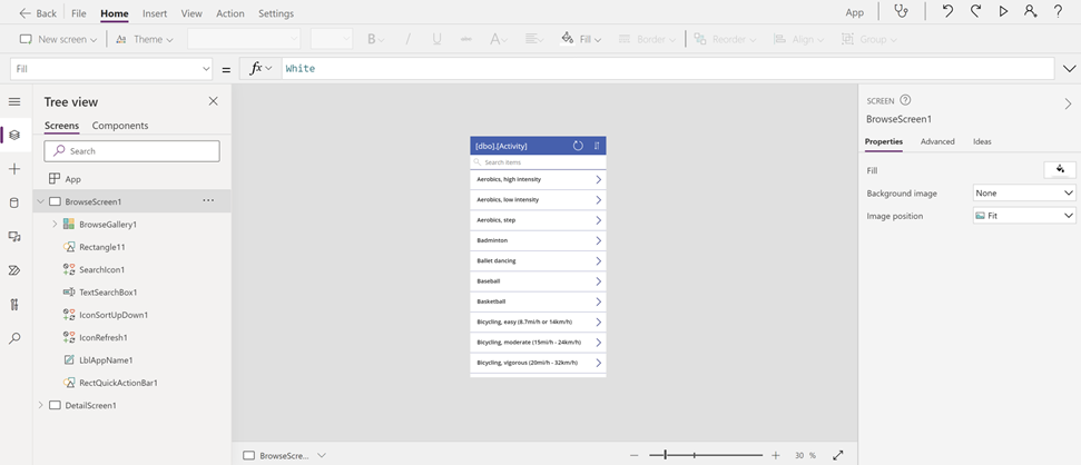
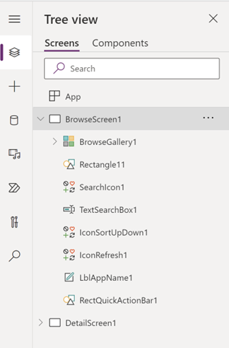
The Tree View section on the left side of the screen displays a list of all the visual elements on each screen. Each screen is denoted by a white rectangle icon. When you click the chevron next to the screen’s name, you can see all the visual elements that encompass the screen.
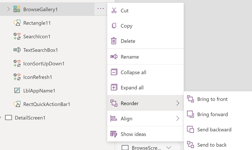
The visuals are ordered according to how they are layered on the screen. To move visuals in front of or behind each other, click the ellipsis icon > Reorder > Bring Forward or Send Backward. A useful tip is to rename visuals as you’re working so that it is easier to reference the visuals in the tree view and in formulas.
When you click any visual, the visualization pane on the right allows you to change every aspect of the visual’s design.
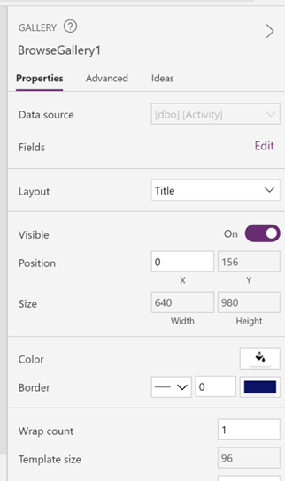
You can change the data source, color, border, and numerous other visual options depending on the selected visual type.
The Advanced tab allows more experienced users to write Excel-like formulas using the Power Fx language. In the Advanced section, you can define actions for various properties of the visuals, such as OnSelect behavior (meaning when users click the visual) or OnChange behavior (when users alter the value and click enter). The Advanced Section also allows you to enter RGB hex values for the Color or Fill properties to meet any specific color scheme requirements.

You can also write formulas and control the same visual options by changing the drop down on top of the Tree View and typing your formula in the Fx bar. This option makes it easier to write formulas, as PowerApps automatically color codes the formula while you’re typing.
The center portion of the designer is how the app appears to the end users. Here, designers drag and drop elements onto the screen, such as galleries, text input, drop down controls, or basic media files. When you add buttons, you can test the functionality of the button by holding the Alt key on your keyboard and clicking the button. Another useful tip is to use the zoom button in the bottom right to make it easier to work on designing the app.

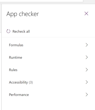
The icons in the top right of the designer ribbon are useful for testing and troubleshooting your app. The stethoscope icon opens the App Checker. Here, you will receive warnings for invalid formulas or performance bottlenecks. Further, the App Checker allows you to ensure your app is accessible to all users. The useful part of the App Checker is that you can click the warning, and PowerApps will automatically navigate you to where the error is happening, even if it is on a different screen.
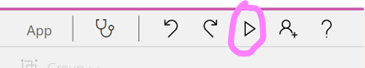
The right-facing arrow icon is the Play icon. Here, you can test how end users will interact with your app without having to click the Alt key on your keyboard.
Making Basic Customizations
Creating an Edit Screen
We can use this app as a starting point for further development. Right now, our users can only view information. Let’s create a screen to allow users to edit records in the source.
Note: to be able to edit records, the data source must not be read-only, and there must be a primary key in the source.
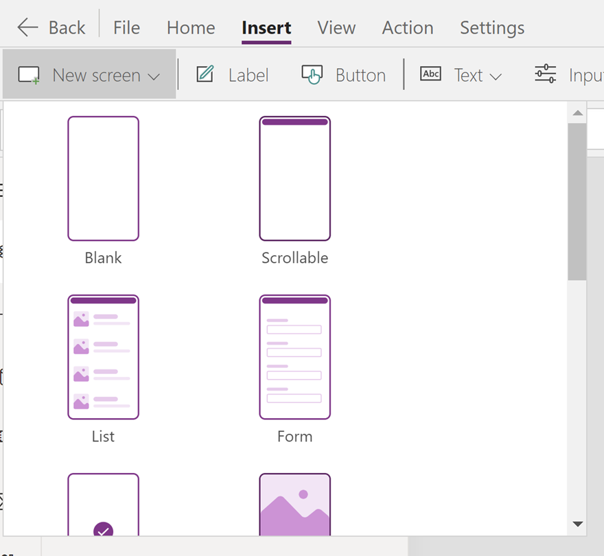
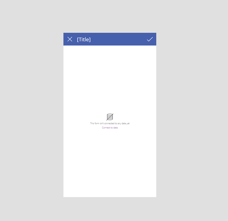
To create a new edit screen, go to the Insert tab > New Screen > and select the “Form” option. PowerApps automatically generates a new empty screen with an empty edit form. Edit forms look the same as the display form shown earlier; however, they allow users to edit records and save the changes directly back to the source.
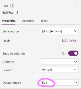
To verify that the edit form is set to edit, note that in the Properties pane, the Default Mode is set to “Edit”:
Right now, the form is empty because it is not yet tied to the data. Setting the DataSource property of an item allows you to connect the visual to your data source. Click the edit form and set the DataSource property to your data source (in this case, I am using the SQL database).
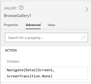
Setting the Item property of a visual allows you to specify which record you want to be displayed in the visual. We can specify the selected record with the following syntax (BrowseGallery1 is the name of the gallery visualization on BrowseScreen1):

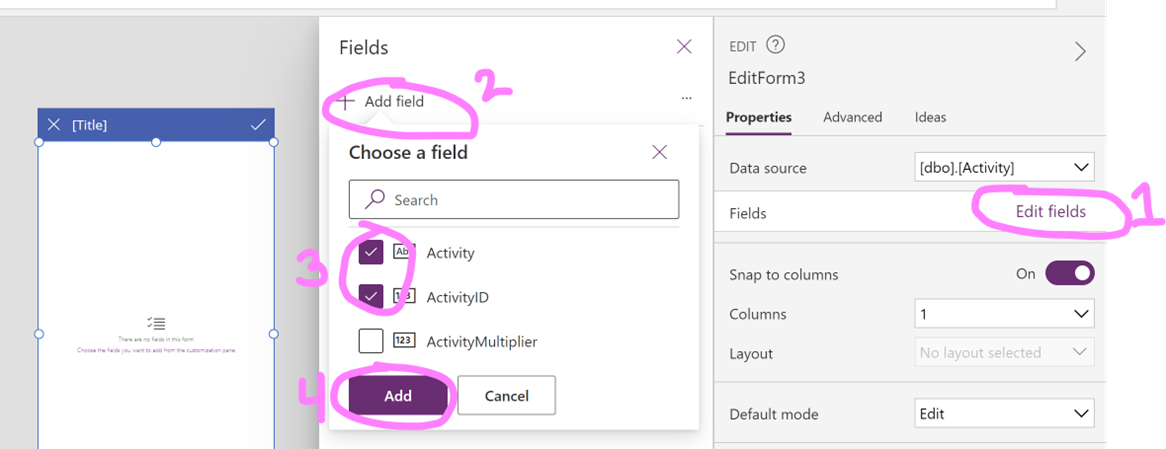
Now, we can add the fields we want our users to be able to edit. Select the edit form. In the Properties pane, click Edit Fields. Then, in the Fields pane, click Add Field and select the fields that you want users to be able to change. Click Add.
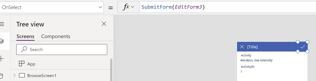
Now, users will be able to alter the value of the selected fields. Once users have made changes, they will click the check mark icon in the top right corner of the screen. The OnSelect property allows you to create actions that happen when the user clicks the visual. Notice that the icon has an OnSelect formula that submits the form back to the source:
Adding Screen Navigation
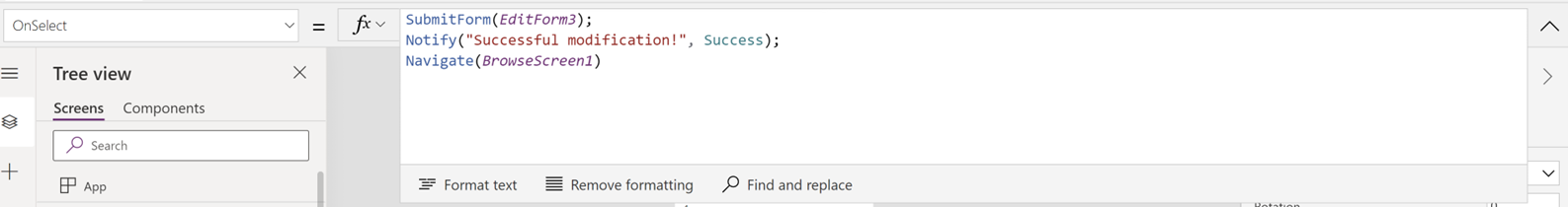
A useful addition to this formula would be to notify users that their changes were successfully saved and redirect them back to BrowseScreen1. To build more lines to the formula, insert a semicolon at the end of the formula and add the following lines of code to send a notification message and navigate the users back to the original screen:
Similarly, it would also be useful to set the OnSelect property of the cancel icon to Navigate(BrowseScreen1). You can use the Navigate function to direct users to any screen in the app.
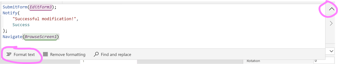
Tip: When writing complex formulas, you can press enter on your keyboard to add more lines to the formula bar. Click the down arrow icon on the far right of the formula bar to expand the space. Also, the “Format Text” option at the bottom of the formula bar makes it easier to read formulas.
Now our end users will be able to view or change entries in our database. Click the Play icon to test the functionality of the report and change any visual formatting as desired.
Creating Dynamic Text Boxes
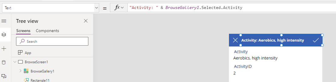
A useful design tip is to create text boxes that dynamically show users the title of the record being displayed. This way, it is very clear to our users what record they are editing on the current screen. You can set the Text property of text boxes to either static text strings or use formulas to build dynamic content. You can even combine static text with formulas by using the & operator.
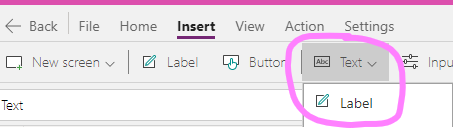
On the Edit Screen, go to the Insert tab > Text > Label to insert a blank text box. Move the text box to the top of the screen.
Select the Text property and enter the following formula. Set the Color property to whatever color font you would like. Notice that now the text box dynamically shows users what record they have selected from the BrowseGallery1 on BrowseScreen1.
Publishing & Sharing the App
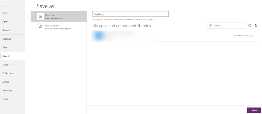
When you are finished designing the app, click File > Save As to save the app. Saving the app to the cloud will make the app accessible within your Environment. Users that have the appropriate security role will also be able to edit the app.
When you make additional changes to your app, you need to click File > Save. However, you have not yet published the app at this point, so end users would not see the changes that have been made since the previous publish. To make all changes available to end users, click Publish after you save the app.
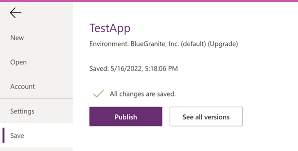
A useful feature of PowerApps is the built-in version history. When you click Save > See all versions, you can see a running history of all the saved versions of the app and revert to previous versions if needed. The version that says “Live” in the Published column is the currently visible version available to end users. This feature facilitates troubleshooting and collaboration amongst teams.

To edit a previously published or saved app, go to the Apps tab. Click the ellipsis icon next to the app’s name and click Edit to open the app designer. Note that if you just click the name of the app, you will play the published version of the app like it appears to the end users, not edit it.

Conclusion
Creating a basic business app is a simple, straightforward process using Microsoft’s Canvas Apps. The possibilities for solving common business tasks are endless with the flexible structure of canvas apps. Canvas apps are a key aspect in streamlining manual processes within any organization.
3Cloud has strong experience with apps supporting modern analytics solutions to create a more efficient Microsoft Azure ecosystem. If you’re wondering how these tools could benefit your business outcomes, contact us today!
Don’t miss out, 3Cloud offers a variety of resources and events to help you learn how you can leverage Modern Analytics capabilities.